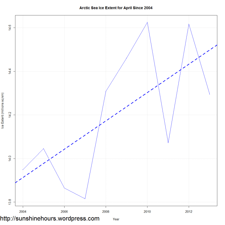
I saw the following article at the NSIDC site about the trend for April Sea Ice Extent in the Arctic.
And I wondered what it would look like if I just graphed the last 10 years. And I thought … looking ok.
And then I though … how about the last 20 years with a loess curve? Don’t you think the NSIDC articles words are misleading?


Darn, looks like my hopes are dashed.
I really wanted the North Pole to hit zero ice (alright down to the size of Egypt) then point out to everyone that the tidal gauges still read (within a centimeter) the same maximum tides. We’ll not drown.
Instead we’ll get chilled some more.
I worry that every time there is less ice, some moron in government will squander 100 billion more on stupid renewables.
thank you for the graphs the NSIDC has been stonewalling me on requests for graphs for the last ten years !!