The AMO and Temperature

My Swedish is poor. But the graph is clear. Spitsbergen temperatures are in synch with the AMO. Some translated text below graph. (Thanks)

Grafen viser temperatursvinginger tilbake til slutten av 1800-tallet. Foto: Skjermdump

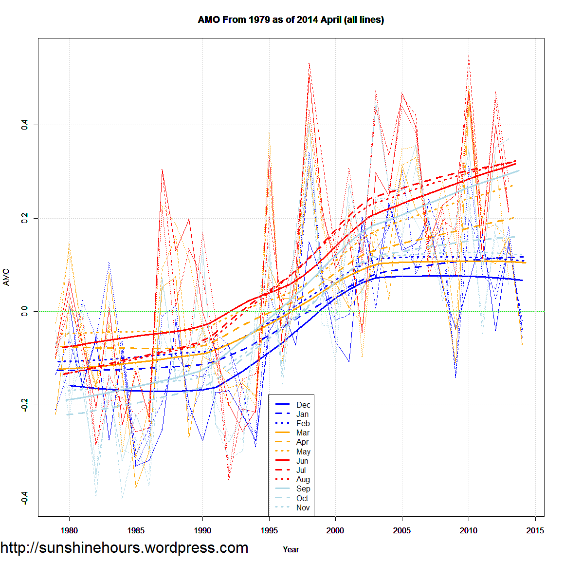
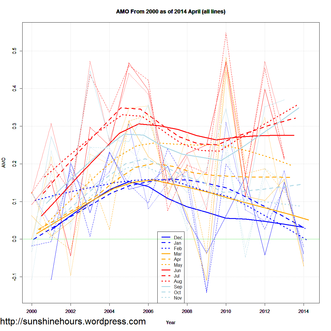
Contributing to making this part of the report a worrying reading is that the natural climate variations are not included in the used climate models. This is depressing, as it is well known that the air temperature around Svalbard is clearly influenced by the AMO (Atlantic Multidecadal Oscillation), which is a natural and periodic variation. This impact is actually mentioned in the report, and this realization ought to have been exploited.

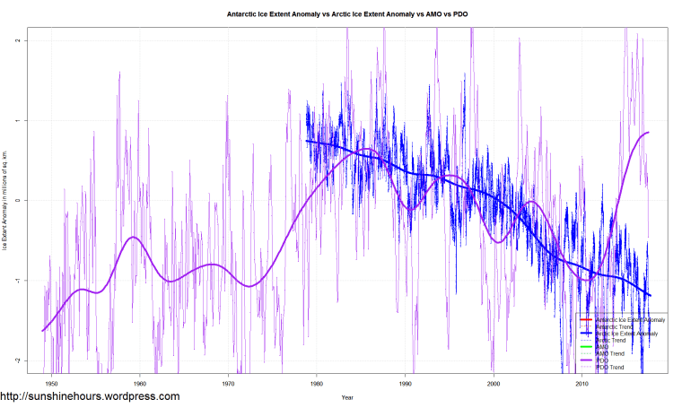
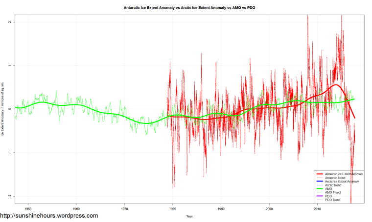
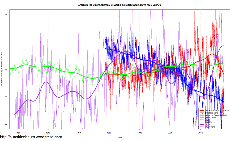
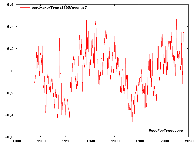
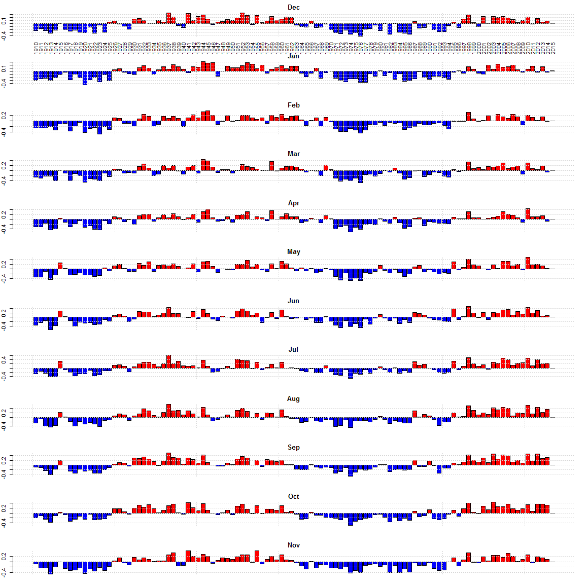
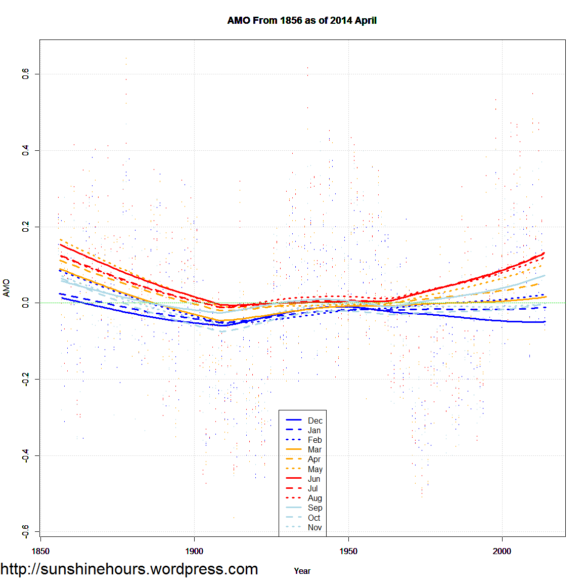
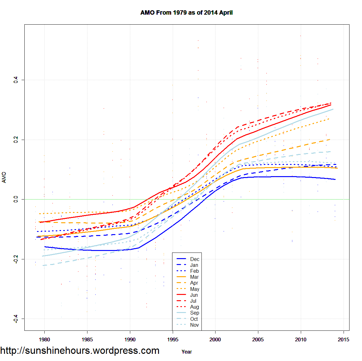
Both the AMO and the air temperature in Longyearbyen have largely covaried since 1898 (see figure). The natural climate variations are thus far from unimportant, and explain better than all CO2-controlled climate models what actually takes place here in Longyearbyen.

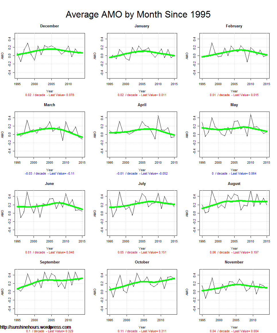
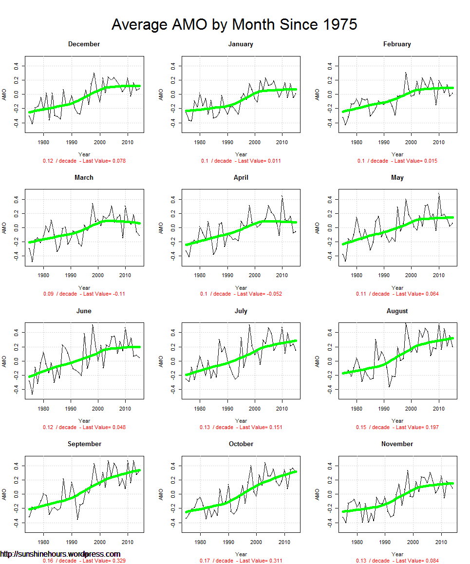
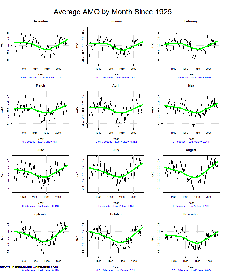
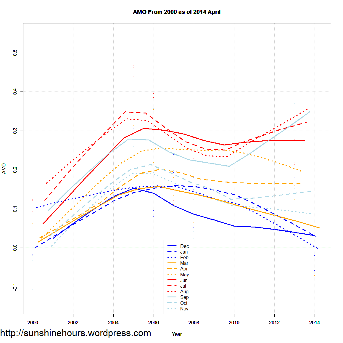
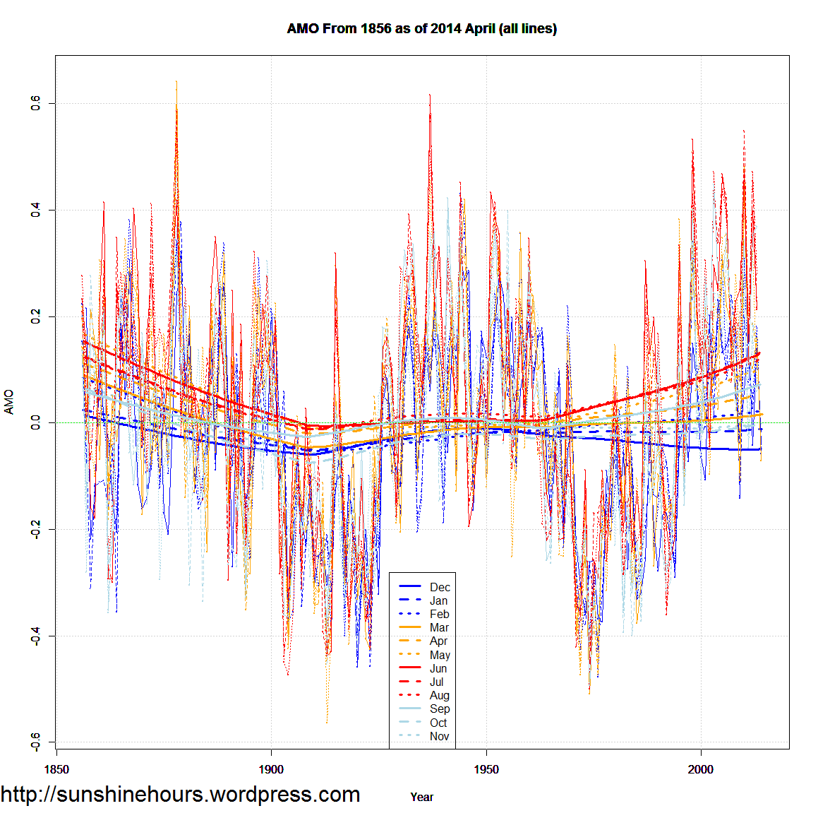
AMO is known from measurements since 1856, and geological surveys show that AMO has been in unbroken function for at least the past 8000 years. So it is not likely that AMO will stop in the near future. AMO is currently passing a peak, and will in all likelihood decline over the next 30-35 years. We can all imagine how it will affect the Svalbard temperature. So the natural phenomenon of AMO ought to be included in the report’s assessment of the future climate in Longyearbyen with great emphasis, but does not.

PDO AMO Arctic Antarctic

The graphs start from 1950 to show a full 66 year cycle of the PDO and AMO.

I’m graphing anomalies from the mean for all. Sea Ice is in millions of sq km.

PDO versus Arctic Extent  – note that the satellite record for sea ice starts at peak of PDO

AMO versus Antarctic Extent

Everything

Antarctic Ice Extent Anomaly vs Arctic Ice Extent Anomaly vs AMO vs PDO from 2010

Update: Experimental Graph Removed until I can fix my code.

Update 2: Experimental Graph 2: Antarctic Ice Extent Anomaly vs Arctic Ice Extent Anomaly vs AMO vs PDO from 2010

(Arctic is anomalies. I will try other values later)

It was in perfect synch for a while.

Sea_Ice_Extent_Trends_Arctic_vs_PDO

South / North

California Water Management Fails Epically

Michael Reagan states the obvious:
In response to the shortage of water, the California Water Resources Board wants to institute a punitive fine of $500/day for people it calls “water hogs.”
But I think Thomas Del Beccaro, writing in Forbes, has a better idea: Let’s fine the board for failing to do its job over the last 40 years.
He explains, “California is the most populated state in the Union, with more than 38 million people. Its population was just under 20 million in 1970, when the bulk of its current water storage and delivery systems were already built. In other words, the California governments have done very little to significantly increase water supplies in over 40 years, even though its population has doubled during that period of time.
Instead of realizing that “water” was its middle name, the board has been made captive by enviro-Nazis who think people in general are the enemy. Rather than build dams and reservoirs to keep up with a growing population, state government has preferred to depend on the kindness of clouds to provide water for taxpayers.
Then the clouds stopped being kind.
Felicia Marcus, chairman of the water board, exemplifies the arrogant, buck-passing mentality of its members: “I like to say, having a browning lawn and a dirty car is a badge of honor.”
No Felicia, the dead grass and filthy car are the result of a do-nothing board that should be thrown out on its ear.


http://www.newsmax.com/MichaelReagan/California-Water-Management-Fails/2014/08/04/id/586658/

AMO Update as of April 2014

UPDATE: Sorry about the title. Not sure what happened. Fixed now.

The AMO is definitely linked with climate cycles. And probably has more to do with Arctic Sea Ice than any other factor. This is loess trend of each month of the AMO on the same graph.

The winter months started trending down around 2005/2008. Spring months have been flattish since the same time. Only July-Sept have stayed high. June has been flat.

The first four months of 2014 were all negative.

AMO From 2000 as of 2014 April

Same graph, but from 1856 and 1979. The spread in months now seems to be repeating the pattern way back in 1856. But that could be an endpoint artifact.

AMO From 1856 as of 2014 April

AMO From 1979 as of 2014 April


Same graphs, but the data and the trends.

AMO From 1856 as of 2014 April (all lines) AMO From 1979 as of 2014 April (all lines) AMO From 2000 as of 2014 April (all lines)