Where is the Data? UAH, HADCRUT kind of late

2nd UPDATE: UAH is out. My post here.I knew if I complained it would all show up. 🙂

UPDATE: HADCRUT4 for March 2013 is out. My post is here.

Anyone know where the UAH and HADCRUT data is?

While some of the UAH data arrived a few days ago, the downloadable file is still missing April’s data. March’s data arrived April 2.

HADCRUT is usually available by the 28th of the following month. February’s data came out March 28. It is now 10 days late.

Are they having a conference? March and April too cold to explain?

RSS is out. HADCET is out. NCDC is due soon, but not overdue.

HADCRUT3 Dec 2012 – Colder Than 1939,1981,1979,1987 etc – 18th Coldest

HADCRUT3 for Dec 2012 is out.

Dec 1939 was .112C warmer. And 1979 was warmer. And 1981. And 1987.

Notice how 2010, 2011 and 2012 are at the bottom of this list. Three cold Decembers in a row.

Here is the list of Decembers warmer or equal to Dec 2012.

year Dec
1997 0.533
2003 0.523
2006 0.523
1998 0.444
2009 0.427
2004 0.376
2005 0.37
1939 0.345
1979 0.33
2002 0.328
1999 0.327
2008 0.327
1987 0.326
2001 0.321
2010 0.267
2011 0.249
1981 0.238
2012 0.233

NOAA September 2012 = 15 Year Trend By State

There has been much discussion in the climate blogosphere over the flat line in HADCRUT over the last 15 years.

Here are the 15 year trends from NOAA by State. Highlighted = Cooling

State 15 Year Trends in F/Decade
Alabama 0.1
Arizona -0.2
Arkansas 0
California 0.5
Colorado -0.3
Connecticut 0.4
Delaware 1
Florida -0.2
Georgia -0.1
Idaho -0.7
Illinois -0.1
Indiana -0.1
Iowa -0.7
Kansas -0.3
Kentucky -0.2
Louisiana 0.1
Maine 0.7
Maryland 0.4
Massachusetts 0.2
Michigan -0.3
Minnesota -0.7
Mississippi 0.1
Missouri 0
Montana -0.9
Nebraska -0.8
Nevada -0.1
New Hampshire 0.3
New Jersey 0.8
New Mexico 0.1
New York 0.4
North Carolina 0.2
North Dakota -0.9
Ohio 0
Oklahoma 0.3
Oregon -0.6
Pennsylvania -0.1
Rhode Island 0.1
South Carolina 0.3
South Dakota -1
Tennessee 0
Texas 0
Utah -0.5
Vermont 0.8
Virginia 0.5
Washington -1.2
West Virginia 0.1
Wisconsin -0.6
Wyoming -0.1

HADCRUT4 and Met Office Claims

Read this article: Met Office reply to David Rose Sunday Mail article:

As we’ve stressed before, choosing a starting or end point on short-term scales can be very misleading. Climate change can only be detected from multi-decadal timescales due to the inherent variability in the climate system. If you use a longer period from HadCRUT4 the trend looks very different. For example, 1979 to 2011 shows 0.16°C/decade (or 0.15°C/decade in the NCDC dataset, 0.16°C/decade in GISS). Looking at successive decades over this period, each decade was warmer than the previous – so the 1990s were warmer than the 1980s, and the 2000s were warmer than both.”

Ok, lets look at a non-arbitrary endpoint (the last datapoint) and go back in 5 year increments.

HADCRUT4 Last 5 years colder than previous 5 years

Mean of the anomaly of the last 5 years = .45C

Mean of the anomaly of the previous 5 years = .49C

Mean of the anomaly of the previous previous 5 years = .41C

HADCRUT3 – Last 5 years colder than previous AND colder than the previous previous 5.

Mean of the anomaly of the last 5 years = .39C

Mean of the anomaly of the previous 5 years = .45C

Mean of the anomaly of the previous previous 5 years = .41C


Warming stopped. HADCRUT3 trend is negative.

IPCC predicted .2C per decade. HADCRUT4 has been created to change the negative trend of HADCRUT3 to a positive one.

But even with the “adjustments”, the last 15 years trend in HADCRUT4 is 1/6th that predicted by the IPCC.


HADCRUT4 hates 1998

Once upon a time there was a global average temperature set call HADCRUT3.

HADCRUT3 loved 1998. 4 out of the top 10 warmest months were from 1998.

year month anomaly
1998 Jul 0.671
1998 Apr 0.647
2007 Jan 0.61
2002 Mar 0.609
1998 Jun 0.606
2002 Jan 0.598
2010 Mar 0.583
2010 Apr 0.571
2003 Oct 0.566
1998 Mar 0.548

And then along came HADCRUT4 whose primary purpose seems to be to make sure the graph of the last 15 years slopes up instead of down.

HADCRUT4 hates 1998. Not only did 2 months from 1998 drop out of the top 10, but Jan 2007 was made .208C warmer than the old Jan 2007.

year month anomaly
2007 Jan 0.818
2002 Mar 0.689
2006 Dec 0.687
2010 Apr 0.673
2010 Mar 0.662
1998 Jul 0.66
2002 Jan 0.66
1998 Apr 0.611
2003 Oct 0.602
2010 Jul 0.601

Why? I have no idea.

Paul Homewood has more. Take note of his footnote. There are no new stations in Antarctica. It looks like maybe 6 new stations south of the equator … and we know it is cooling in the south.

HADCRUT4 – The Scammers Are Getting Shameless

HADCRUT4 is the new Met Office dataset designed to replaced HADCRUT3. Why do they need to replace HADCRUT3?

Because the trend for the last 15 years in HADCRUT3 is negative and therefore it must be exterminated – like the Medieval Warming Period.

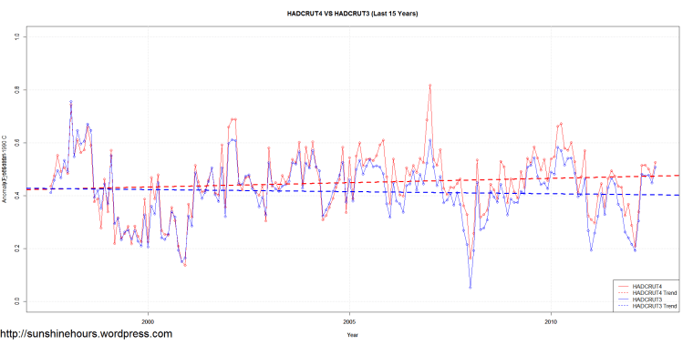
The following graph compares HADCRUT4 to HADCRUT3. (Click for a larger version)

Take note of the following:

1) HADCRUT3 and HADCRUT4 overlaps until about 2002 with minor differences.

2) For some reason, after 2002, there appears to be corrections of .1 to .2C. Why was the data ok in 1997-2002 and suddenly it was so bad it had to be “corrected”.

3) What justifies a .2C adjustment up in 2007? Thats 40% higher!

4) Every place a red line is well above the blue they have adjusted up to make the the “new dataset”  hotter.

5) HADCRUT3 trend (the dashed line) was negative (-.016C/Decade). HADCRUT4 is positive (.033C/Decade).

HADSST2 Southern Hemisphere Aug 2012 – Cooling For 15 Years

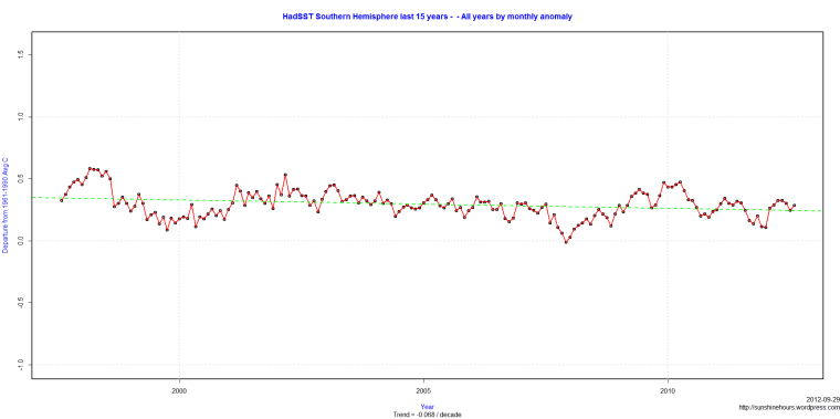
Using data from the Climate Research Unit of the UEA , it appears sea surface temperatures may explain Antarctic Sea Ice at record levels.

SST in the southern hemisphere have a cooling trend of -0.068C / decade.over the last 15 years.

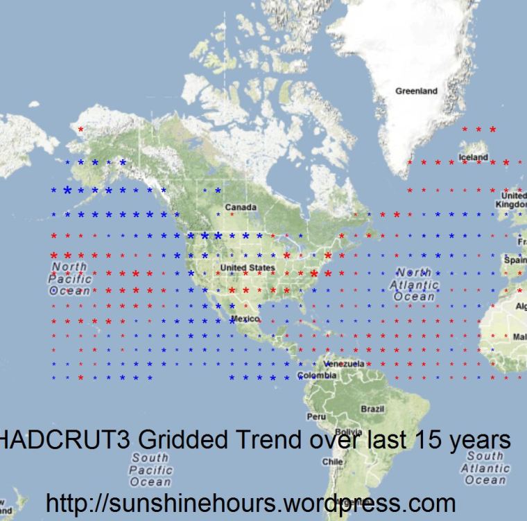
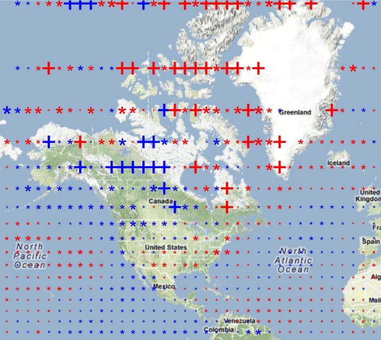
HADCRUT3 Gridded Data – NW Corner – Last 15 years

This post looks at the North West corner of the HADCRUT3 Gridded data for the last 15 years. It is a continuation of this post.

But Northwest I mean Latitude above 0, Longitude < 0. Roughly North America.

In the first map, I am showing the grid cells that have 170 data points out of the last 180 months. I believe that is close to what CRU does for the HADCRUT3 data summarized by month. The 2nd map has all the grid cells with 2 or more data points.

The * represents the magnitude of the data roughly. If there is a + it is too large to show (like the giant red star). Red = warming. Blue = cooling.


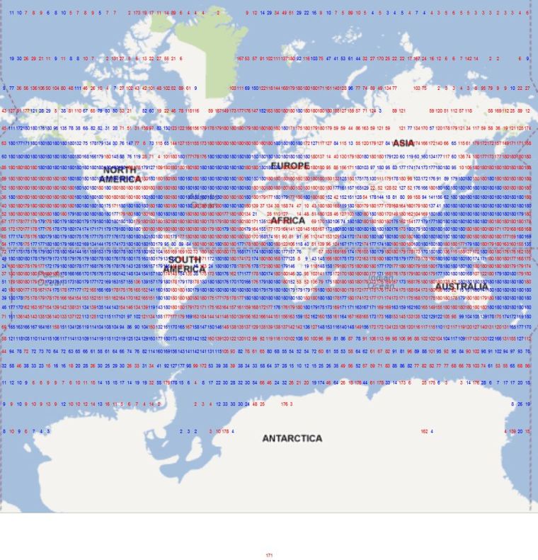
HADCRUT3 Gridded Last 15 years – Some Data is Missing

My first look at the gridded data ended up with a Big Red Star. This post looks at how much data there is over the last 15 years counting back from June 2012 (the most recent gridded data).

For grids with temperature stations there should be 180 data points (15 years x 12 months).

I found 2,315 grid cells with data out of a possible 2,592. 731 of those grid cells have a 180 data points. 1,132 grid cells have 170 or more data points.

I calculated the trend for each gridcell.

I’ve used RGoogleMaps before to map spatial data, so here is a map of the world with the count of data points centered in each grid cell. You might want to click on it and zoom in. Cells with a cooling trend are in blue, warming cells are colored red. 1253 cells are warming, 1058 are cooling and 4 have a trend of 0.

There are a lot of cells without much data.

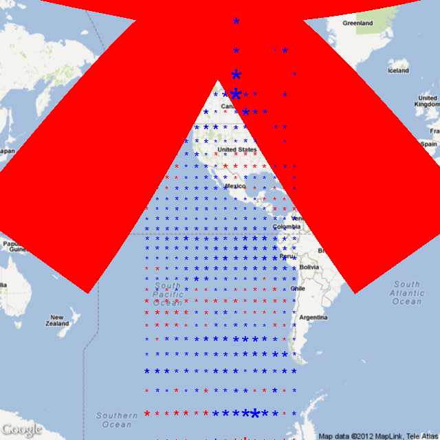
Giant Red Star’s in the Arctic – HADCRUT3 gridded data

I’ve graphed HADCRUT3 before.  It shows a flat temperature trend over the last 15 years (actually a very small negative trend). So I thought I would take a look at the gridded data (HADCRUT3 Zipped Ascii) and find out which grid cells (5 x 5)  are warming and which are cooling by how much.

I’m using the R package RGoogeMaps which I’ve used before. So I started by calculating  the trend in Celsius / Decade for each grid roughly near North and South America. The code puts an asterisk * at the middle of each grid square. Red for warming and blue for cooling. And I used this formula to set the size of the asterisk:

tCex = 1 + (abs(grid$Trend[i]) * 1)

Which means each asterisk starts at 1 and then the absolute Trend is added on. So if a grid square was warming at 1C / Decade, there would be a red asterisk 2 units in size.

So thats when I saw the giant red asterisk. One of the grid squares is warming at 247C / Decade. Of course it turns out there are only two measurements in those 15 years.

The grid square is Latitude 75 to 80 and Longitude -110 to -105. Somewhere near Melville Island in the Canadian North.