A request. (I don’t usually do requests)
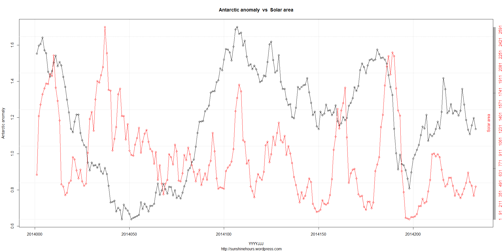
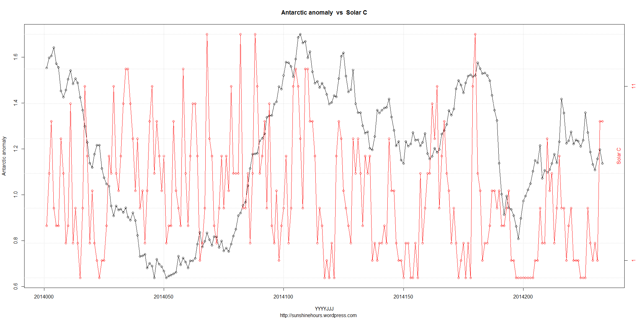
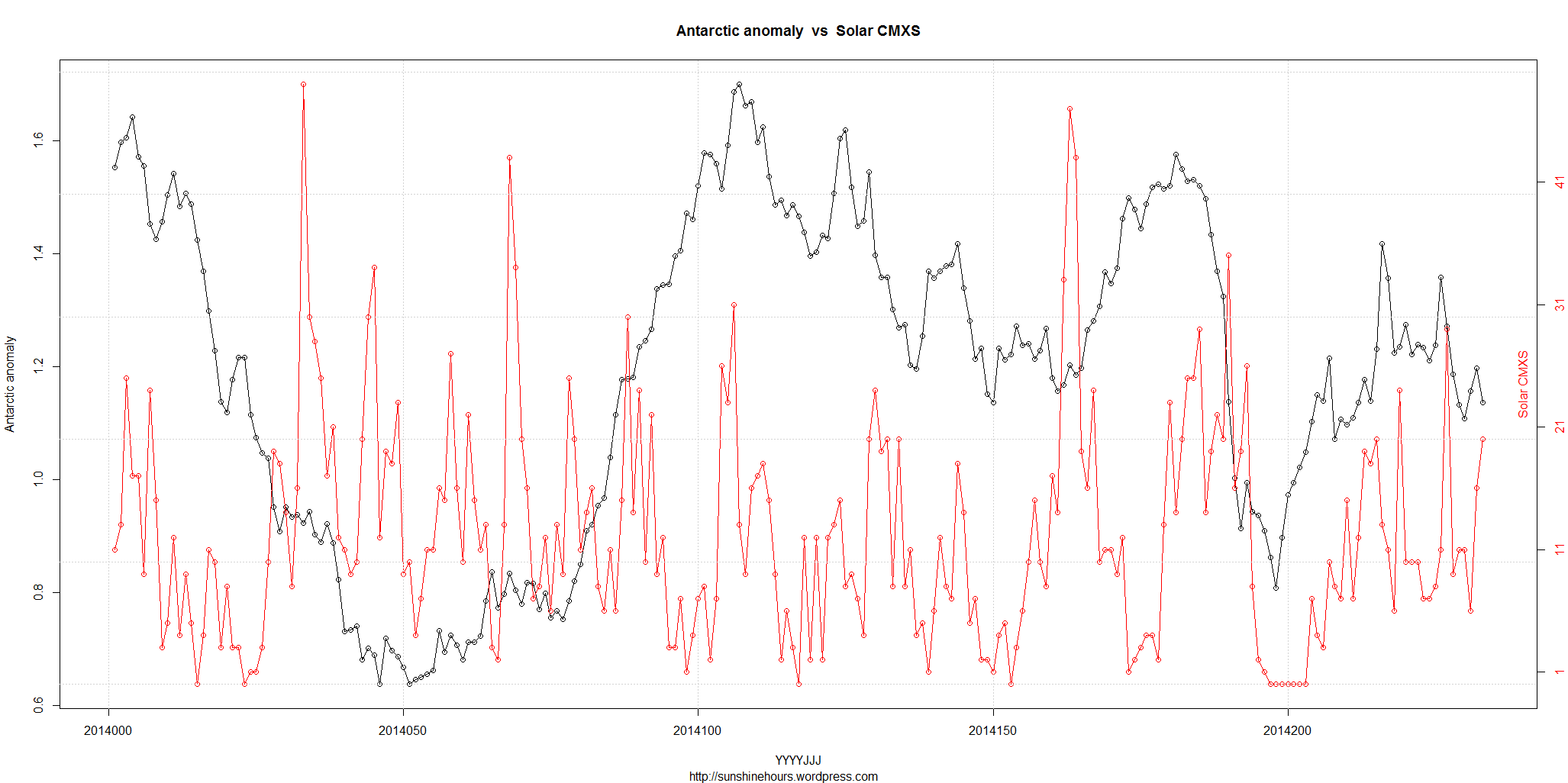
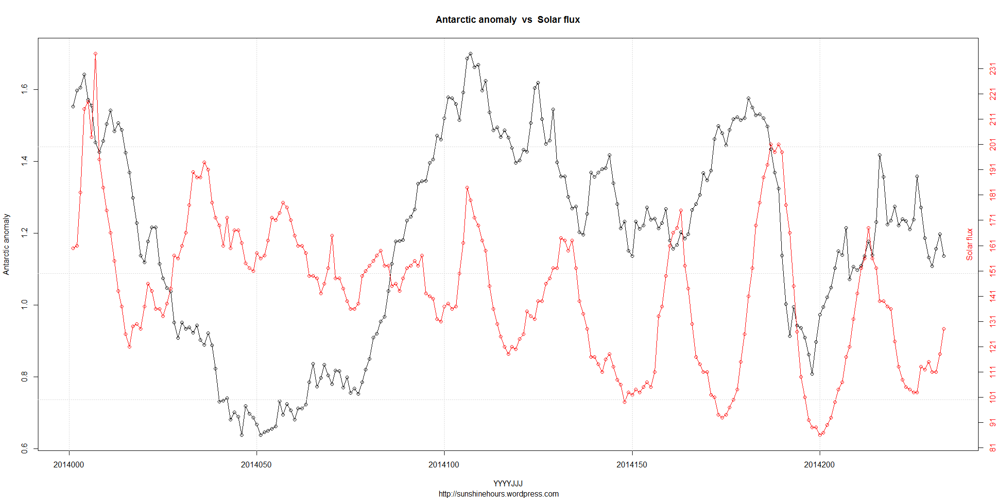
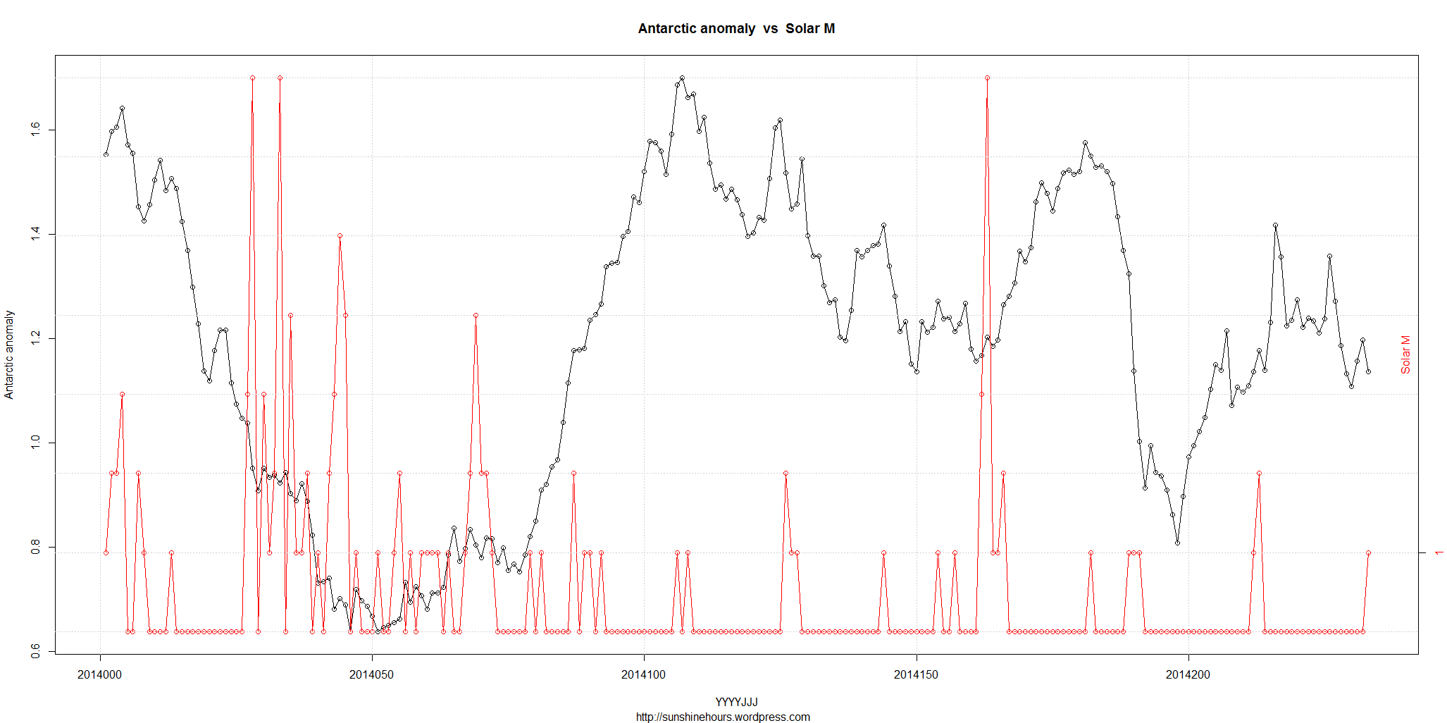
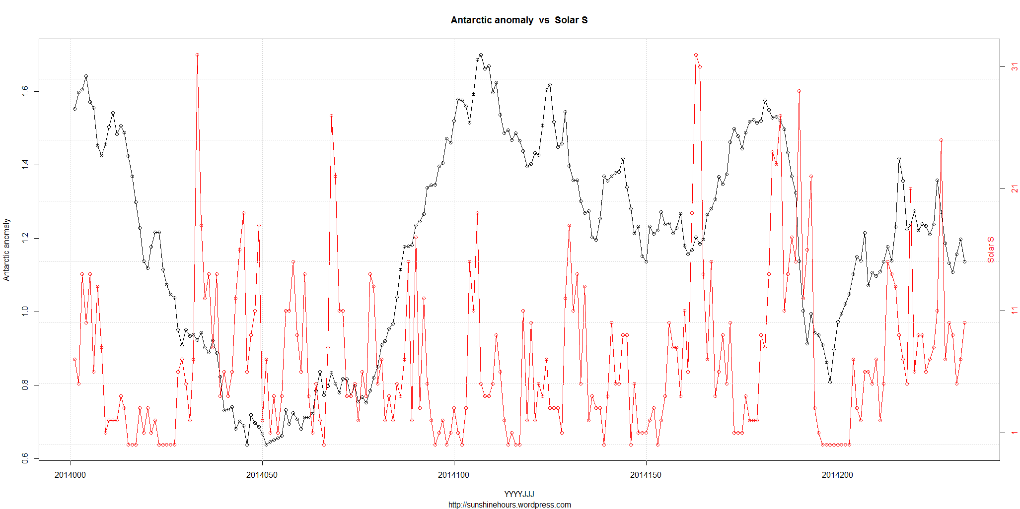
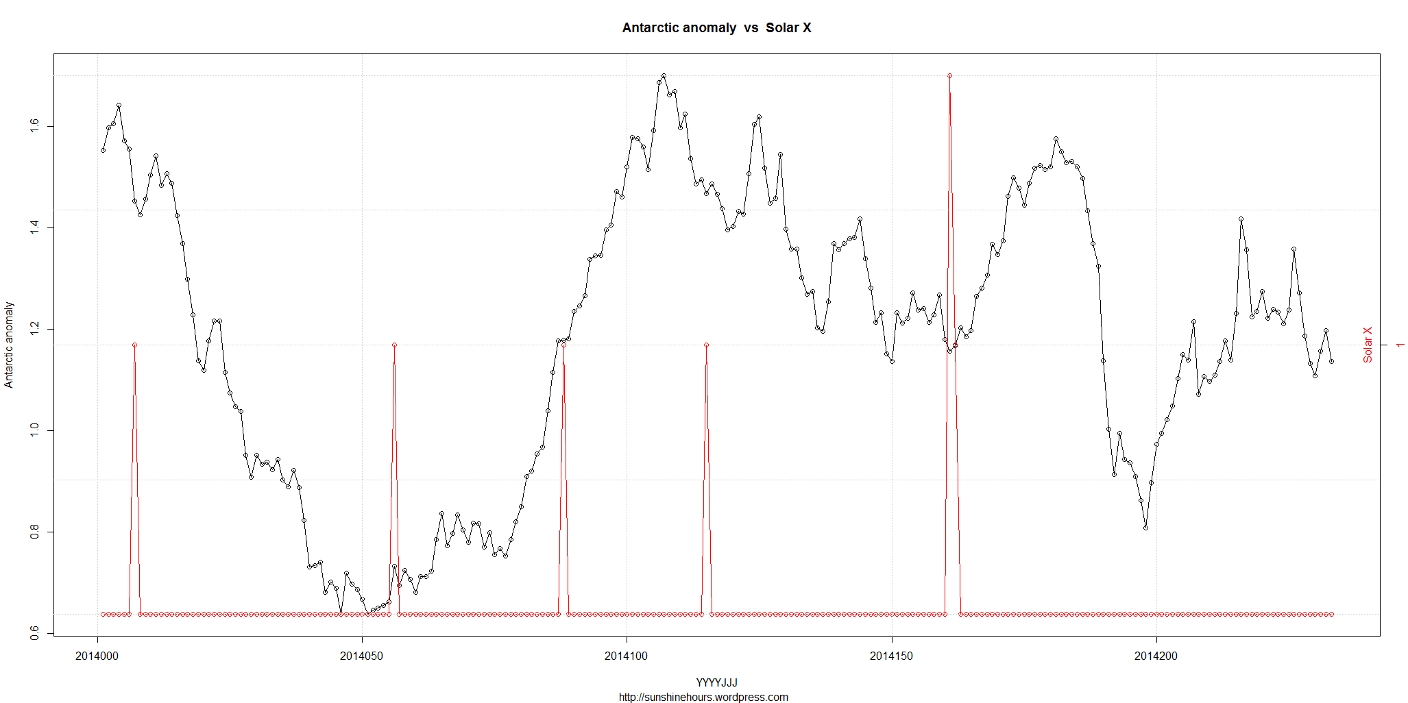
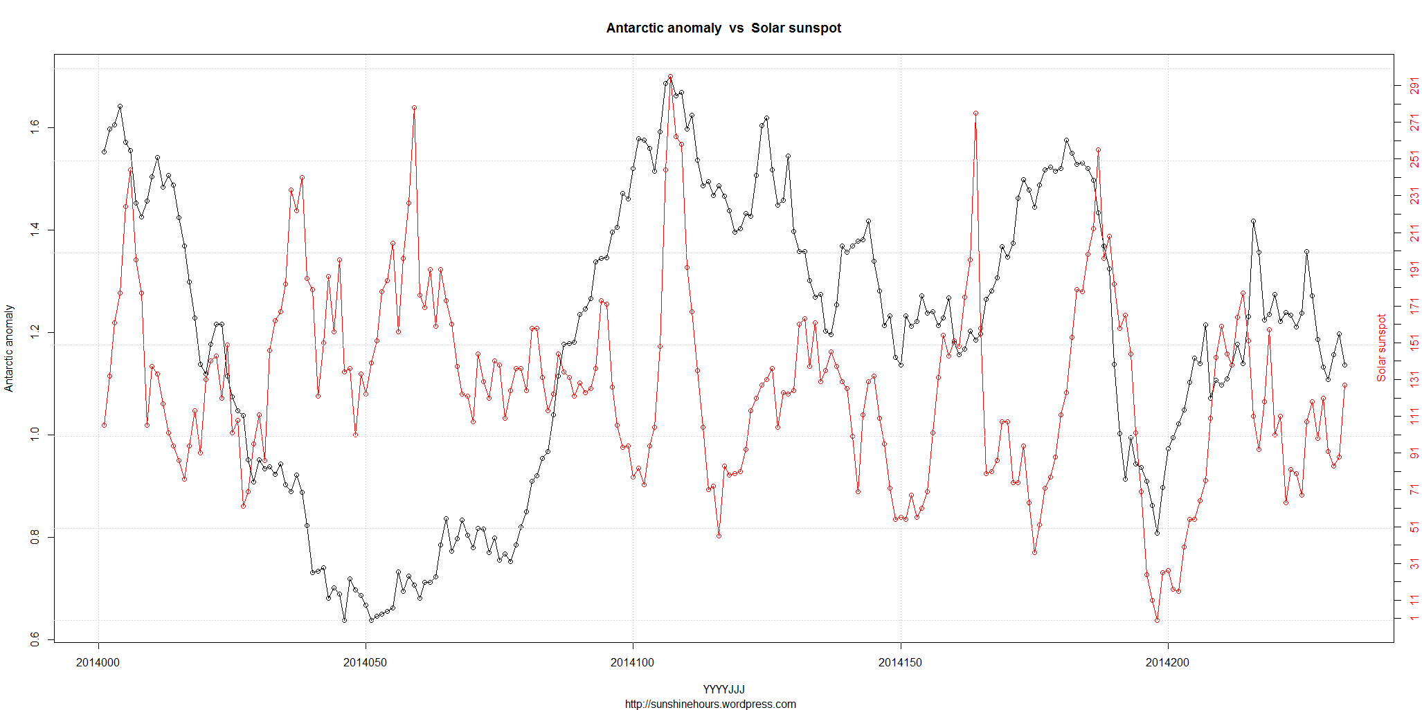
Solar data from here. I graphed the highlighted items.
#                Quarterly Daily Solar Data
#
#                         Sunspot       Stanford GOES15
#           Radio  SESC     Area          Solar  X-Ray  ------ Flares ------
#           Flux  Sunspot  10E-6   New     Mean  Bkgd    X-Ray      Optical
#  Date     10.7cm Number  Hemis. Regions Field  Flux   C  M  X  S  1  2  3
#---------------------------------------------------------------------------
2014 07 01  152    154      850      1    -999   B9.6   5  1  0 14  1  0  0
Anomaly means the difference from 1981-2010 average. CMXS just means the number of C,M,X and S class flares added together.
Discuss.

Comparison of Antarctic sea ice with long term smoothed solar UV and / or other wavelength and particle variations might be more helpful since that is what seems to affect atmospheric chemistry above the tropopause leading to changes in the gradient of tropopause height between equator and poles which, in turn, leads to global cloudiness changes.
Thanks for taking the time to chart solar and Antarctic sea ice Extent, Looks great and looks like you spent a bunch of time on it..
You did not chart the one I noted and I feel shows the clear connection, is daily sea ice Area and daily TSI(solar flux).
Extent shows some connection but not clear as day like Area.
I never thought of charting the daily sea ice Anomalys like you did and I think that was great you did that.
Keep up the great work, I do find that your blog is one of the best on the web for real data charts and info you put out.
Thanks
Chris Beal