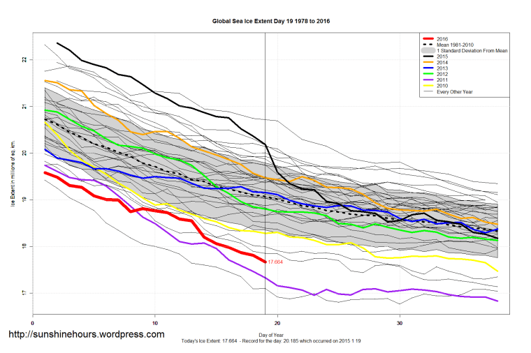
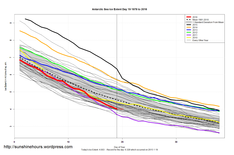
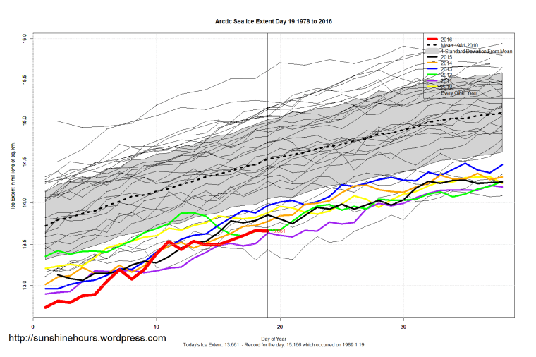
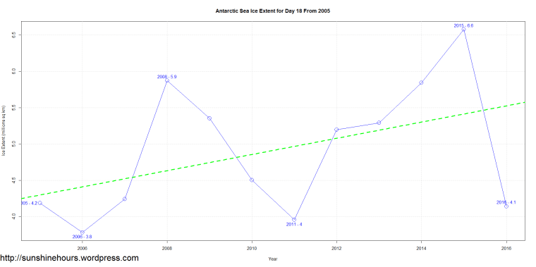
Tag: Global Sea Ice Extent
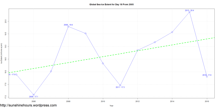
Sea Ice Extent – Day 18 2016 – Sawtooth Pattern

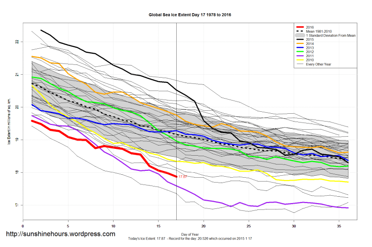
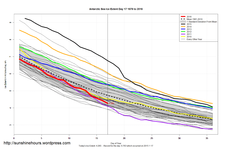
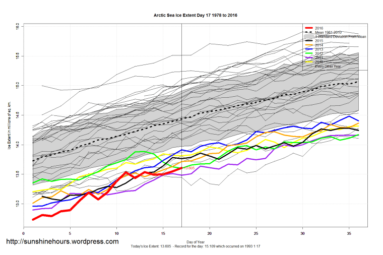
Sea Ice Extent (Global Antarctic and Arctic) – Day 17 – 2016
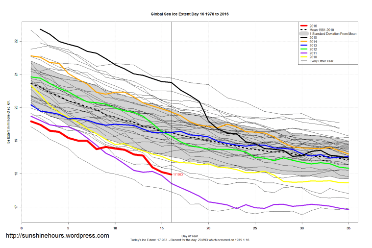
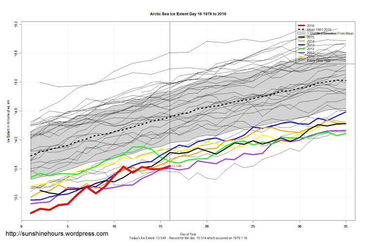
Sea Ice Extent (Global Antarctic and Arctic) – Day 16 2016

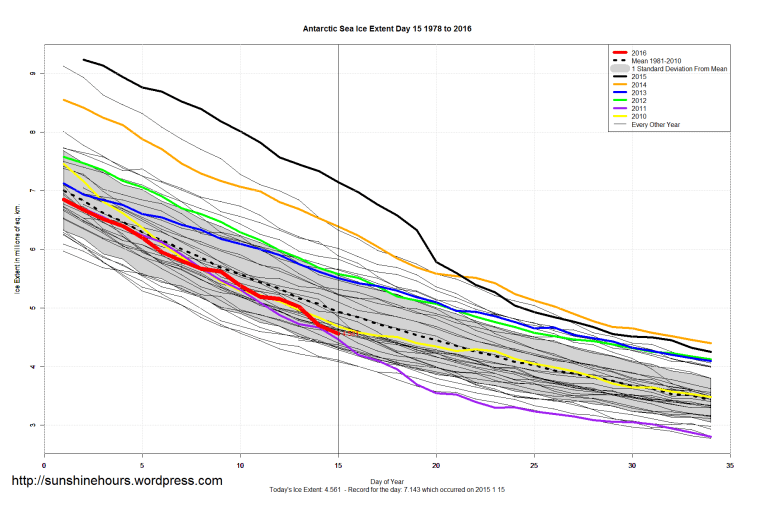
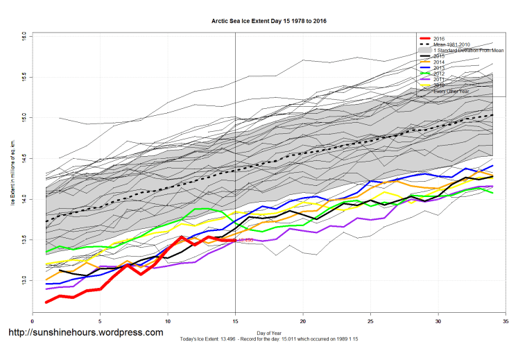
Sea Ice Extent (Global Antarctic and Arctic) – Day 15

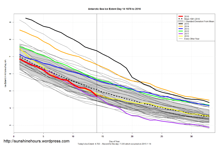
Sea Ice Extent (Global Antarctic and Arctic) – Day 14


Sea Ice Extent (Global Antarctic and Arctic) – Day 13


Sea Ice Extent (Global Antarctic and Arctic) – Day 12


Arctic Sea Ice Extent ‘Calendar’ 2015 Visual Aid
I came across a calendar tool for [R] (the language I do the programming in) in the package openAir.
With a lot of kludging (the package was designed to visualize air pollution data) I can visualize the Anomaly % for the year 2015. By anomaly % I mean if the mean is 10,000,000 sq km for 1981-2010 and the anomaly is -500,000 then the anomaly % is -5%.
Darkest red days are closest to the mean. Light colors are far below the mean.


