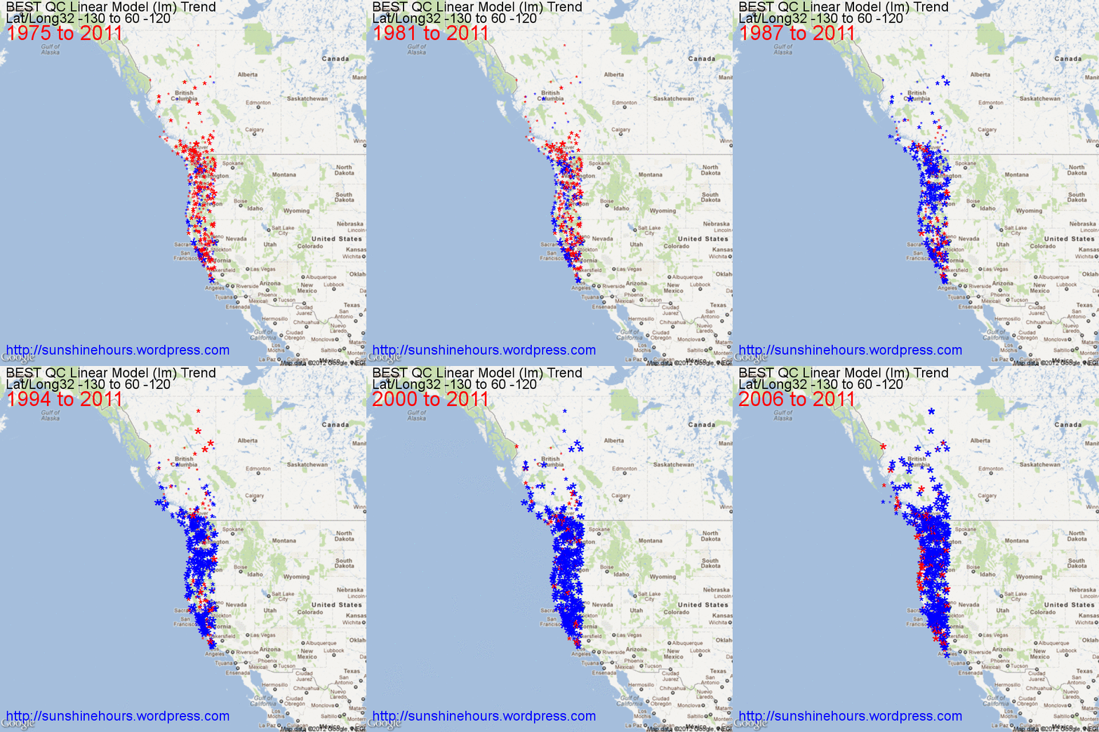
My previous post on Westcoast cooling was written a few weeks ago and only published today.
Since that time I have learned how to map the data using an [R] package called RGoogleMaps. And then I used Graphics Magick to turn all the png files to an animated gif.

Reblogged this on Climate Ponderings.