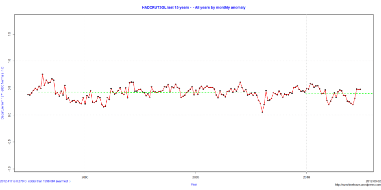
The last 15 years of HADCRUT3 data (up until June 2012). One point for each monthly anomaly. The flat dotted green line is the trend.
- Comment
- Reblog
-
Subscribe
Subscribed
Already have a WordPress.com account? Log in now.

So why the frack they on about global warming for???
More like an iceage 🙂
HADCRUT4 will fix that when they finish adjusting it so temperatures miraculously go up.