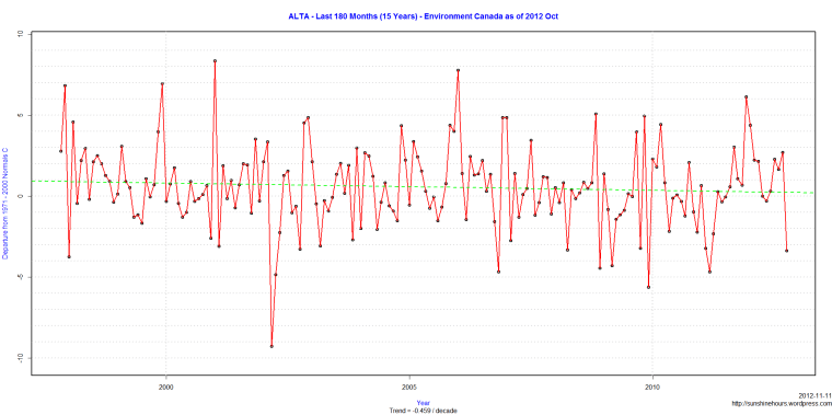
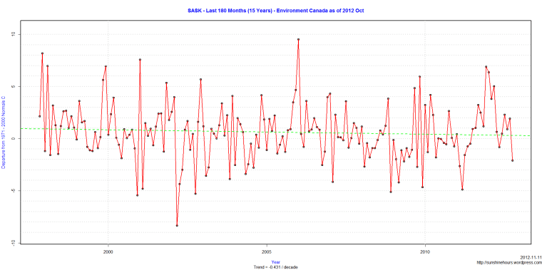
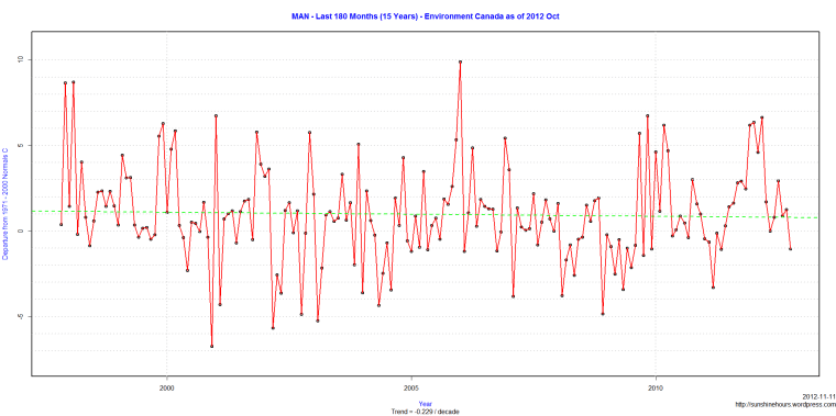
Using temperature stations designated as part of the “Normals” used by Environment Canada, Alberta, Saskatchewan and Manitoba have been cooling for the last 15 years.
Alberta -.459C/decade
Saskatchewan -.431C/decade
Manitoba -.229C/decade
BC is cooling too. See this post.


I did a study of the Central UK Max Temps vs Bright Sunshine Hours (see my limited blog site, it was hosted on Talkbloke’s). Do we have that data for Canada/elselsewhere? Unfortunately I have limited computer knowledge, do things old school onto Excel spreadsheets. If I can cut and past, I’m fine, but beyond that …
Canada has very few stations reporting sunshine.
I love this presentation. Do you keep a running spreadsheet for each province and then graph that? I couldn’t find much on EC that graphs out a series like this. I’m just curious what these will look like after the cold 2013 spring and was hoping to produce my own?
Every month I append the data from the monthly summary EC presents to my datafile and then work off that.
Here is an example of a monthly summary for just BC:
http://climate.weatheroffice.gc.ca/prods_servs/cdn_climate_summary_report_e.html?intMonth=3&intYear=2013&prov=ALL&txtFormat=text&btnSubmit=Submit