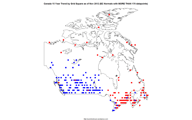
This map is the 15 year temperature trend for Canada by 1×1 grid squares up to November 2012.
The data comes from Environment Canada Stations that are part of the “normals” and have 170 or more datapoints in the last 180 months (15 years).
The color of the square indicates warming or cooling.
The square size is Not proportional to the amount of warming or cooling.
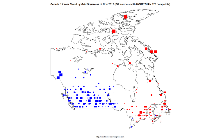
Here is the same map where the square size is proportional to warming cooling.

One thought on “Canada Nov 2012 15 Year Trend by 1×1 Grid Square”