How much behind 2013 and 2014 is the current extent? It seems to me that, based on various sources from WUWT’s sea ice pages, there could be a quick and significant jump in Arctic extent, and the PIOMAS volume anomaly has not rebounded as it has in the previous 5-6 years. There is also an unusual 8°C above normal anomaly SW of the Faroe Islands that seems strangely out of place being so close to the leading edge of the ice pack. Any possibility that this upwelling is from underwater volcanic activity and not evidence of atmospheric induced warming?
I know you say you don’t do charting favors but I am asking for some help Please.
Can you chart Antarctica sea ice Area anomalies and the PDO.
Take a look at two charts in my tweet, they are Antarctica sea ice Area anomalies and second one is The PDO.
Almost exact match when one is flipped upside down. There is about 2 year lag time I also see.
Thanks
Chris https://mobile.twitter.com/NJSnowFan/status/662317642234073090
I See the Sun drives the PDO. Hope you can see it in this normalized chart.
Warmest say the sun has little effect on weather or climate.
It has a huge roll.
Chart here in one of my tweets as a ref. https://mobile.twitter.com/NJSnowFan/status/662044309437435908
The main difference between this year and last in the Arctic is Barents Sea: melted out early and completely and is slow to recover. But it turns out that as winter ice extent goes in Barents, so goes annual Arctic ocean ice extent.
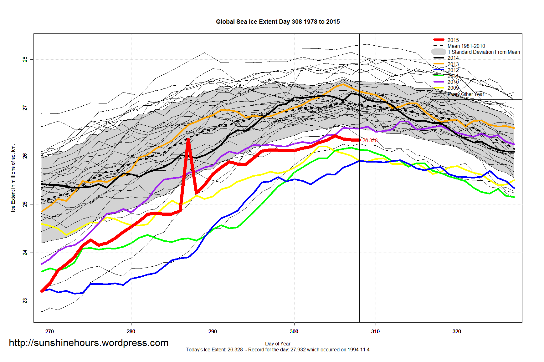
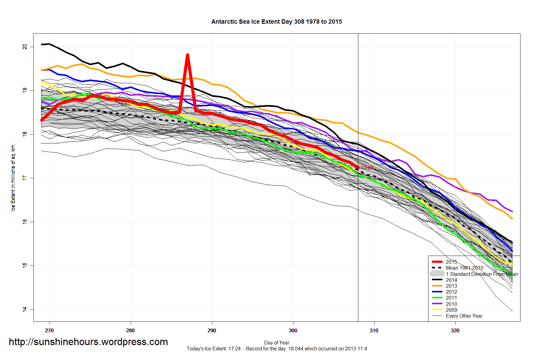
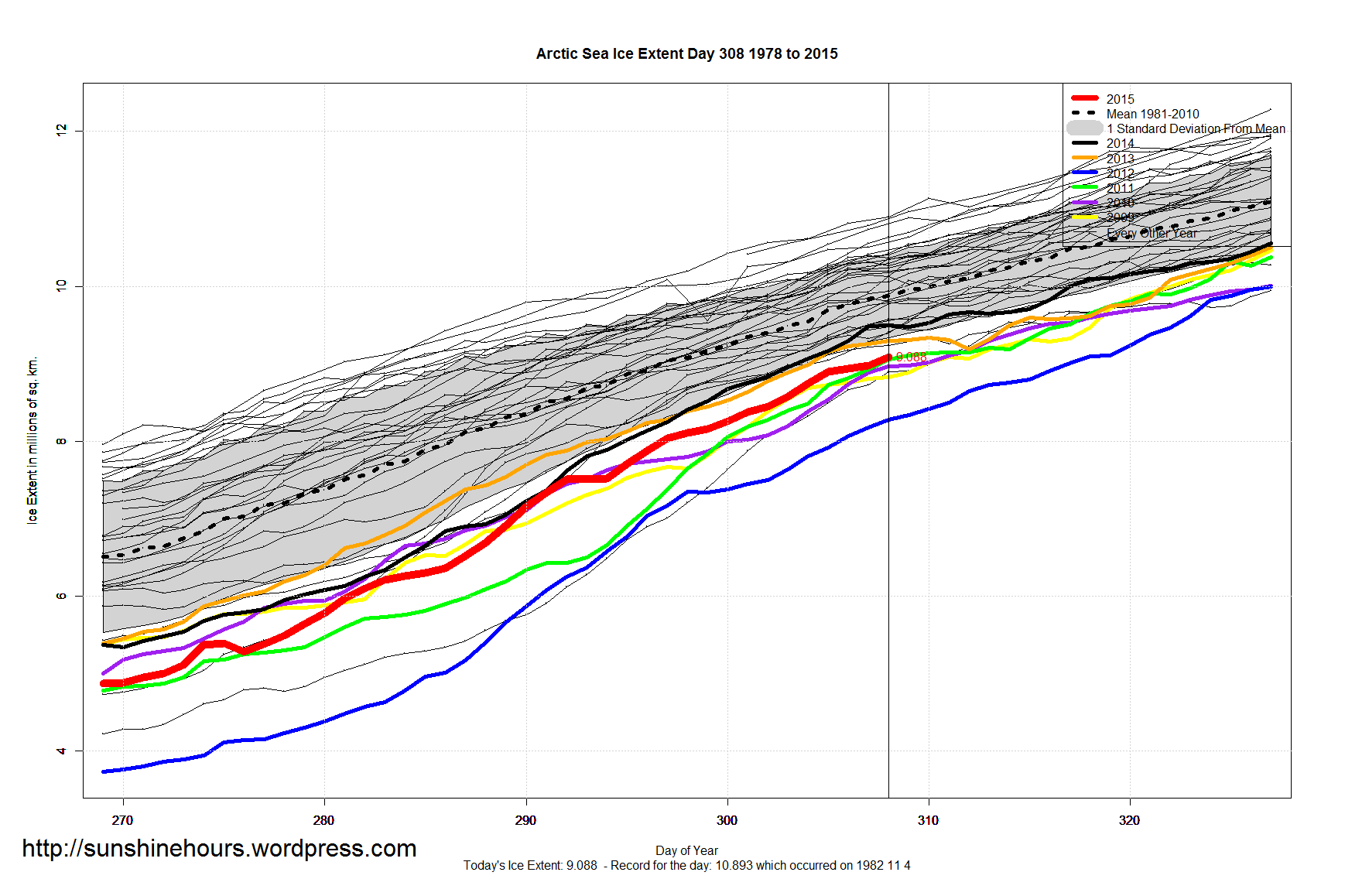

How much behind 2013 and 2014 is the current extent? It seems to me that, based on various sources from WUWT’s sea ice pages, there could be a quick and significant jump in Arctic extent, and the PIOMAS volume anomaly has not rebounded as it has in the previous 5-6 years. There is also an unusual 8°C above normal anomaly SW of the Faroe Islands that seems strangely out of place being so close to the leading edge of the ice pack. Any possibility that this upwelling is from underwater volcanic activity and not evidence of atmospheric induced warming?
I know you say you don’t do charting favors but I am asking for some help Please.
Can you chart Antarctica sea ice Area anomalies and the PDO.
Take a look at two charts in my tweet, they are Antarctica sea ice Area anomalies and second one is The PDO.
Almost exact match when one is flipped upside down. There is about 2 year lag time I also see.
Thanks
Chris
https://mobile.twitter.com/NJSnowFan/status/662317642234073090
More Need for you to help with that chart.
https://mobile.twitter.com/NJSnowFan/status/662349339969331201
I See the Sun drives the PDO. Hope you can see it in this normalized chart.
Warmest say the sun has little effect on weather or climate.
It has a huge roll.
Chart here in one of my tweets as a ref.
https://mobile.twitter.com/NJSnowFan/status/662044309437435908
Best I can do making the chart lining up two
Best I can do making the chart. https://twitter.com/NJSnowFan/status/662420040478793729
The main difference between this year and last in the Arctic is Barents Sea: melted out early and completely and is slow to recover. But it turns out that as winter ice extent goes in Barents, so goes annual Arctic ocean ice extent.
https://rclutz.wordpress.com/2015/11/11/barents-sea-arctic-ice-predictor/