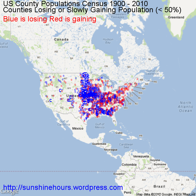
A quick update to my previous post on County Depopulation. I was thinking about slow growth and decided to map those counties with negative growth (blue) and those with growth of less than 50% since 1900. I think thats fair since the US population has quadrupled in population since 1900.
(And a hat tip to the Texas Tribune who published this map of county population changes which got me thinking … )
