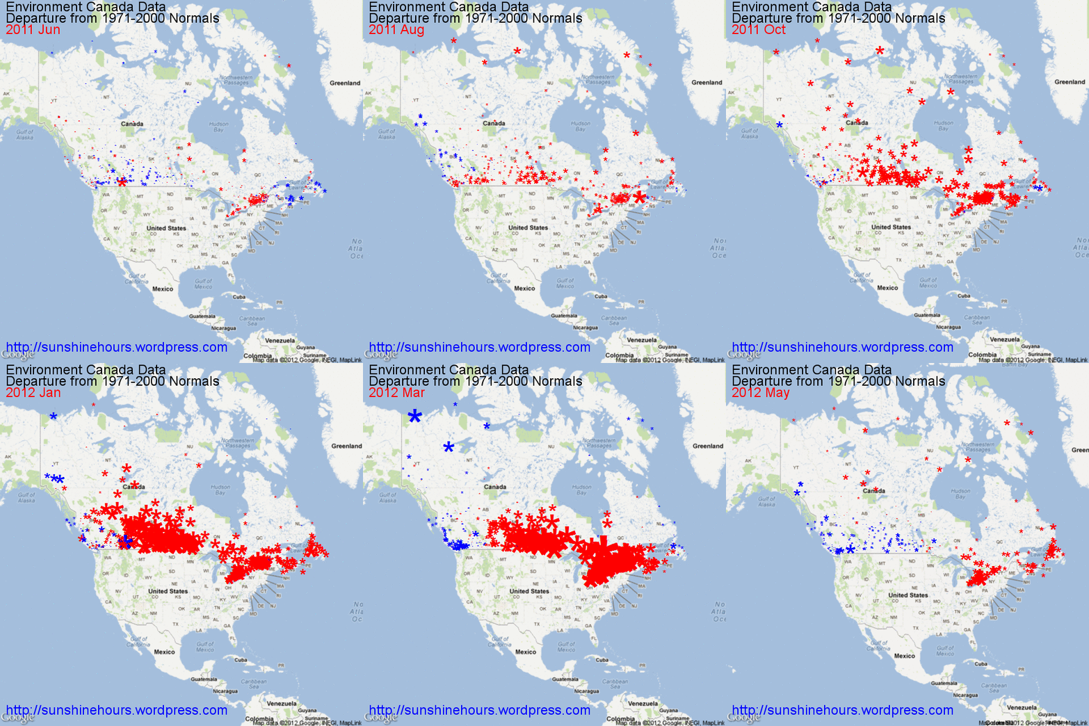
Environment Canada designates some stations with data that is the Departure from Normals 1971-2000.
This animated gif is the subset of stations with “Normals” mapped. The size of the blue (colder than Normal) or red (warmer than Normal) is related to the magnitude.
As you can see the recent heat wave that is making headlines is like a red wave that engulfs most of Canada and then retreats back to the north and eastern Canada.
