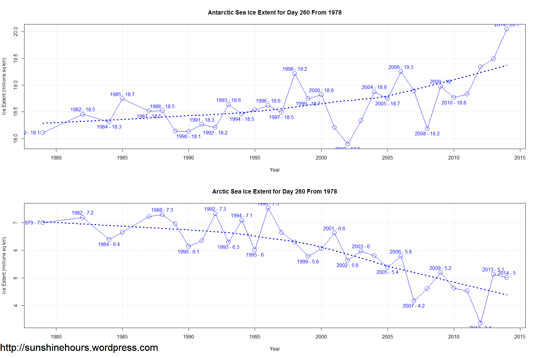
Can you plot use the same vertical scale on both graphs? the vertical division on Antarctic are 10 million square miles, but on Arctic are 1 million square miles
Reblogged this on Roskasaitti and commented:
Merijäiden syyskuun 17. päivän tilanne eri vuosilta. Eteläinen on nyt satelliittikauden ennätyksessään, pohjoinen (alempi) lähellä vuoden alinta arvoaan (jota ei voine kuitenkaan päätellä vuosisarjasta). Yhteensä merijäät ovat lähellä normaalia.

Every once in a while I like to play devils advocate. If you look at the ice gains and losses on a percentage basis you get a different picture.
On a non-percentage basis they are identical. Global Sea Ice is right on the mean.
Can You please show Antarctis-Minimum vs. Arctic Maximum additionally ? Would make me a lot more confident in my argumentation.
They happened further apart.
https://sunshinehours.wordpress.com/?attachment_id=5809
https://sunshinehours.wordpress.com/?attachment_id=5810
Thank You, Sunshinehours. I’d like MR166 to calculate gain/loss-percentage again;>))
BTW thanks for all of the information you provide. I know that it takes a lot of work to find the real data.
Can you plot use the same vertical scale on both graphs? the vertical division on Antarctic are 10 million square miles, but on Arctic are 1 million square miles
Its pretty close. One goes from 18 to 20. One goes from 7 to 5.
Reblogged this on Roskasaitti and commented:
Merijäiden syyskuun 17. päivän tilanne eri vuosilta. Eteläinen on nyt satelliittikauden ennätyksessään, pohjoinen (alempi) lähellä vuoden alinta arvoaan (jota ei voine kuitenkaan päätellä vuosisarjasta). Yhteensä merijäät ovat lähellä normaalia.