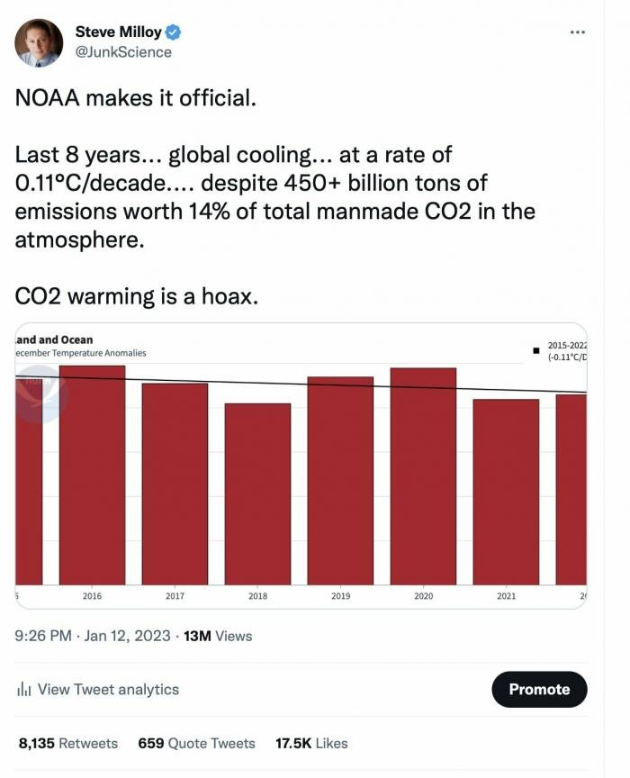
That date range goes from the strongest el Nino on record to a la Nina.
I’d bet that you would get a warming trend if you started the data EVERY SINGLE YEAR before 2013.
What’s the +/- confidence range for that “.11C/decade cooling trend”?
If I read the picture right (it’s truncated), that is only the data for the month of December. According to the UAH Satellite data, every one of the last 8 Decembers has been in the warmest 14 Decembers on record.
You can tell immediately from the snow cover extent data, which shows no trend for 25 years. The snow cover anomaly graph is effectively the location of the snow line. It isn’t doing much except for normal variations year to year. Which means the 0ºC isotherm isn’t moving northwards, which it should be if the average temperature is really rising.
The snow cover data doesn’t need calibration or adjustment – you just pretty much read the white pixels off a sat pic. So it demonstrates that all the temperature datasets have unjustifiable warming bias in them.
I should update the graph, but you can see from the Rutgers Snow Lab site that the lack of trend is still holding to the current year. (The link to the most recent data is in the comment under my graph.)
Snow cover doesn’t tell you temperature. You could have snow on the ground when it’s several degrees above freezing, and no snow on the ground when it’s several degrees below freezing.
Snow cover also doesn’t tell you whether summer nights are pleasantly cool or intolerably hot.
It looks like you’re shopping for a data set that tells you what you want to believe. RSS was great back in 2015 when it said no warming trend since 1997. When the RSS team found a calculation error and adjusted their trend upwards, everybody switched to UAH. Now snow cover is better (because it says less warming)?!?!
Jon – I’ve replied in some detail, but it looks like the comment went to spam. Hopefully our host will extract it!
Jon – I’ve replied in some detail, but it looks like the comment went to spam. Hopefully our host will extract it!
(It may also be that the blog settings don’t like me replying to myself, since this comment also went to spam when I did that.)
In short the 12 month moving average removes the temporary stuff you mention. And the anomaly, which is the current date value minus the average for that date, means that it is a measure of movement of the snowline, north or south. Since the trend is in neither direction the implication is the real world temperature isn’t actually changing. The temperature datasets therefore appear to be contaminated by spurious adjustments. The snow cover extent anomaly is following the oceanic thermohaline cycle, which has a period of about 60 years. We’ve been on the plateau of that for this whole century so far, and when it goes the decline is rapid. Snow cover extent should then rise, as it fell in the period between 1960 and 1995.
My field is aqueous chemistry R&D with a lot of statistical and thermodynamical analysis.
I’m still waiting to hear how snow cover can tell the difference between:
– a winter when it it too warm for snow and a winter when it is cold but too dry for snow to fall.
– a summer that is very hot and a summer that is moderately warm (neither will have any snow).
Can you point me to any peer reviewed scientific literature that claims snow cover is a more accurate way to measure global temperature than satellites or thermometers?
The AMO has increased in the last 8 years, even though the NOAA temperature data says that global average temperature has cooled over that period.
According to Steve Milloy’s logic, doesn’t that mean AMO warming is a hoax?

That date range goes from the strongest el Nino on record to a la Nina.
I’d bet that you would get a warming trend if you started the data EVERY SINGLE YEAR before 2013.
What’s the +/- confidence range for that “.11C/decade cooling trend”?
If I read the picture right (it’s truncated), that is only the data for the month of December. According to the UAH Satellite data, every one of the last 8 Decembers has been in the warmest 14 Decembers on record.
Jon – You would, except even UAH is overheated.
You can tell immediately from the snow cover extent data, which shows no trend for 25 years. The snow cover anomaly graph is effectively the location of the snow line. It isn’t doing much except for normal variations year to year. Which means the 0ºC isotherm isn’t moving northwards, which it should be if the average temperature is really rising.
The snow cover data doesn’t need calibration or adjustment – you just pretty much read the white pixels off a sat pic. So it demonstrates that all the temperature datasets have unjustifiable warming bias in them.
I should update the graph, but you can see from the Rutgers Snow Lab site that the lack of trend is still holding to the current year. (The link to the most recent data is in the comment under my graph.)
Snow cover doesn’t tell you temperature. You could have snow on the ground when it’s several degrees above freezing, and no snow on the ground when it’s several degrees below freezing.
Snow cover also doesn’t tell you whether summer nights are pleasantly cool or intolerably hot.
It looks like you’re shopping for a data set that tells you what you want to believe. RSS was great back in 2015 when it said no warming trend since 1997. When the RSS team found a calculation error and adjusted their trend upwards, everybody switched to UAH. Now snow cover is better (because it says less warming)?!?!
Jon – I’ve replied in some detail, but it looks like the comment went to spam. Hopefully our host will extract it!
Jon – I’ve replied in some detail, but it looks like the comment went to spam. Hopefully our host will extract it!
(It may also be that the blog settings don’t like me replying to myself, since this comment also went to spam when I did that.)
Sadly my long comment hasn’t been posted.
In short the 12 month moving average removes the temporary stuff you mention. And the anomaly, which is the current date value minus the average for that date, means that it is a measure of movement of the snowline, north or south. Since the trend is in neither direction the implication is the real world temperature isn’t actually changing. The temperature datasets therefore appear to be contaminated by spurious adjustments. The snow cover extent anomaly is following the oceanic thermohaline cycle, which has a period of about 60 years. We’ve been on the plateau of that for this whole century so far, and when it goes the decline is rapid. Snow cover extent should then rise, as it fell in the period between 1960 and 1995.
My field is aqueous chemistry R&D with a lot of statistical and thermodynamical analysis.
I’m still waiting to hear how snow cover can tell the difference between:
– a winter when it it too warm for snow and a winter when it is cold but too dry for snow to fall.
– a summer that is very hot and a summer that is moderately warm (neither will have any snow).
Can you point me to any peer reviewed scientific literature that claims snow cover is a more accurate way to measure global temperature than satellites or thermometers?
Here is the AMO with a 120 month running average. Snow cover extent anomaly is inversely tracking it. You can see the ~60 year period very clearly.
The AMO has increased in the last 8 years, even though the NOAA temperature data says that global average temperature has cooled over that period.
According to Steve Milloy’s logic, doesn’t that mean AMO warming is a hoax?