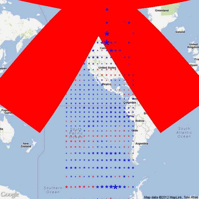
I’ve graphed HADCRUT3 before. It shows a flat temperature trend over the last 15 years (actually a very small negative trend). So I thought I would take a look at the gridded data (HADCRUT3 Zipped Ascii) and find out which grid cells (5 x 5) are warming and which are cooling by how much.
I’m using the R package RGoogeMaps which I’ve used before. So I started by calculating the trend in Celsius / Decade for each grid roughly near North and South America. The code puts an asterisk * at the middle of each grid square. Red for warming and blue for cooling. And I used this formula to set the size of the asterisk:
tCex = 1 + (abs(grid$Trend[i]) * 1)
Which means each asterisk starts at 1 and then the absolute Trend is added on. So if a grid square was warming at 1C / Decade, there would be a red asterisk 2 units in size.
So thats when I saw the giant red asterisk. One of the grid squares is warming at 247C / Decade. Of course it turns out there are only two measurements in those 15 years.
The grid square is Latitude 75 to 80 and Longitude -110 to -105. Somewhere near Melville Island in the Canadian North.

“One of the grid squares is warming at 247C / Decade.” That is worse than we thought!
People could burst into flame! 🙂
That is hilarious! I hope the IPCC adopts it as the iconic graphic for the summary for policymakers in AR5.