According to the UK Met Office 2015 was the 9th highest (since 1929) for sunshine.
Approximate 100 hours higher than the 1981-2010 average.
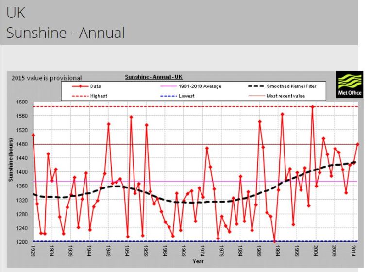
UK Max temperature graph looks similar to the sunshine graph.
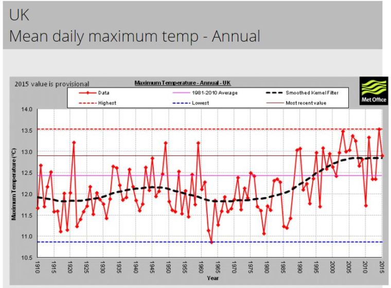
According to the UK Met Office 2015 was the 9th highest (since 1929) for sunshine.
Approximate 100 hours higher than the 1981-2010 average.
UK Max temperature graph looks similar to the sunshine graph.
Boris Johnson , the Mayor Of London, mocks the AGW Cults total inability to predict climate.
“For more than 20 years now, we have been told that this country was going to get hotter and hotter and hotter, and that global warming was going to change our climate in a fundamental way. Do you remember that? We were told that Britain was going to have short, wet winters and long, roasting summers. It was going to be like 1976 all over again, with streakers at Lord’s and your Mr Whippy melting before you could even lick it, and Hyde Park scorched into a mini Kalahari.
They said we were never going to have snow again, and that we should prepare for southern England to turn gradually into a Mediterranean world. There were going to be olive groves in the Weald of Kent, and the whole place was going to be so generally broiling in summer that no one would be able to move between noon and 4pm, after which people would come out to play boules and sip pastis, to the whine of a mandolin, in the dusty square that had once been a village green.
That’s what they said: the BBC, and all the respectable meteorologists – and I reckon there were tens of thousands of people who took these prophecies entirely seriously. Omigod, they said to themselves, we are all going to fry.
…
I hope I don’t need to tell you that we have not experienced a Mediterranean climate – not since they started to tell us to expect it. On the contrary, we have had some pretty long and miserable winters – including the last one, in which I saw snow settle in London on four separate occasions – and our summer is at risk of becoming a bit of a farce.”
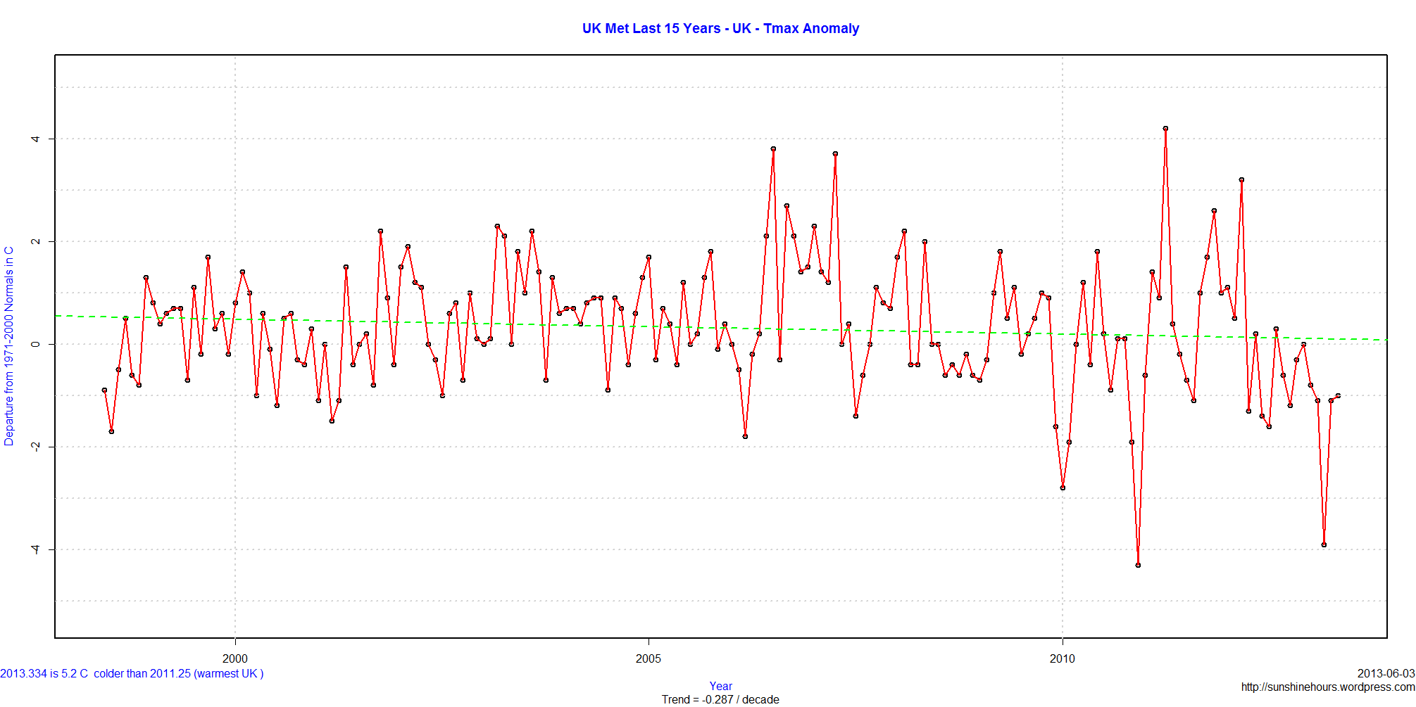
UK Met data shows that UK Daily Tmax (mean maximum temperature) is cooling at at -1.088C / decade for the last 5 years.

The 15 year trend is lower at -0.287C / decade.
Using data from the UK Met, May Tmax (mean maximum temperature) in the UK is cooling at -.618C / decade for 15 years.
The warmest May Tmax (in the last 104 years) was 16.9C in 1992. May 2013 was 13.8C. Tied for 33rd coldest out of 104.
CO2 seems to not work in May in the UK ….

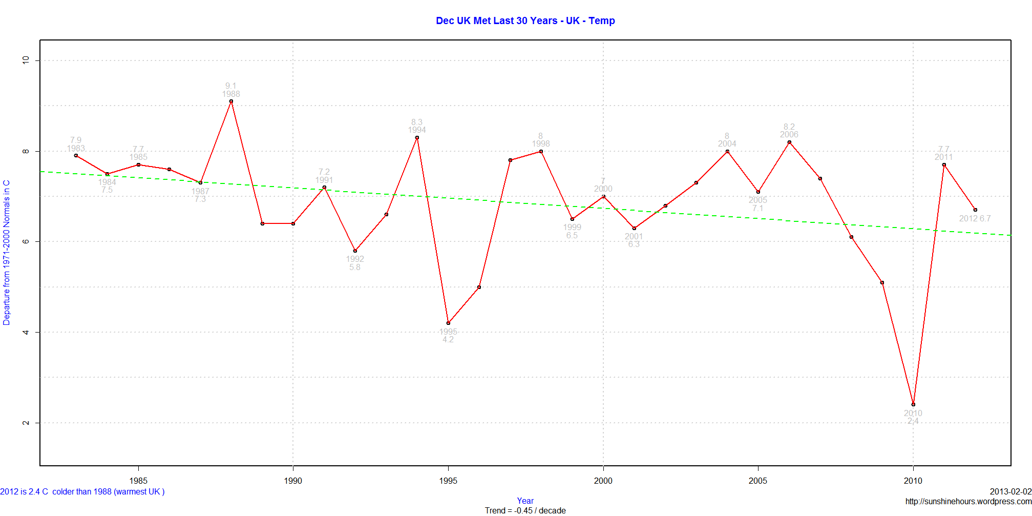
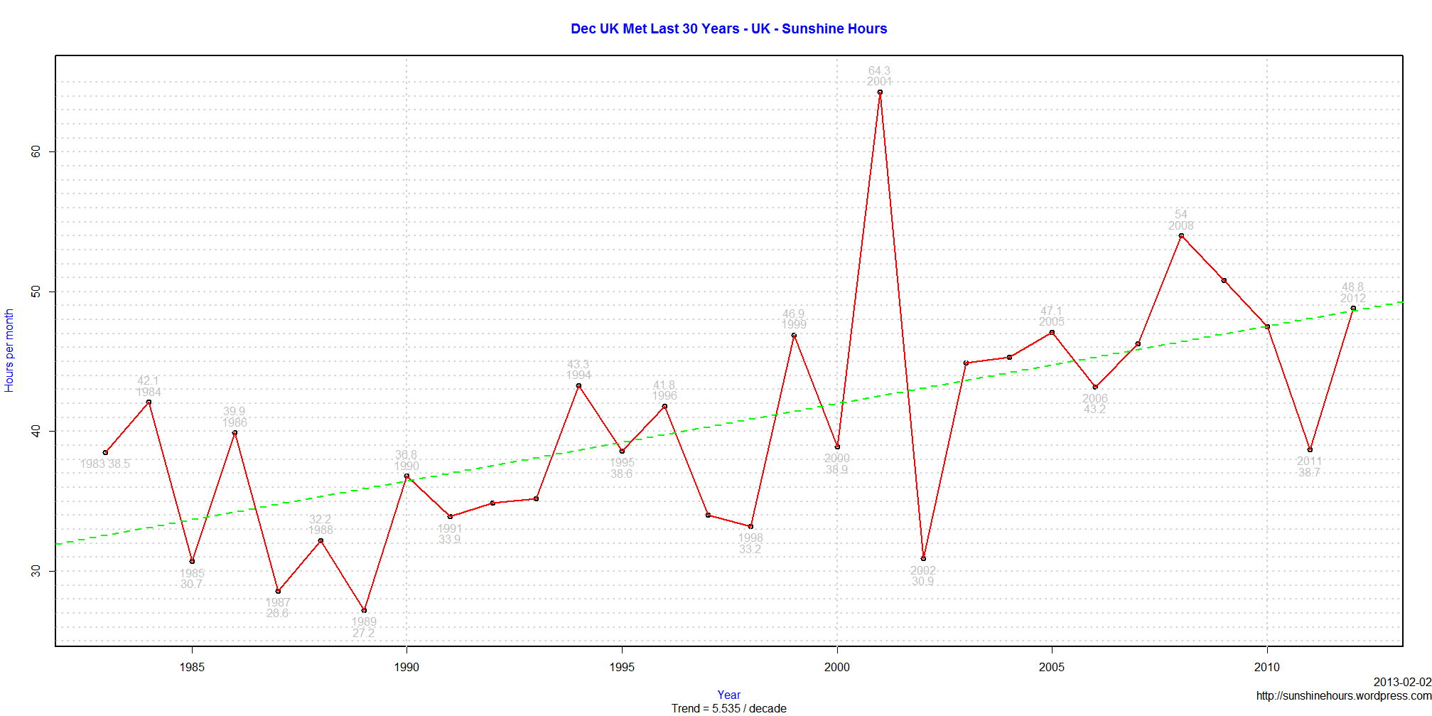
Using UK Met data from here, I noticed that Tmax for Decembers are cooling at -.45C / decade for 30 years. Thats a lot!
And then I wondered why? A theme I have returned to over and over is that hours of bright sunshine has increased because of cleaner air. Could more sunshine in December lead to cooler Decembers since clear skies can lead to colder temperatures in winter?
Guess what. Sunshine is up an average of 5.5 hours per year in December for the last 30 years. And compared to 1988 sunshine is up 80% in December. Instead of 28 hours of sunshine in December, the average is closer to 48.
Click on the graphs to enlarge.
This graph is Tmax % of normal versus Sunshine% of normal. The curved lines are the Loess curves from [R]. Data retrieved from here.
Why would sunshine be higher? Cleaner air in the UK (until China and India started to burn a lot more coal) thanks to the Clean Air Acts of 1956 and 1968.
The loess curves bottom out around 1968/1972.

UK Tmin (the average minimum temperature) has been cooling at -.336C/decade for last 15 years (as of Nov 2012).
Data retrieved from here. The graph has each monthly anomaly from the 1971-2000 average for the last 15 years.

I’ve graphed HADCRUT3 before. It shows a flat temperature trend over the last 15 years (actually a very small negative trend). So I thought I would take a look at the gridded data (HADCRUT3 Zipped Ascii) and find out which grid cells (5 x 5) are warming and which are cooling by how much.
I’m using the R package RGoogeMaps which I’ve used before. So I started by calculating the trend in Celsius / Decade for each grid roughly near North and South America. The code puts an asterisk * at the middle of each grid square. Red for warming and blue for cooling. And I used this formula to set the size of the asterisk:
tCex = 1 + (abs(grid$Trend[i]) * 1)
Which means each asterisk starts at 1 and then the absolute Trend is added on. So if a grid square was warming at 1C / Decade, there would be a red asterisk 2 units in size.
So thats when I saw the giant red asterisk. One of the grid squares is warming at 247C / Decade. Of course it turns out there are only two measurements in those 15 years.

The grid square is Latitude 75 to 80 and Longitude -110 to -105. Somewhere near Melville Island in the Canadian North.
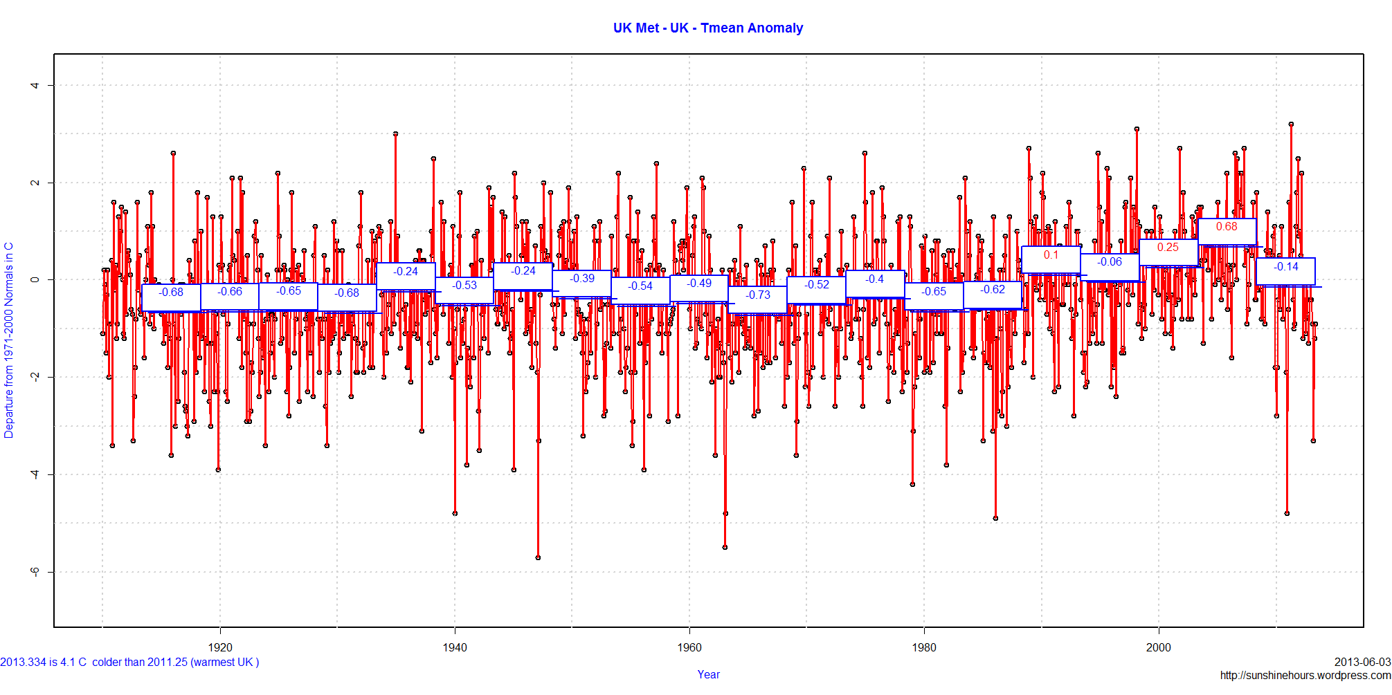
An addition to this post on 5 year averages/ But today I am using data from the UK. I had to first calculate the 1971-2000 anomalies. I started using that baseline because Canadian data that I downloaded already had the 1971-2000 normals calculated.
The last 5 years are on average .66C cooler than the previous 5 years, and .16C colder than the 5 year period before that, and also .1C colder than the period starting in the late 1980s.
As I noted in the blog post on Washington, the thing that struck me about this graph is that previous 5 years were not hotter than many, many other periods. By not hotter I mean the positive anomalies were not larger. What made the previous 5 years “warmer” was the absence of really large negative anomalies. The recent 5 year period saw the first anomaly colder than -4C since the 1980s and two colder than -2C when there had not been any in the previous 10 year period. The occasional really cold anomaly is part of climate. I wonder why they went away? And why did they come back?