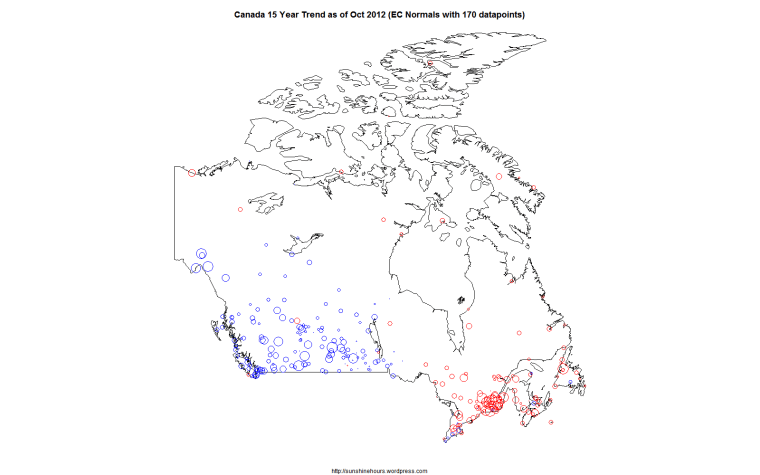
This is a map of Environment Canada Stations that are part of the “normals” and have 170 or more datapoints in the last 180 months (15 years) as of October 2012.
The circle size is proportion to the warming or cooling.
When some people say Canada is “warming”, I would disagree and say Western Canada is definitely cooling for 15 years and a small part of Eastern Canada clustered around the big cities and a couple of arctic stations are warming.

Could you give the URL for the Enviro Canada Webpage on this, please. It is very important we circulate this far and wide!
I wrote a program in R to scrape the data from Environment Canada one month at a time.
Here is the latest month.
http://climate.weatheroffice.gc.ca/prods_servs/cdn_climate_summary_report_e.html?intMonth=10&intYear=2012&txtFormat=text&btnSubmit=Submit
I use the stations with values in the D column which are the “normals” – the anomaly from the 1971-2000 average.
I run a climate station just south of Calgary (since 1990) for Environment Canada. I still have a warming trend, but the last few years have shown a very large decline (except this year was very warm)…http://www.lanceappleby.com/OkotoksWeather/Okotoks%20History%20Index.htm
if your interested in a short term history.
The three closest stations with 170 or more datapoints in the last 15 years are:
Trend in C/Decade – Station – Distance
-0.02 CALGARY INTL A 43km
-0.96 QUEENSTOWN 71km
-0.33 KANANASKIS 82km
The distances are from the [R] Imap package.
If I just graph the last 15 years – Nov 1997 to Oct 2012 I get:
-.262C / Decade for the Tmean
-.463C / Decade for Tmax
if i get a few moments, i’ll run some sql against my database and see what numbers i come up with for the 170 months.
Don’t doubt that the decline has started, but remember, my data is only read to the nearest .5C (as required by EC), even though I have accurate thermometers!
Its just the way they wanted it.
Anyhow, will be interesting to see.
I checked EC webpage and both Queenstown and K are climate stations also, thus read to .5C too. I would believe they are better suited to show the trend better than my station, as, unfortunately, my place has become surrounded by the town over the years (1990 – about 3000 people) to present day 25,000? Thus UHI has hit my area!