The other day I did a post about HADCET data by month showing how some of the months have a 350 year flat trend.
The next day I did a post about the top 18 year warming trends at anytime in the 350 year history of HADCET.
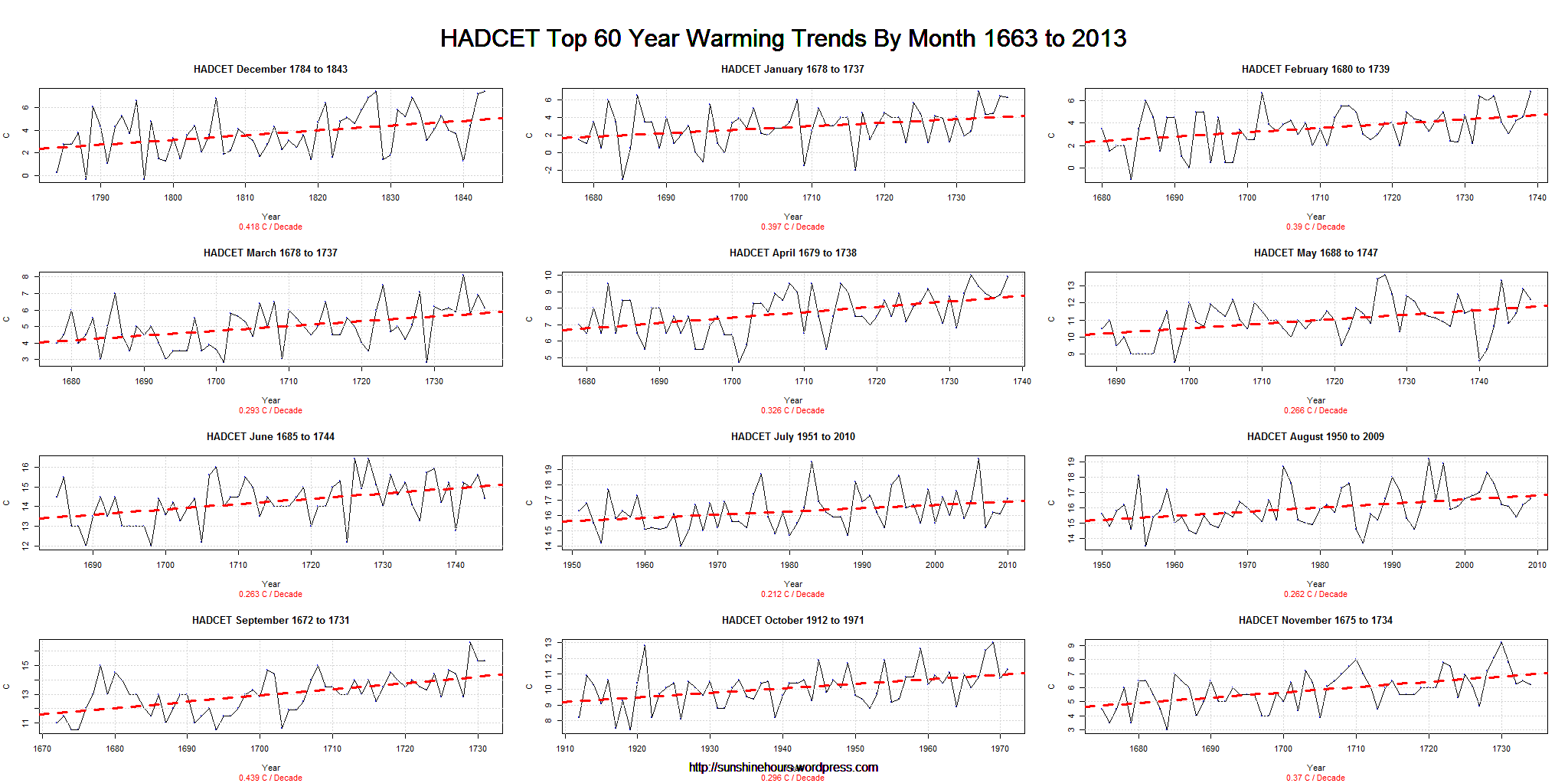
How about 60 years? Surely the key period in global warming propaganda is 1950 on. You might expect them all to be around 1950 to 2000 or so wouldn’t you? Well, if you believe in global warming you might. But if you haven’t been taken in, you might not.
Well, only two months (July and August) were from the modern era. October was close, but 1912 to 1971 doesn’t fit the AGW cult criteria.
Eight of the months started the trend in the 1600s. One in the 1700s.
So much for CO2 as the cause of “unprecedented warming”. The warming was for the most part very precedented.
Click for a bigger graph.

You, sir, do good work. Keep it going. It is very interesting that July and August are the only months where the warming is in more recent times, especially given the assmption that winters are the seasons seeing the most “unprecedented” warming. Island heat effect, anyone?
UHI is a possibility, But one thing I’ve learned is that bright sunshine is not a constant. Sunshine is up in the UK from around 1980, which is when air pollution laws (I suspect) really started to make the air cleaner.
https://sunshinehours.wordpress.com/2012/12/05/uk-tmax-versus-sunshine-are-well-correlated-cleaner-air-more-sunshine/uk-tmax-vs-sunshine-annual_tmax_sunshine/
I think I will see what UK sunshine per month looks like.
I really wish we had decent historical sunshine data the equivalent of HADCET.