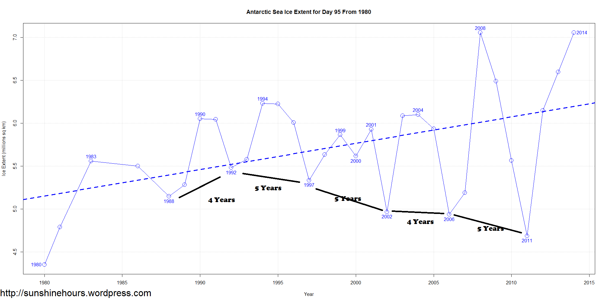
I don’t know what it means, but I’ve been aware of an oscillation pattern in Antarctic Sea Ice Extent for some time. A week or two ago I made a slight change in one of my graphs to annotate the peaks and valleys with the year and now the pattern jumps out at you even more.
This graph is for day 95, but the pattern is similar in other parts of the year.
There has been since 1988 a 4 or 5 year oscillation where the ice extent goes to a valley in between peaks. And the magnitude of the oscillation is growing.
These are not small oscillations. Sea Ice Extent as of today is 7,000,000 sq km. The 2011 valley is 4,700,000 sq km. That is a 50% jump in sea ice on day 95 from 2011 to 2014.
I know the AMO has peaked and is poised to start down (it may take a few more years). But to repeat myself, I’m not sure what it means.
Click for larger.

I would be curious to see if any of the very low points in the graph, happened to coincide with peer-reviewed research which claims that the Antarctic were melting down.
This is what it means, Arctic sea ice recovery.
https://mobile.twitter.com/NJSnowFan/status/451794965769646080
BTW can you make me a proper chart of this..
https://mobile.twitter.com/NJSnowFan/media/grid?idx=5&tid=452810114106286080
Thanks
Sorry second link was wrong. Can you make me proper chart of this with data.
https://mobile.twitter.com/NJSnowFan/status/451778208552464384
Data location?
80N and Solar Activity
Solar Charts/data
http://www.solen.info/solar/
2013 TSI data http://www.swpc.noaa.gov/ftpdir/indices/old_indices/2013_DSD.txt
Years TSI data http://www.swpc.noaa.gov/ftpdir/indices/old_indices/
I do not have data for Daily Temp readings above 80 N. I only have this.
http://ocean.dmi.dk/arctic/meant80n.uk.php
Thanks
AMO data http://www.esrl.noaa.gov/psd/data/correlation/amon.us.long.data
PDO Data http://jisao.washington.edu/pdo/PDO.latest
S.O.I. (Southern Oscillation Index) Archives
– 1876 to present
http://www.bom.gov.au/climate/current/soihtm1.shtml
If you graph the March 1st snowpack at Silverstar (nearest station to my house), you get a similar sort of graph. Also, I’ve noticed that extremes at both ends are often clumped together. For example, in terms of temperature the 1930s saw the highest number of extreme maximums and extreme minimums of any decade. Download and graph the USA weather extremes by state and see what I mean.
Thanks for the snowpack info. I may look for some data that matches the oscillation when I have a chance.