An addendum to yesterdays post about “Estimated” data.
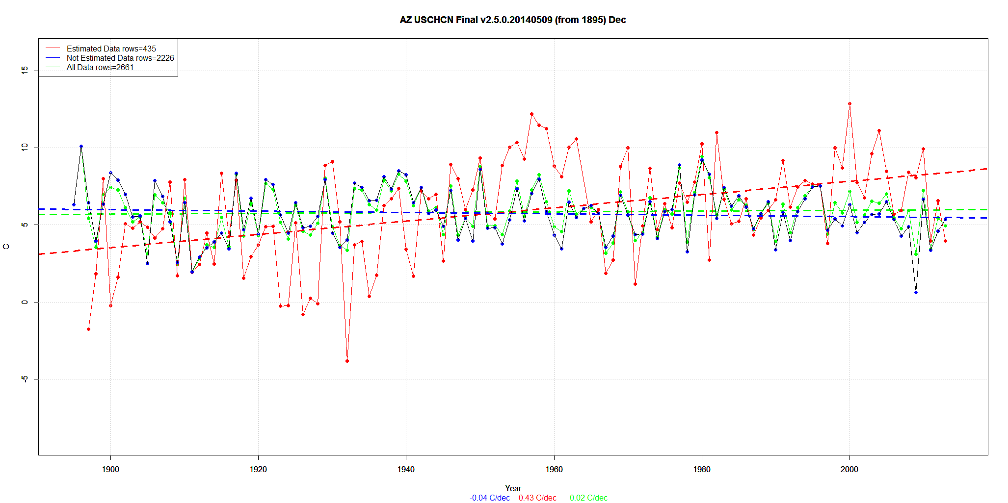
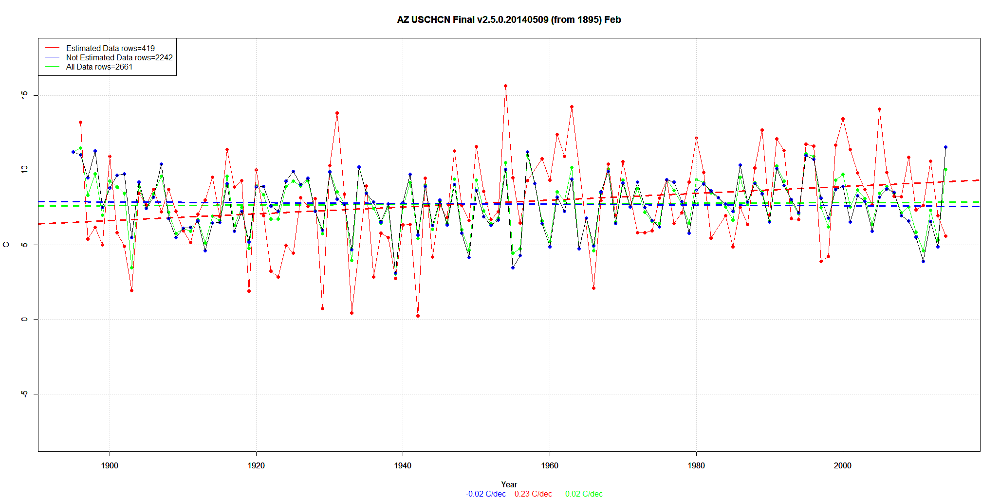
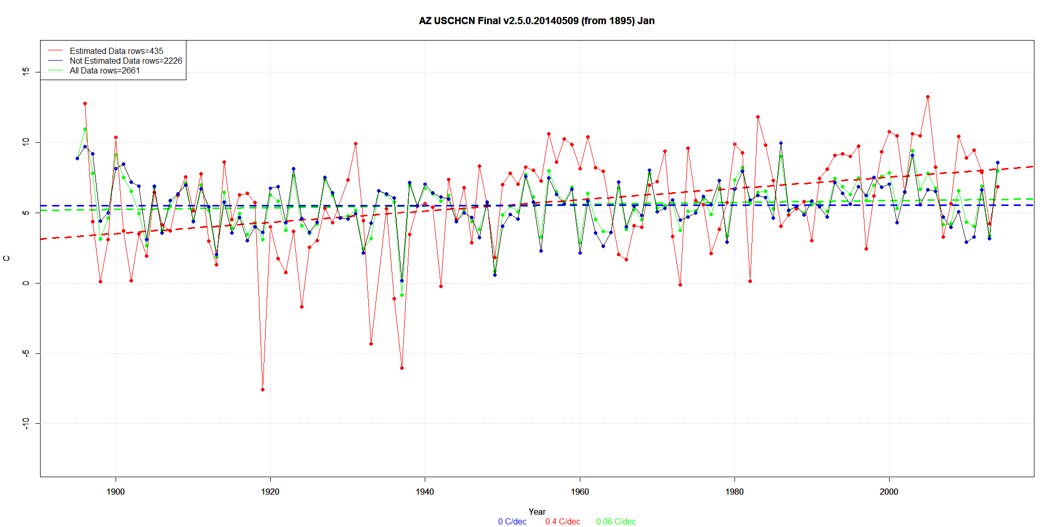
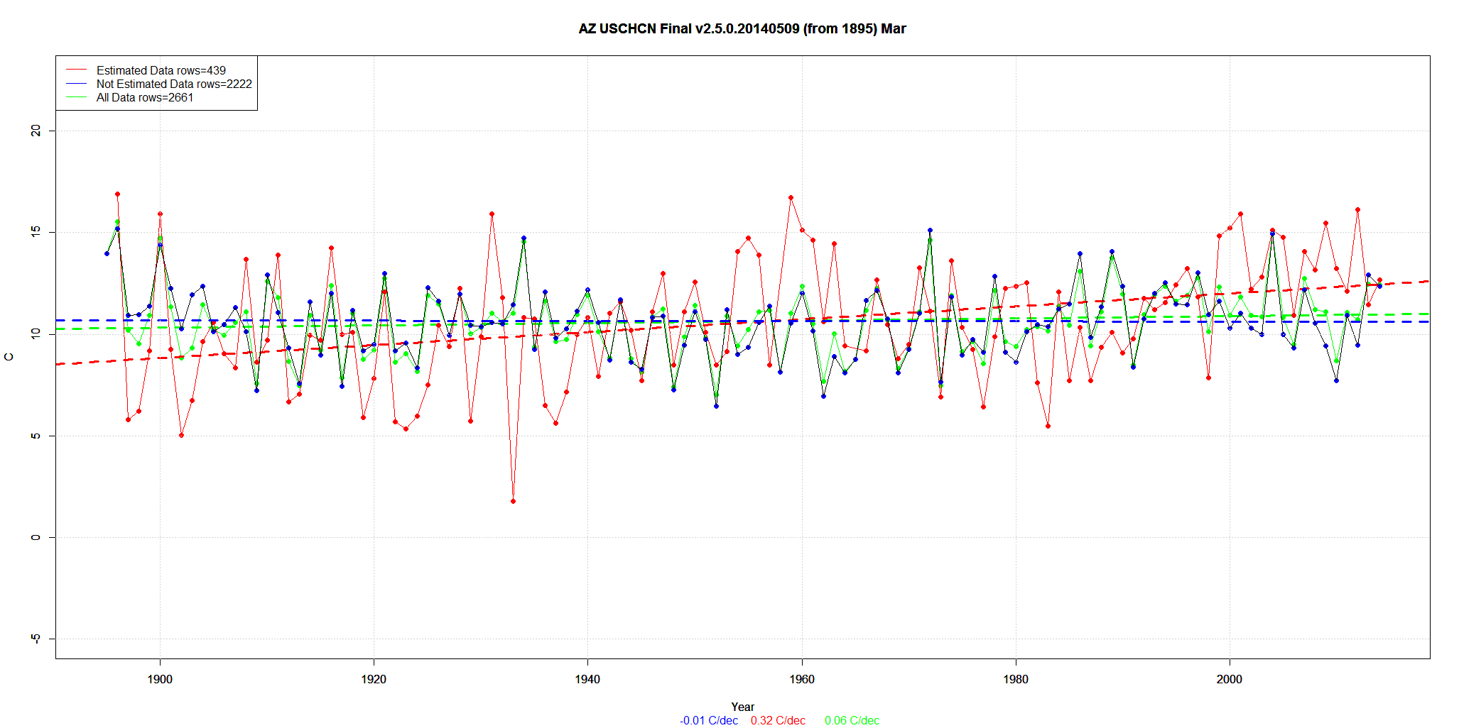
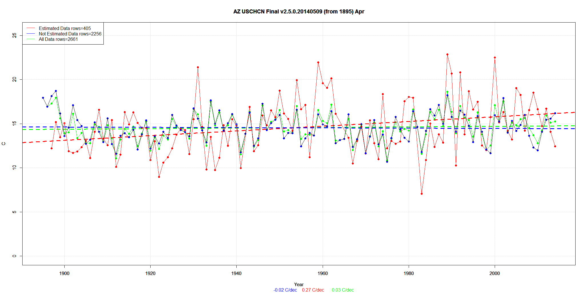
These are the 9 months in Arizona with the biggest change due to Estimated data. I’ll focus on December (the top graph). Remember, this is the Final data after all the other adjustments.
About 15% of the data is Estimated from neighboring stations.
The trend of REAL data is negative -.04C/decade.
Then they add in about 15% Estimated data with a trend of +0.43C/decade.
The net result is a new trend of +0.02C/decade.
Presto. Magic. A downward trend is now an upward trend. (Click on graph for larger)
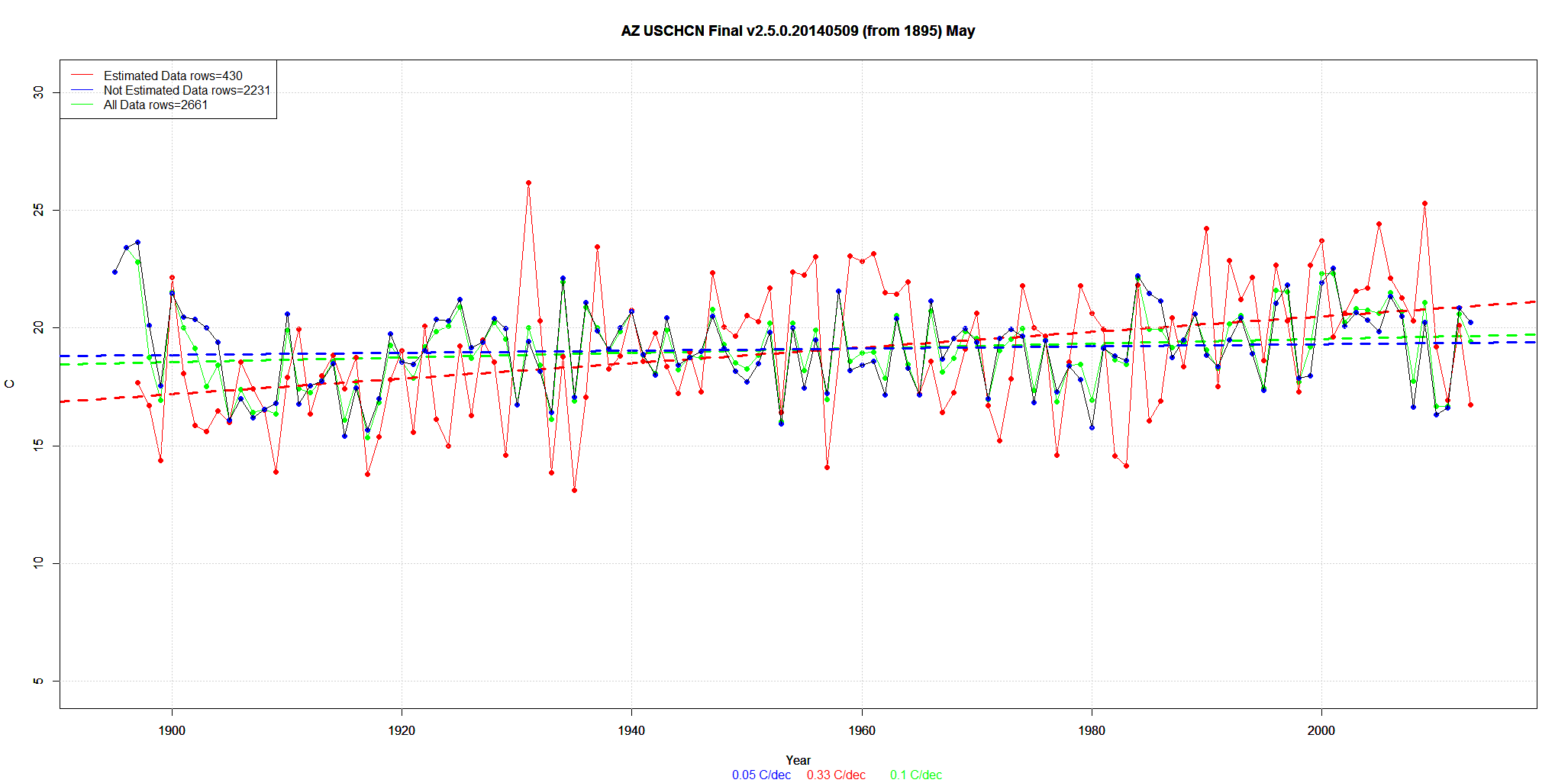
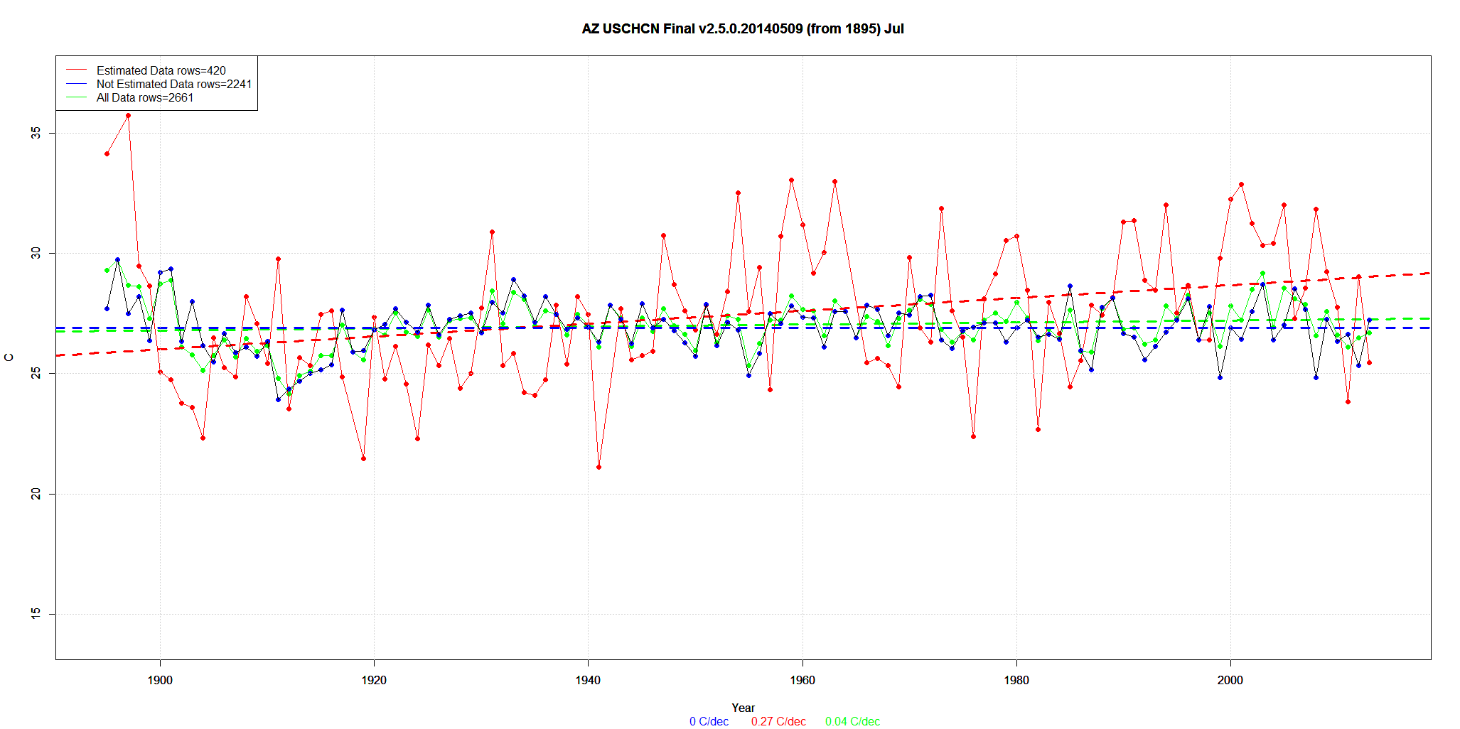
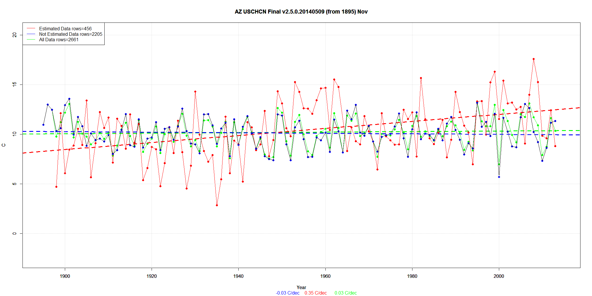
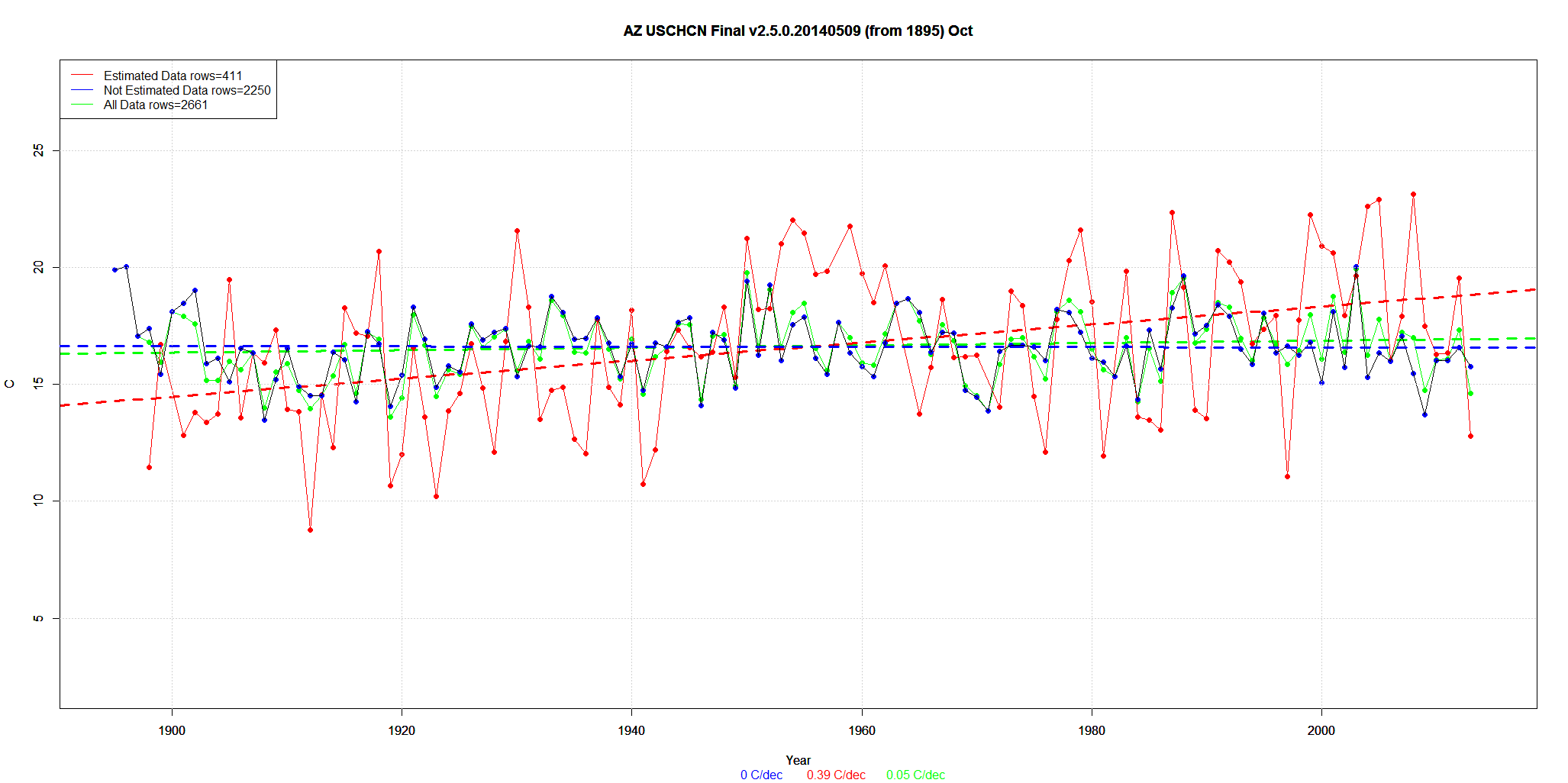

I really think that it would only take one MSM story summarizing findings like this that would blow this whole scam wide open.