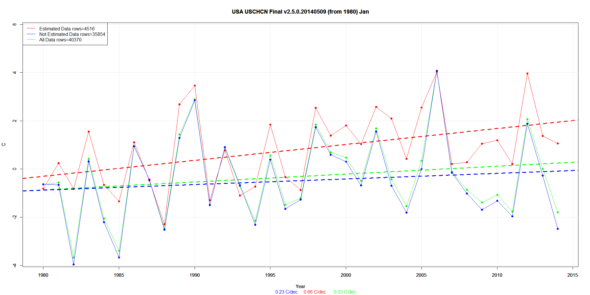
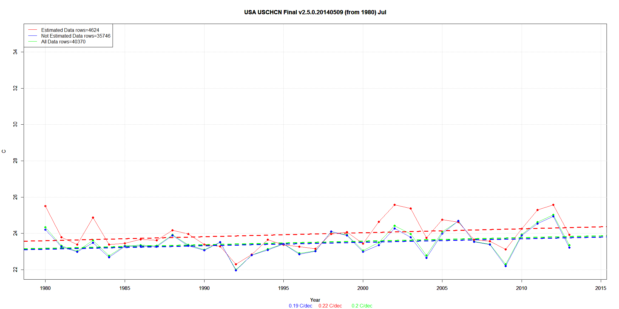
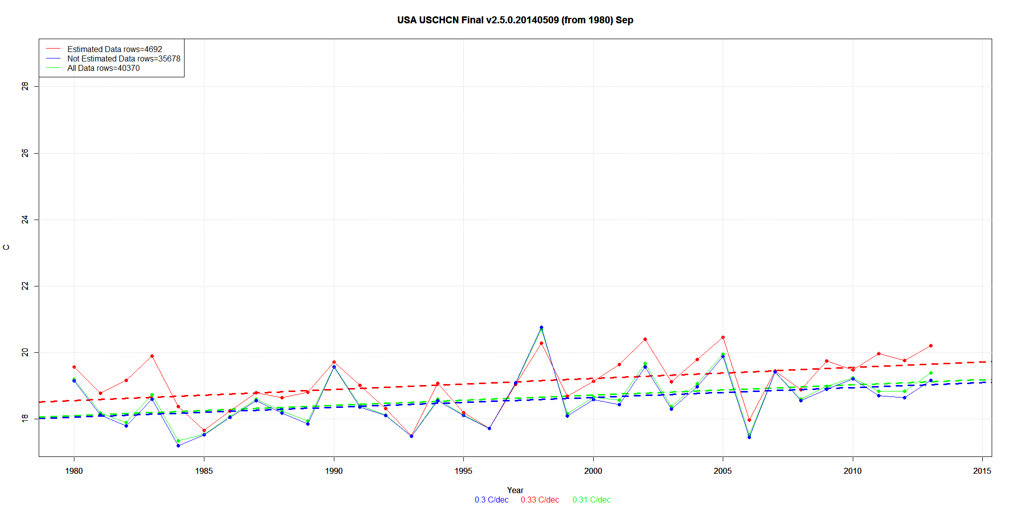
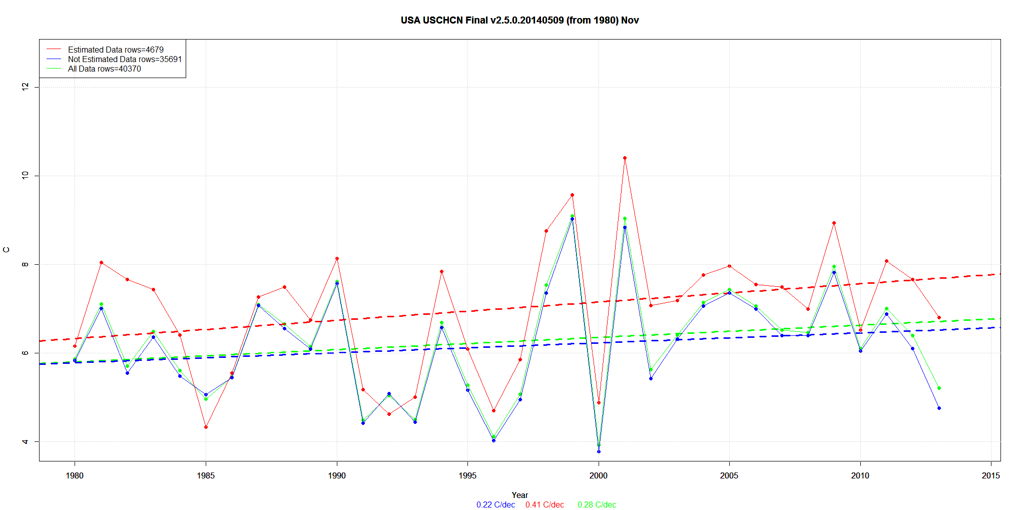
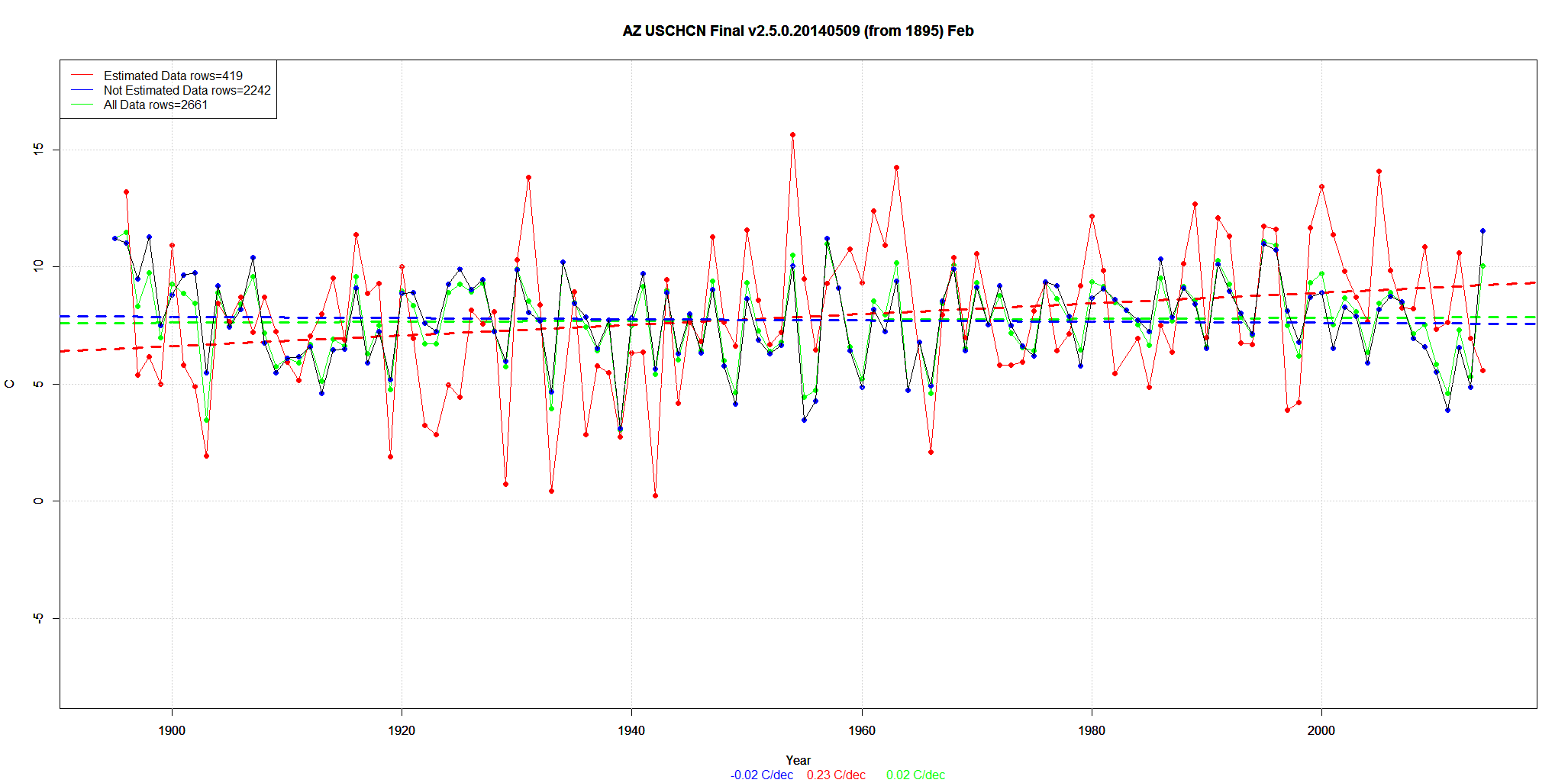
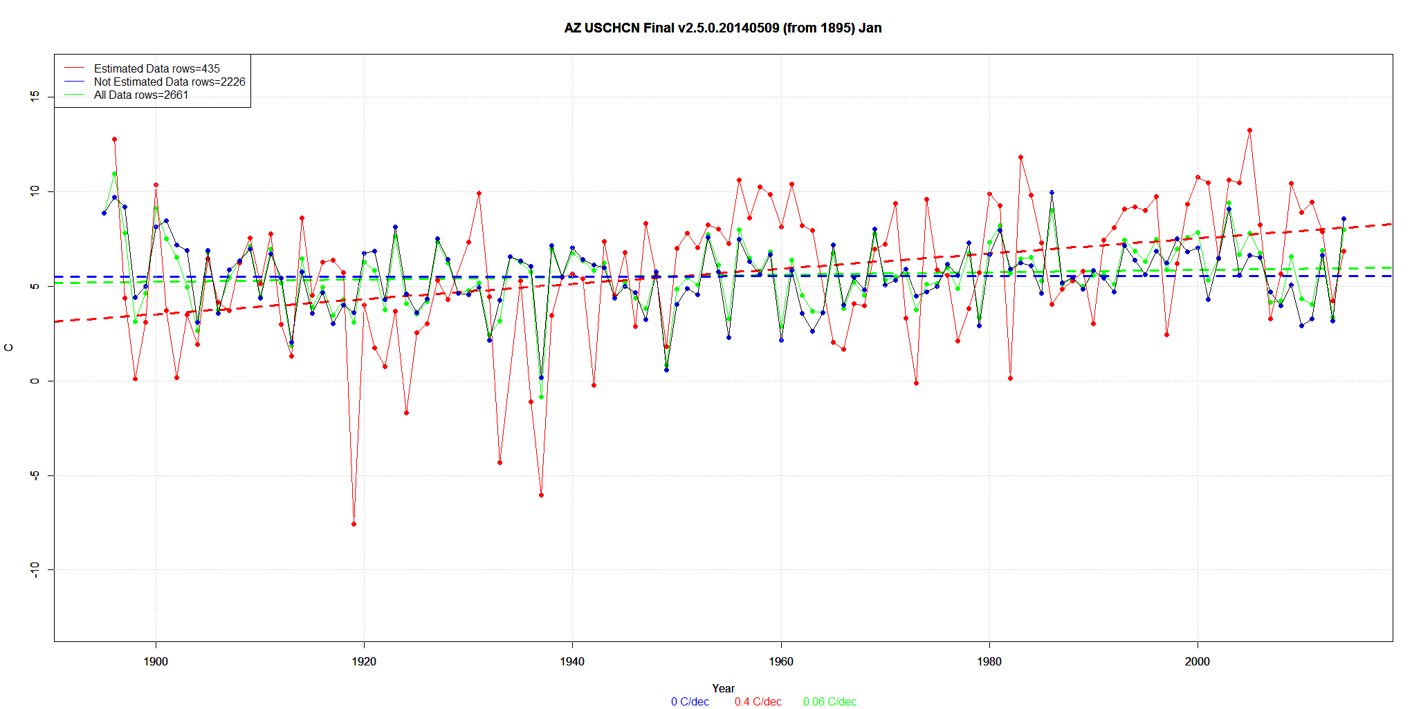
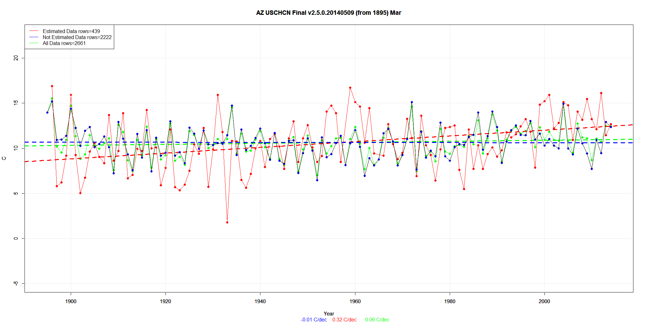
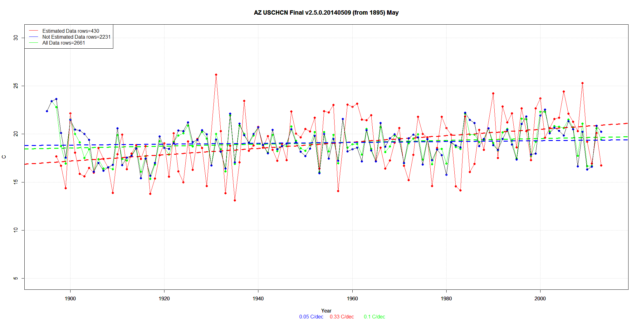
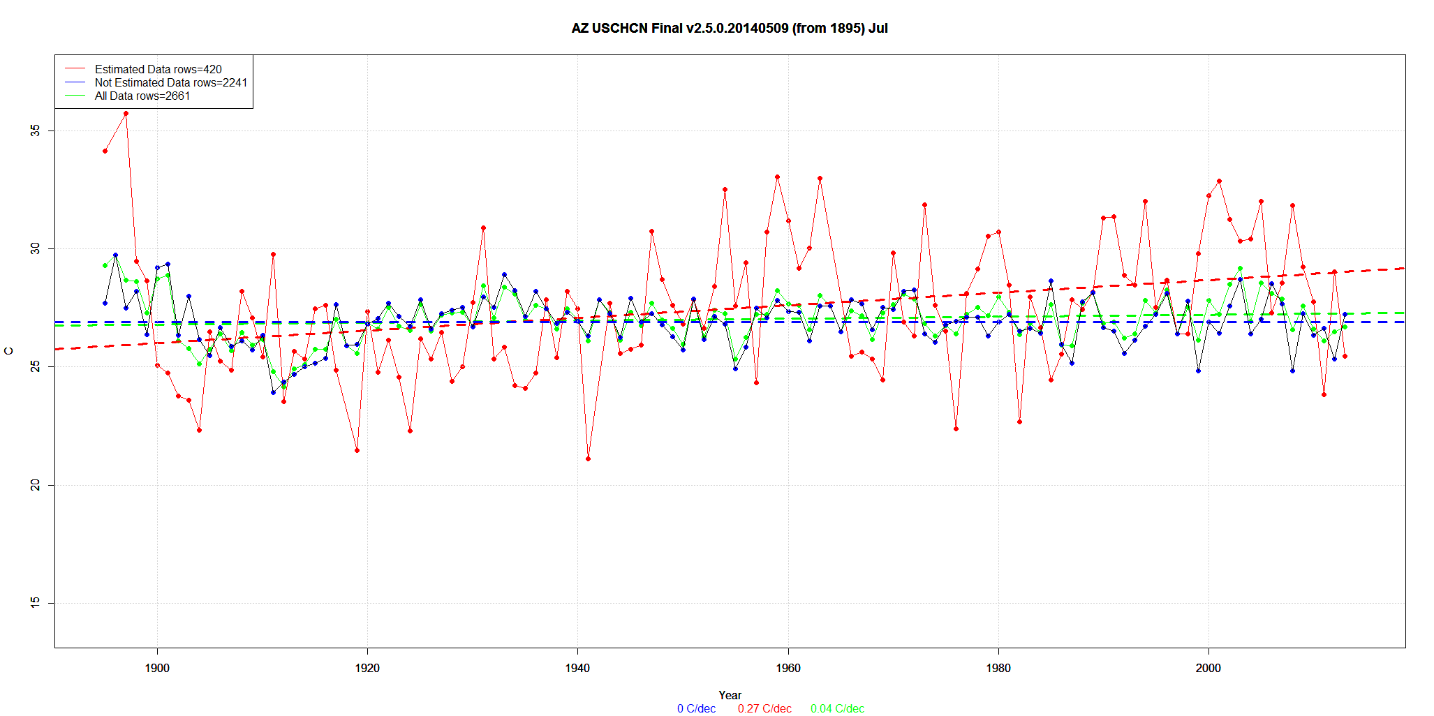
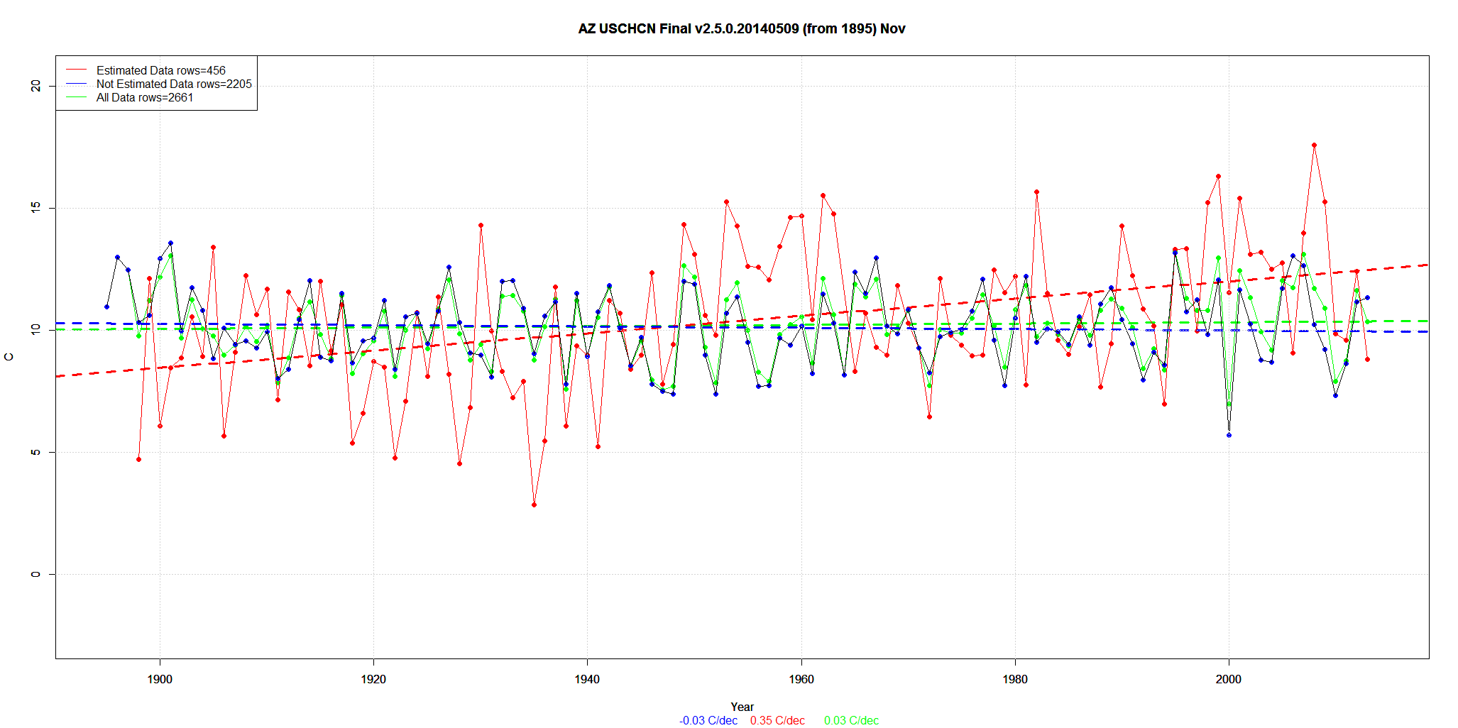
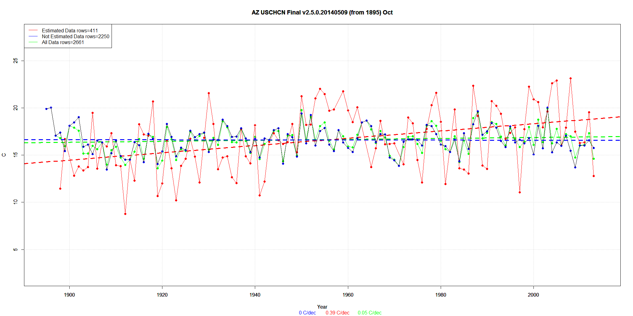
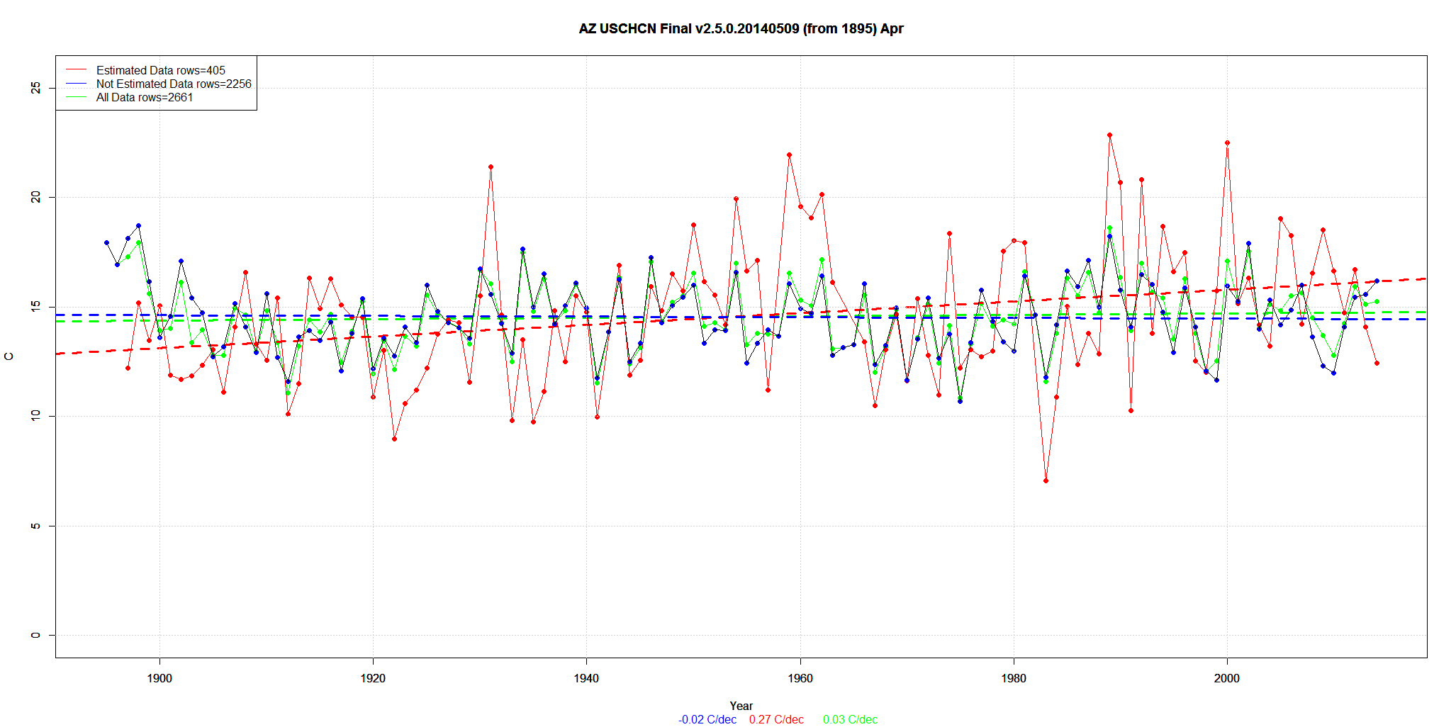
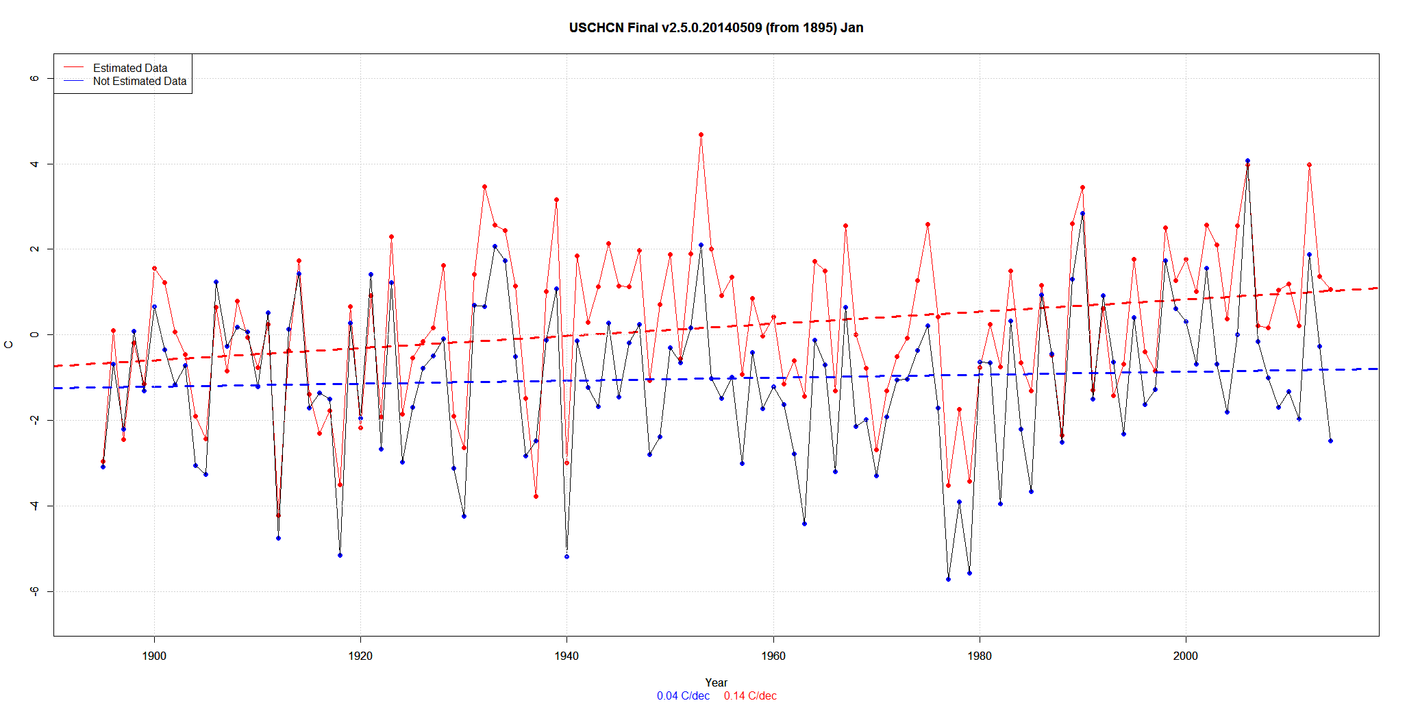
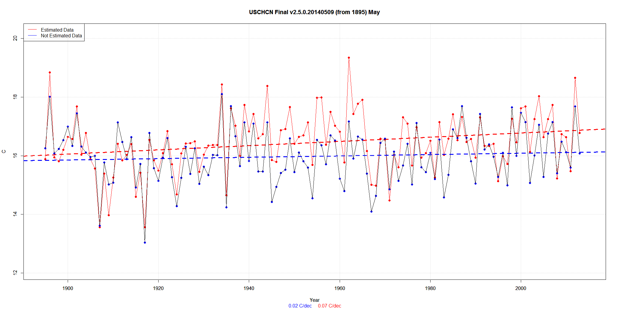
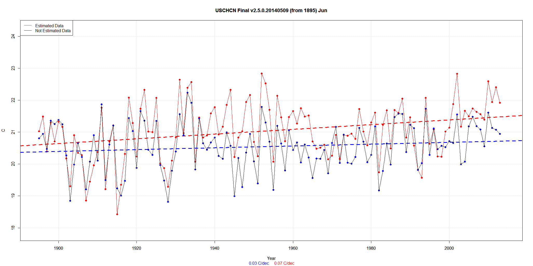
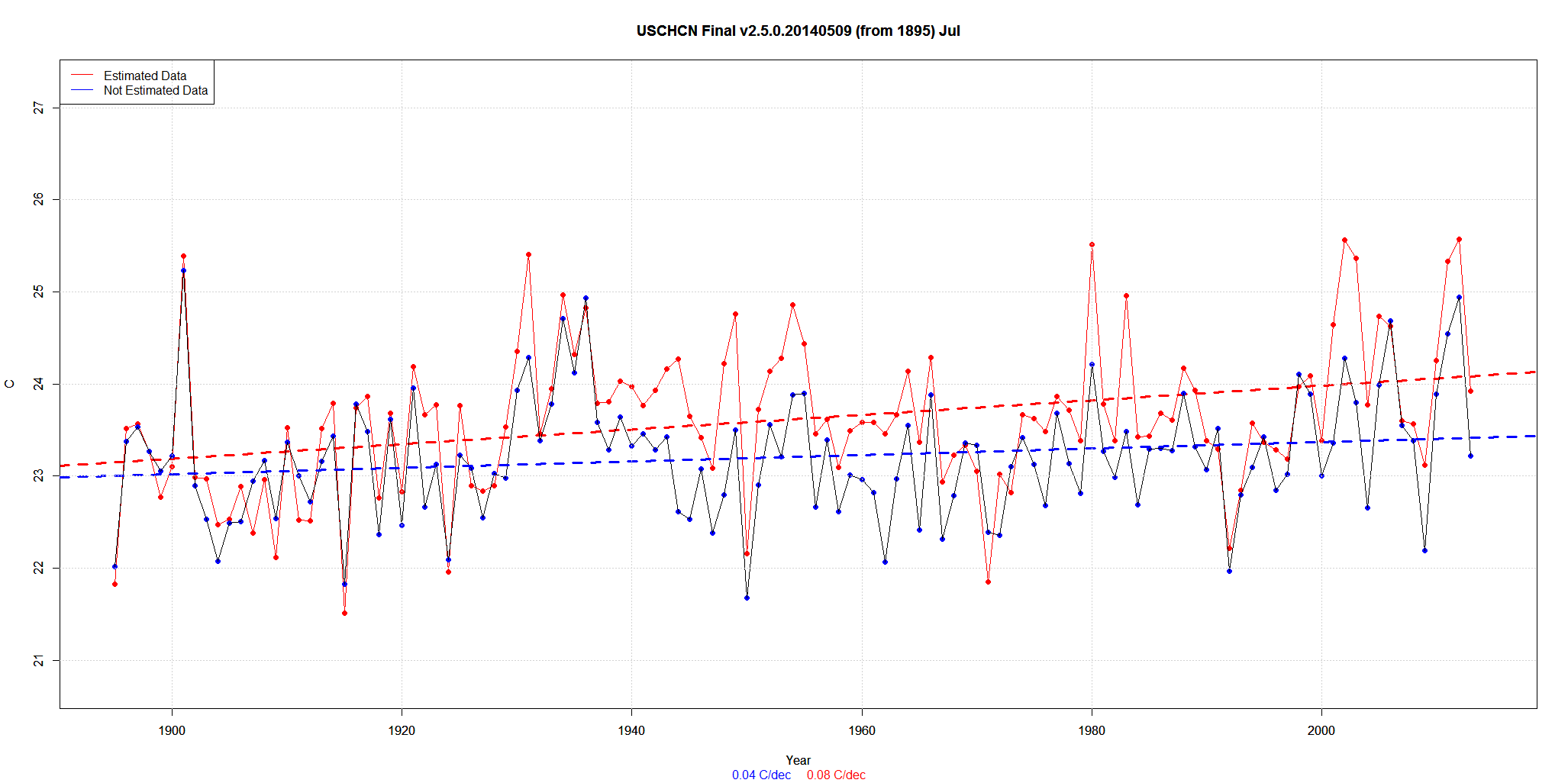
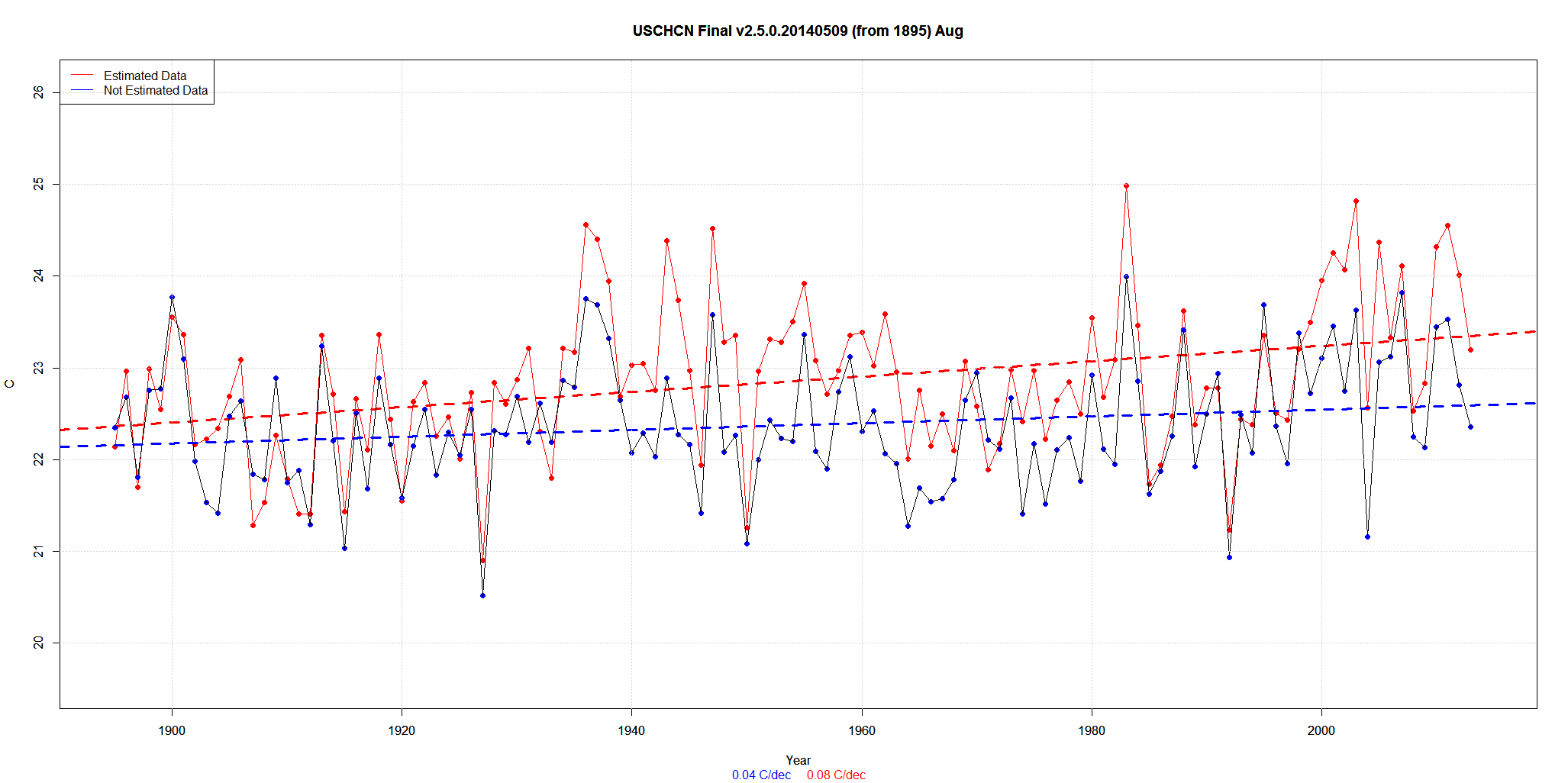
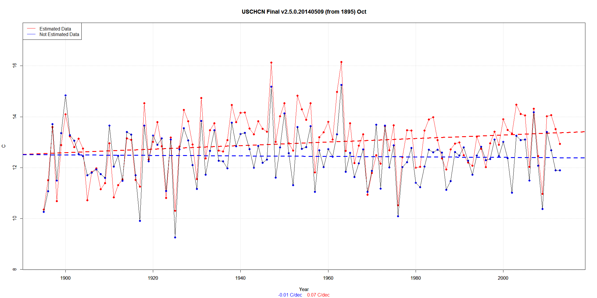
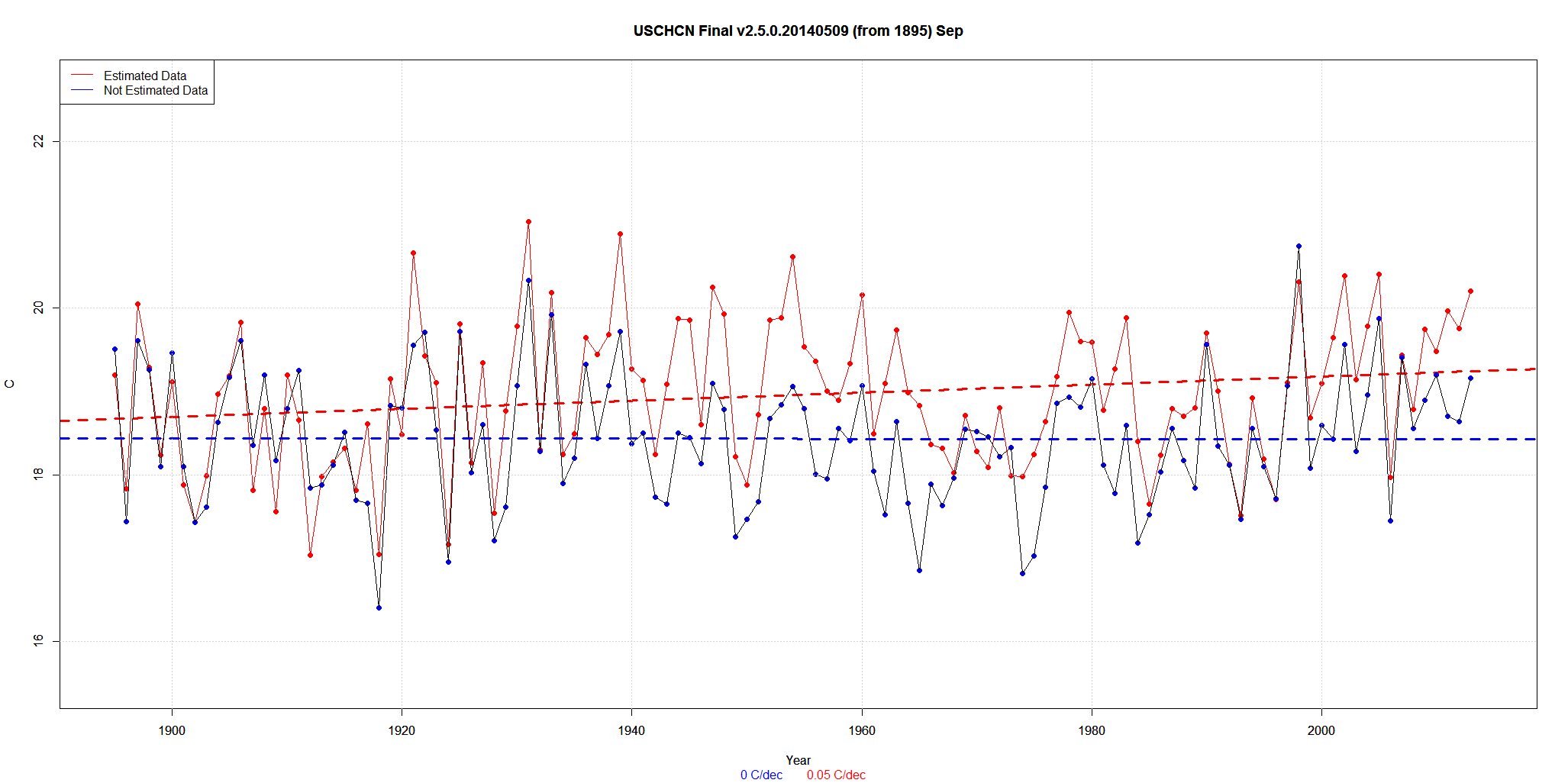
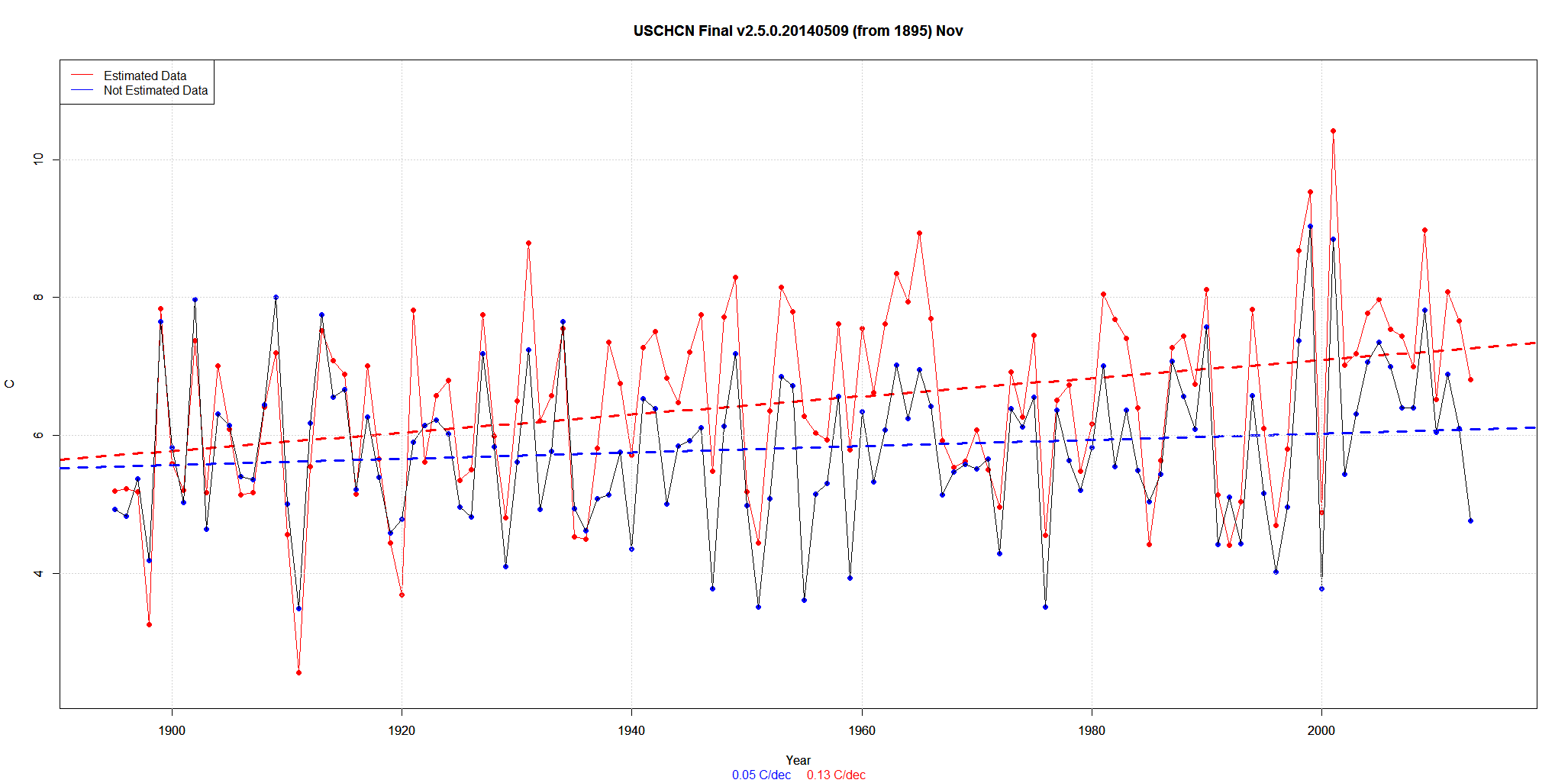
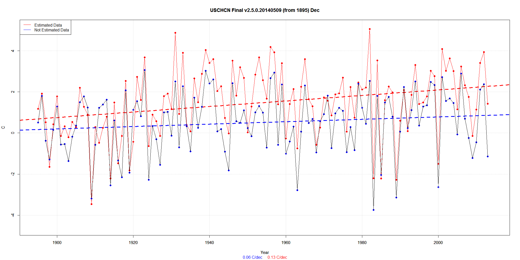
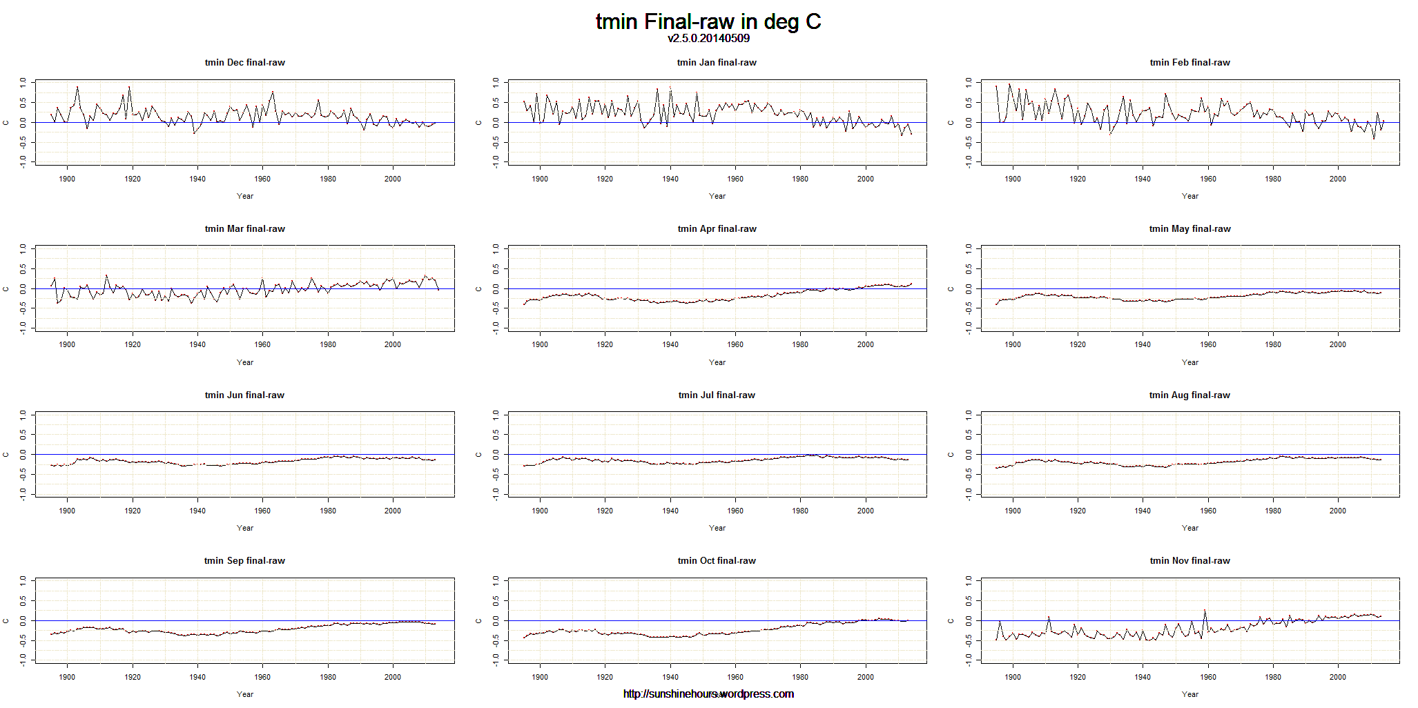
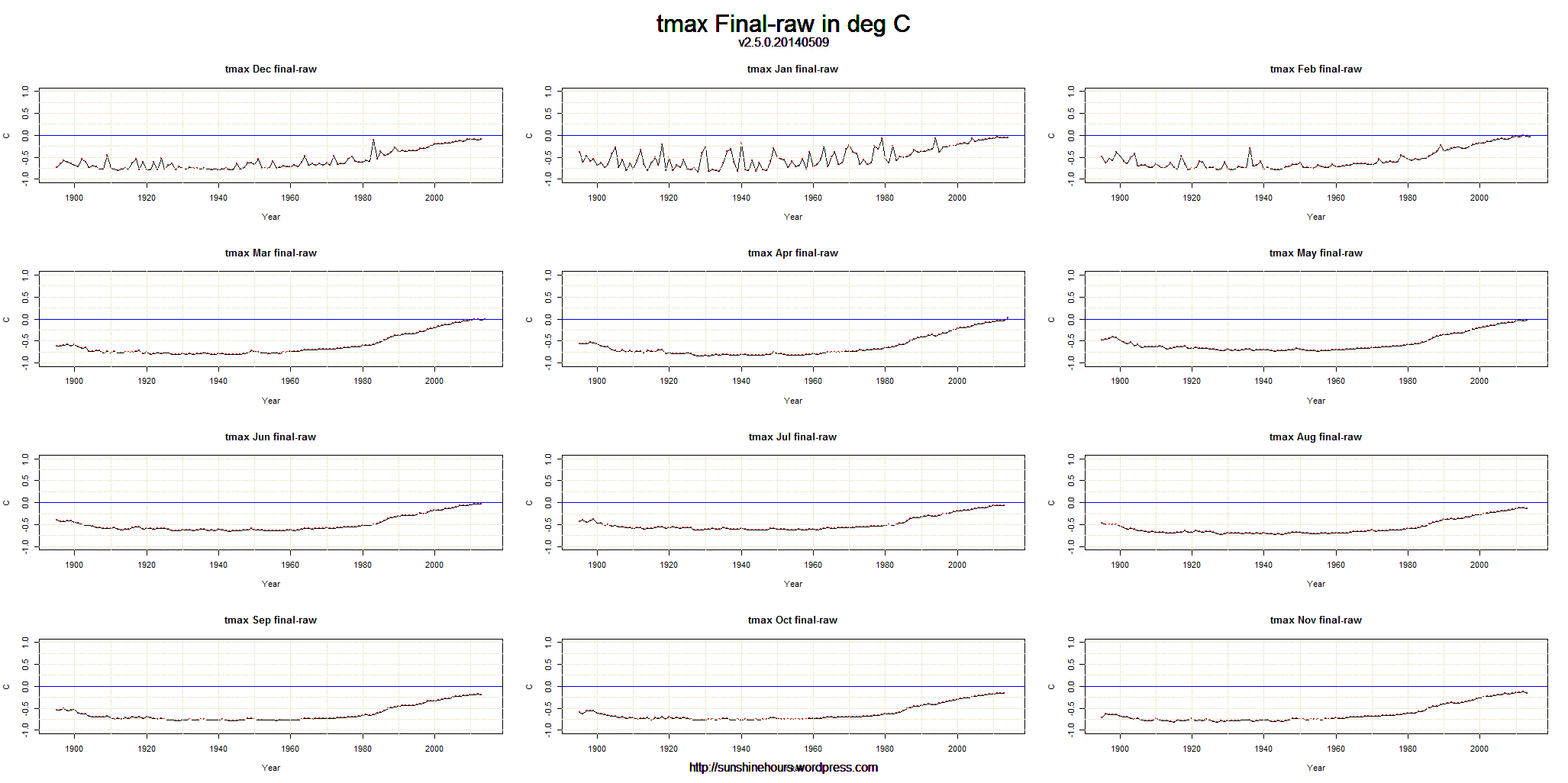
I’ve been posting on USHCN and the effect of “estimating” or “Infilling” on the Final data.
Earlier today I showed that Estimating/Infilling made the 1980-2014 trend steeper upwards.
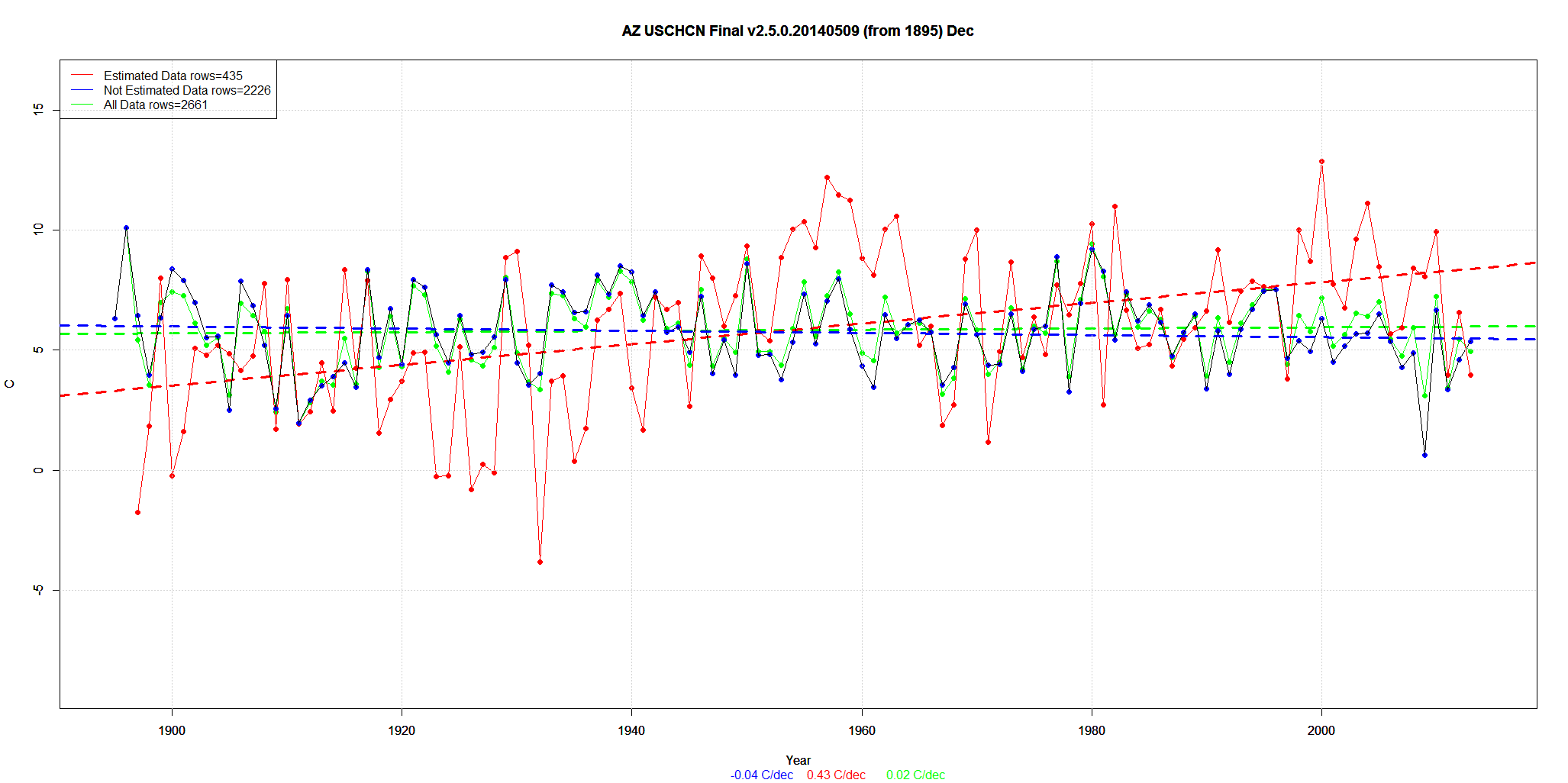
Now I will show the opposite: When the trend is down, infilling makes the trend steeper downwards.
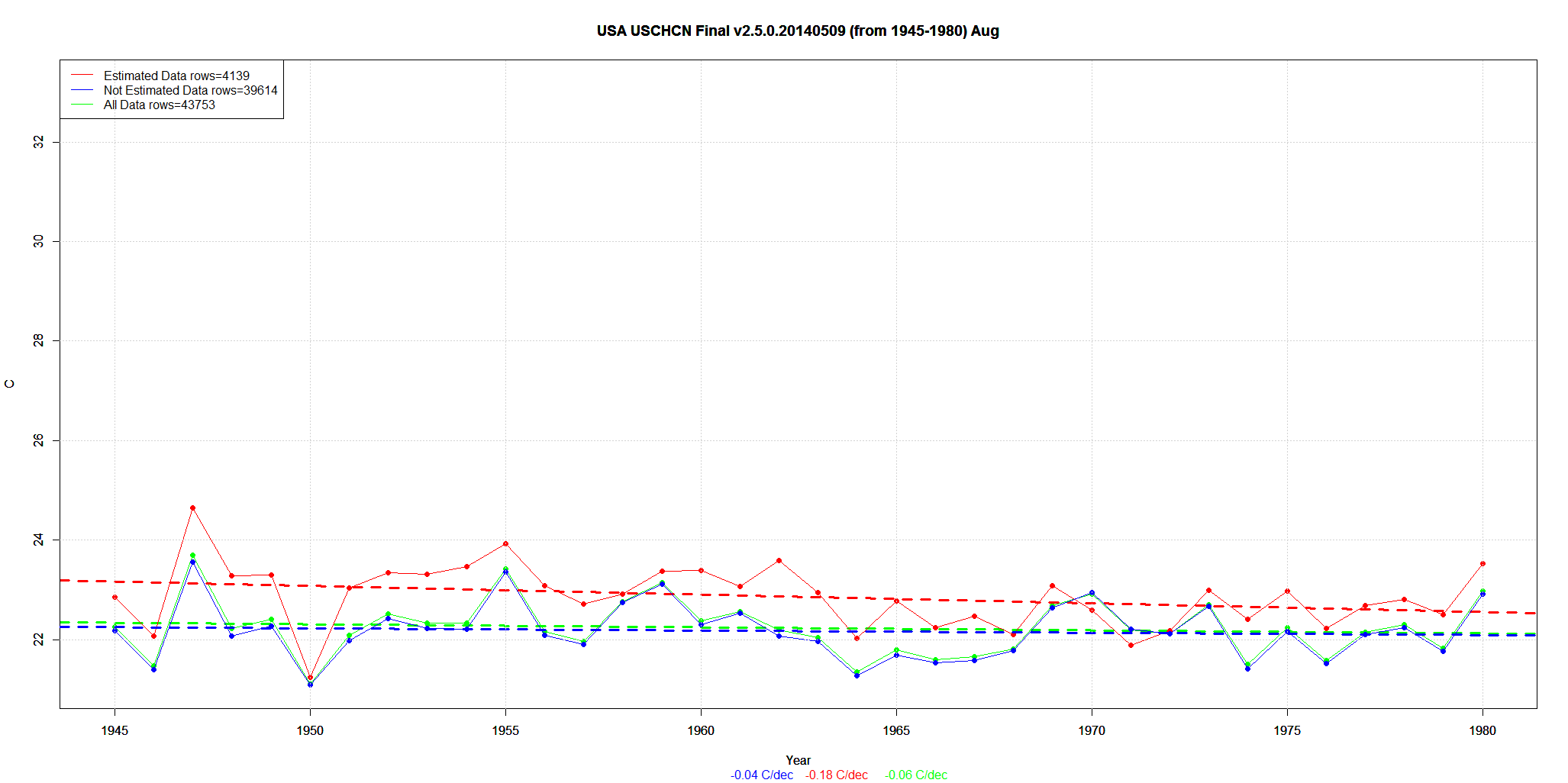
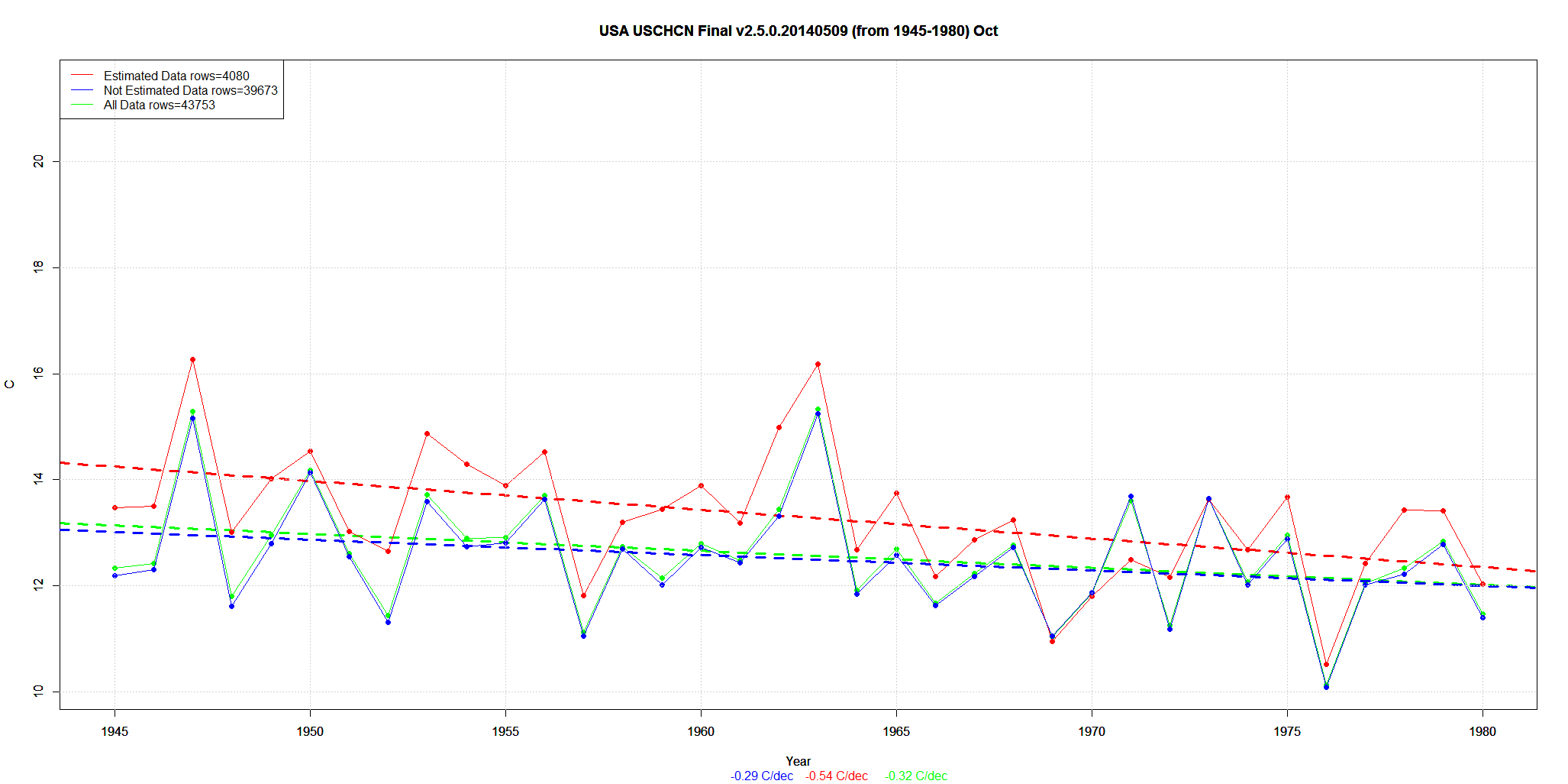
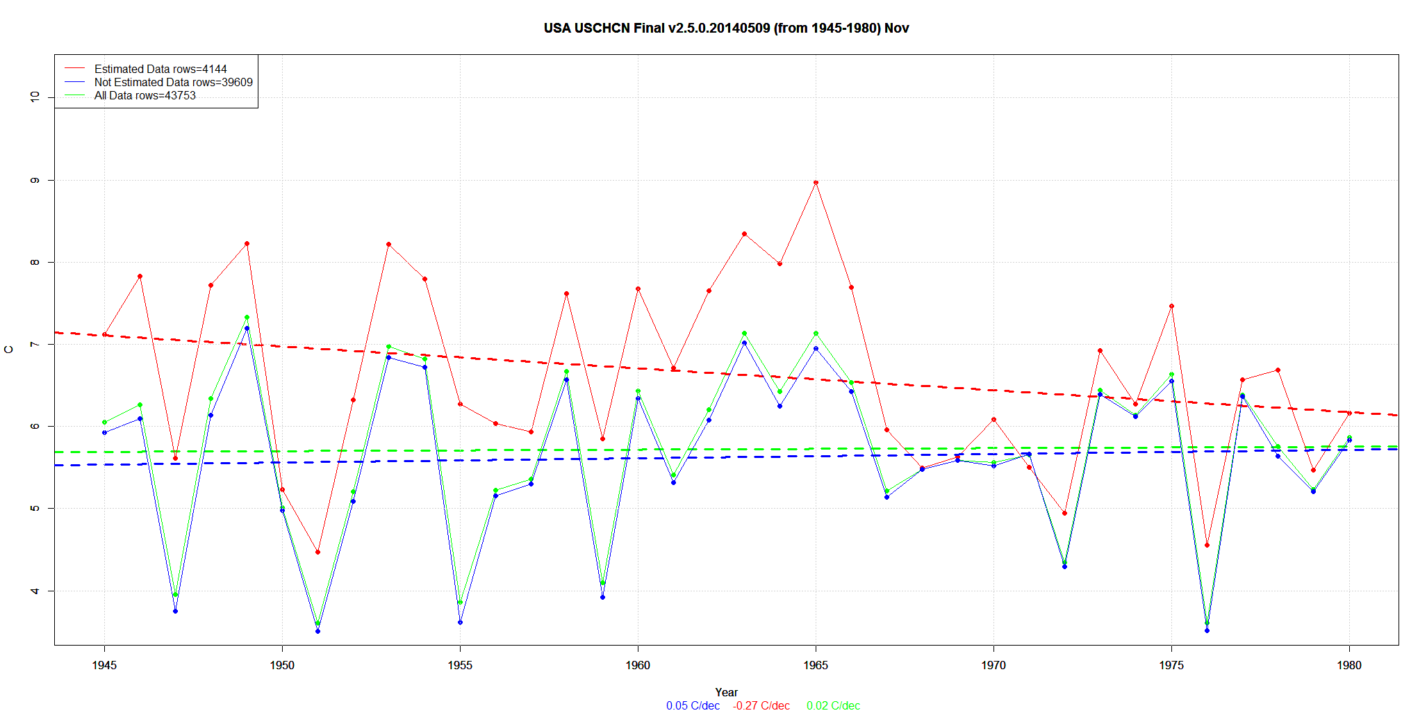
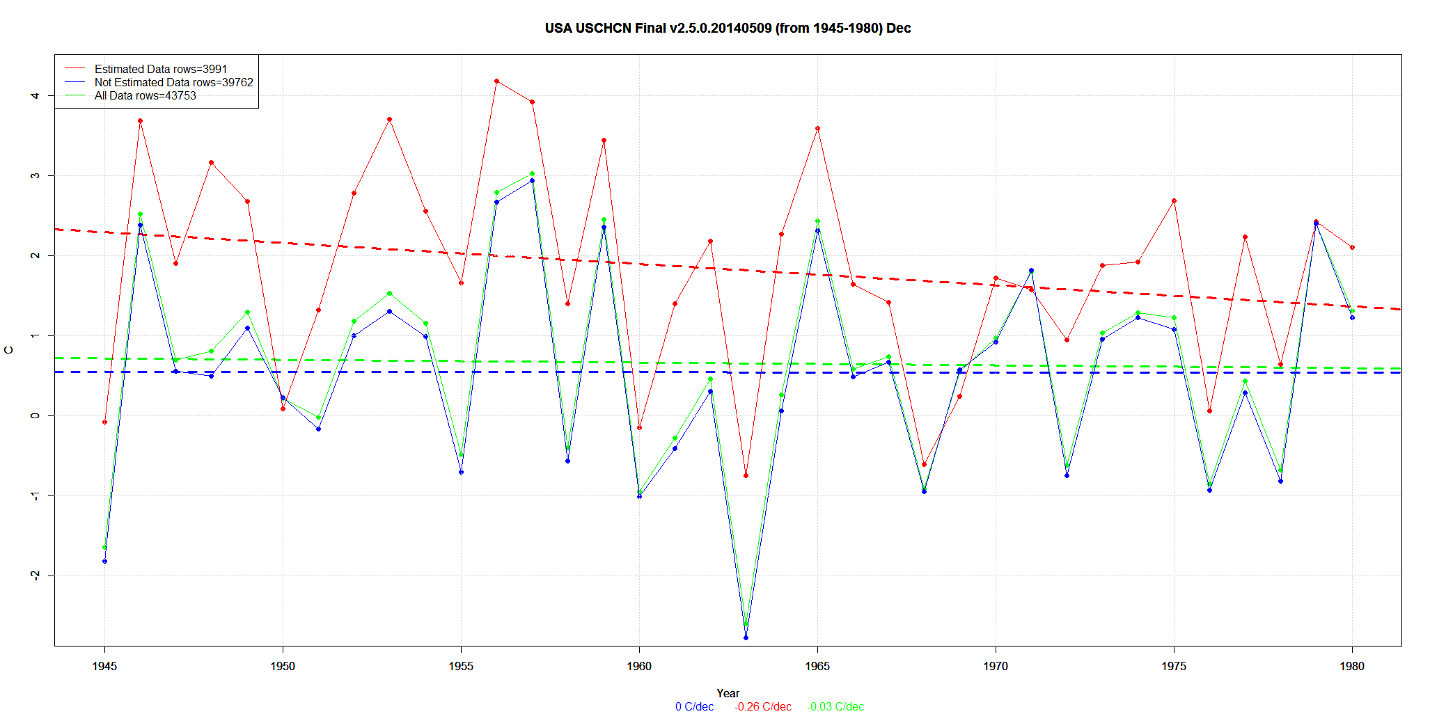
I repeat … this is the Final data after all the other adjustments. About 15% of the data is Estimated from neighboring stations.
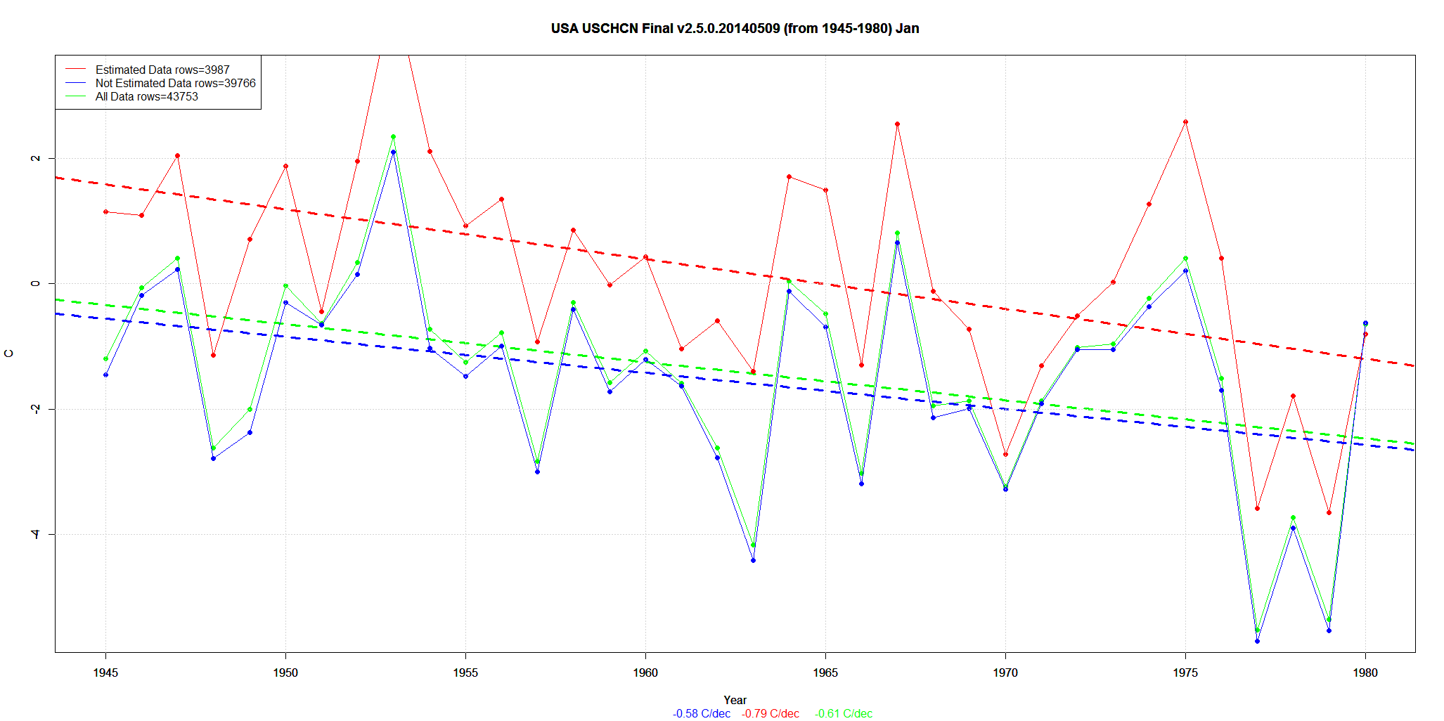
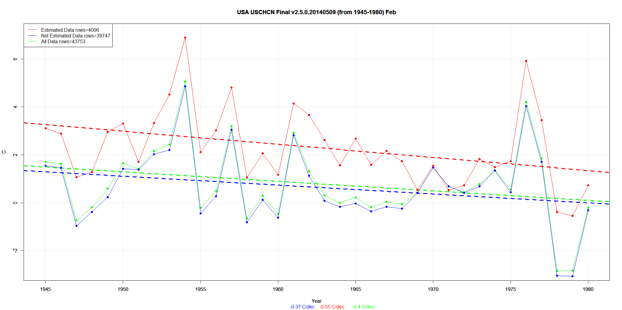
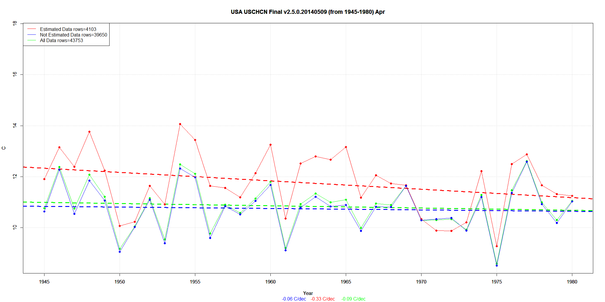
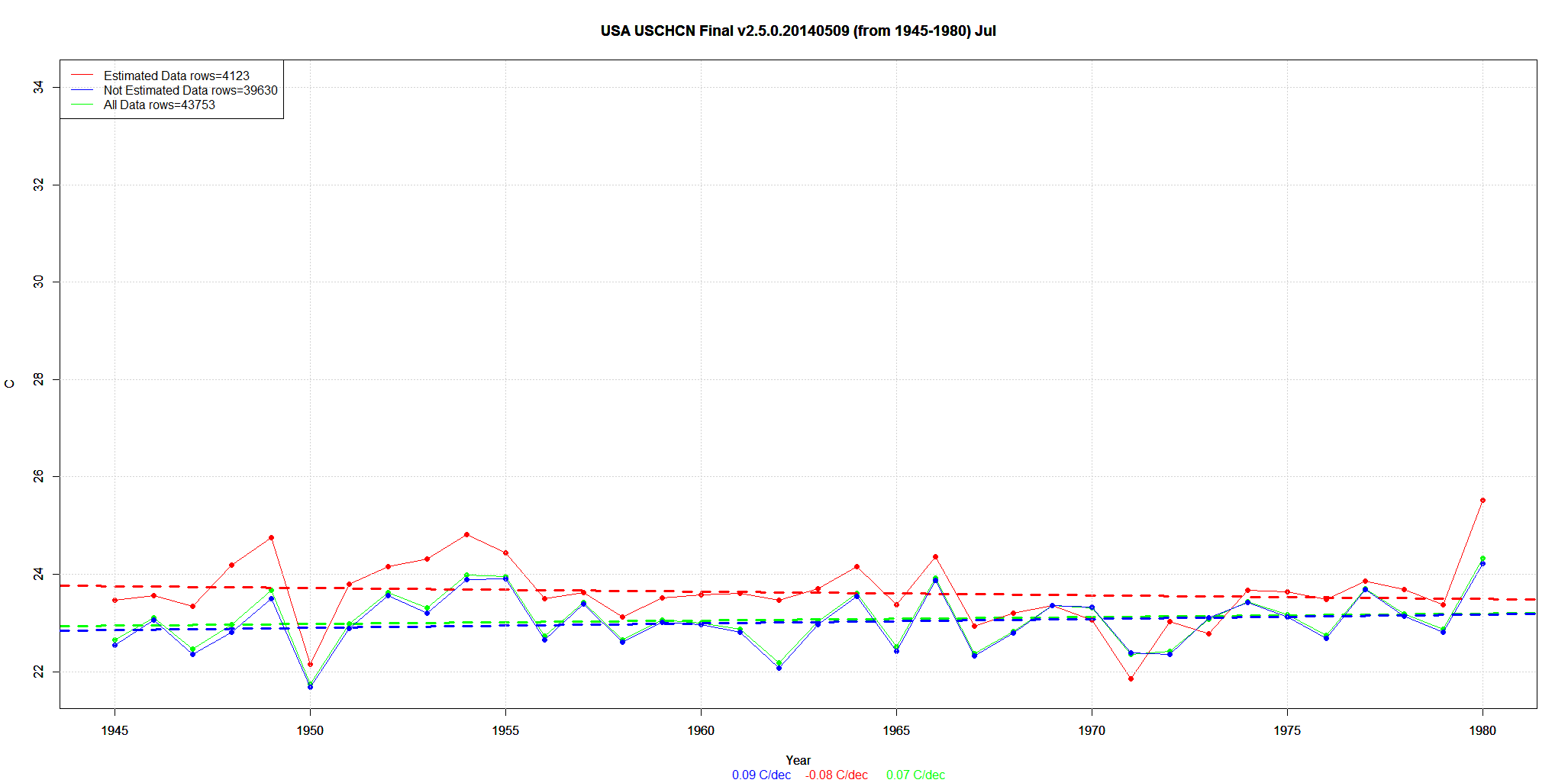
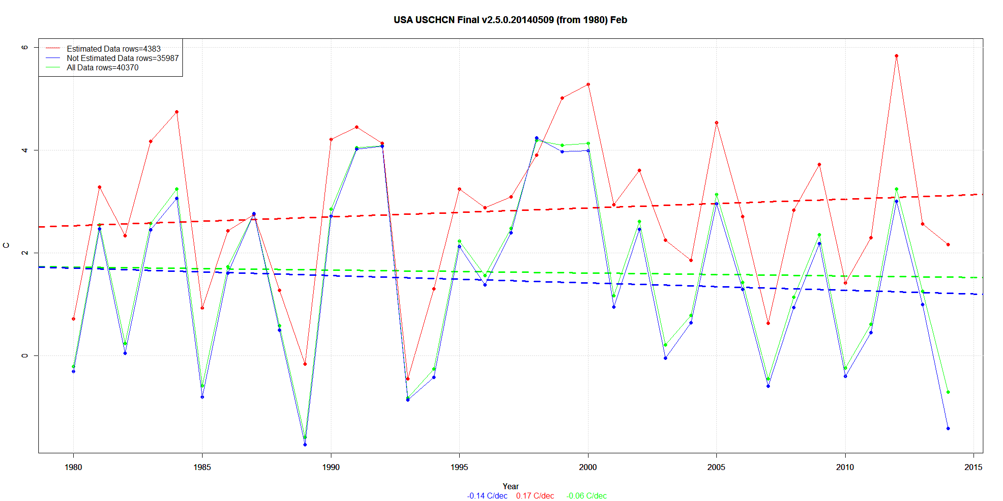
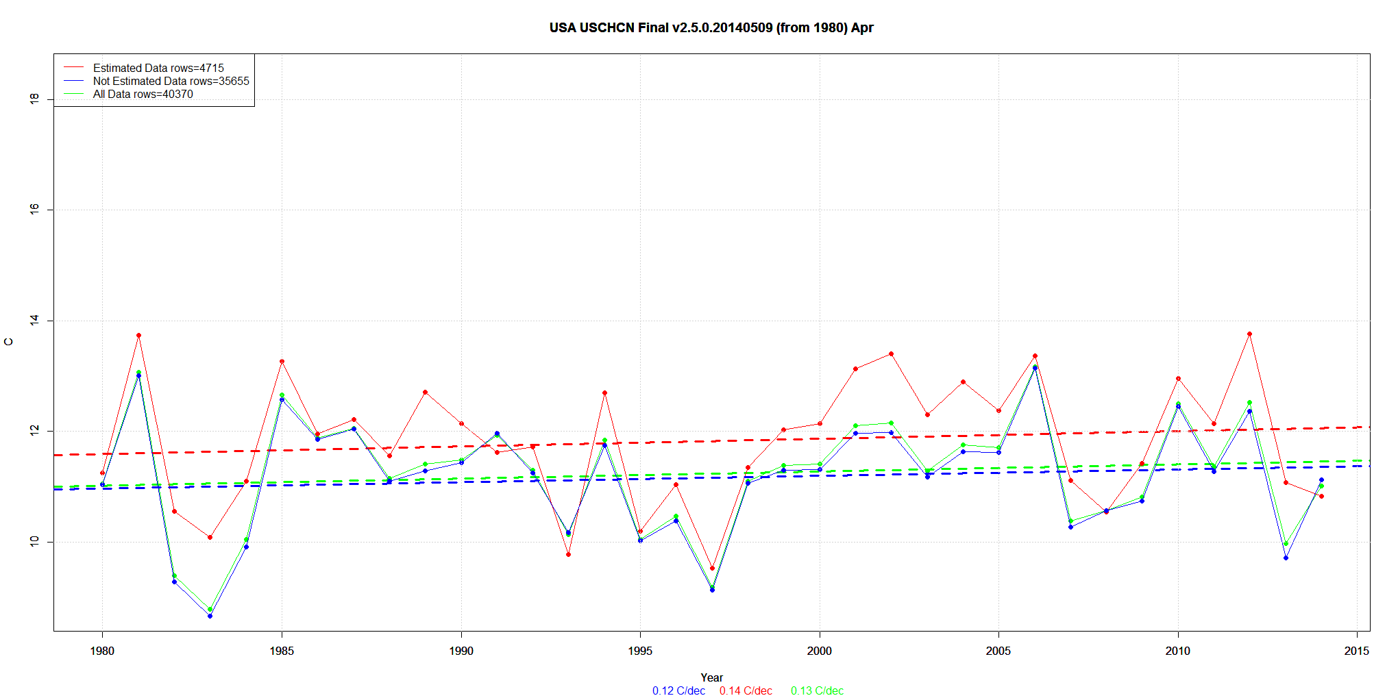
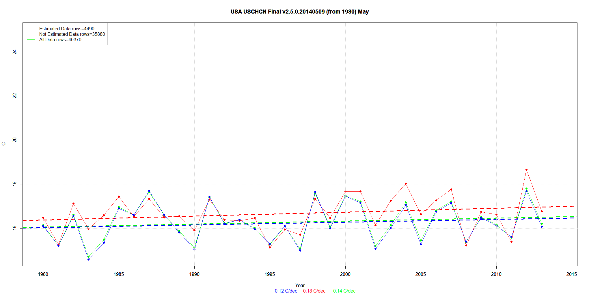
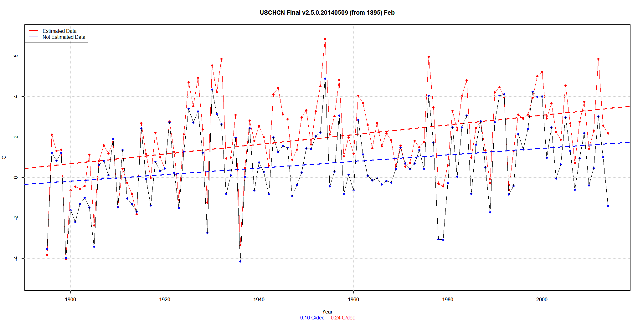
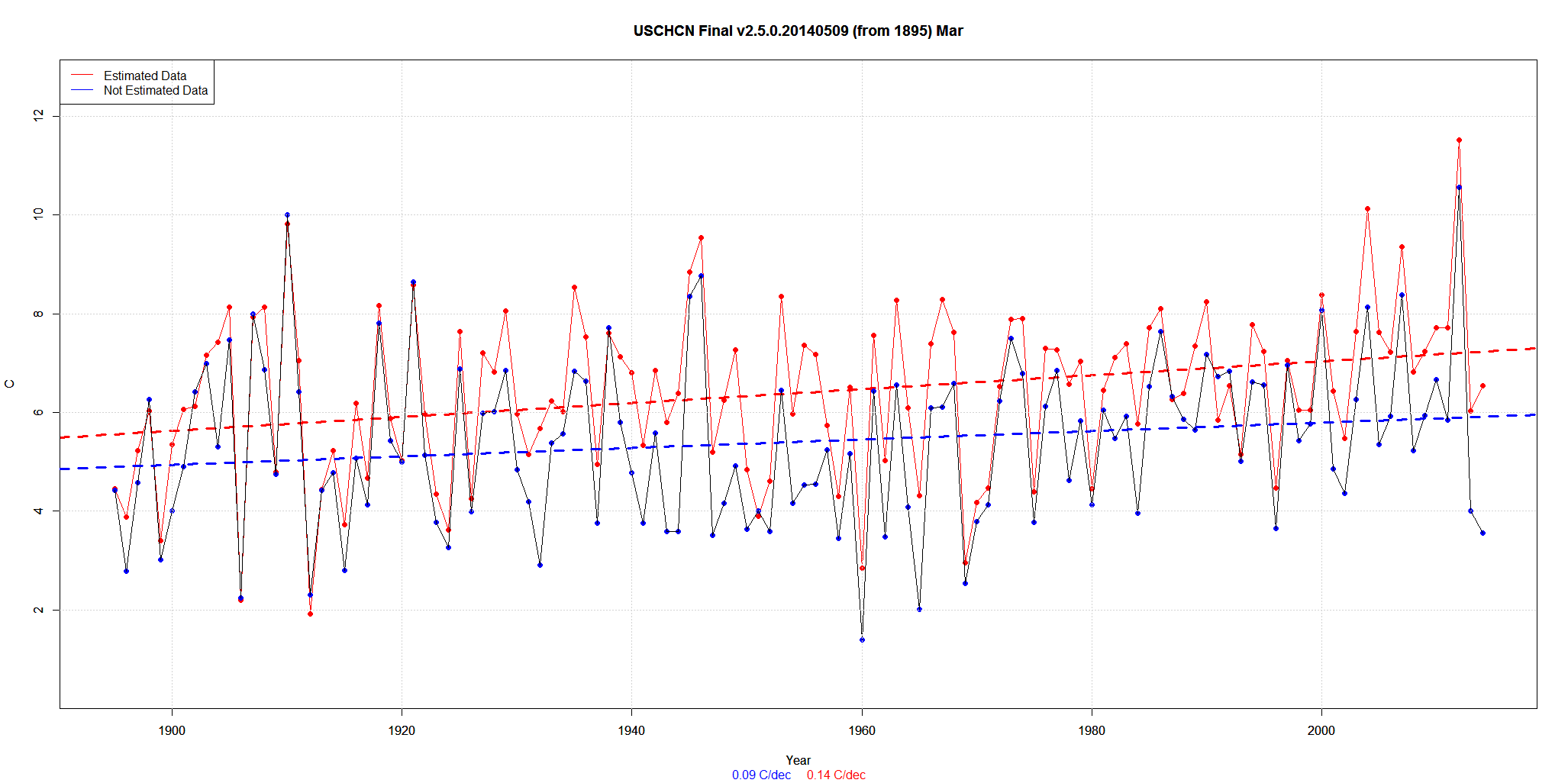
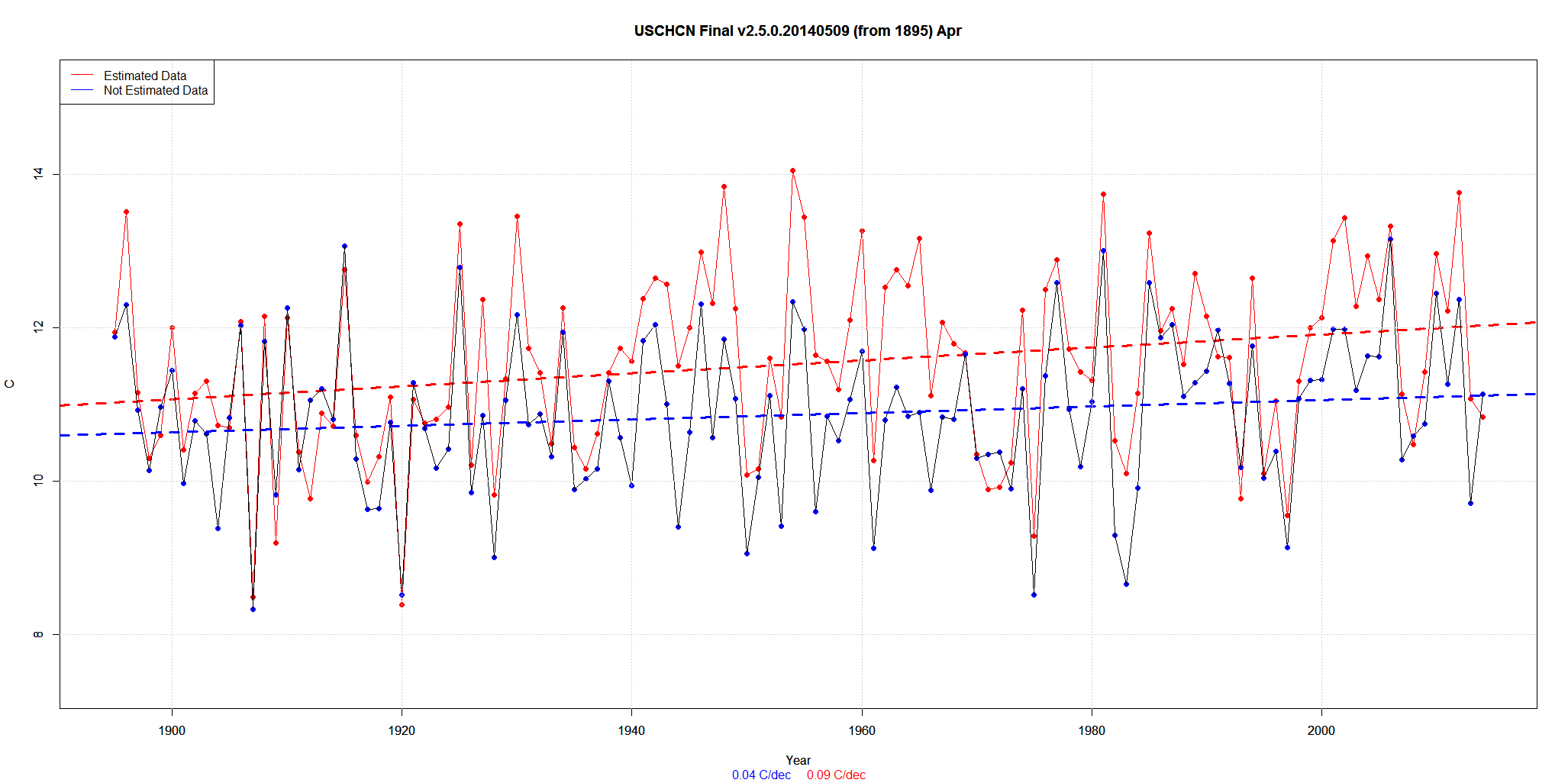
I will post all the monthly graphs … but just discuss the first – January.
The data is 1945 to 1980. So it covers a period of cooling.
The trend of REAL data is –0.58C/decade. That’s the 39,766 values referenced in the legend.
Then they add in about 15% Estimated data with a trend of -0.79C/decade. That’s the 3987 values.
The net result is a new trend of -0.61C/decade.
Presto. Magic. A -0.58C trend is now a -0.61C trend.
Not a big change. But it is always there. But the red line is almost always well above the others. Sometimes by 2C.
(Click on graphs for larger).