USHCN Infilling – A rebuttal to Nick Stokes

Nick Stoke and Zeke Hausfather don’t like my graphs showing a difference between Estimated (infilled) and non-Estimated (not infilled)  USHCN data

Nick said:

“The difference between average estimated and average non-estimated, doesn’t reflect estimation. It just reflects changes in the kind of stations that were being estimated.

For some reason, they were more likely to be warmer. I don’t know why, but they were. It’s just the wrong way to do it.”

I’m not sure I believe in coincidences.

I believe Nick and Zeke both created an anomaly baseline for each month for each station. Nick used 1900 to 2013. Zeke said he used 1961-1990.

Neither of them added trend lines.

I believe both used all the data (infilled and non-infilled). (As of my posting this they had not confirmed). I disagree with that. Infilled data should not be used in the baseline.

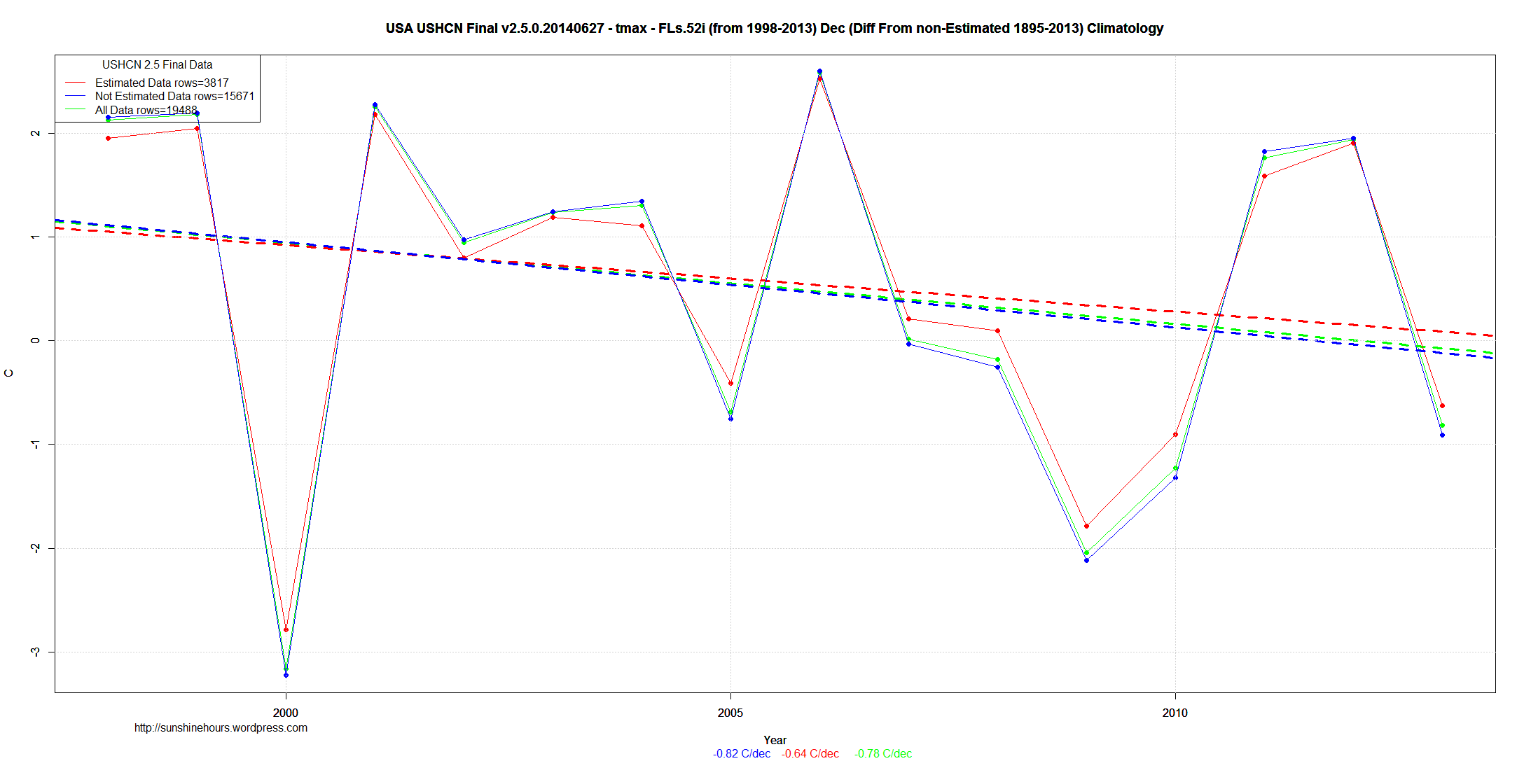
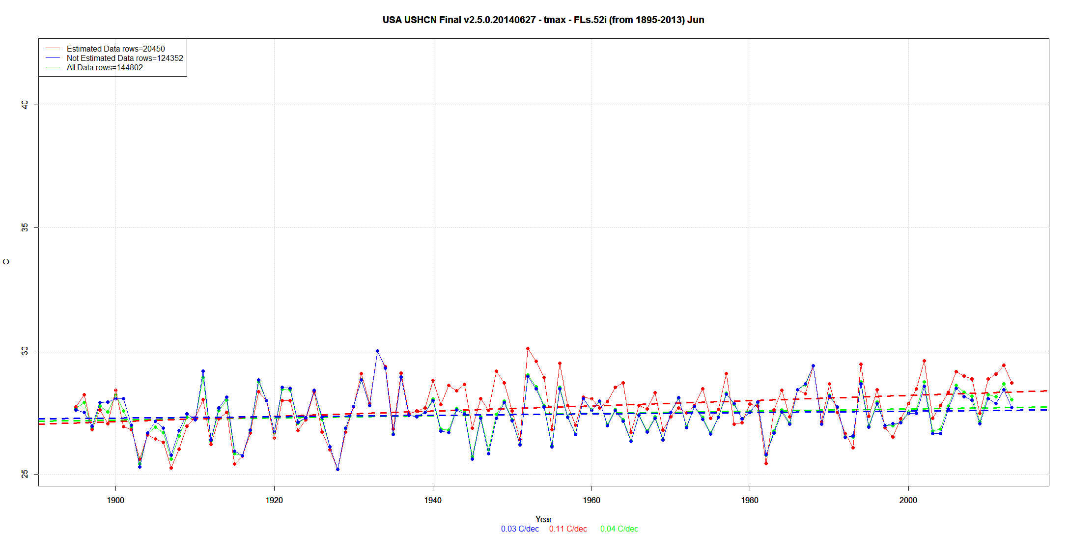
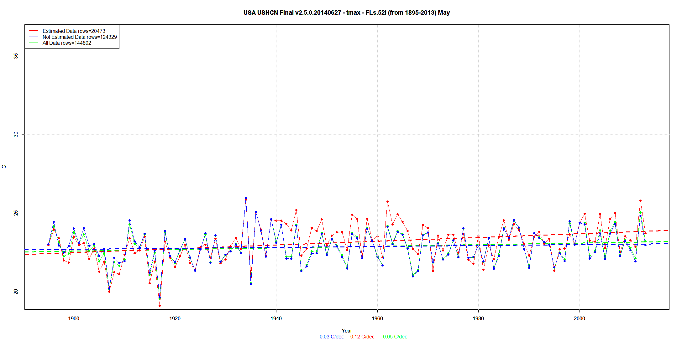
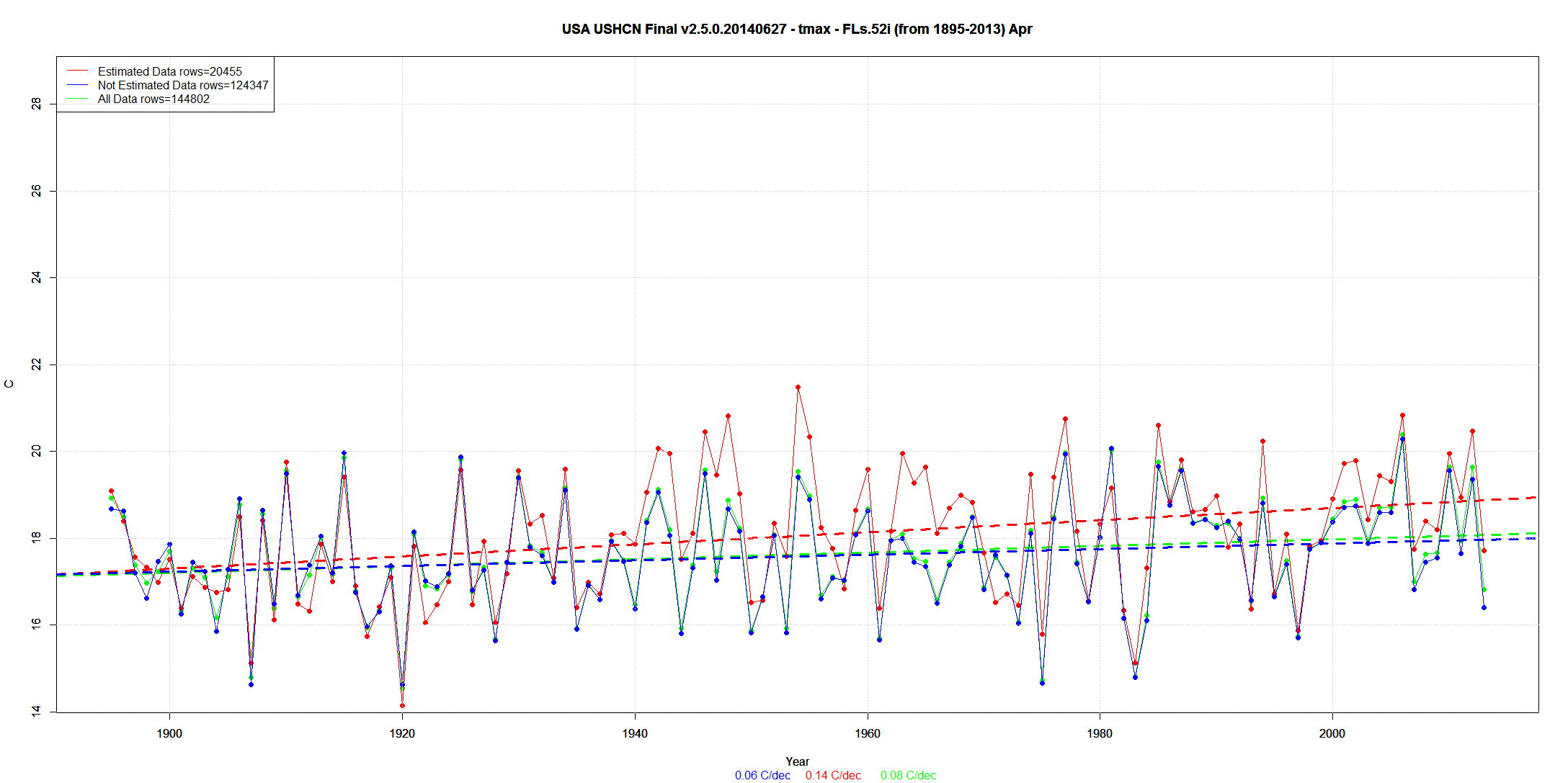
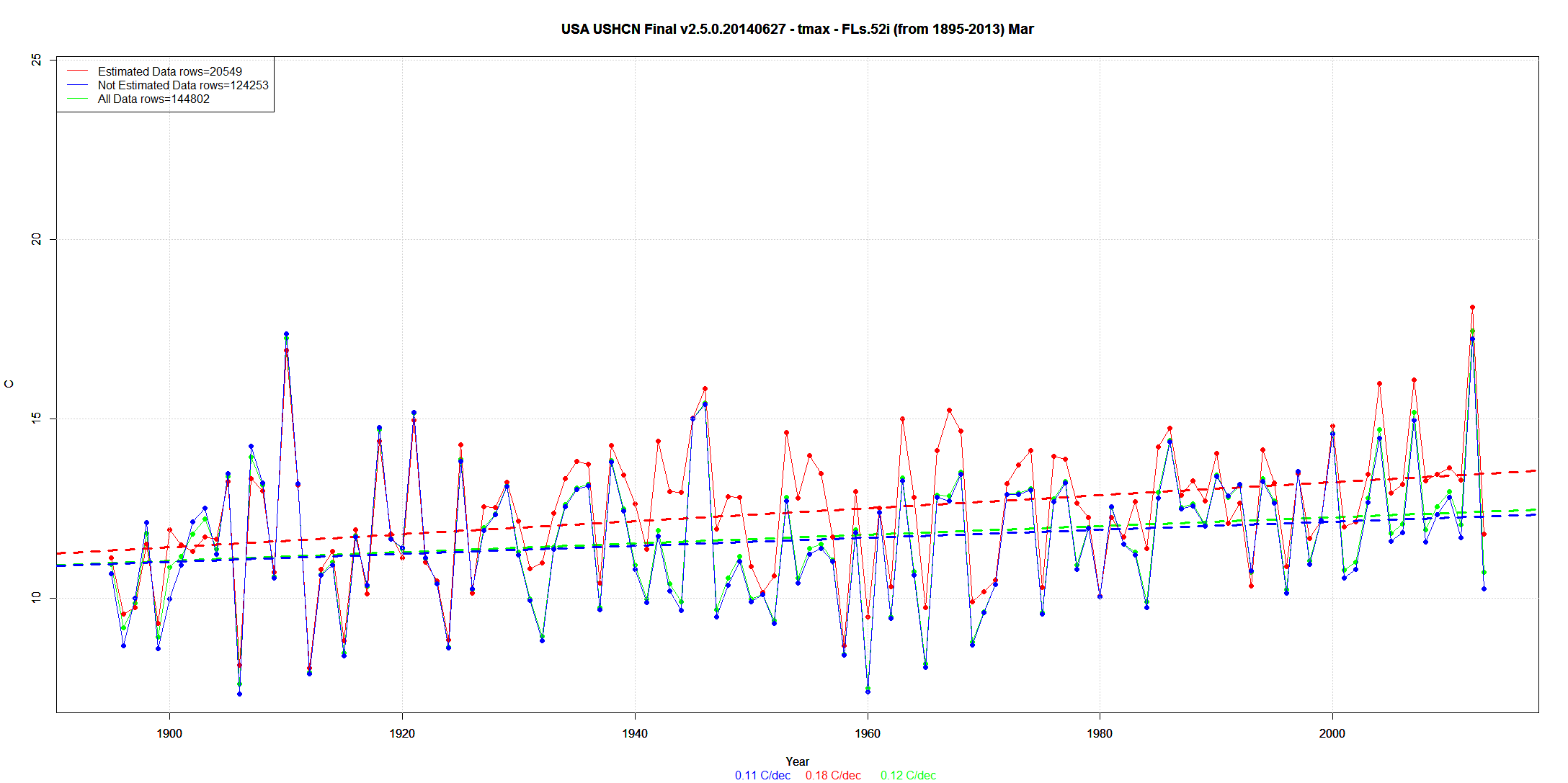
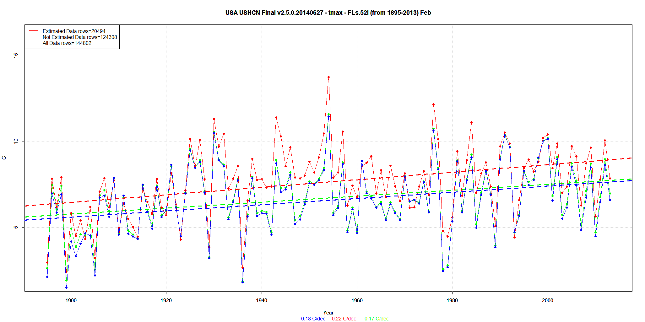
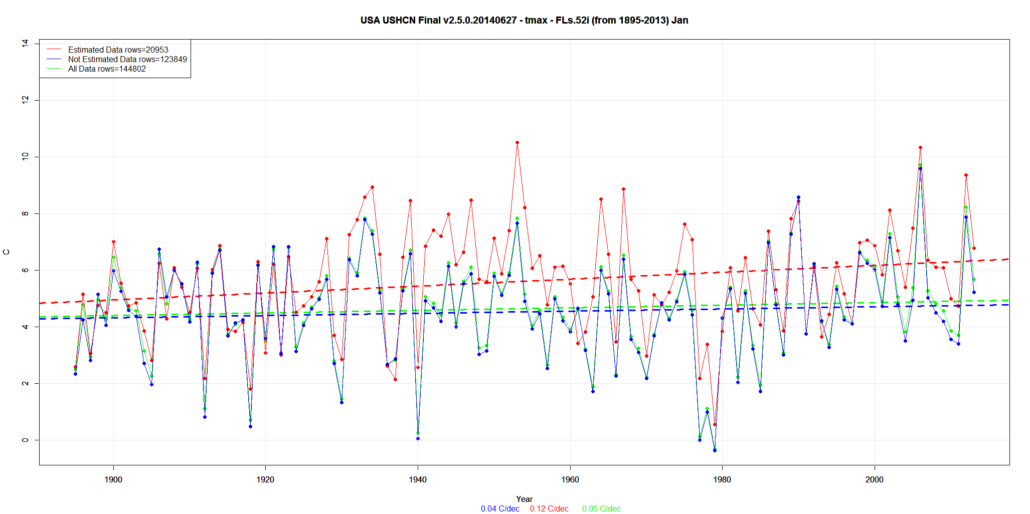
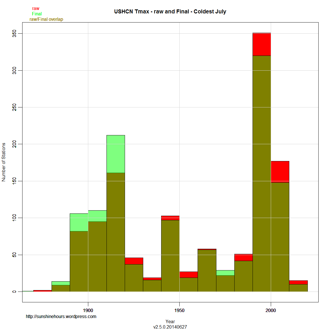
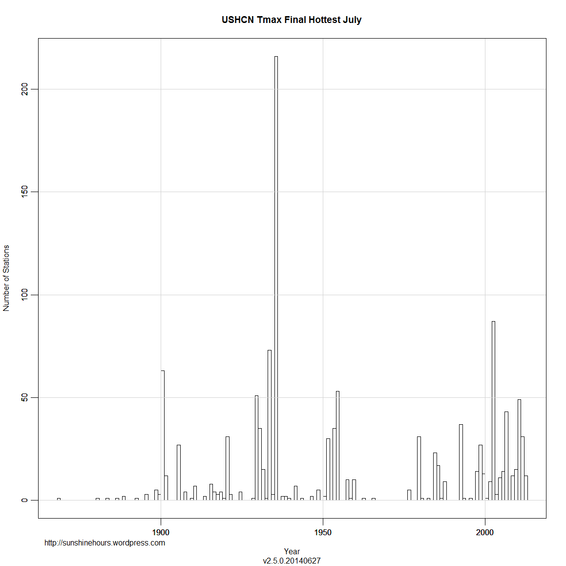
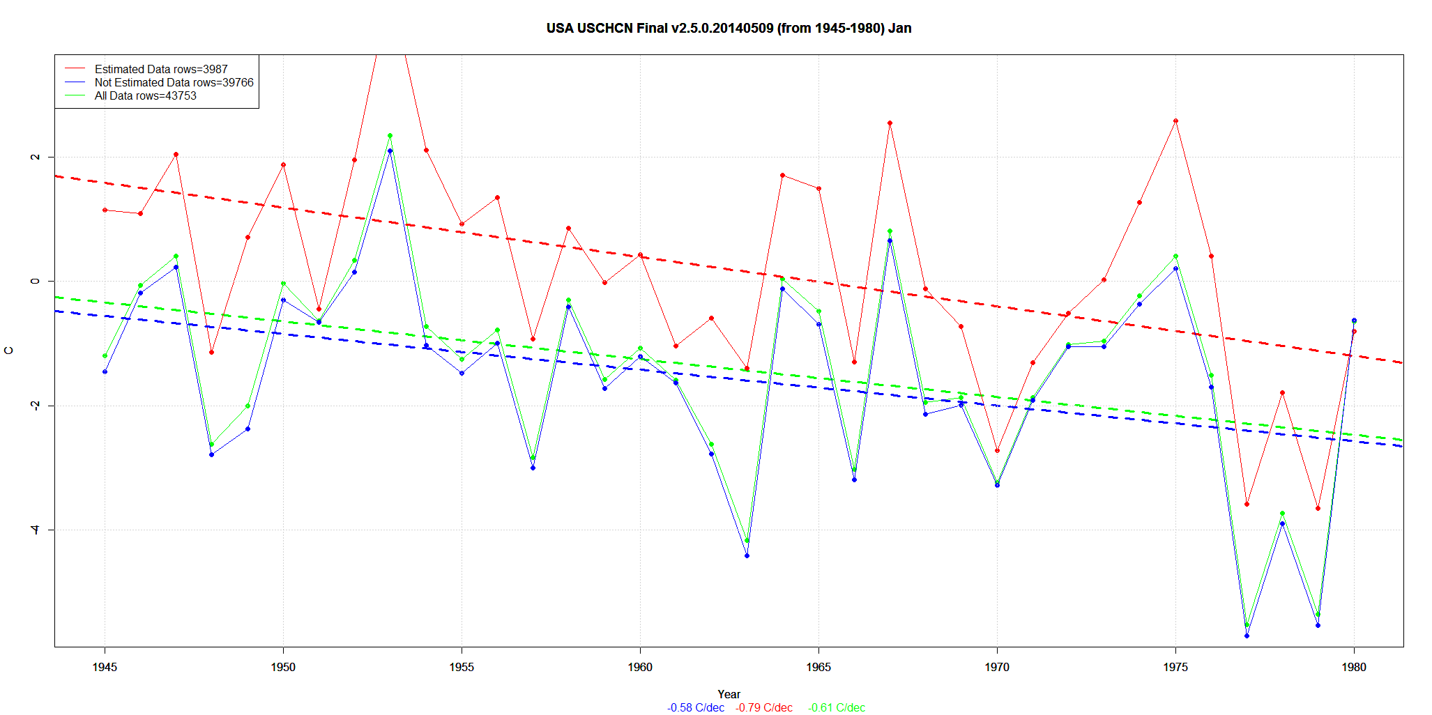
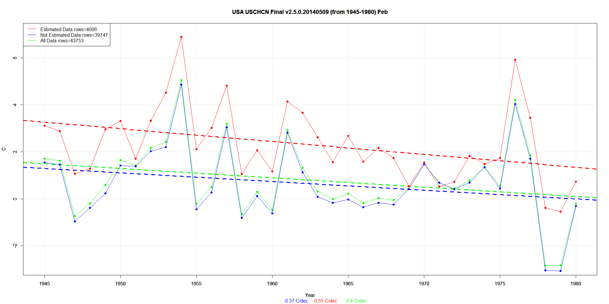
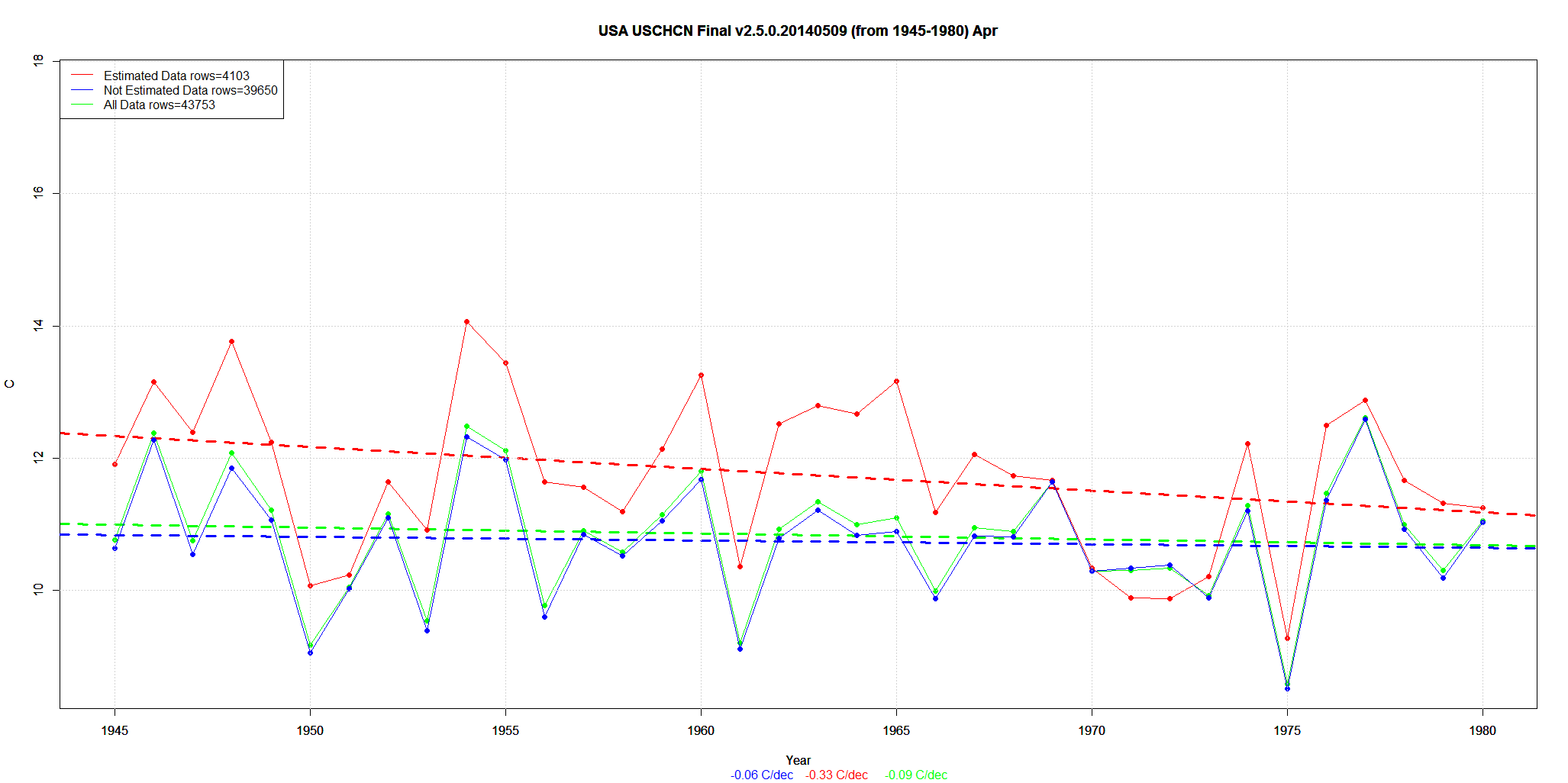
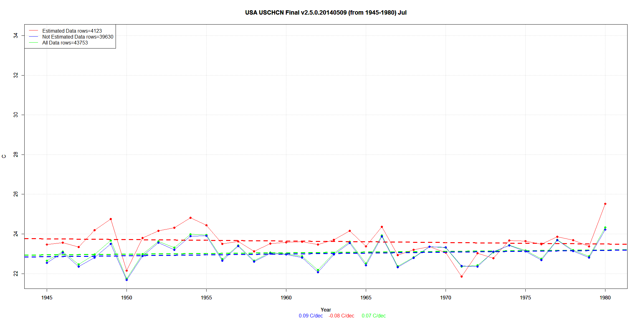
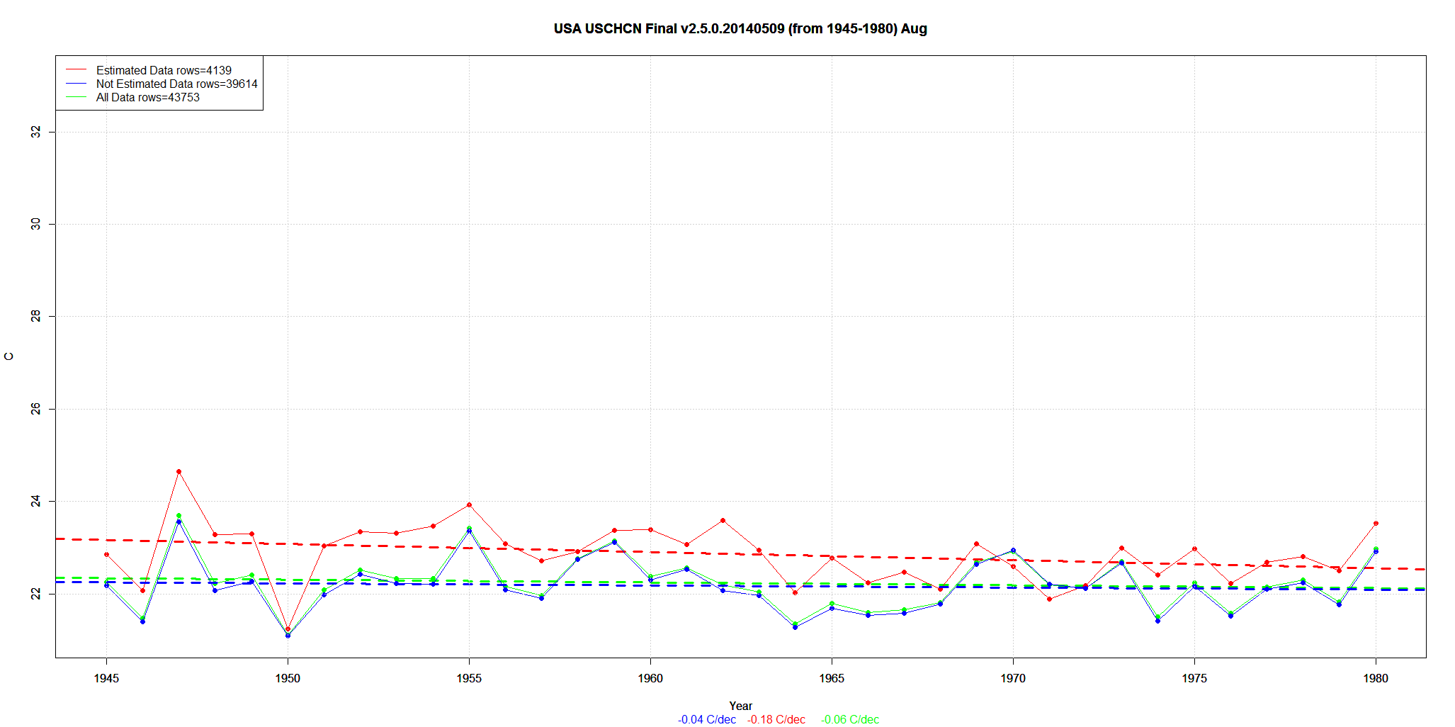
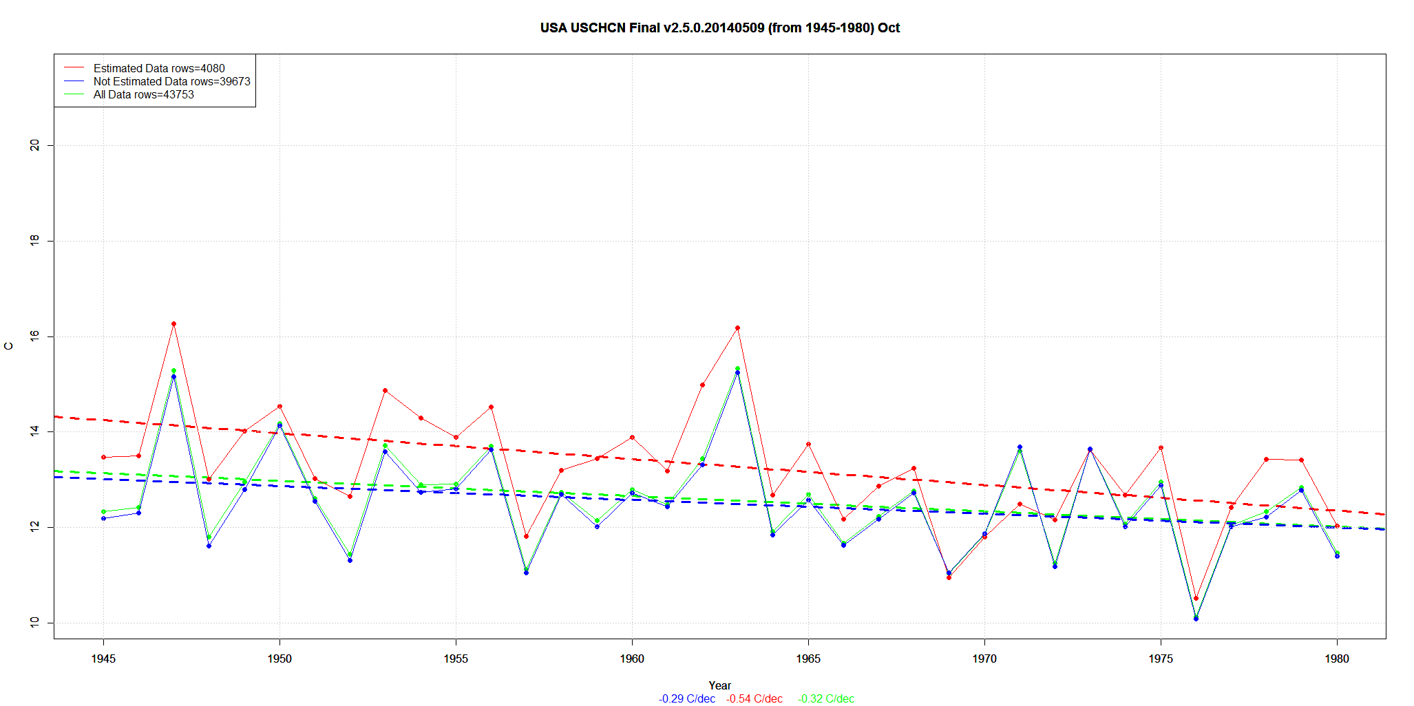
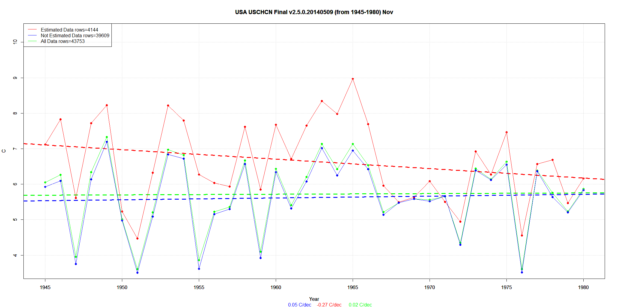
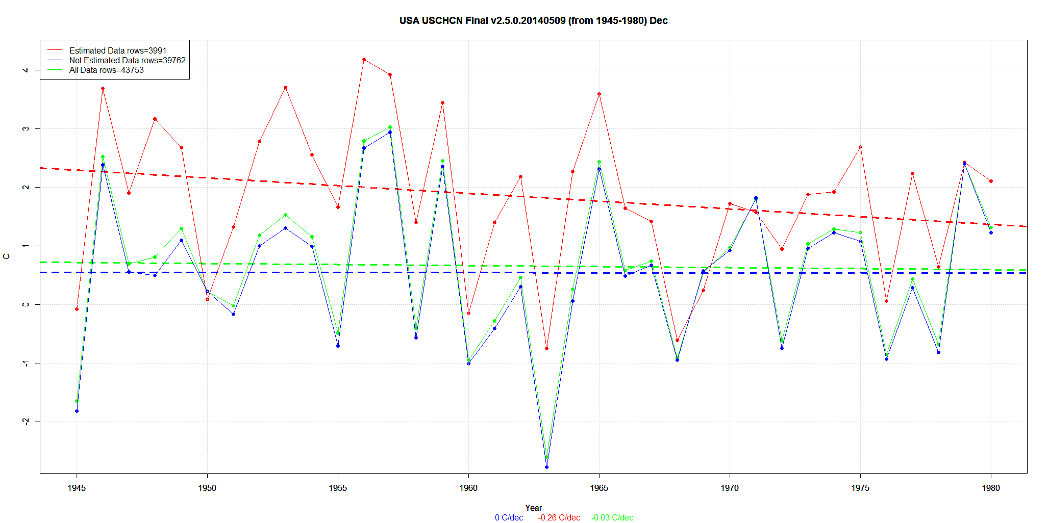
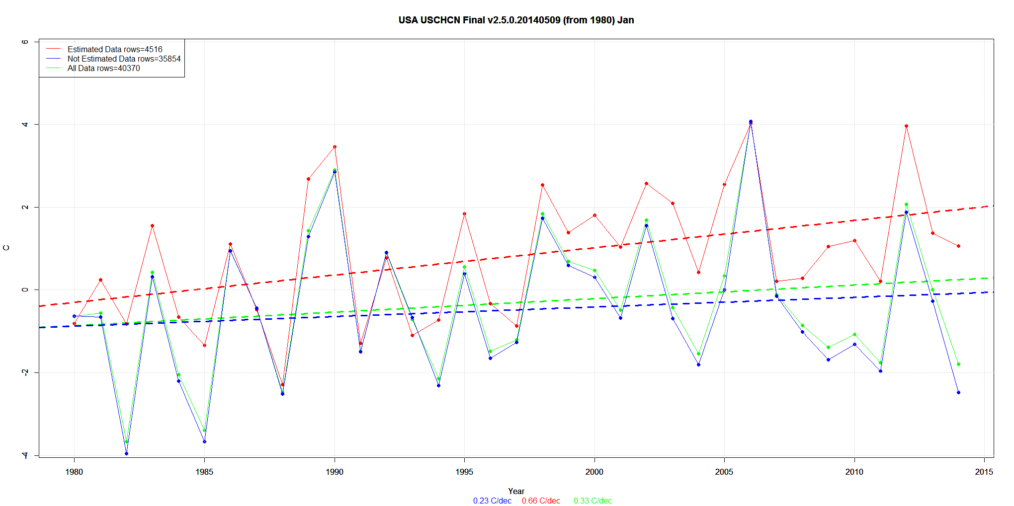
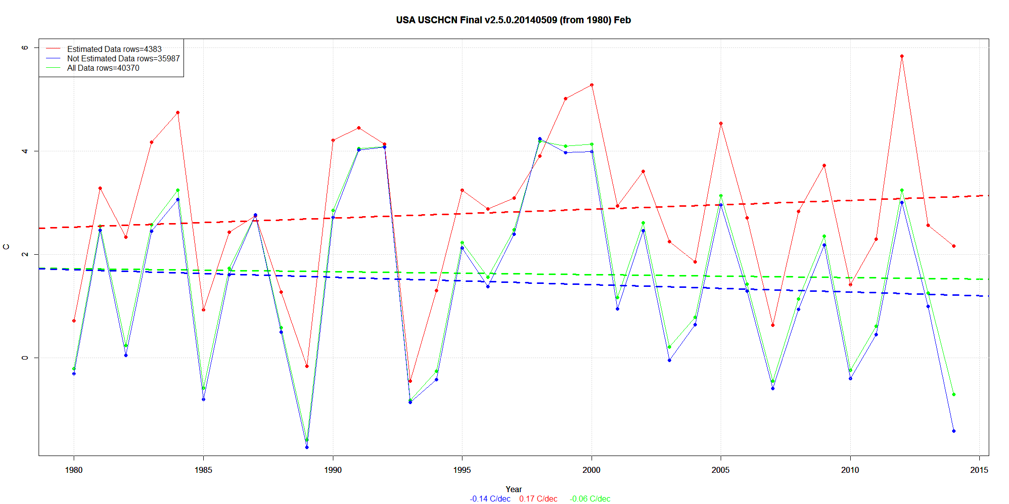
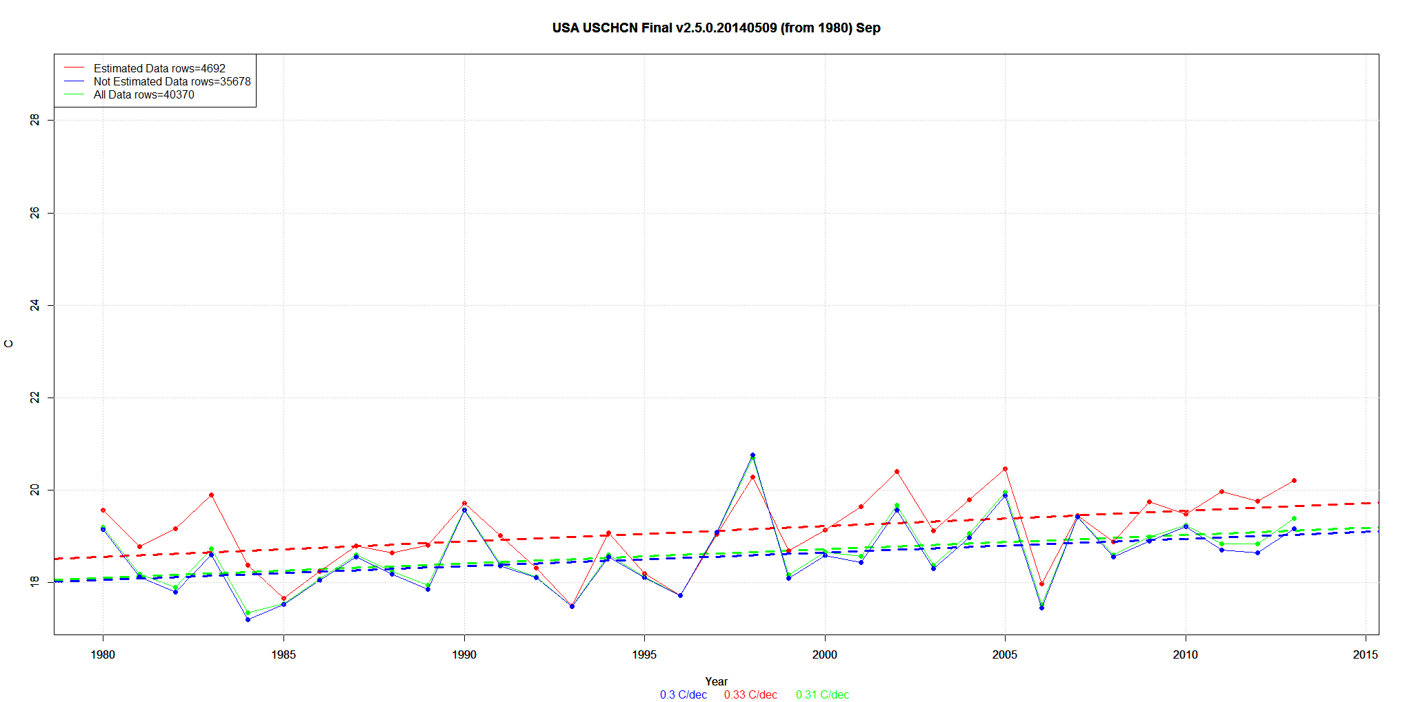
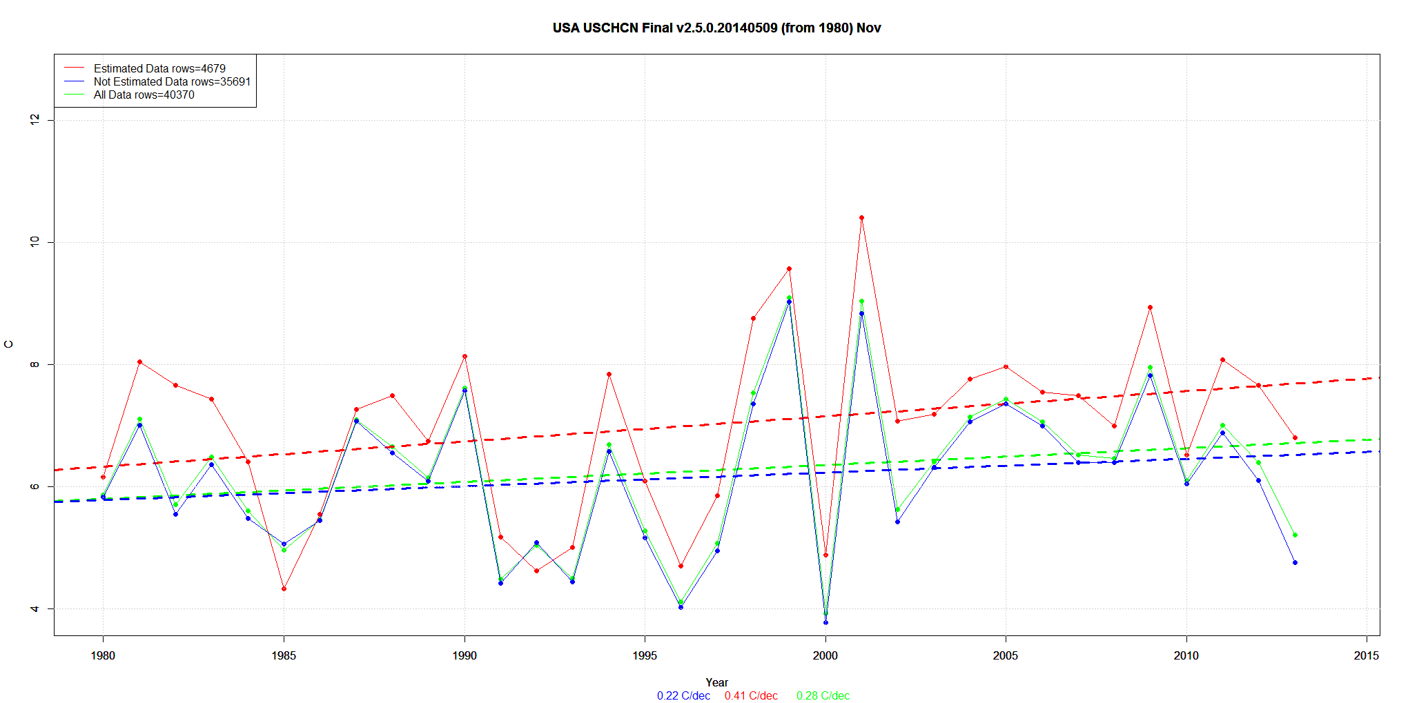
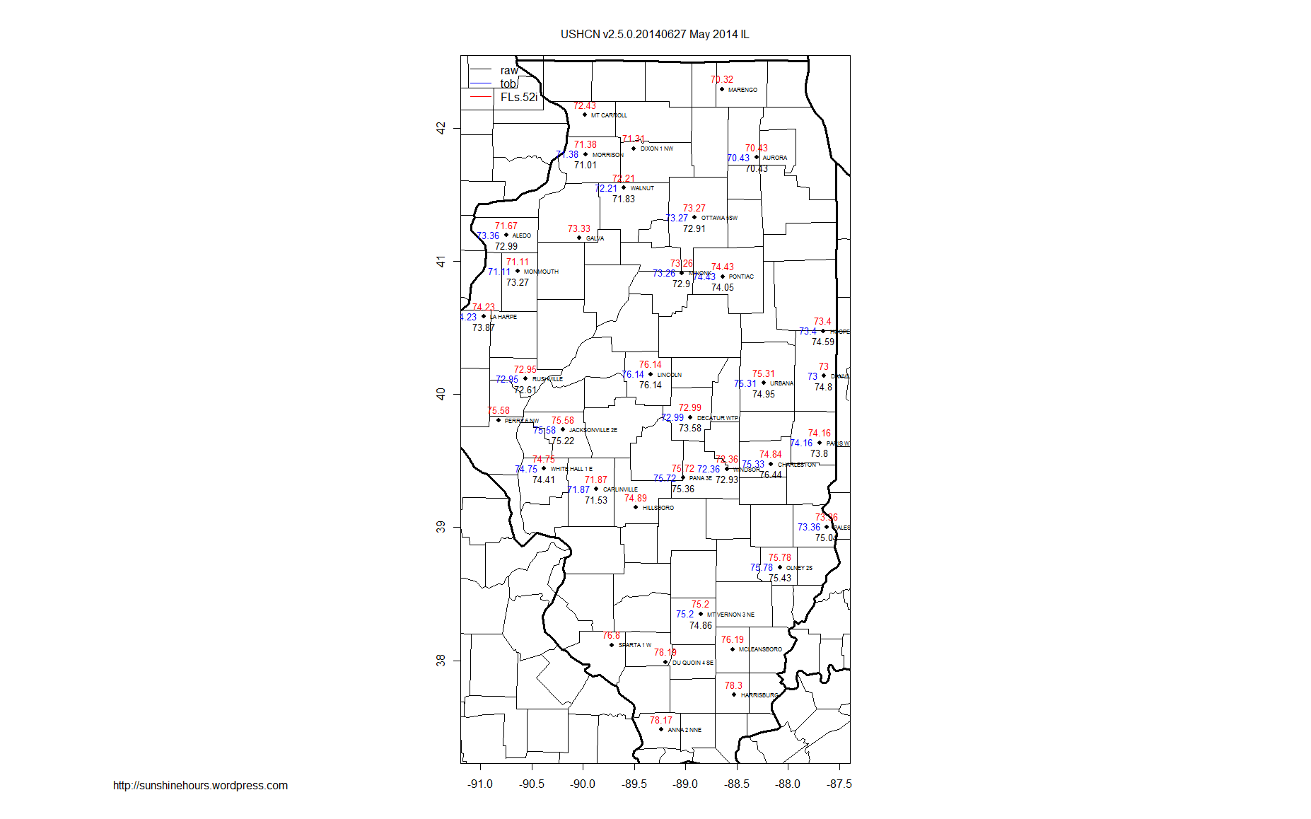
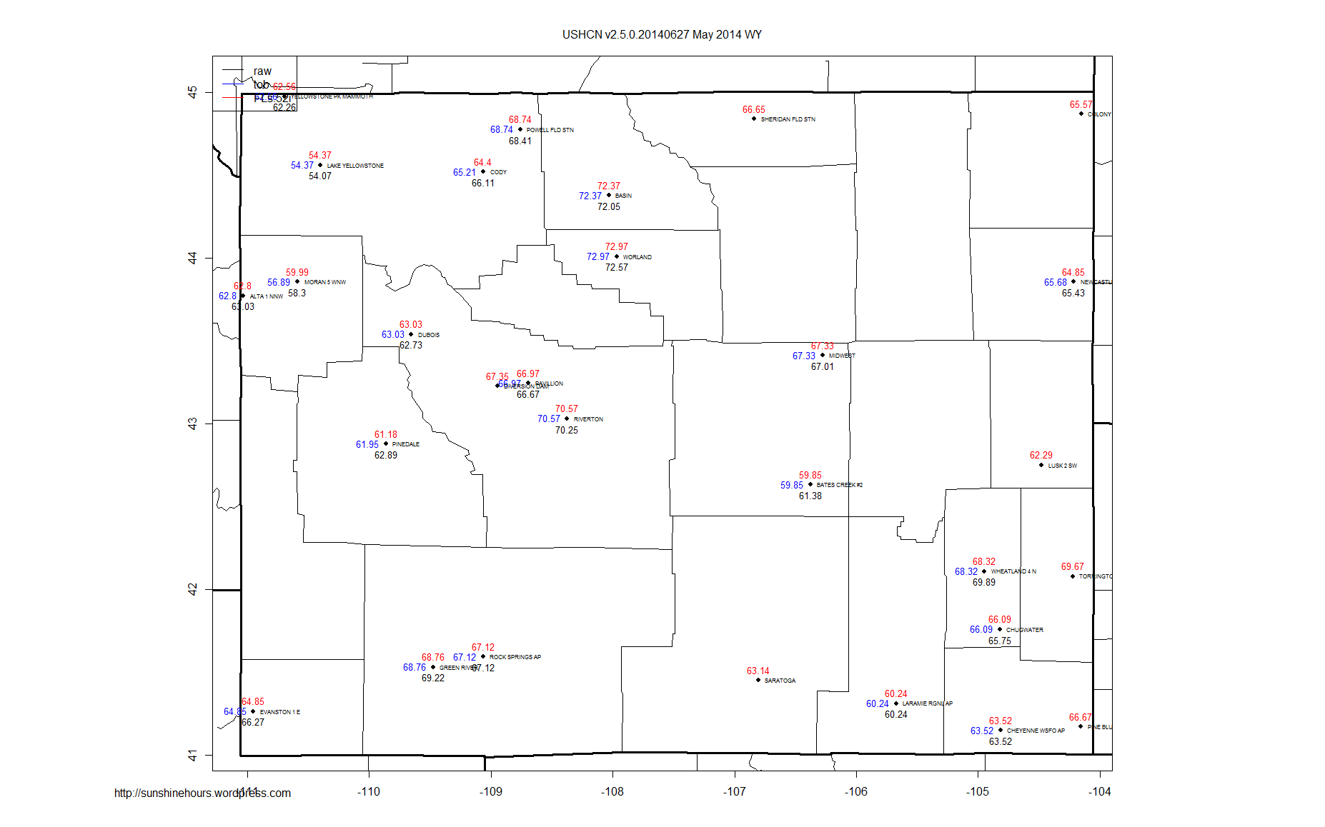
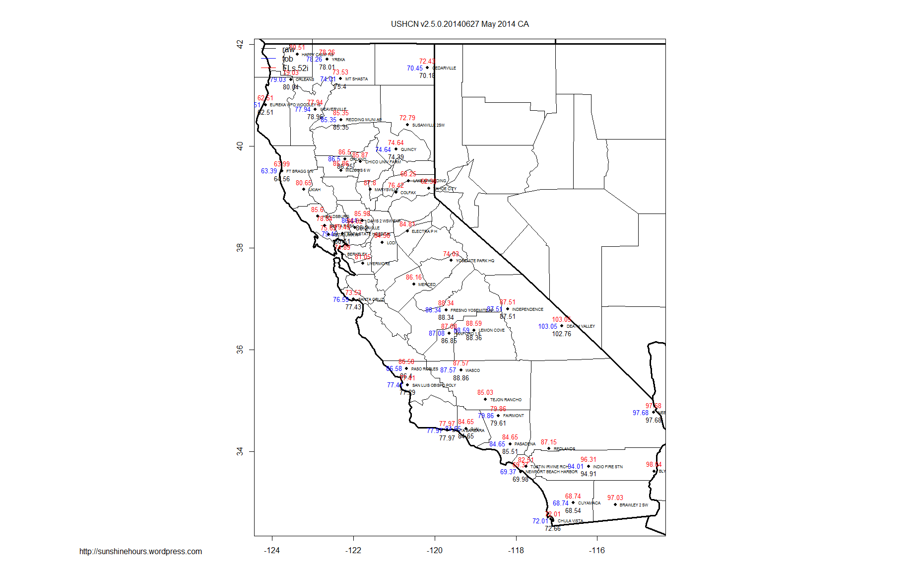
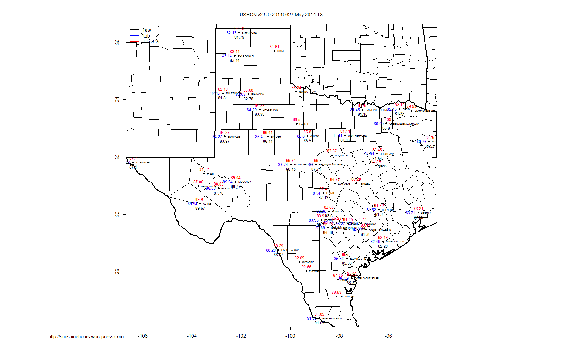
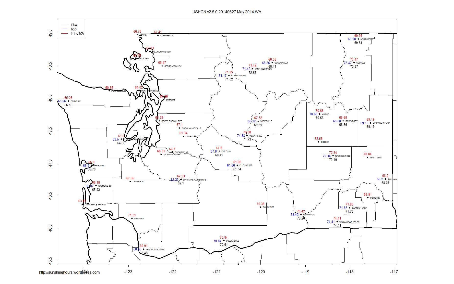
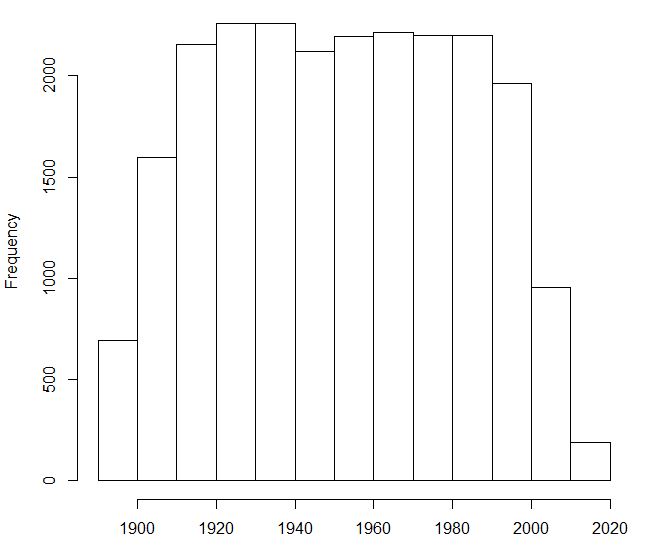
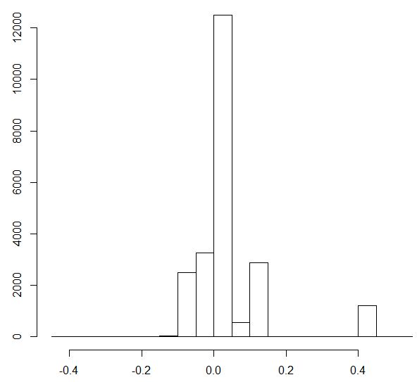
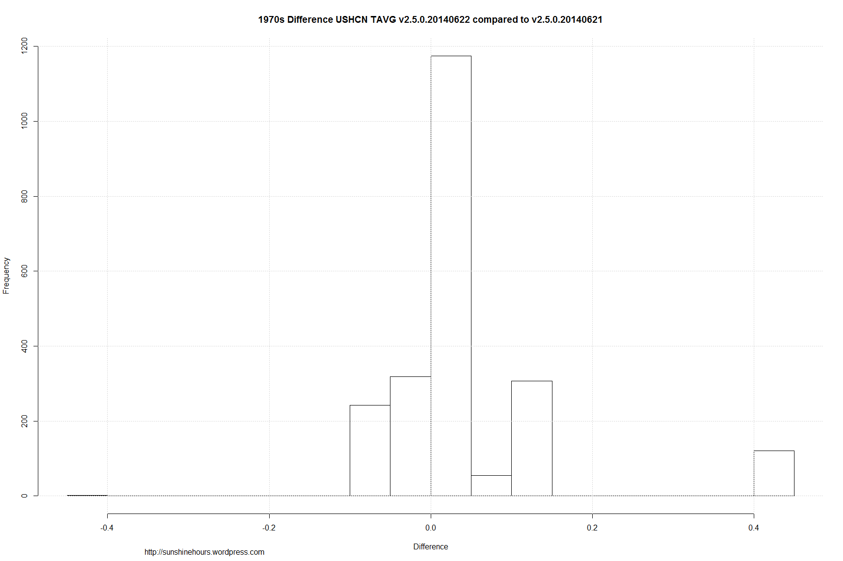
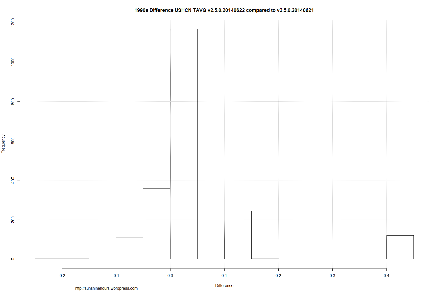
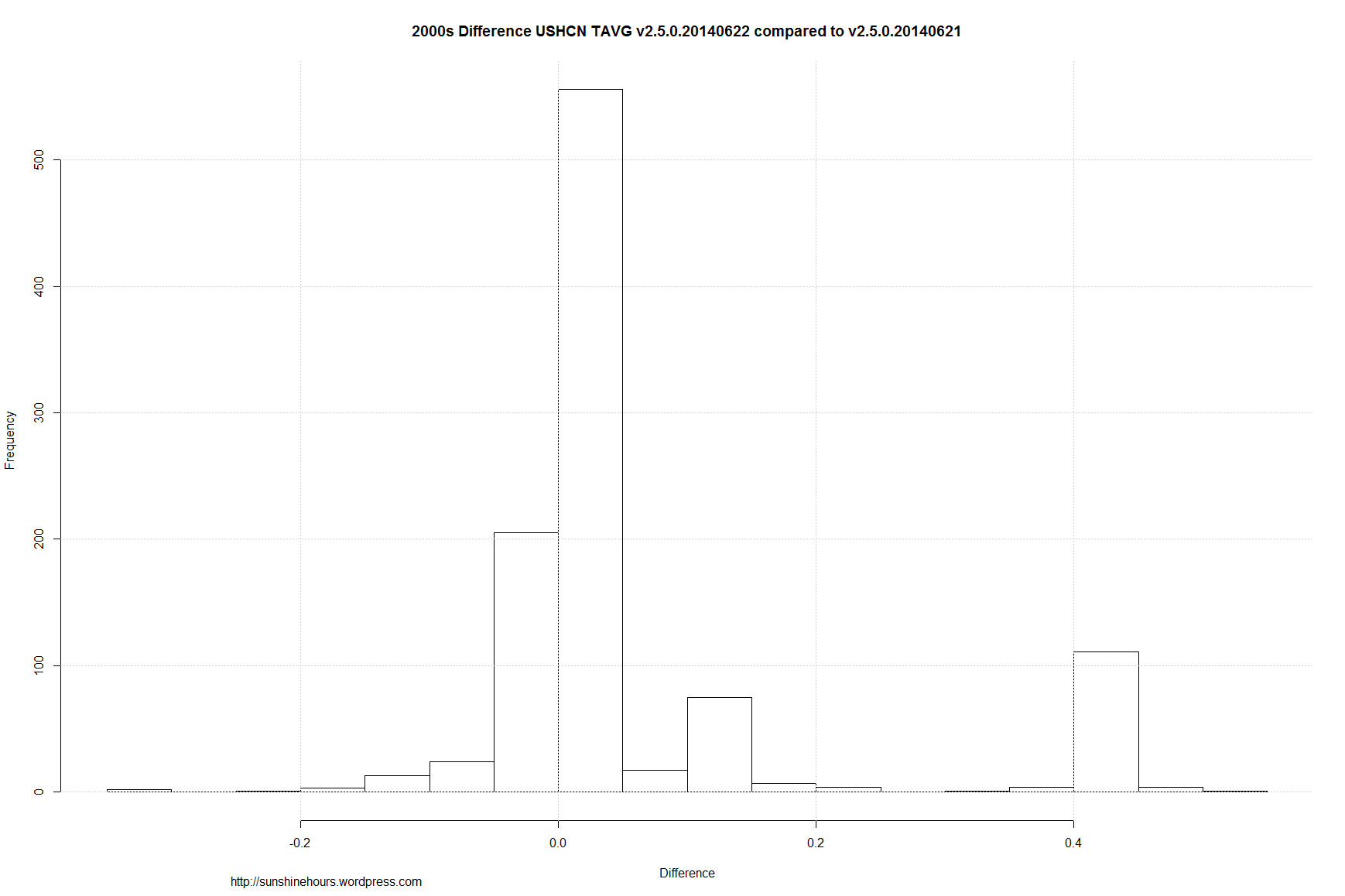
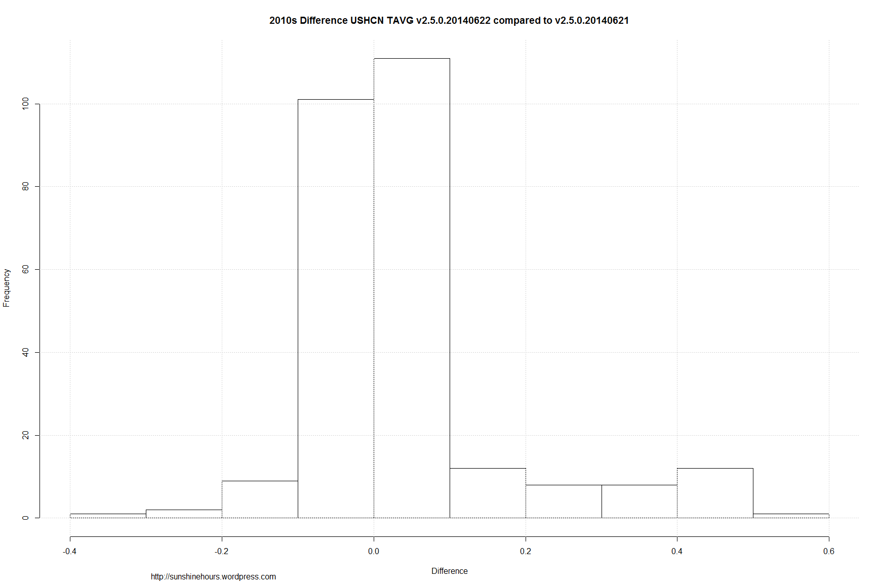
As an example of what infilling does using the difference by station from the 1895-2013 baseline here is Dec 1998 to 2013 Tmax.

In this case, the real data had a downwards trend of -0.82C/decade and the infilled data was -0.64C/decade which is .18C/decade higher not because infilled data was hotter, but because it was less cold.

USA USHCN Final v2.5.0.20140627 - tmax - FLs.52i (from 1998-2013) Dec (Diff From non-Estimated 1895-2013) Climatology

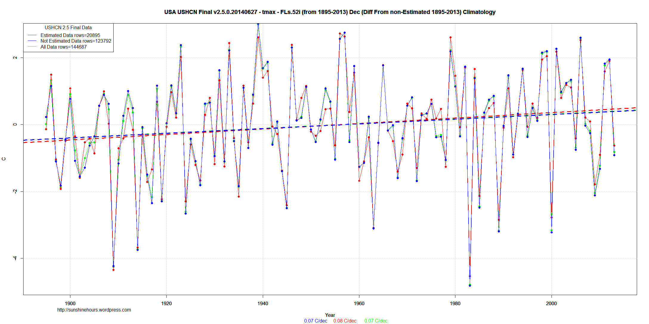
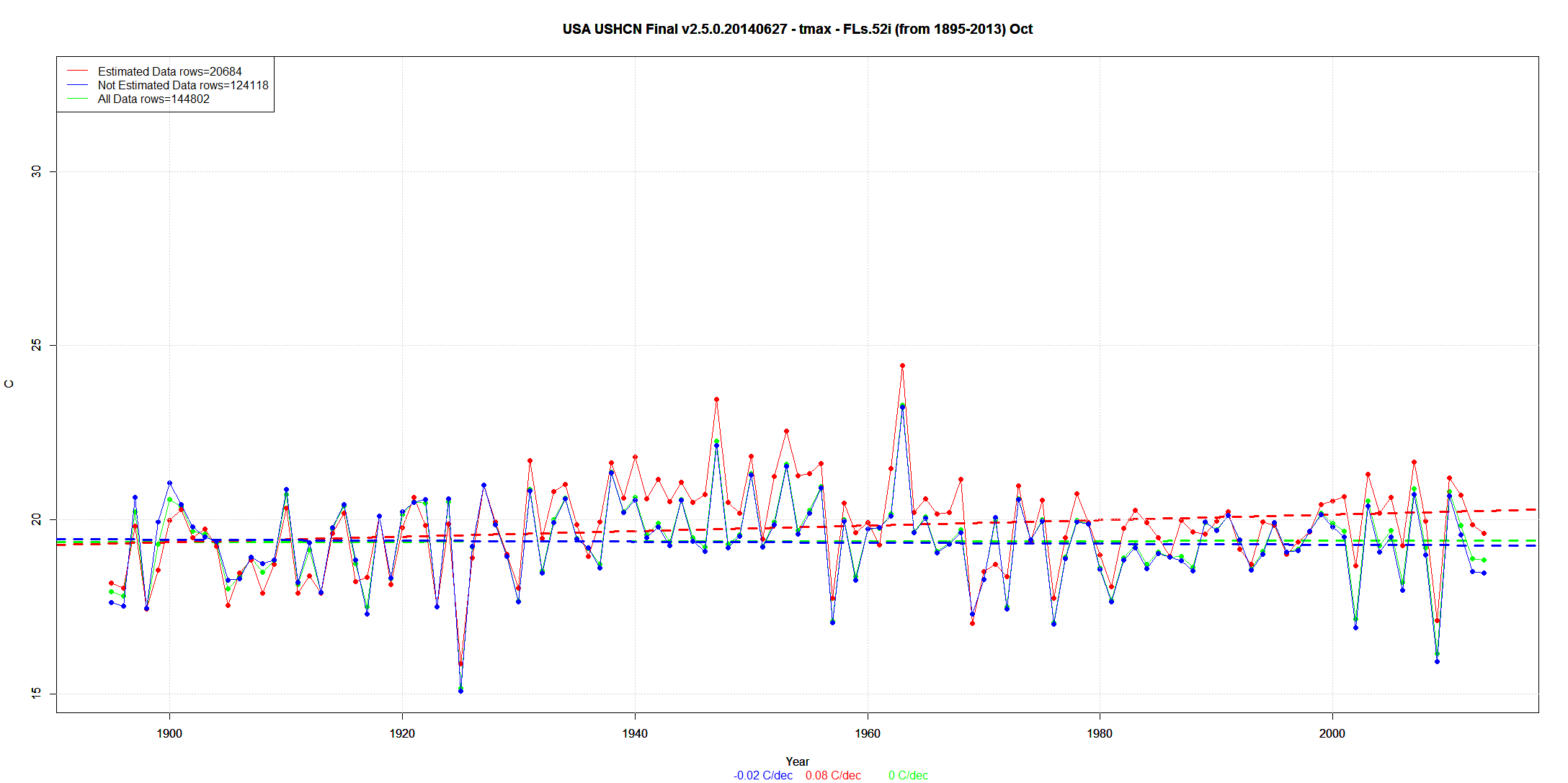
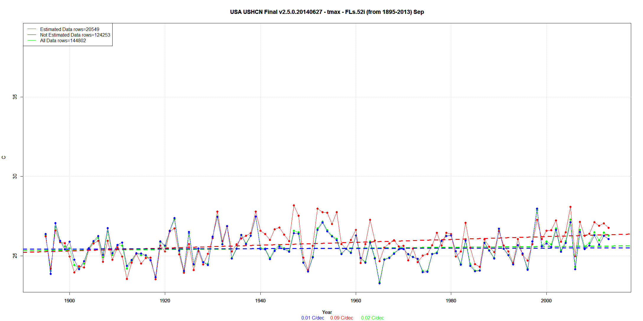
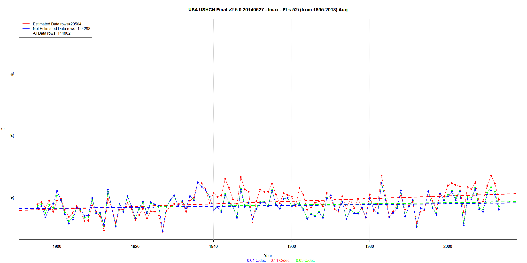
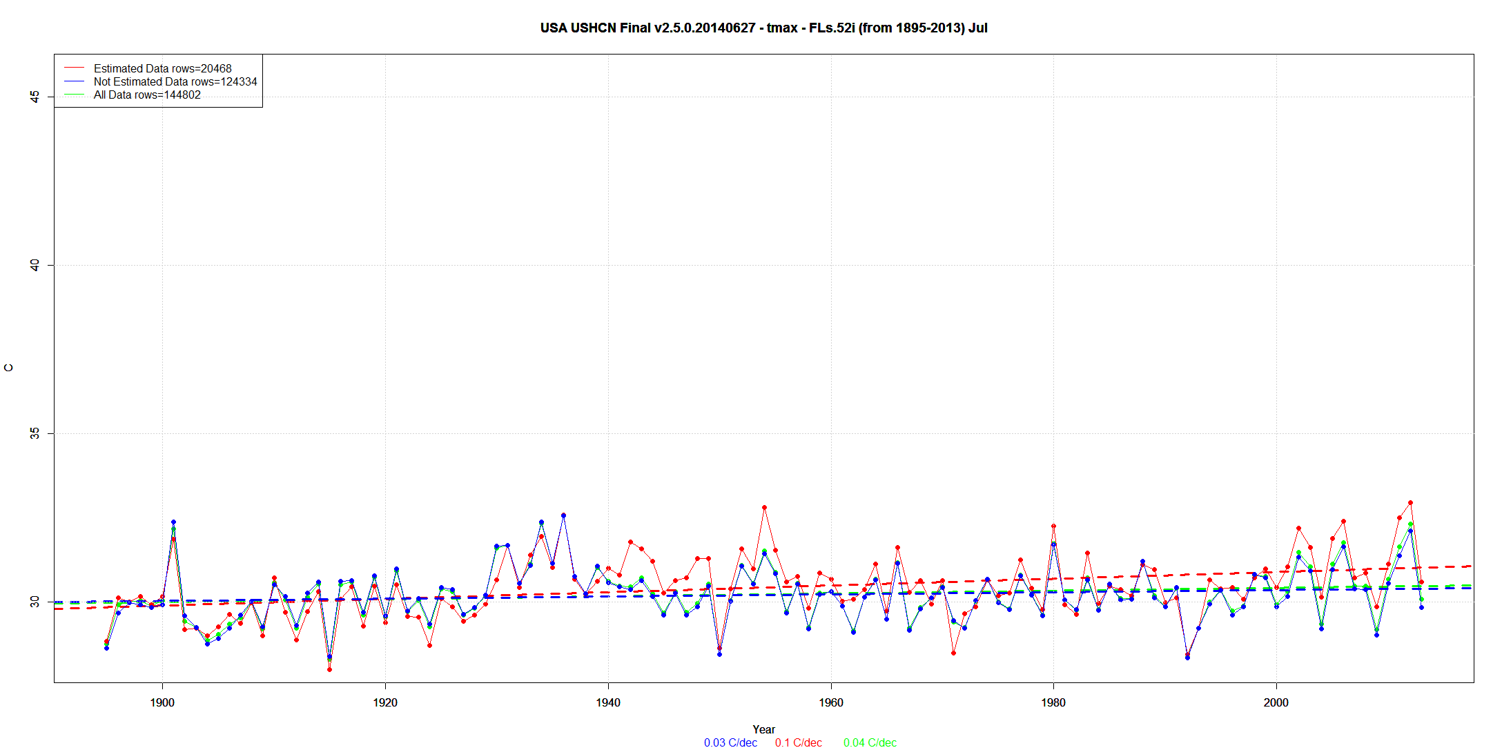
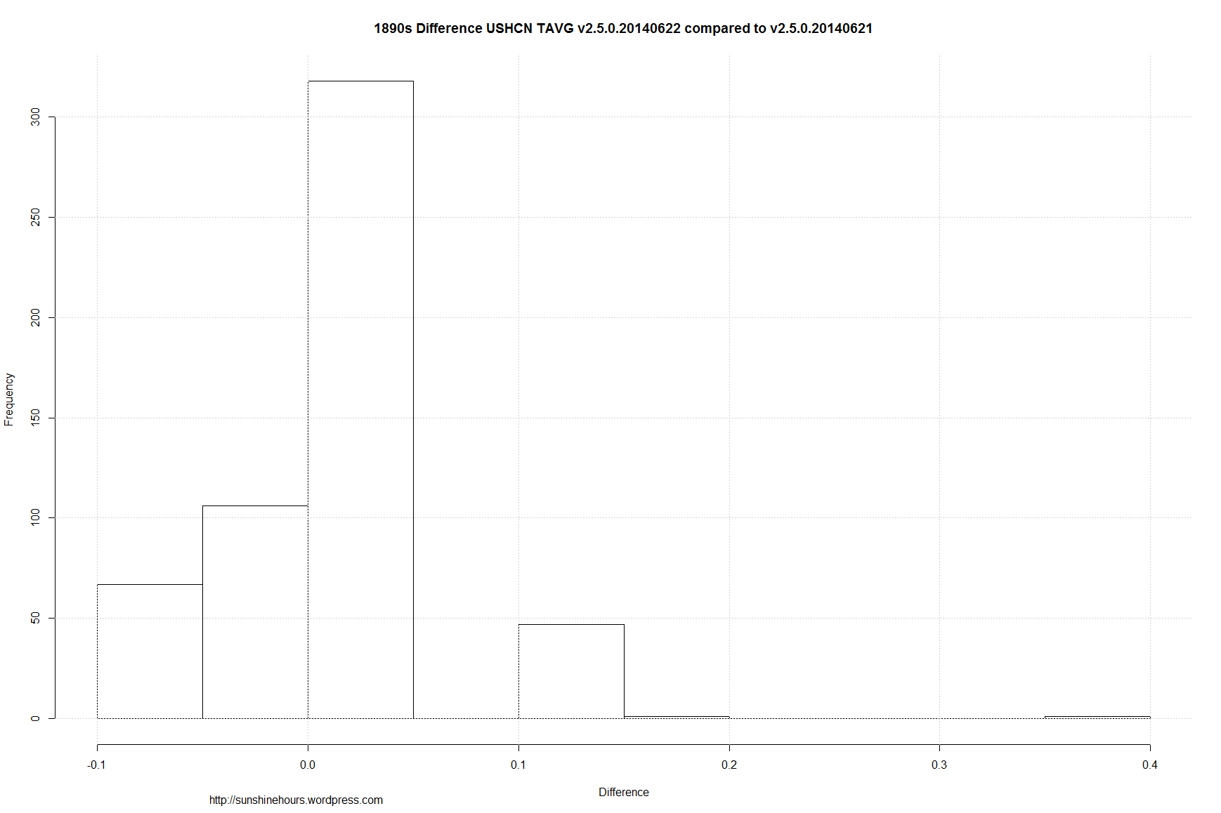
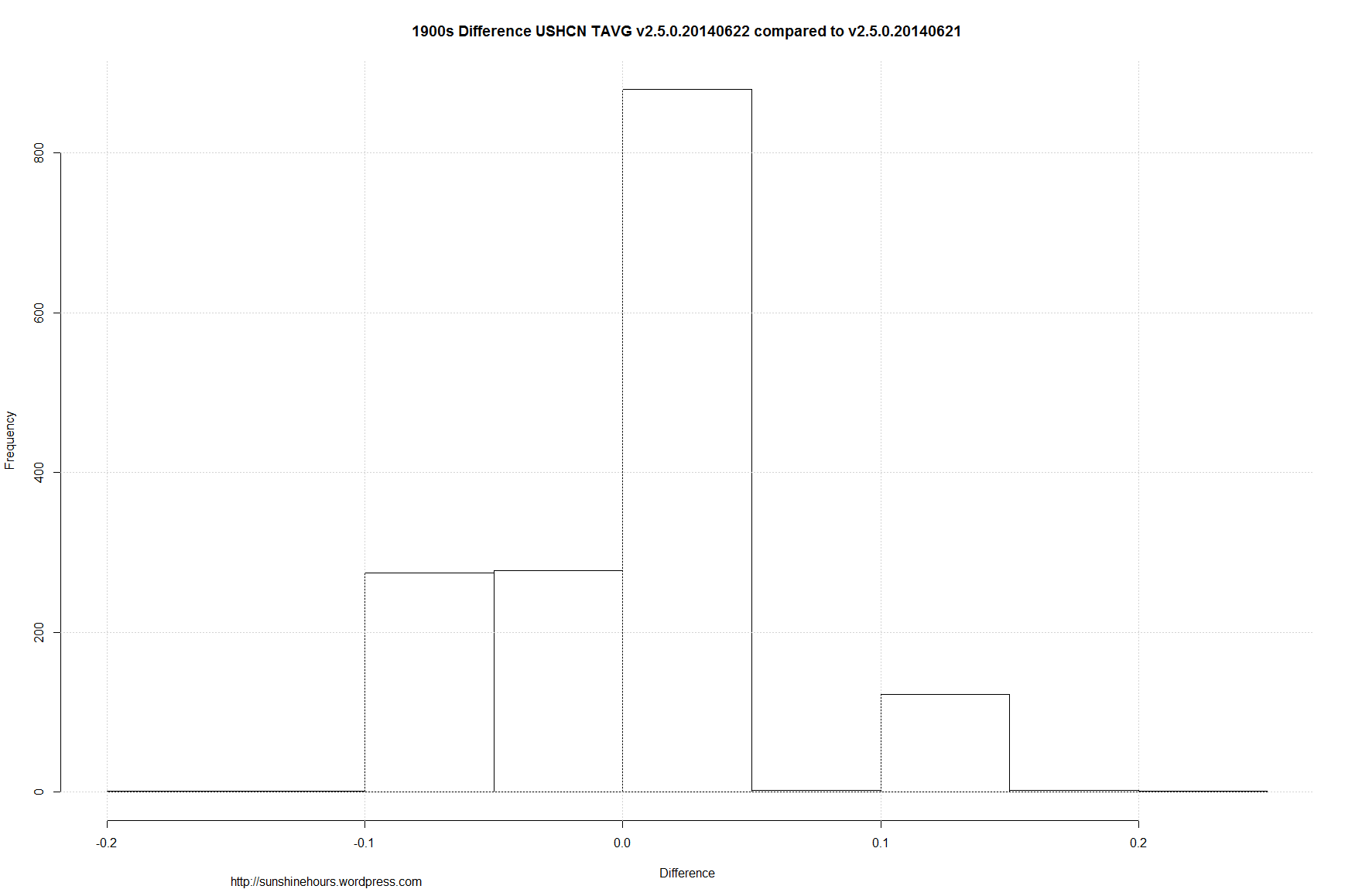
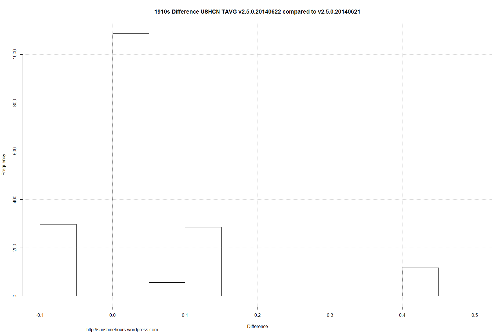
From 1895 to 2013 the infilled trend is consistently .02C/decade to .03C/decade higher than the non-infilled trend.

The red dots are higher on the 1980 and later side of the graph while they are lower on the pre-1960 part of the graph.

Cooling the past, warming the present.


USA USHCN Final v2.5.0.20140627 - tmax - FLs.52i (from 1895-2013) Jul (Diff From non-Estimated 1895-2013) Climatology


USA USHCN Final v2.5.0.20140627 - tmax - FLs.52i (from 1895-2013) Dec (Diff From non-Estimated 1895-2013) Climatology


Misleading Information About USHCN At Judith Curry’s Blog

Zeke has an post over at Judith Curry’s blog where he makes a claim that “infill has no effect on CONUS-wide trends” (among other claims).

Zeke_Infilling_Curry


I disagree. Here are the 12 months comparing Estimated and Non-Estimated and then all the data. Blue = Final data (non-Estimated) Red = Final Data Estimated Green = All Final Data.

Infilling does change the trend. For example, Estimating changed the trend in Dec from .06C per decade to .07C per decade because the Estimated data had a trend of .15C/decade.

USA USHCN Final v2.5.0.20140627 - tmax - FLs.52i (from 1895-2013) Dec

USA USHCN Final v2.5.0.20140627 - tmax - FLs.52i (from 1895-2013) Nov

USA USHCN Final v2.5.0.20140627 - tmax - FLs.52i (from 1895-2013) Oct

USA USHCN Final v2.5.0.20140627 - tmax - FLs.52i (from 1895-2013) Sep

USA USHCN Final v2.5.0.20140627 - tmax - FLs.52i (from 1895-2013) Aug

USA USHCN Final v2.5.0.20140627 - tmax - FLs.52i (from 1895-2013) Jul

USA USHCN Final v2.5.0.20140627 - tmax - FLs.52i (from 1895-2013) Jun

USA USHCN Final v2.5.0.20140627 - tmax - FLs.52i (from 1895-2013) May

USA USHCN Final v2.5.0.20140627 - tmax - FLs.52i (from 1895-2013) Apr

USA USHCN Final v2.5.0.20140627 - tmax - FLs.52i (from 1895-2013) Mar

USA USHCN Final v2.5.0.20140627 - tmax - FLs.52i (from 1895-2013) Feb

USA USHCN Final v2.5.0.20140627 - tmax - FLs.52i (from 1895-2013) Jan

USHCN Tmax – Hottest July Histogram – Raw vs Adjusted

Yesterday I did a post looking at every station and finding out which year had the hottest July. Today I am showing you what effect the adjustments have.

I am using USHCN Final Tmax monthly data and comparing it to the raw data . From the file v2.5.0.20140627. (This is not necessarily all the data NOAA uses)

The format is a little different, but it is designed to allow easy comparison. Red is the raw data. Green is Final and muddy green is where raw and final overlap.

As you can see, the number of years near the present have a lot green. Which means the adjustments created more record hot years.

The 1910s to 1980s have red at the top which indicates raw data. Translation: More record July’s occurred in the past using raw data.

For the Coldest July data, the results are the opposite. Adjusting creates more colder July’s in the past and takes away cold July’s from the present.


USHCN Tmax - raw and Final - Hottest July

USHCN Tmax - raw and Final - Coldest July

USHCN Tmax – Coldest and Hottest July Histogram Will Surprise You!

The other day I noted that NOAA had July 1936 back on top. Now don’t take this post as an endorsement of the adjustments and infilling, but I thought I would check which years did stations set their hottest July and coldest July.

I am using USHCN Final Tmax monhtly data . From the file v2.5.0.20140627. (This is not necessarily all the data NOAA uses)

I don’t think the histogram of the hottest July will actually be a surprise. 216 stations had their hottest July in 1936.

But the coldest July histogram will surprise you. 1992 and 1993 tied with 148 stations each having the coldest July. A small subset of the stations at bottom.

USHCN Tmax Final Hottest July

USHCN Tmax Final Coldest July

I just picked the top 15 stations with the coldest July in 1992 and the hottest July in 1936. There are 92. The temperatures are in Celsius.

STATE Station NAME Coldest_Year Coldest_July Hottest_Year Hottest_July
IA USH00130133 ALGONA 3 W 1992 23.22 1936 35.98
IA USH00131402 CHARLES CITY 1992 24.18 1936 34.5
IA USH00132724 ESTHERVILLE 2 N 1992 23.06 1936 35.82
IA USH00132977 FOREST CITY 2 NNE 1992 23.69 1936 35.72
IA USH00132999 FORT DODGE 5NNW 1992 24.73 1936 36.1
IA USH00134063 INDIANOLA 2W 1992 26.57 1936 37.13
IA USH00134894 LOGAN 1992 26.56 1936 39.88
IA USH00135952 NEW HAMPTON 1992 23.38 1936 35.31
IA USH00137147 ROCK RAPIDS 1992 23.96 1936 37.48
IA USH00137161 ROCKWELL CITY 1992 24.81 1936 36.69
IA USH00137979 STORM LAKE 2 E 1992 23.85 1936 36.54
IA USH00138296 TOLEDO 3N 1992 24.82 1936 35.34
IL USH00115326 MARENGO 1992 24.66 1936 33.89
IL USH00118916 WALNUT 1992 24.94 1936 36.2
IN USH00122149 DELPHI 2 N 1992 26.5 1936 36.38

Here are a sample of 15 that have neither.

STATE Station NAME Coldest_Year Coldest_July Hottest_Year Hottest_July
AL USH00011084 BREWTON 3 SSE 1989 30.77 1902 36.71
AL USH00012813 FAIRHOPE 2 NE 1928 30.05 2000 34.93
AL USH00013160 GAINESVILLE LOCK 1916 30.25 1952 37.26
AL USH00013511 GREENSBORO 1967 28.49 1901 35.09
AL USH00015749 MUSCLE SHOALS AP 1967 29.59 1930 36.57
AL USH00017157 SAINT BERNARD 1967 27.33 1952 35.2
AL USH00017304 SCOTTSBORO 1906 29.21 1980 35.86
AL USH00017366 SELMA 1916 28.1 2000 36.65
AL USH00018178 THOMASVILLE 1916 29.87 1930 36.35
AL USH00018380 TUSCALOOSA ACFD 1889 29.5 1930 37.77
AL USH00018469 VALLEY HEAD 1967 28.31 1930 36.48
AR USH00031596 CONWAY 1989 27.83 1954 38.96
AR USH00031632 CORNING 1905 29.14 1930 38.45
AR USH00032356 EUREKA SPRINGS 3 WNW 1950 27.51 1980 38.65
AR USH00032444 FAYETTEVILLE EXP STN 1950 27.86 1954 38.03

USHCN 2.5 – Kansas Mapped – July 1936 and 2012

UPDATE:  I am adding the following means:

1936 raw / tobs / final mean = 101.47 / 100.83 / 100.32

2012 raw / tobs/ final mean = 99.57 / 99.66 / 99.48

Original Start of post:

I’ve been doing posts about USCHN and Estimated data. I wanted to visualize.

This is the USHCN July 1936 and 2012 TMAX data for Kansas.

Form the most part, in July 1936 the red data (Final) is colder than the raw temperatures (black) and in 2012 it is the other way around.

The data is in F (originally in C so there may be very slight conversion issues).

Black temperatures are raw, blue are TOBS and red are Final adjusted. Stations with just a red have no raw data. The data is just ‘E’stimated.

Click for full size.

USHCN Tmax v2.5.0.20140627 - Jul 1936 - KS

USHCN Tmax v2.5.0.20140627 - Jul 2012 - KS

USHCN 2.5 – Estimated Data Is Warming Data – USA 1945 to 1980

I’ve been posting on USHCN and the effect of “estimating” or “Infilling” on  the Final data.

Earlier today I showed that Estimating/Infilling made the 1980-2014 trend steeper upwards.

Now I will show the opposite: When the trend is down, infilling makes the trend steeper downwards.

I repeat … this is the Final data after all the other adjustments. About 15% of the data is Estimated from neighboring stations.

I will post all the monthly graphs … but just discuss the first – January.

The data is 1945 to 1980. So it covers a period of cooling.

The trend of REAL data is –0.58C/decade. That’s the 39,766 values referenced in the legend.

Then they add in about 15% Estimated data with a trend of  -0.79C/decade. That’s the 3987 values.

The net result is a new trend of -0.61C/decade.

Presto. Magic. A -0.58C trend is now a -0.61C trend.

Not a big change. But it is always there.  But the red line is almost always well above the others. Sometimes by 2C.

(Click on graphs for larger).

USA USCHCN Final v2.5.0.20140509 (from 1945-1980) Jan

USA USCHCN Final v2.5.0.20140509 (from 1945-1980) Feb

USA USCHCN Final v2.5.0.20140509 (from 1945-1980) Mar

USA USCHCN Final v2.5.0.20140509 (from 1945-1980) Apr

USA USCHCN Final v2.5.0.20140509 (from 1945-1980) May

USA USCHCN Final v2.5.0.20140509 (from 1945-1980) Jun

USA USCHCN Final v2.5.0.20140509 (from 1945-1980) Jul

USA USCHCN Final v2.5.0.20140509 (from 1945-1980) Aug

USA USCHCN Final v2.5.0.20140509 (from 1945-1980) Sep

USA USCHCN Final v2.5.0.20140509 (from 1945-1980) Oct

USA USCHCN Final v2.5.0.20140509 (from 1945-1980) Nov

USA USCHCN Final v2.5.0.20140509 (from 1945-1980) Dec

USHCN 2.5 – Estimated Data Is Warming Data – USA 1980 – 2014

I’ve been posting on USHCN and the effect of “estimating” or “Infilling” on  the Final data. I did Arizona earlier.

I repeat … this is the Final data after all the other adjustments. About 15% of the data is Estimated from neighboring stations.

I will post all the monthly graphs … but just discuss the first – January.

The data is 1980 to 2014. So it has the 1980-1990 warming trend in it.

The trend of REAL data is 0.23C/decade. That’s the 35,854 values referenced in the legend.

Then they add in about 15% Estimated data with a trend of  +0.66C/decade. That’s the 4516 values.

The net result is a new trend of +0.33C/decade.

Presto. Magic. A .23C trend is now a .33C trend. (Click on graphs for larger).

USA USCHCN Final v2.5.0.20140509 (from 1980) Jan

USA USCHCN Final v2.5.0.20140509 (from 1980) Feb

USA USCHCN Final v2.5.0.20140509 (from 1980) Mar

USA USCHCN Final v2.5.0.20140509 (from 1980) Apr

USA USCHCN Final v2.5.0.20140509 (from 1980) May

USA USCHCN Final v2.5.0.20140509 (from 1980) Jun

USA USCHCN Final v2.5.0.20140509 (from 1980) Jul

USA USCHCN Final v2.5.0.20140509 (from 1980) Aug

USA USCHCN Final v2.5.0.20140509 (from 1980) Sep

USA USCHCN Final v2.5.0.20140509 (from 1980) Oct

USA USCHCN Final v2.5.0.20140509 (from 1980) Nov

USA USCHCN Final v2.5.0.20140509 (from 1980) Dec

USHCN 2.5 – OMG … The Old Data Changes Every Day (Mapped)

Update: I added a few other states

I’ve been doing posts about USCHN and Estimated data. I wanted to visualize.

This is the USHCN May 2014 TMAX data for Illinois.

The data is in F (originally in C so there may be very slight conversion issues).

Black temperatures are raw, blue are TOBS and red are Final adjusted. Stations with just a red have no raw data. The data is just ‘E’stimated.

Click for full size.

USHCN v2.5.0.20140627 May 2014 IL


A few other states:

USHCN v2.5.0.20140627 May 2014 WY USHCN v2.5.0.20140627 May 2014 CA USHCN v2.5.0.20140627 May 2014 TX USHCN v2.5.0.20140627 May 2014 WA

USHCN 2.5 – OMG … The Old Data Changes Every Day Updated

UPDATE: I got a request for a histogram by Decade for the differences. I have attached them at the bottom.

A few days ago I did a post about the USHCN data changing every day. I focused on one month of one year,

So this is a stats update. From Jun 21 2014 to Jun 22 2014 the TAVG data had 22,996 temperature values changed (out of 138136)

The changes were spread out through the years.  And the change was predominantly to warm the data.

This is a histogram of the Year.


june21_22_2014_tavg_hist_year

This is a histogram of the change. (The right side of 0 says the data got warmer)


june21_22_2014_tavg_hist_dif


1890s Difference USHCN TAVG v2.5.0.20140622 compared to v2.5.0.20140621

1900s Difference USHCN TAVG v2.5.0.20140622 compared to v2.5.0.20140621

1910s Difference USHCN TAVG v2.5.0.20140622 compared to v2.5.0.20140621

1920s Difference USHCN TAVG v2.5.0.20140622 compared to v2.5.0.20140621

1930s Difference USHCN TAVG v2.5.0.20140622 compared to v2.5.0.20140621

1940s Difference USHCN TAVG v2.5.0.20140622 compared to v2.5.0.20140621 < a href=”https://sunshinehours.files.wordpress.com/2014/06/1950s-difference-ushcn-tavg-v2-5-0-20140622-compared-to-v2-5-0-20140621.png”&gt;1950s Difference USHCN TAVG v2.5.0.20140622 compared to v2.5.0.20140621

1960s Difference USHCN TAVG v2.5.0.20140622 compared to v2.5.0.20140621

1970s Difference USHCN TAVG v2.5.0.20140622 compared to v2.5.0.20140621

1980s Difference USHCN TAVG v2.5.0.20140622 compared to v2.5.0.20140621

1990s Difference USHCN TAVG v2.5.0.20140622 compared to v2.5.0.20140621

2000s Difference USHCN TAVG v2.5.0.20140622 compared to v2.5.0.20140621

2010s Difference USHCN TAVG v2.5.0.20140622 compared to v2.5.0.20140621

USHCN Only 51 Stations Have A Full Set Of Monthly Data For 1961-1990

UPDATE: Published. Not in moderation.

Over at WUWT I have a couple of comments in moderation in the argument about US climate data. This one of them (slightly clarified).


Zeke is quoted: “The way that NCDC, GISS, Hadley, myself, Nick Stokes, Chad, Tamino, Jeff Id/Roman M, and even Anthony Watts (in Fall et al) all calculate temperatures is by taking station data, translating it into anomalies by subtracting the long-term average for each month from each station (e.g. the 1961-1990 mean)”

To create a 1961-1990 baseline, you would have 360 monthly values.

The USHCN monthly data has error flags. The E flag means the data for that month is Estimated. There is not enough daily data to created a monthly value.

There are ONLY 51 stations that had 360 values without an E flag from 1961-1990.

That means only 51 out of 1218 stations have relatively complete data to use as a baseline.


WY MORAN 5 WNW USH00486440 is one of the 51

WY NEWCASTLE USH00486660 is one that failed. 61 months of the 360 had an E flag. (Admittedly my comment had a typo over at WUWT).

And I just looked at the E flag. There lots of other flags.


Here is the other comment:


Anthony, you should double check Zeke’s work.

Using USHCN Final Tavg dated v2.5.0.20140622

July 2012 – 880 Stations have data without the E for Estimated flag.

There are 1218 stations.

27% of the July 2012 Stations are missing data.

July of 1895 has 472 station reporting Real (non-Estimated) data

61%. of the July 1895 stations are missing data.

Now remember, I am only look at the monthly records. Monthly records avoid the E flag if there are enough daily data. It doesn’t mean there is data for every day.