UPDATE: The original version of this post had the y axis going from -1 to 1. I’ll leave those graphs at the bottom.
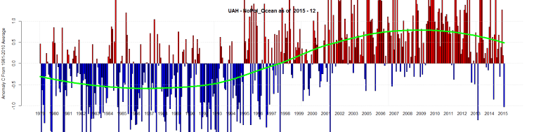
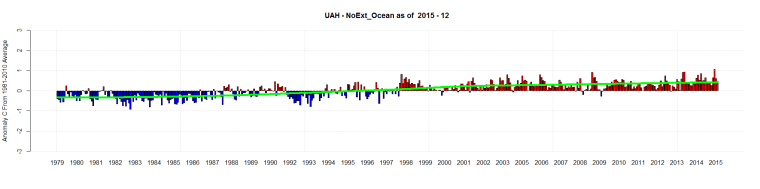
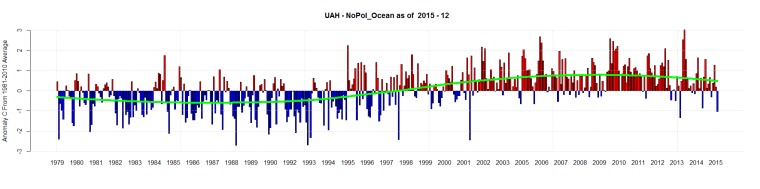
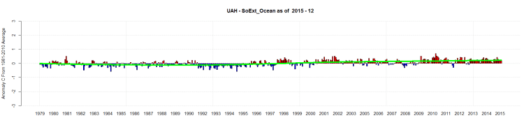
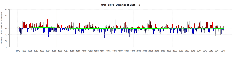
The new graphs have -3 to 3. Notice how much the NoPol Ocean temperatures fluctuate compared to the other 3 regions.
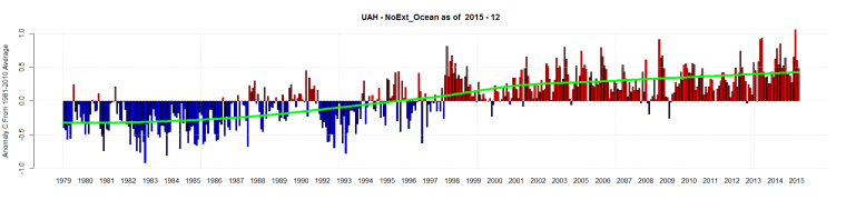
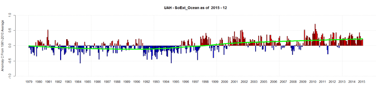
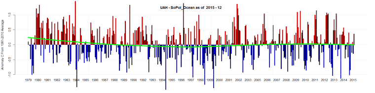
UAH for December 2015 is out.
Here is the South and North Pole Ocean Data plus the Southern and Northern Extent Ocean Data
Original graphs: