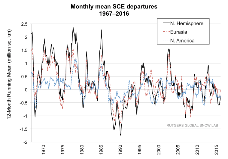
These graphs are NH only.
Its a pity Rutgers graphing script can’t spell Hemisphere.
But …
Fall up 1,500,000 sq km
Winter up 900,000 sq km
Spring down 3,000,000

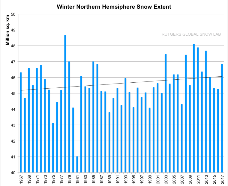
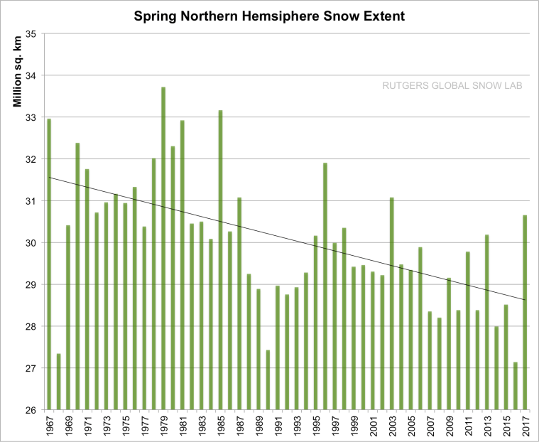
https://climate.rutgers.edu/snowcover/index.php
These graphs are NH only.
Its a pity Rutgers graphing script can’t spell Hemisphere.
But …
Fall up 1,500,000 sq km
Winter up 900,000 sq km
Spring down 3,000,000
https://climate.rutgers.edu/snowcover/index.php

Interesting…
Very basic question: what conclusion can be gleaned from these graphs which clearly show an upward trend in fall SCE and a decline in spring SCE? If you look at the “preferable” colder 1967-1985 period, snow came later but also melted later. In the more recent “warmer” 1995-2016 period, the reverse is true: snow comes earlier but also melts sooner. I don’t see any evidence of an overall warming climate in those truths, only that a shift has occurred—but one that, on the whole, averages out. Perhaps a graph demonstrating the SCE with overall length of time might yield some interesting data, but I am guessing not a whole lot.
I think it says 47 years of data is not enough when cycles are 66/70/100 years or more.
I will in the future graph the data against PDO/AMO/ENSO.
Reblogged this on Climate Collections.