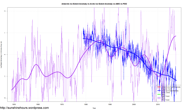
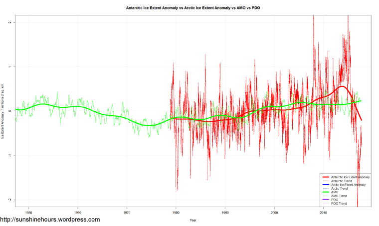
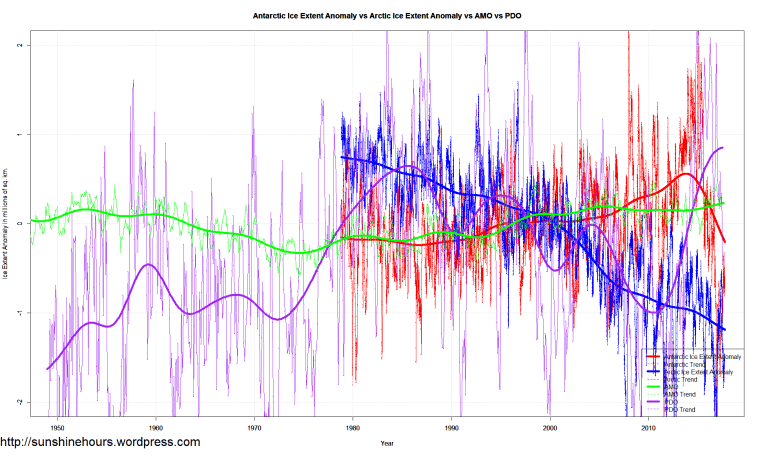
The graphs start from 1950 to show a full 66 year cycle of the PDO and AMO.
I’m graphing anomalies from the mean for all. Sea Ice is in millions of sq km.
PDO versus Arctic Extent – note that the satellite record for sea ice starts at peak of PDO
AMO versus Antarctic Extent
Everything

Reblogged this on Climate Collections.