Due to the government shutdown, sea ice extent data was unavailable for about 20 days. It is now available again here.
It appears that for the last 11 days Arctic Sea Ice Extent has been within one standard deviation. Not much of a death spiral.

Due to the government shutdown, sea ice extent data was unavailable for about 20 days. It is now available again here.
It appears that for the last 11 days Arctic Sea Ice Extent has been within one standard deviation. Not much of a death spiral.
“Climate change has forced professional snowboarder Forrest Shearer to go on the run. Over the past decade he’s seen the winter decrease from a six-month season (November to April) to a three-month season (January to March), so he has to travel to find the winter, wherever it may be. “Before we could go in our backyard,” says Shearer, a resident of Utah who has appeared in and worked on numerous snowboarding films. ”
http://www.sikids.com/athletes-give-back/winter-athletes-climate-change
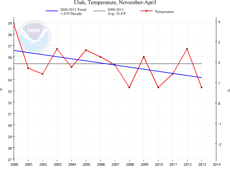
For the last 10 years (According to the NOAA) November to April temperatures in Utah fell -2F.

The highest mark for temperature was 2000.
The Canadian side of the Northwest Passage appears closed due to ice at both ends. Read about it here.
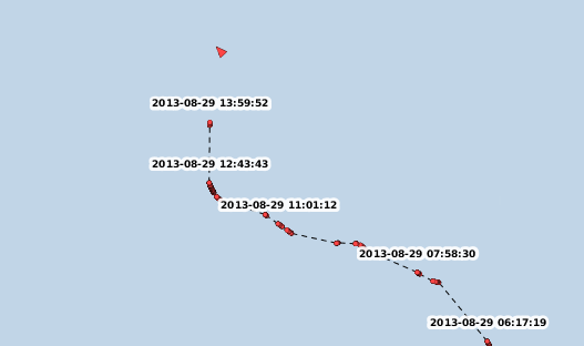
I checked on the Yong Sheng (famously trying to take cargo via the Northwest Passage).
It appears to be “confused” as to what to do next. It made a strange northwards turn.
I wonder if the same conditions are occurring on the Russian side causing trouble for the Yong Sheng?
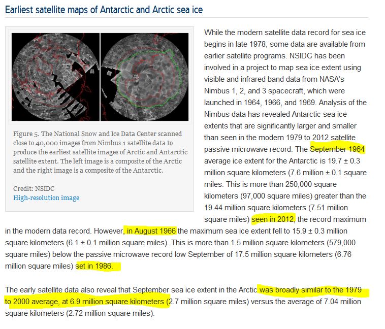
At the bottom of this post is a screen capture of an article at NSIDC concerning some early satellite pictures of the Arctic and Antarctic.
The article is titled “Earliest satellite maps of Antarctic and Arctic sea ice”.
Go ahead an read it at NSIDC (link) or in the screen capture.
Some things jumped out at me right away:
1) The Antarctic data is very specific comparing September 1964 to September 2012 and August 1966 to September 1986.
2) Why did they compare August 1966 to September 1986? The lowest average for August is 1986, but it was 17 million sq km, not 17.5 million.
3) The 15.9 million sq km for August 1966 is 1.1 million sq km lower than the lowest “modern” mean for August. Which means Antarctic Sea Ice has been growing since 1966 (at least in August).
4) Why are they so incredibly unspecific about the Arctic? “early satellite data” for September is compared to “broadly similar to the 1979 to 2000 average”. Why not give values for specific years?
5) 6.9 million square kilometers for some September in the 1960s would be 700,000 sq km lower than the highest Arctic Sea Ice which occurred in 1980. Isn’t that evidence of Arctic Sea Ice being cyclic?
6) I smell a rat. Why so ambiguous about the years in the Arctic? What are they hiding?
Conservation groups in Southern California sued the Department of the Interior on Tuesday in an attempt to block construction of a wind farm they claim could cause nearby residents to develop health problems ranging from diabetes to cancer to attention deficit disorder.
“The project is an unnecessary industrialization of pristine wilderness areas,” they said in the complaint.”
Antarctic Sea Ice area is still at a record amount for day 260. Using the data from Cryosphere I have graphed the record breaking Antarctic Sea Ice data.
Highlighted are 2012, 2007 and the median for 1979-2008.

Greenland Temperatures from stations with data from the 1800s. Updated link here.
It was warmer in the past.
These are the warmest years for each month and season.
| Station | SEP | OCT | NOV | Autumn | DEC | JAN | FEB | Winter | MAR | APR | MAY | Spring | JUN | JUL | AUG | Summer |
| Upernavik | 1928 | 1960 | 1878 | 2010 | 1873 | 1929 | 1947 | 1947 | 1916 | 1905 | 1932 | 1932 | 2008 | 2011 | 1960 | 2011 |
| Ilulissat | 1915 | 1960 | 1878 | 2010 | 1978 | 1929 | 1986 | 1929 | 1916 | 1905 | 1933 | 1932 | 1997 | 1960 | 1960 | 1960 |
| Nuuk | 2010 | 1960 | 1878 | 2010 | 2010 | 1917 | 1901 | 2010 | 1916 | 1953 | 2010 | 1932 | 1947 | 2008 | 2010 | 2010 |
| Quaqortoq | 2010 | 1960 | 2010 | 2010 | 1978 | 2010 | 1901 | 2010 | 1932 | 1881 | 1935 | 1932 | 1929 | 2003 | 1960 | 1929 |
| Tasiilaq | 1939 | 1915 | 2002 | 1941 | 1933 | 1987 | 1932 | 1929 | 1929 | 1926 | 1933 | 1929 | 1932 | 1939 | 2010 | 2003 |
Steve McIntyre has a post up looking at Siple Dome ice core data and Gavin Schmidt’s claim that the data shows”exceptionally high values in the late 20th Century “.
Steve includes an R script and a link to the data so I graphed it myself with a few minor tweaks. The peak year in the period from 1840 to 1994 was 1881.

In the last few days I’ve been graphing some of the data so I thought I would look at CRUTEM3 Southern Hemisphere to see if 1881 was exceptionally warm. And there is some confirmation of ~1881 being really, really warm. These are the ones that jumped out at me (graphs are below).
The 2nd warmest August in the Southern Hemisphere was 1884.
The 3rd warmest December was 1881. (First was 1850, 2nd was 1977)
The 3rd warmest September was 1878.
The 5th warmest July was 1877.
The 2nd warmest June was 1873.


I appreciate Gavin prompting Steve to look at the data so I would look at the CRUTEM3 SH data and realize …. what “global” warming?
My previous post on Westcoast cooling was written a few weeks ago and only published today.
Since that time I have learned how to map the data using an [R] package called RGoogleMaps. And then I used Graphics Magick to turn all the png files to an animated gif.


