
Tag: Jaxa
Arctic Sea Ice – JAXA versus MASIE versus NSIDC 2016-08-17
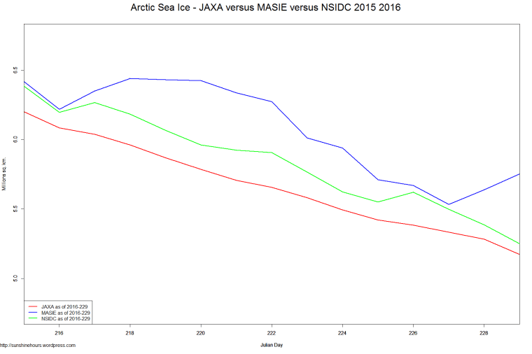
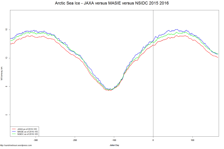
JAXA versus MASIE versus NSIDC – Day 165 – 2016
Now that NSIDC is publishing data again I thought I would post two graphs comparing JAXA MASIE and NSIDC.
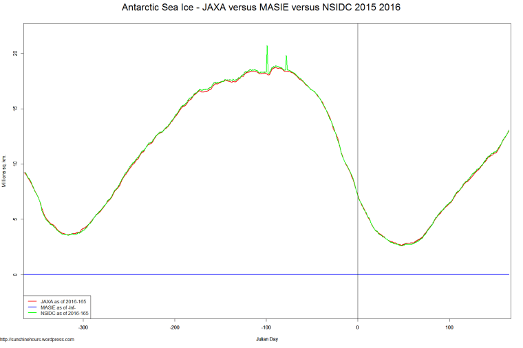
I’m doing it for Arctic and Antarctic (but MASIE has no Antarctic data)
Normally in the Arctic JAXA and NSIDC are very close only at the minimum … but now they are very close.
And in the Antarctic they might as well be doing just one they overlap so much.
DMI Arctic Ice Chart Shows 2016 Crossing 2012
2012 was the lowest minimum sea ice according to most sea ice extent charts.
DMI is now showing 2016 crossing to be higher than 2012. JAXA doesn’t show this yet.

Jaxa Version 2 – Make The Low Even Lower (and the Great Big Con continues)
UPDATE: All the graphs are here.
Jaxa is one of the other sea ice monitoring agencies. They just came out with a version 2 of their data.
I thought … why not graph the difference between version 1 and version 2 for 2013.
Red = Version 2 Lower Than Version 1
Blue = Version 2 Higher Than Version 1
Guess what the following graph shows? It makes the minimum dramatically lower (400,000 sq km lower) and the maximum higher so the minimum looks even worse when graphed.
For shame.

