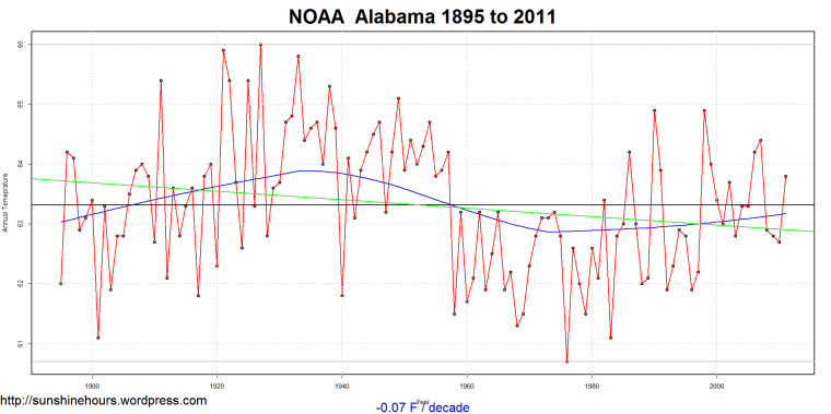
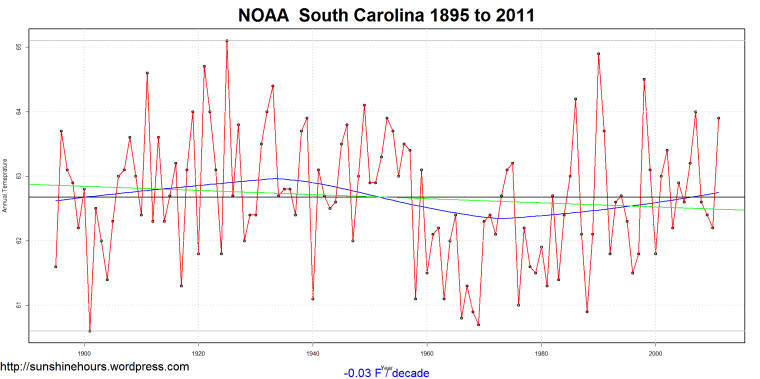
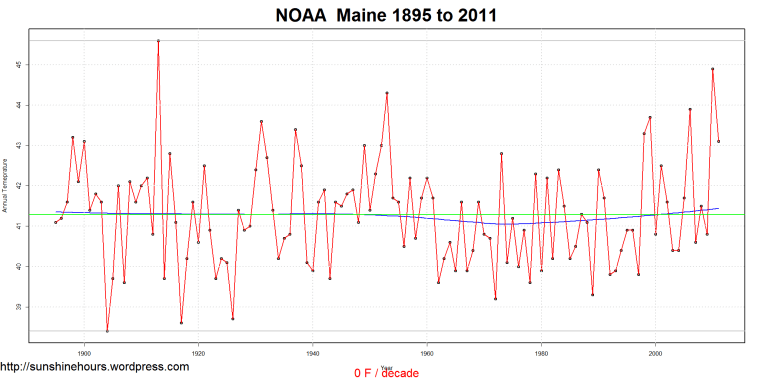
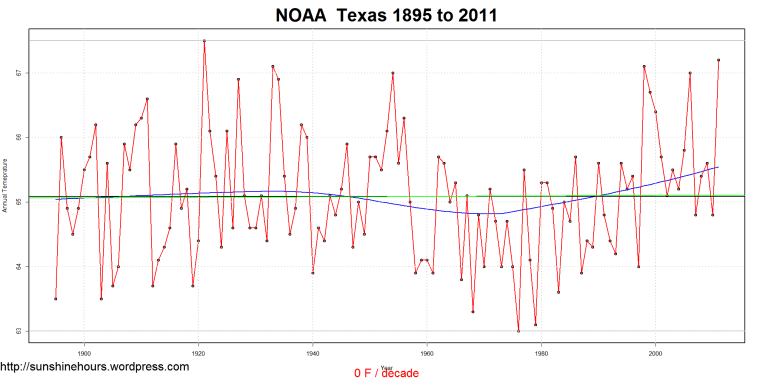
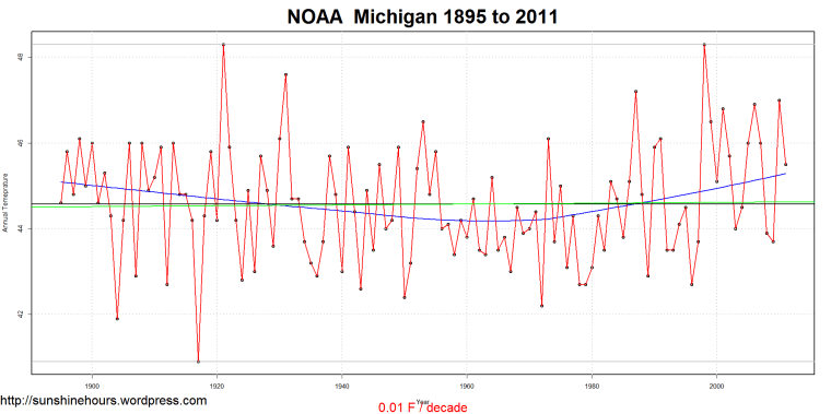
Part 1a of 3. See part 1 for the start of this series. This quick post is just to contain graphs from the other cooling states. Part 1b will be an animated gif of the 48 states where the data starts from 1895.
The green line is the trend, the blue line is the default loess fit, the red line is the data, the black line is the average for the whole period, and the faint top and bottom grey lines are max and min.







3 thoughts on “Is the USA warming? The NOAA data says”It depends” – Part 1a”