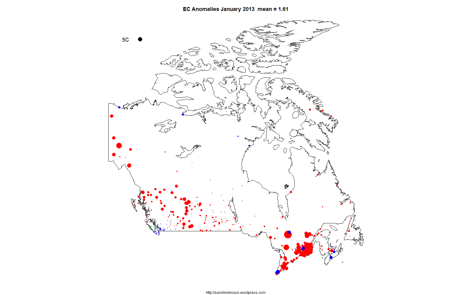
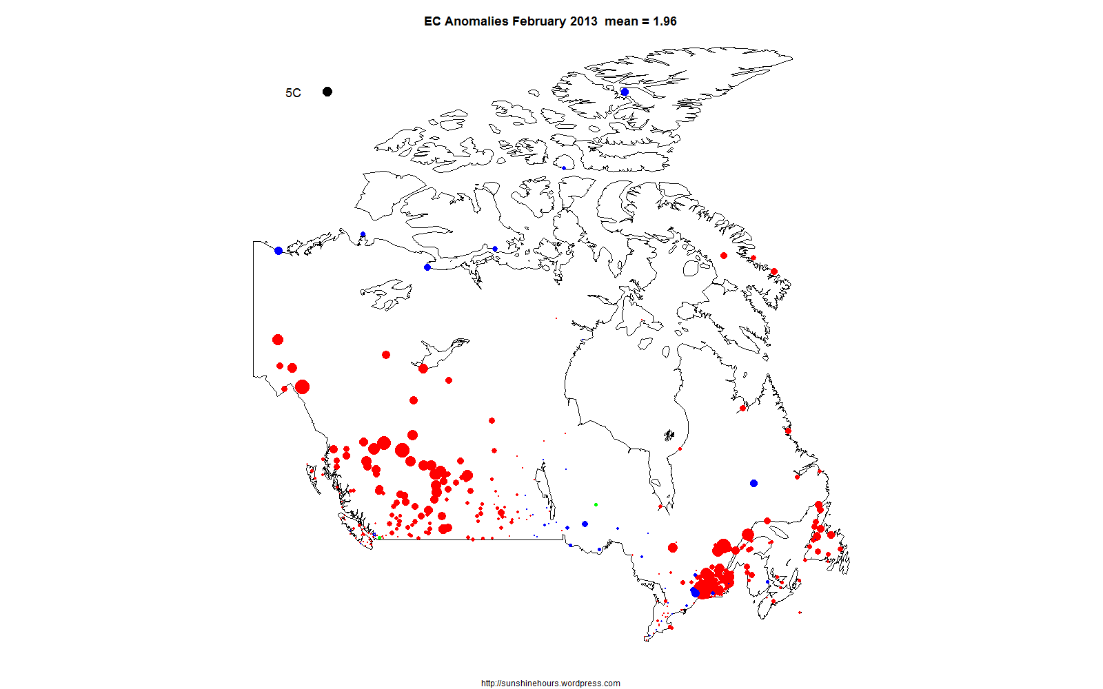
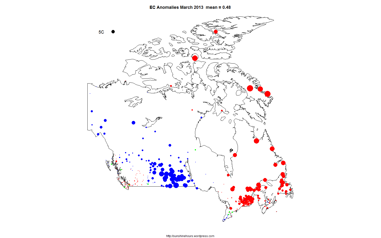
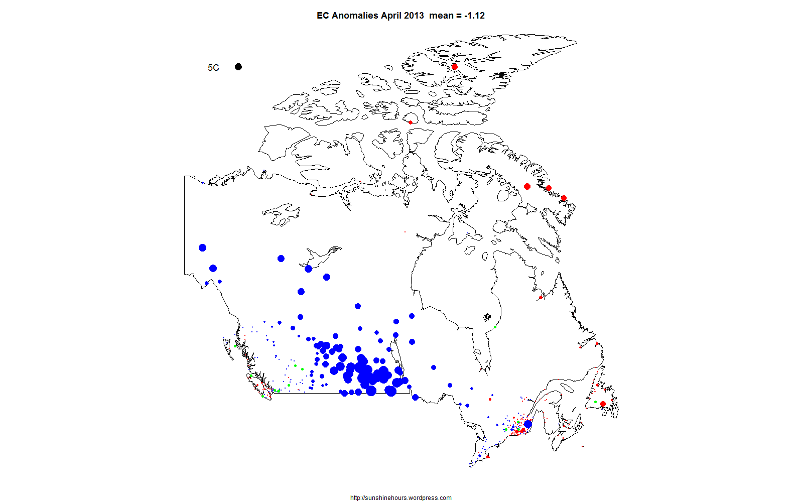
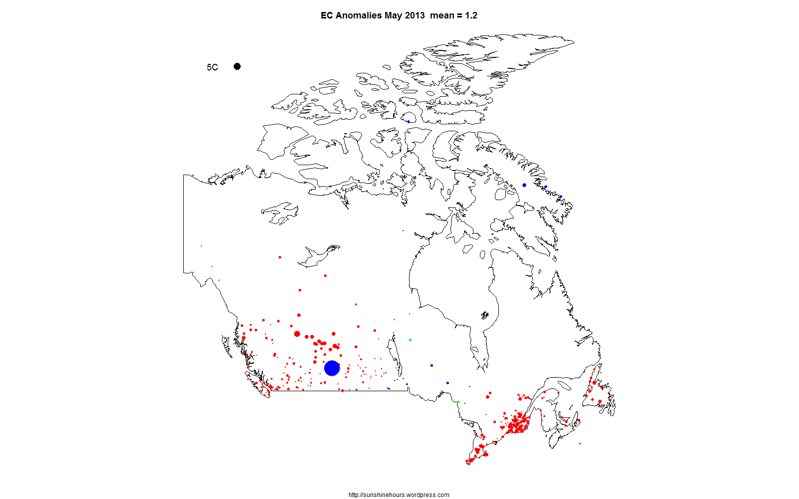
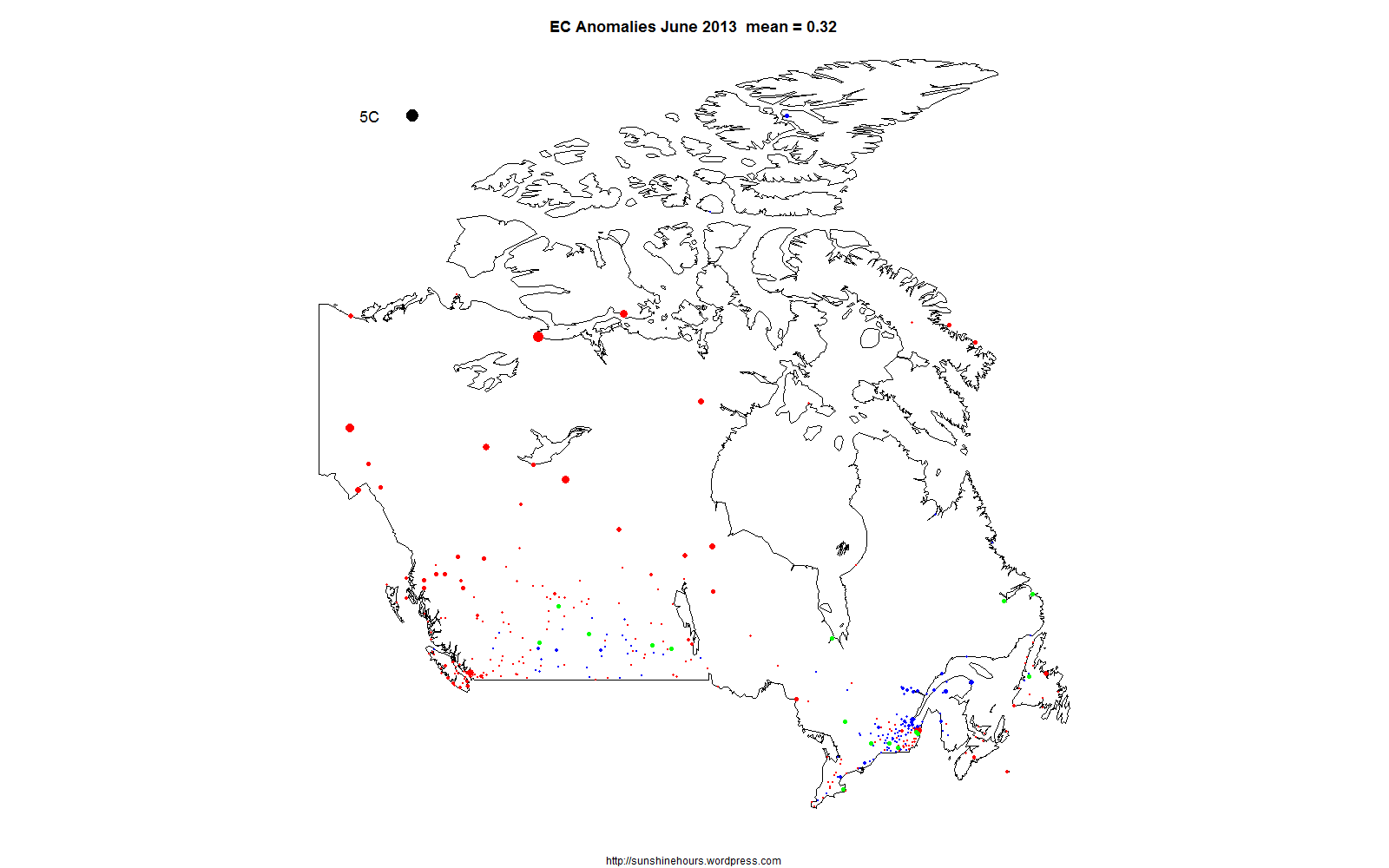
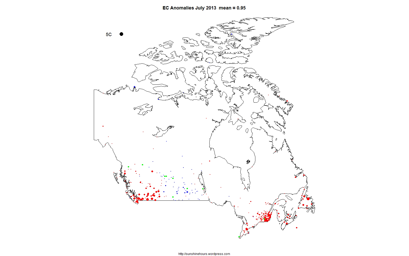
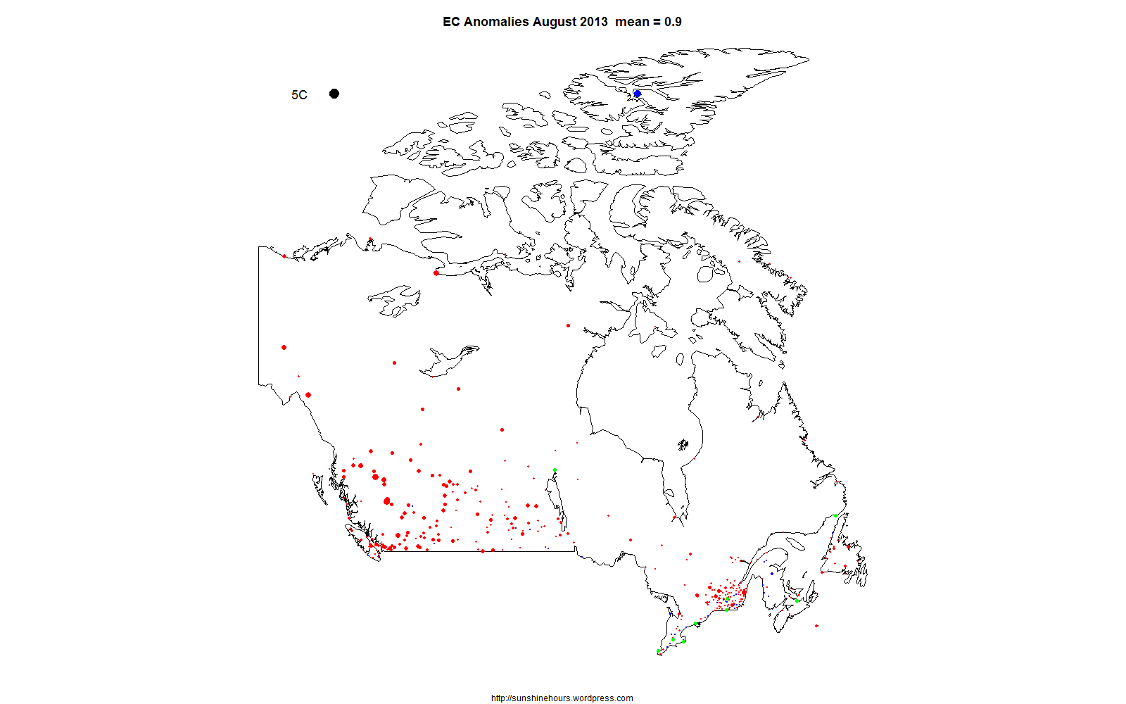
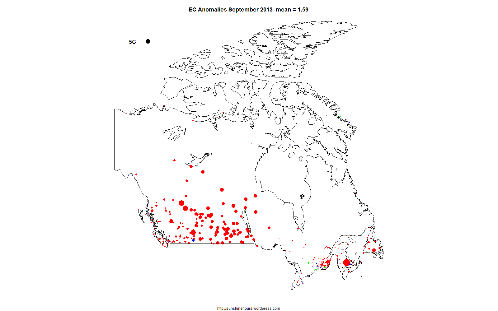
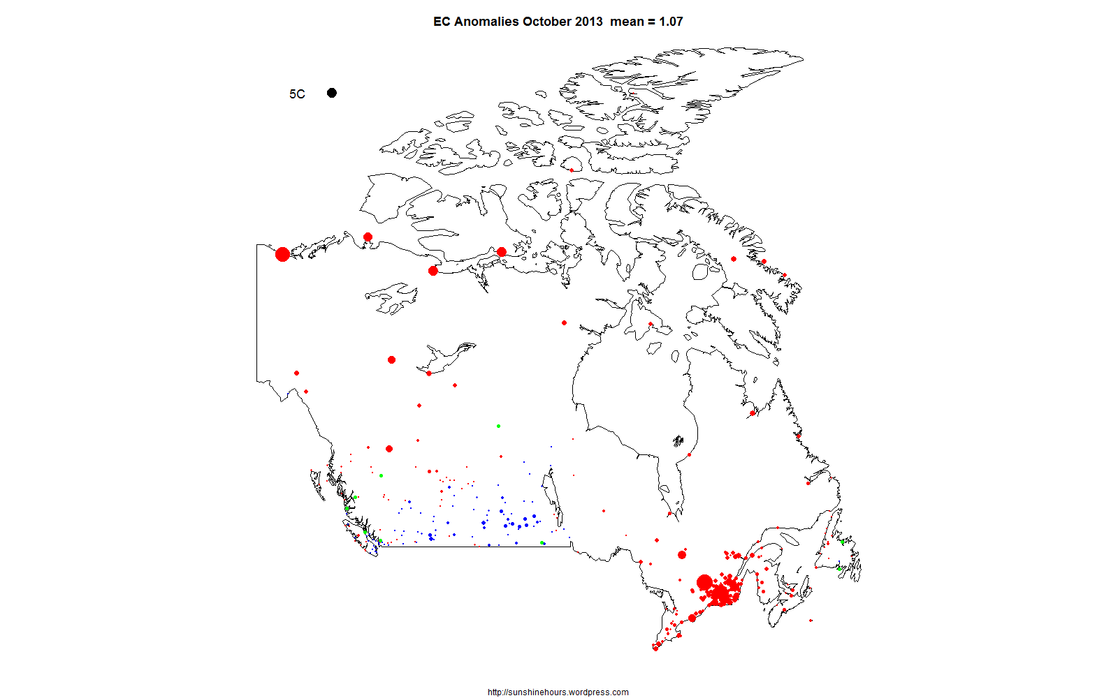
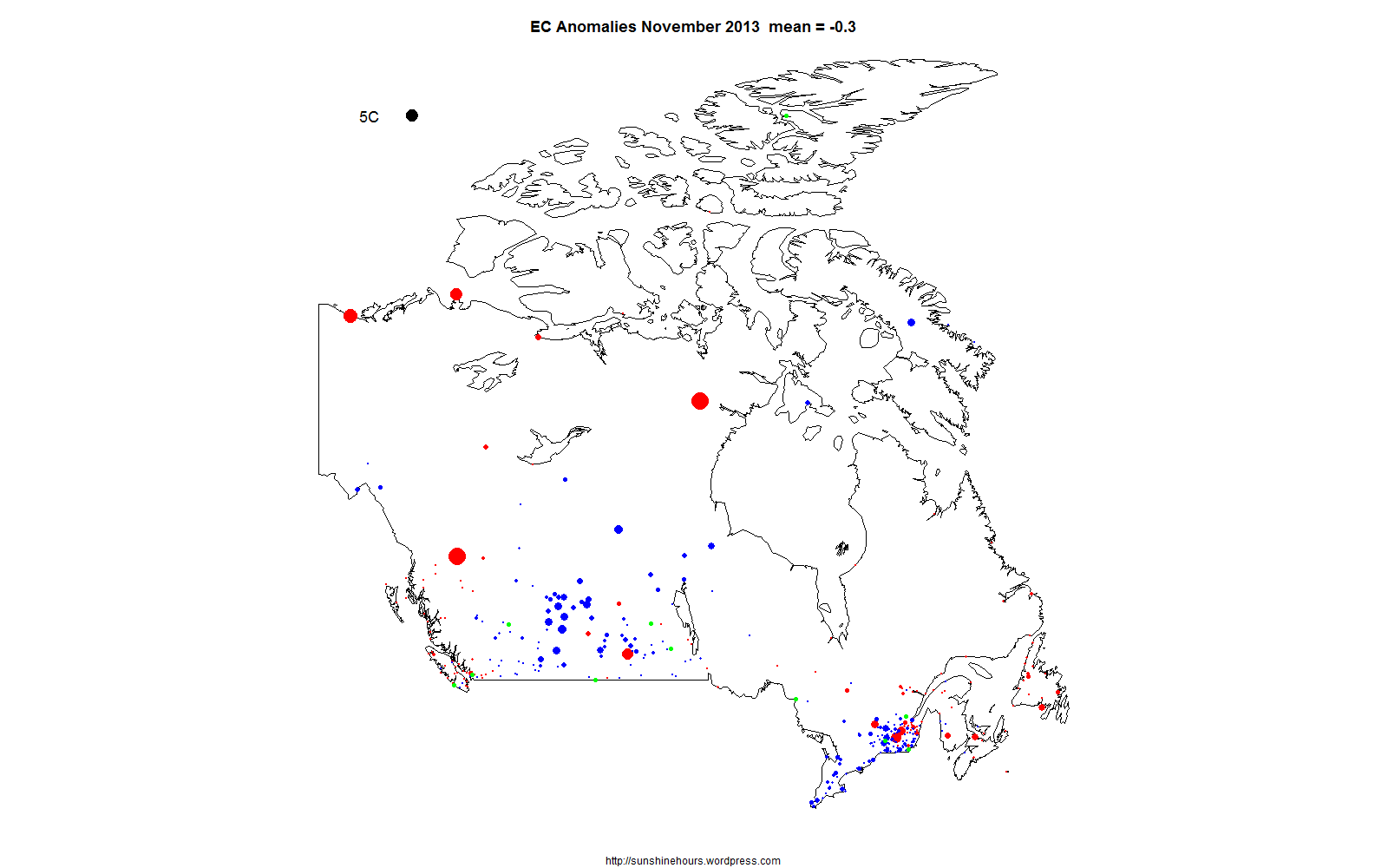
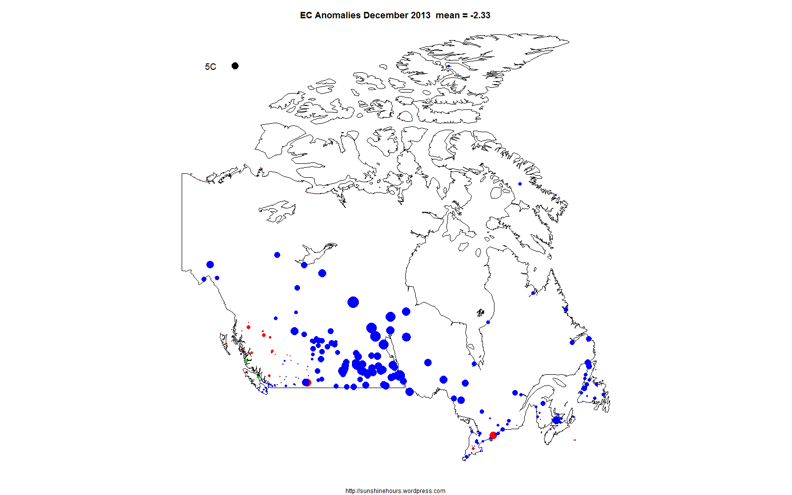
I have mapped the anomalies in the Environment Canada monthly summaries that have “normals”. The anomalies are calculated from selected stations based on the 1971-2000 average.
The 5C black dot in the top left hand corner represents 5C difference from “normal”. Red dots are warmer than normal. Blue are cooler. And Green are 0.
April was cold. December ended up very cold across the country.
There is an animated gif at the top showing all months of 2013. You may have to refresh this page or click on the gif to get the full effect.


Nicely presented. I always find it interesting when locations with cold anomalies are right beside warm anomalies (seems to occur frequently around Montreal and less so out west.)
Sometimes it appears like a line has been drawn and it can change one DAY to the next.
The is DAILY data for May 2013.
https://sunshinehours.wordpress.com/2013/06/08/canada-may-2013-daily-mean-temperature-anomaly-map/
UHI for warmer and Rural Colder?
Just weather, As I replied to the other comment, even daily data changes from cold to blue or blue to cold one day apart,
I like to compare against the 1981-2010 normals. Here is my graph for the entire year (2013): https://mapsengine.google.com/map/edit?mid=zf-tW8JNQzCU.kCFYbvjd6WS8
Nice. The monthly anomalies I am using from EC still says the normals are 1971-2000.
D Mean Temperature difference from Normal (1971-2000) (°C)
You can download the new normals here: http://climate.weather.gc.ca/climate_normals/index_e.html#1981
You probably know this, but just in case… I also wonder how long EC will use the 1971-2000 normals in the climate summaries. The next climate period is going to be an embarrassing one for them since so many weather stations are no longer in operation.
Thanks. I too was wondering how long they will use 1971-2000. At least they aren’t HADCRUT still using 1961-1990.