Nick Stoke and Zeke Hausfather don’t like my graphs showing a difference between Estimated (infilled) and non-Estimated (not infilled) USHCN data
Nick said:
“The difference between average estimated and average non-estimated, doesn’t reflect estimation. It just reflects changes in the kind of stations that were being estimated.
For some reason, they were more likely to be warmer. I don’t know why, but they were. It’s just the wrong way to do it.”
I’m not sure I believe in coincidences.
I believe Nick and Zeke both created an anomaly baseline for each month for each station. Nick used 1900 to 2013. Zeke said he used 1961-1990.
Neither of them added trend lines.
I believe both used all the data (infilled and non-infilled). (As of my posting this they had not confirmed). I disagree with that. Infilled data should not be used in the baseline.
As an example of what infilling does using the difference by station from the 1895-2013 baseline here is Dec 1998 to 2013 Tmax.
In this case, the real data had a downwards trend of -0.82C/decade and the infilled data was -0.64C/decade which is .18C/decade higher not because infilled data was hotter, but because it was less cold.
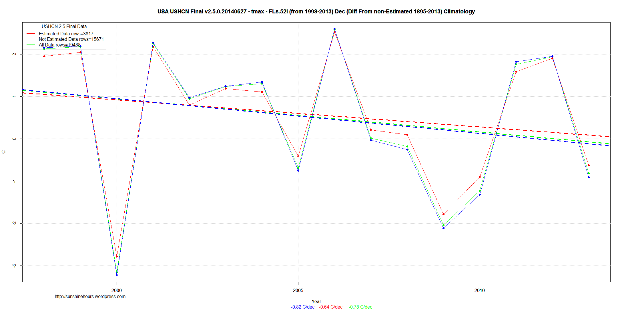
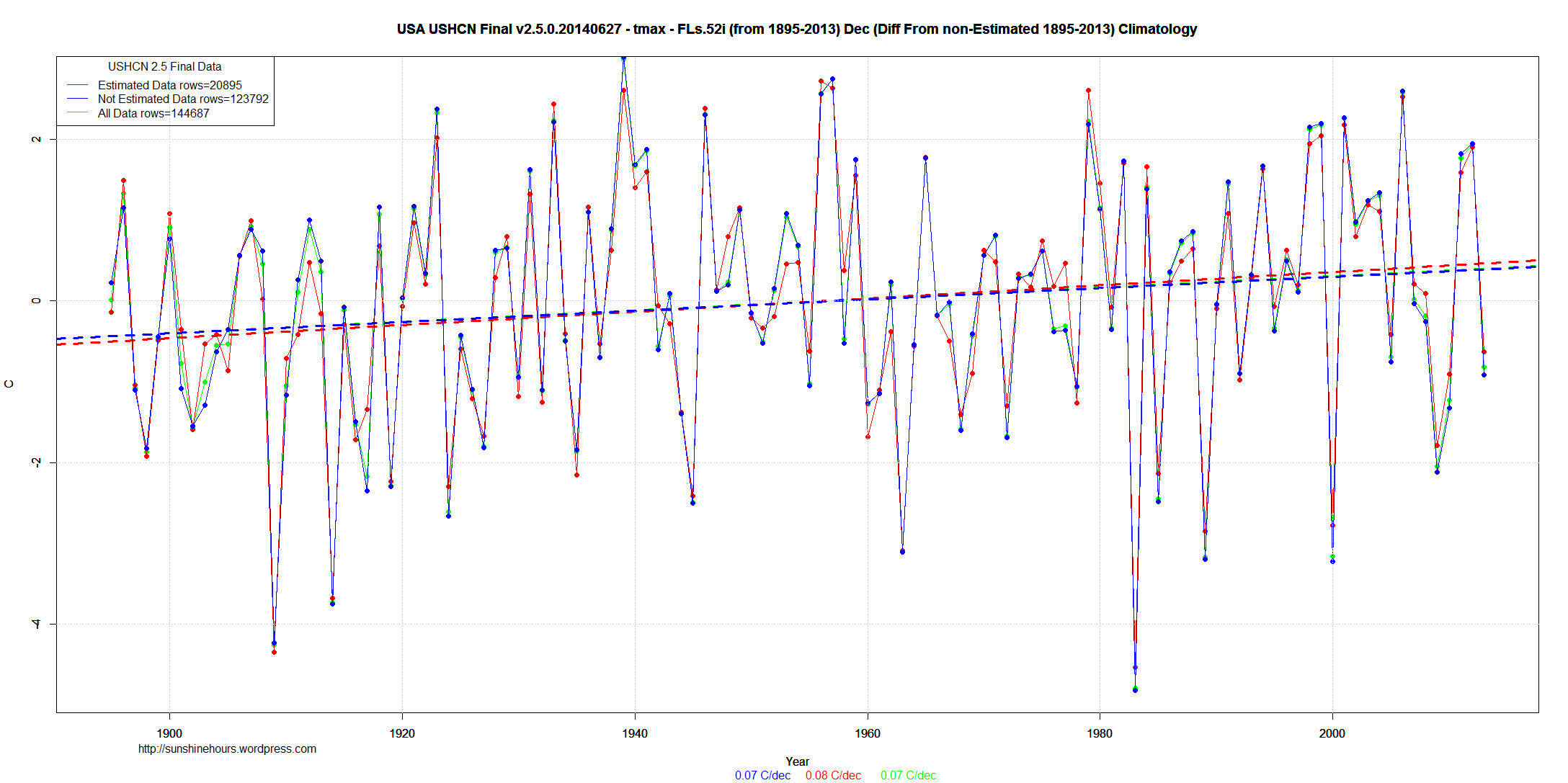
From 1895 to 2013 the infilled trend is consistently .02C/decade to .03C/decade higher than the non-infilled trend.
The red dots are higher on the 1980 and later side of the graph while they are lower on the pre-1960 part of the graph.
Cooling the past, warming the present.

You should be aware of this:
July 3, 2014

Note that all estimated values in the USHCN v2.5 dataset are identified

using the 'E' flag. As described in the previous versions of the readme.txt

file, NCDC's intent was to use a flagging system that

distinguishes between estimates for values that were originally missing

versus those that were removed as part of the homogenization process.

NCDC intends to fix this issue in flag identification in the near future.
Showed up in the 07_04_2014 “status.txt” file: ftp://ftp.ncdc.noaa.gov/pub/data/ushcn/v2.5/status.txt
Thanks