County Population Statistics and Cooling/Warming Stations Since 1900

I took the list of BEST sites and using those sites in BEST with a Country code of United States I used State/County name to merge with the list of Counties I have with population changes.

I am attempting to correlate County population changes changes from 1900 to 2010 with cooling or warming from 1900 to 2011.

1956 Stations with data in 2011 and 1900.

1320 were warming and 636 were cooling.

1213 of those I could match to the table of US Counties.

1089 distinct counties.

562 of those counties had more warming stations than cooling.

496 had more cooling stations than warming.

31 had an equal number of cooling and warming stations.

Warming Counties had a mean temperature change of .0692C/decade.

Warming counties had a mean population increase of 174,361.

Warming counties on average grew by 648% from 1900 to 2011.

Cooling counties had a mean temperature change of -.0573C/decade.

Cooling counties had a mean population increase of 39,060.

Cooling counties on average grew by 194% for 1900 to 2011.

“Equal” counties had a mean temperature change of .0119C/decade.

“Equal” counties had a mean population increase of 86,469.

“Equal”   counties on average grew by 512% from 1900 to 2011.

It appears warming counties grew much, much faster than the country as a whole, while cooling counties grew  slower than the country as a whole.

Depopulation and cooling at the county level

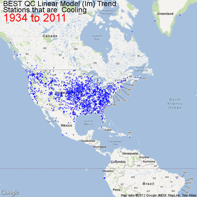
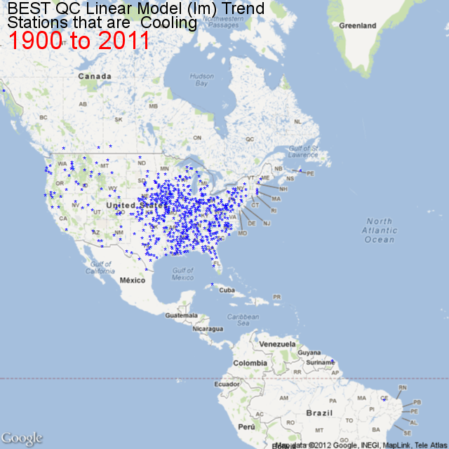
I’ve been trying to figure out why so many weather stations are cooling since 1900 in the US. You can check out the map of their locations here.

I’ve been using the Berkley Earth dataset, quality controlled. (not that I trust it for reasons demonstrated here) .

Then I came across a list of US Counties with 2010 population and Latitude and Longitude here. And I found a list of Population By County with data for 1900,1910,1920 up to 1990 here. So I wrote a small [R] script to import the files, massage them a tiny bit so I could merge them by FIPS code.

#http://www.census.gov/geo/www/2010census/centerpop2010/county/CenPop2010_Mean_CO.txt
filenameCLL = "F:/R/CenPop2010_Mean_CO.txt"

#http://www.nber.org/data/census-decennial-population.html
# download the xlsx file
## Change all . to 0 using text editor before next step
filenameCC = "F:/R/cencounts.csv"

dfCLL dfCLL[4:5, "fips"] dfCLL$fips
dfCC
# Merge the two files by FIPS
dfCounty = merge(dfCLL,dfCC)
# Rename 3 columns
# Notice the POPULATION column is pop2010
# For completeness I may track down pop2000

names(dfCounty)[names(dfCounty)=="LATITUDE"] <- "Latitude"
names(dfCounty)[names(dfCounty)=="LONGITUDE"] <- "Longitude"
names(dfCounty)[names(dfCounty)=="POPULATION"] <- "pop2010"

# calculate the dif
# so far no code deals with Alaska etc  where counties had 0 pop in 1900
# I just used a text editor to replace the no population placeholder . with 1
dfCounty[4:5, "difPct"] dfCounty$difPct dfCounty[4:5, "dif"] dfCounty$dif

And then I mapped those counties with the R package RGoogleMaps. In the map below I am only showing the counties that have been shrinking since 1900.

Doesn’t it look a like the map of cooling stations? Admittedly there is no an exact match because the Latitude Longitude is for the center (by population I think) of the counties and there is no guarantee that just because a county is losing population the area right around the station is losing population. But it might be a good indicator, or maybe UHI at the county level is important.

But I think I am zeroing in on the reason there are so many cooling stations in the mid to eastern USA. Depopulation. Deindustrialization. Negative UHI.

And if a shrinking population can cause stations to cool despite increasing CO2, could not the opposite be true? Could not the warming be caused exclusively by population growth?

Finally, that map is just the counties shrinking since 1990.

[1] "Counties Shrinking Since 1900: 694"
[1] "Counties Shrinking Since 1910: 865"
[1] "Counties Shrinking Since 1920: 955"
[1] "Counties Shrinking Since 1930: 979"
[1] "Counties Shrinking Since 1940: 1033"
[1] "Counties Shrinking Since 1950: 957"
[1] "Counties Shrinking Since 1960: 882"
[1] "Counties Shrinking Since 1970: 814"
[1] "Counties Shrinking Since 1980: 1028"
[1] "Counties Shrinking Since 1990: 823"

Cooling Since 1900 – Zooming In To Gary Indiana

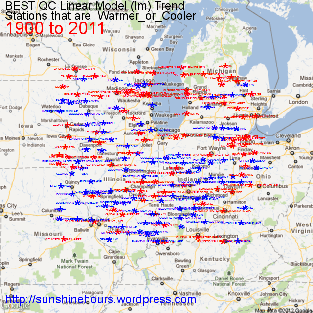
I’m trying to get handle on why so many US stations have cooled since 1900. So I thought I would zoom into an area bounded by Latitude 38 and Latitude 43.999 and Longitude 92W and 83W which is roughly centered on Gary Indiana. I am not an expert on that region, but it seems to me that a lot of the warming stations are centered in those circles Google Maps shows for cities. I suspect that UHI is the cause of much of the warming and the reason some stations are cooling is because they have less UHI.


Of the 181 stations on this map, 93 are cooling and 88 are warming.

The mean of the warming stations is 0.061C/decade.

The mean of the cooling station is  -0.051C/decade.

And the overall mean is a minuscule 0.0036C/decade.

Cooling since 1900

I have been looking at the BEST data and playing around with [R] and came across a package for [R] called RGoogleMaps that allows you to download a 640×640 Google Map tile and add text or points.

I thought why not find which climate stations have been cooling from 1900 and map them. This isn’t every station (it is most of them) but this map is zoomed in to the USA.

Auditing the latest BEST and EC data for Malahat

Over the last few weeks I’ve been looking at the latest BEST data and sometimes comparing it to data from Environment Canada (EC) I scraped off their website.

To start with I am looking at one station. In BEST it is StationID 7973 – “MALAHAT, BC”.  In EC it is station MALAHAT which is Station_No 1014820.

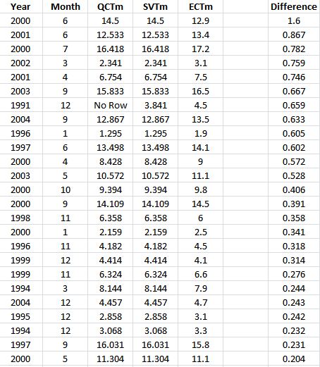
I am comparing the BEST SV (Single Valued) data to the BEST QC (Quality Controlled) data.  The first  minor problem is that the EC data has records from the 1920s and 1930s that BEST does not have (that I have found). Thats no big deal. The next problem is that out of 166 MOnth/Year records, not one of them matched exactly. BEST SV and QC data is to 3 decimal points while EC is to 1.

For example. Jan 1992 has QC = 5.677, as does SV, while EC = 5.8. Close. But not an exact match.

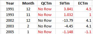
However, the real problem is that  there are 5 records that have been discarded between SV and QC. Two out of the five make no sense at all, and one is iffy.

Where it says “No Row” it means BEST has discarded the record completely between SV and QC.

1991 is iffy. EC has it has 4.5, SV has 3.841. Close, but not that close

1993 makes no sense at all.

2002 is fine. Thats a huge error. But where the heck did BEST get the -13.79 number in the first place.

2003 is fine. But again,   where the heck did BEST get the -4.45 number in the first place.

Finally, 2005 makes no sense at all. There is little difference between -1.1 and -1.148. Certainly most records are that different.

And those are just the discarded records!

There are another 48 record with a difference of .1C or greater and  here are the greater than .2C ones.

What a mystery.