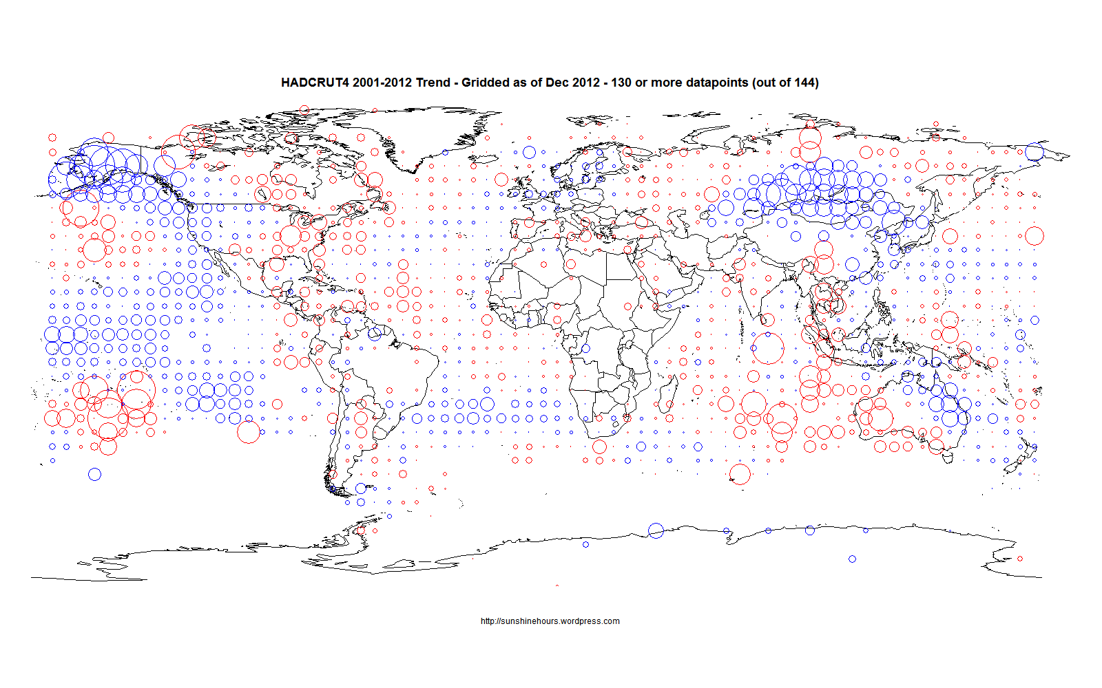
HADCRUT4 for the last 12 years shows a small amount of cooling. The following map shows which 5×5 grid squares are warming or cooling. I am using grid squares with 130 out of 144 possible datapoints for the period. The circles are proportional to the trends. Keep in mind that this is 5×5 grids squares. As I’ve shown for Canada different size of grid squares change warming to cooling.
Tag: Canada
Canada October 2012 – 15 Year Trends (A lot of cooling)
This is a map of Environment Canada Stations that are part of the “normals” and have 170 or more datapoints in the last 180 months (15 years) as of October 2012.
The circle size is proportion to the warming or cooling.
When some people say Canada is “warming”, I would disagree and say Western Canada is definitely cooling for 15 years and a small part of Eastern Canada clustered around the big cities and a couple of arctic stations are warming.

