Depopulation and cooling at the county level

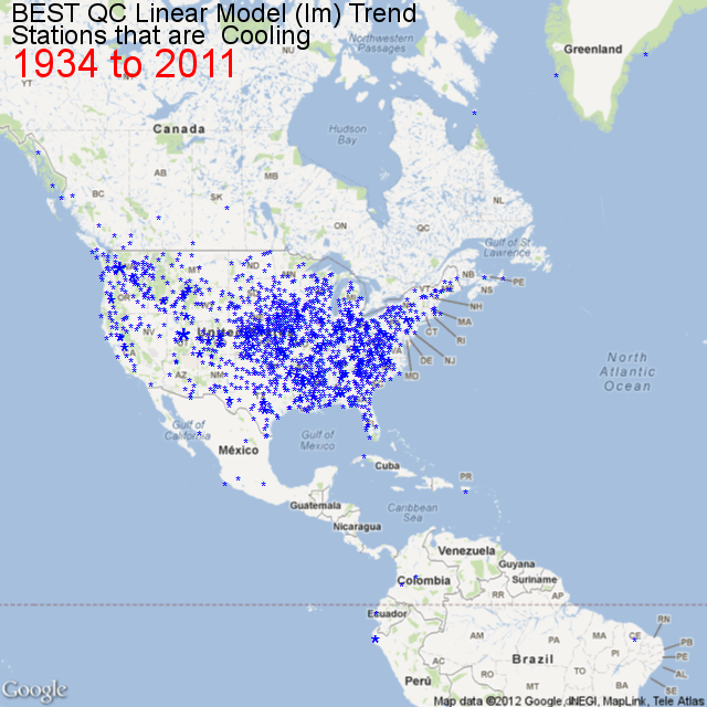
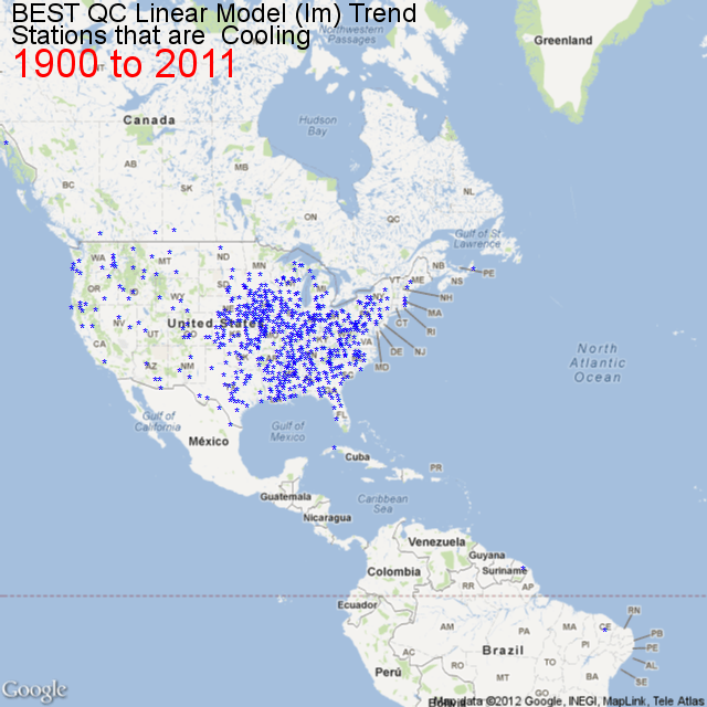
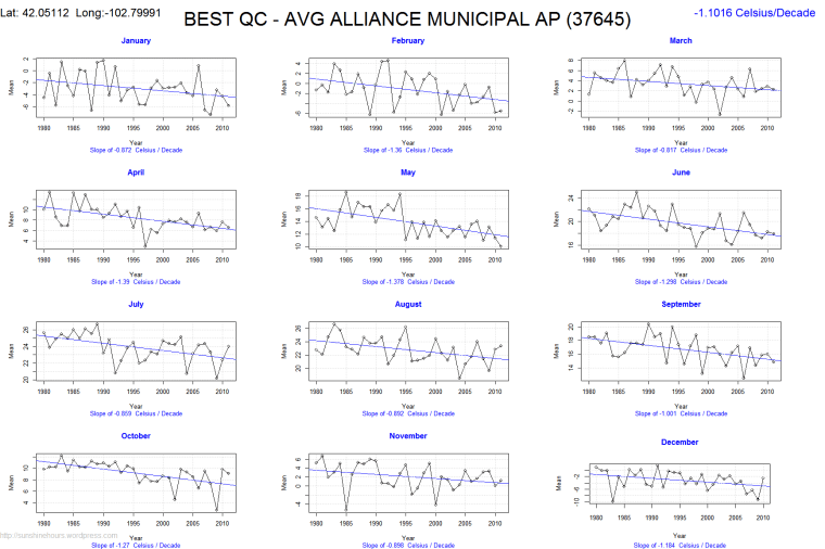
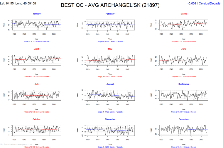
I’ve been trying to figure out why so many weather stations are cooling since 1900 in the US. You can check out the map of their locations here.

I’ve been using the Berkley Earth dataset, quality controlled. (not that I trust it for reasons demonstrated here) .

Then I came across a list of US Counties with 2010 population and Latitude and Longitude here. And I found a list of Population By County with data for 1900,1910,1920 up to 1990 here. So I wrote a small [R] script to import the files, massage them a tiny bit so I could merge them by FIPS code.

#http://www.census.gov/geo/www/2010census/centerpop2010/county/CenPop2010_Mean_CO.txt
filenameCLL = "F:/R/CenPop2010_Mean_CO.txt"

#http://www.nber.org/data/census-decennial-population.html
# download the xlsx file
## Change all . to 0 using text editor before next step
filenameCC = "F:/R/cencounts.csv"

dfCLL dfCLL[4:5, "fips"] dfCLL$fips
dfCC
# Merge the two files by FIPS
dfCounty = merge(dfCLL,dfCC)
# Rename 3 columns
# Notice the POPULATION column is pop2010
# For completeness I may track down pop2000

names(dfCounty)[names(dfCounty)=="LATITUDE"] <- "Latitude"
names(dfCounty)[names(dfCounty)=="LONGITUDE"] <- "Longitude"
names(dfCounty)[names(dfCounty)=="POPULATION"] <- "pop2010"

# calculate the dif
# so far no code deals with Alaska etc  where counties had 0 pop in 1900
# I just used a text editor to replace the no population placeholder . with 1
dfCounty[4:5, "difPct"] dfCounty$difPct dfCounty[4:5, "dif"] dfCounty$dif

And then I mapped those counties with the R package RGoogleMaps. In the map below I am only showing the counties that have been shrinking since 1900.

Doesn’t it look a like the map of cooling stations? Admittedly there is no an exact match because the Latitude Longitude is for the center (by population I think) of the counties and there is no guarantee that just because a county is losing population the area right around the station is losing population. But it might be a good indicator, or maybe UHI at the county level is important.

But I think I am zeroing in on the reason there are so many cooling stations in the mid to eastern USA. Depopulation. Deindustrialization. Negative UHI.

And if a shrinking population can cause stations to cool despite increasing CO2, could not the opposite be true? Could not the warming be caused exclusively by population growth?

Finally, that map is just the counties shrinking since 1990.

[1] "Counties Shrinking Since 1900: 694"
[1] "Counties Shrinking Since 1910: 865"
[1] "Counties Shrinking Since 1920: 955"
[1] "Counties Shrinking Since 1930: 979"
[1] "Counties Shrinking Since 1940: 1033"
[1] "Counties Shrinking Since 1950: 957"
[1] "Counties Shrinking Since 1960: 882"
[1] "Counties Shrinking Since 1970: 814"
[1] "Counties Shrinking Since 1980: 1028"
[1] "Counties Shrinking Since 1990: 823"

Cooling Since 1900 – Zooming In To Gary Indiana

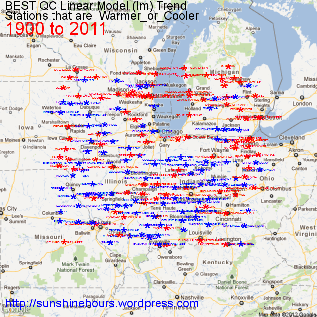
I’m trying to get handle on why so many US stations have cooled since 1900. So I thought I would zoom into an area bounded by Latitude 38 and Latitude 43.999 and Longitude 92W and 83W which is roughly centered on Gary Indiana. I am not an expert on that region, but it seems to me that a lot of the warming stations are centered in those circles Google Maps shows for cities. I suspect that UHI is the cause of much of the warming and the reason some stations are cooling is because they have less UHI.


Of the 181 stations on this map, 93 are cooling and 88 are warming.

The mean of the warming stations is 0.061C/decade.

The mean of the cooling station is  -0.051C/decade.

And the overall mean is a minuscule 0.0036C/decade.

Cooling since 1900

I have been looking at the BEST data and playing around with [R] and came across a package for [R] called RGoogleMaps that allows you to download a 640×640 Google Map tile and add text or points.

I thought why not find which climate stations have been cooling from 1900 and map them. This isn’t every station (it is most of them) but this map is zoomed in to the USA.

EBRO Observatory (Spain) and Bright Sunshine

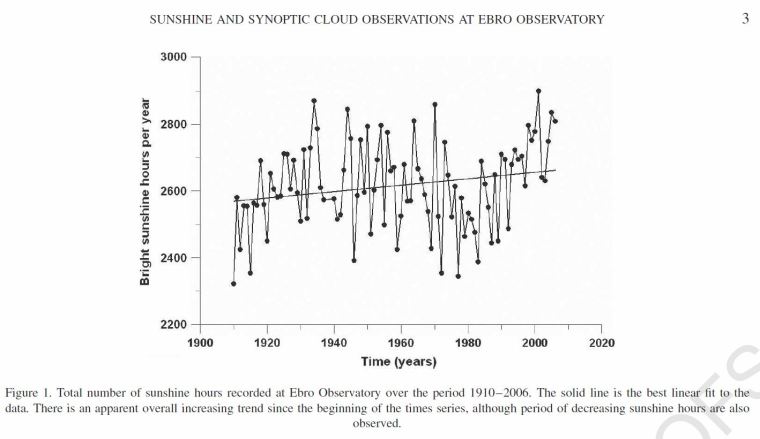
In 2008 a paper was published called  “Short Communication – Sunshine and synoptic cloud observations at Ebro Observatory, 1910–2006” by J. J. Curto, E. Also, E. Palle and J. G. Sole.

I managed to download a copy. The following graph is of sunshine measured from an Observatory in Spain. If you weren’t paying attention you might think it is a graph of GISS or HADCRU temperatures … right?


Since 1910, we find that there has been
an overall increase in the number of sunshine hours, but
with large oscillations that make this increase statistically
insignificant, while over the same time period cloudiness
has increased by a larger amount (about 12%) with high
statistical significance.
We associate the increase in both sunshine hours and
cloud amount with a shift in cloud types during the
100-year period covered by the observations.”

Temperatures at a standstill for 10 years

Dr. David Whitehouse:

“If you look at the instrumental temperature record, HadCrut3 for example, it’s obvious that there are features in the temperature curve that each require an explanation. The initial low temperatures and rough standstill between 1850 – 1910 (there was a brief warmish phase at about 1875). The rise between 1910 and 1940, the standstill between 1940 – 1980, the rise 1980 – 2000 and the standstill 2000 – 2010. Standstills are not unusual. It is also interesting that in the 50 years since 1960 when the IPCC says greenhouse gasses became the dominant climate driver, there has been temperature increases in only two of five decades! In fact, since the start of the instrumental period in 1850 only 50 of the 160 years have been part of an increasing trend.

Recently the UK Met Office conducted a series of simulations incorporating climate change models with decadal fluctuations in climate and concluded that one out of every eight decades would show a ten-year standstill, but that no standstill will last as long as 15 years. Since we have three standstill decades since 1960 this data seems to be somewhat outside the conclusions of the simulations. Each year is now significant as a prolonged hiatus in temperature acquires more and more statistical significance in taking the observations away from the theoretical predictions.

The IPCC says there should be an increase, on average, of 0.2 deg per decade. In Hadcrut3 the increase for 1979 – 2008 is 0.18 deg per decade which seems to fit in with the IPCC estimates. However, the trend for the past decade is zero making a revised estimate for the 1980 – 2000 period as 0.27 deg per decade.

Looking at atmospheric data, which is independent of the weather station data used in HadCrut3 (I am grateful to Lubos Motl for these figures), from RMS AMU between January 1979 and 2011 the increase was 0.14 deg per decade. However, the figure for 2001 – 2011 is minus 0.04 deg per decade. That is, if anything, the world has got cooler, although still within a statistical constant line within errors of measurement.

http://thegwpf.org/the-observatory/3192-warming-what-warming.html