Climate Data and Elevation

Yesterday, The Cheefio mentioned “During the times I was looking at GIStemp, I’d noticed that GHCN had reduced the high altitude coverage. Thermometers had fled the mountains for lower elevations.”

I’ve been using the Berkley Earth dataset, quality controlled. (not that I trust it for reasons demonstrated here) .

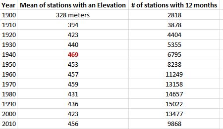
So I thought I would take a quick and dirty snapshot of the BEST data elevation. I looked all stations that had an elevation and had 12 months of data at the decadal rollover (1900, 1910 … 2010).

It looks like the Cheefio was right, with the peak year being near 1940 and then dropping for the next 60 years . (Of course the Elevation may have peaked slightly higher before or after 1940 … I didn’t do every year).

According to a lapse rate calculator I found online, a 46m drop would raise temperature by .45C from 1940 to 2000. I’m not quite sure what to make of the big drop in stations in 2010 and subsequent rise in elevation. The number drops back to 423m in 2010 if you change the criteria to any data in 2010. I must assume many of the stations were incomplete for 2010.
How Well Do We Know What The Temperature Was in 1900?

As part of my investigation into the BEST data (which I do not trust, but I’d like to understand) I thought I would see how many weather stations there were at various times and places.

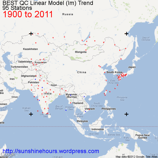
We really don’t know what the temperature was in 1900. There are only 95 stations (the four big + are the boundary of the data) in the following image.

China is essentially a blank .


Cooling Weather Stations by decade from 1880 to 2000

As part of my investigation into the BEST data (which I do not trust, but I’d like to understand) I thought I would make a little gif movie of the stations that are cooling at 10 year intervals from 1880.

These are just the cooling stations that actually have data in 1880 (for example) and 2011.

And this is just for Latitude  25N to 70N and Longitude 160W to 60W. But most are in this region.

The count of stations cooling is the count for the region displayed.

You can see the number of stations rise as more stations have data, but also because it got warmer in the 1930s meaning the chance of a cooling trend to 2011 increased. And then the number of stations dropped into the 1960s/70s as it cooled off. And the numbers skyrocket as global warming (at least in the USA) somewhat ends in the 1990s.

The image is a large animated gif. If it isn’t moving clicking on it or refreshing the page should get it to restart.

County Population Statistics and Cooling/Warming Stations Since 1900

I took the list of BEST sites and using those sites in BEST with a Country code of United States I used State/County name to merge with the list of Counties I have with population changes.

I am attempting to correlate County population changes changes from 1900 to 2010 with cooling or warming from 1900 to 2011.

1956 Stations with data in 2011 and 1900.

1320 were warming and 636 were cooling.

1213 of those I could match to the table of US Counties.

1089 distinct counties.

562 of those counties had more warming stations than cooling.

496 had more cooling stations than warming.

31 had an equal number of cooling and warming stations.

Warming Counties had a mean temperature change of .0692C/decade.

Warming counties had a mean population increase of 174,361.

Warming counties on average grew by 648% from 1900 to 2011.

Cooling counties had a mean temperature change of -.0573C/decade.

Cooling counties had a mean population increase of 39,060.

Cooling counties on average grew by 194% for 1900 to 2011.

“Equal” counties had a mean temperature change of .0119C/decade.

“Equal” counties had a mean population increase of 86,469.

“Equal”   counties on average grew by 512% from 1900 to 2011.

It appears warming counties grew much, much faster than the country as a whole, while cooling counties grew  slower than the country as a whole.

Shrinking and Slow Growing

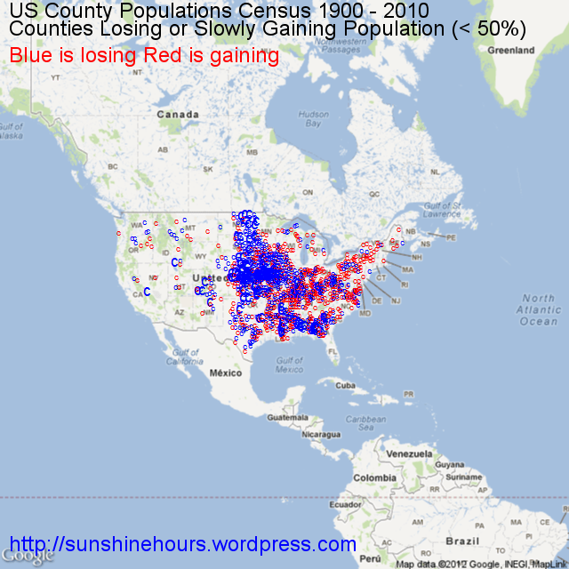
A quick update to my previous post on County Depopulation. I was thinking about slow growth and decided to map those counties with negative growth (blue) and those with growth of less than 50% since 1900. I think thats fair since the US population has quadrupled in population since 1900.

(And a hat tip to the Texas Tribune who published this map of county population changes which got me thinking … )

Depopulation and cooling at the county level

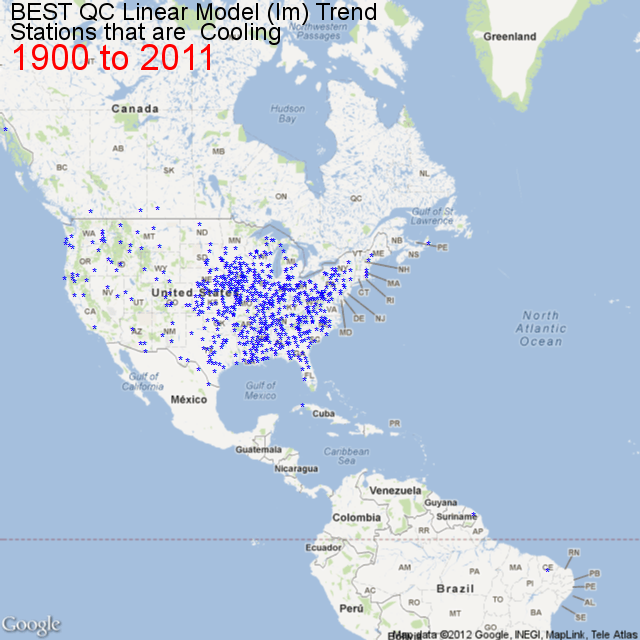
I’ve been trying to figure out why so many weather stations are cooling since 1900 in the US. You can check out the map of their locations here.

I’ve been using the Berkley Earth dataset, quality controlled. (not that I trust it for reasons demonstrated here) .

Then I came across a list of US Counties with 2010 population and Latitude and Longitude here. And I found a list of Population By County with data for 1900,1910,1920 up to 1990 here. So I wrote a small [R] script to import the files, massage them a tiny bit so I could merge them by FIPS code.

#http://www.census.gov/geo/www/2010census/centerpop2010/county/CenPop2010_Mean_CO.txt
filenameCLL = "F:/R/CenPop2010_Mean_CO.txt"

#http://www.nber.org/data/census-decennial-population.html
# download the xlsx file
## Change all . to 0 using text editor before next step
filenameCC = "F:/R/cencounts.csv"

dfCLL dfCLL[4:5, "fips"] dfCLL$fips
dfCC
# Merge the two files by FIPS
dfCounty = merge(dfCLL,dfCC)
# Rename 3 columns
# Notice the POPULATION column is pop2010
# For completeness I may track down pop2000

names(dfCounty)[names(dfCounty)=="LATITUDE"] <- "Latitude"
names(dfCounty)[names(dfCounty)=="LONGITUDE"] <- "Longitude"
names(dfCounty)[names(dfCounty)=="POPULATION"] <- "pop2010"

# calculate the dif
# so far no code deals with Alaska etc  where counties had 0 pop in 1900
# I just used a text editor to replace the no population placeholder . with 1
dfCounty[4:5, "difPct"] dfCounty$difPct dfCounty[4:5, "dif"] dfCounty$dif

And then I mapped those counties with the R package RGoogleMaps. In the map below I am only showing the counties that have been shrinking since 1900.

Doesn’t it look a like the map of cooling stations? Admittedly there is no an exact match because the Latitude Longitude is for the center (by population I think) of the counties and there is no guarantee that just because a county is losing population the area right around the station is losing population. But it might be a good indicator, or maybe UHI at the county level is important.

But I think I am zeroing in on the reason there are so many cooling stations in the mid to eastern USA. Depopulation. Deindustrialization. Negative UHI.

And if a shrinking population can cause stations to cool despite increasing CO2, could not the opposite be true? Could not the warming be caused exclusively by population growth?

Finally, that map is just the counties shrinking since 1990.

[1] "Counties Shrinking Since 1900: 694"
[1] "Counties Shrinking Since 1910: 865"
[1] "Counties Shrinking Since 1920: 955"
[1] "Counties Shrinking Since 1930: 979"
[1] "Counties Shrinking Since 1940: 1033"
[1] "Counties Shrinking Since 1950: 957"
[1] "Counties Shrinking Since 1960: 882"
[1] "Counties Shrinking Since 1970: 814"
[1] "Counties Shrinking Since 1980: 1028"
[1] "Counties Shrinking Since 1990: 823"

Cooling Since 1900 – Zooming In To Gary Indiana

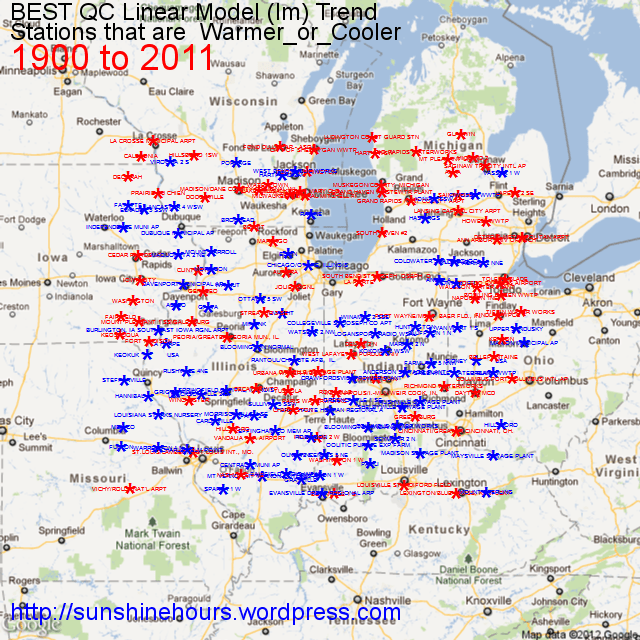
I’m trying to get handle on why so many US stations have cooled since 1900. So I thought I would zoom into an area bounded by Latitude 38 and Latitude 43.999 and Longitude 92W and 83W which is roughly centered on Gary Indiana. I am not an expert on that region, but it seems to me that a lot of the warming stations are centered in those circles Google Maps shows for cities. I suspect that UHI is the cause of much of the warming and the reason some stations are cooling is because they have less UHI.


Of the 181 stations on this map, 93 are cooling and 88 are warming.

The mean of the warming stations is 0.061C/decade.

The mean of the cooling station is  -0.051C/decade.

And the overall mean is a minuscule 0.0036C/decade.

Cooling since 1900

I have been looking at the BEST data and playing around with [R] and came across a package for [R] called RGoogleMaps that allows you to download a 640×640 Google Map tile and add text or points.

I thought why not find which climate stations have been cooling from 1900 and map them. This isn’t every station (it is most of them) but this map is zoomed in to the USA.

Warming and Cooling – Tokyo and Frostburg

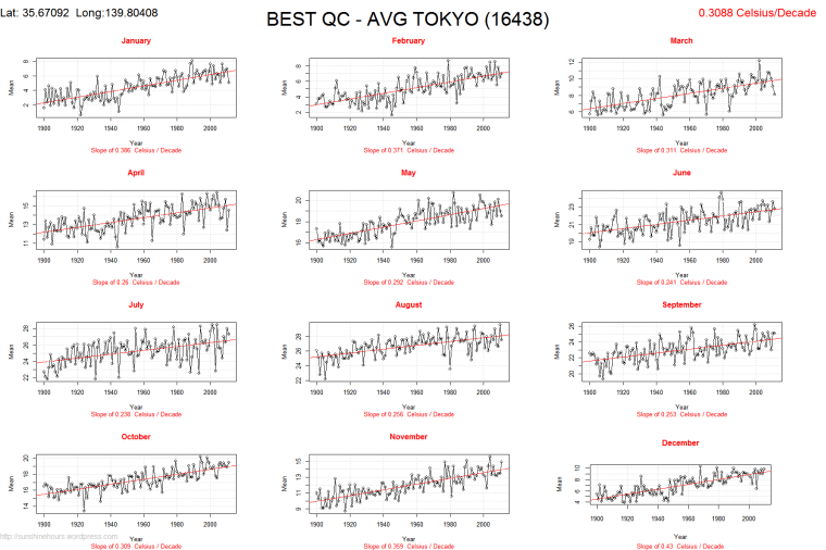
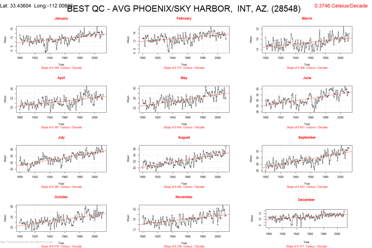
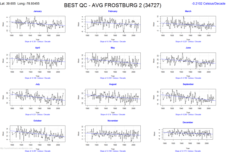
I was working with the BEST data and decided to look at which stations cooled the most and warmed the most since 1900. It turns out, of the 1957 stations that have data in 1900 and 2011, 1320 have a warming trend and 636 have a cooling trend.

Don’t get me wrong,  I’m not saying the BEST data is right. There is a lot of data discarding going before it gets to the Quality Controlled set, and I haven’t analyzed yet.

Tokyo makes the warming top 10. It is warming at the rate of .31C per decade since 1900.

Phoenix also makes the top 10. .37C per decade.

Frostburg is the station cooling the most, -.21C per decade.