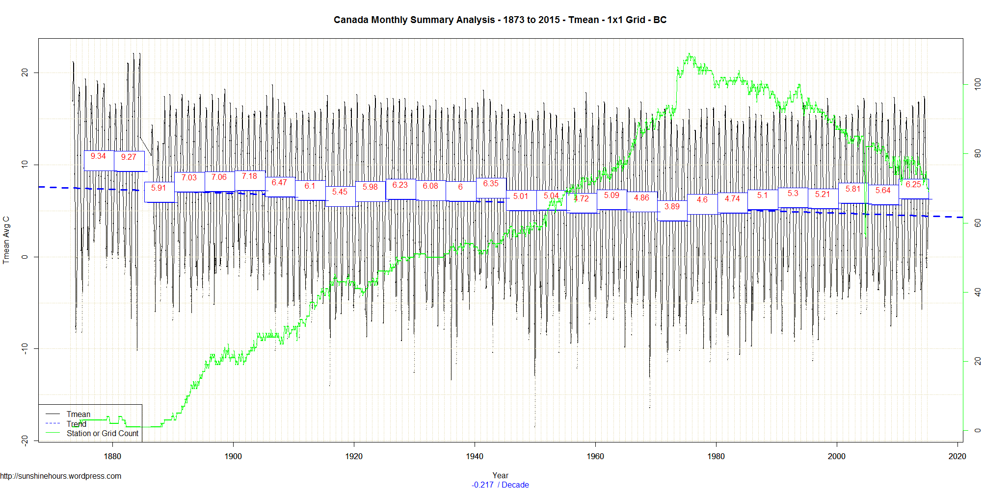
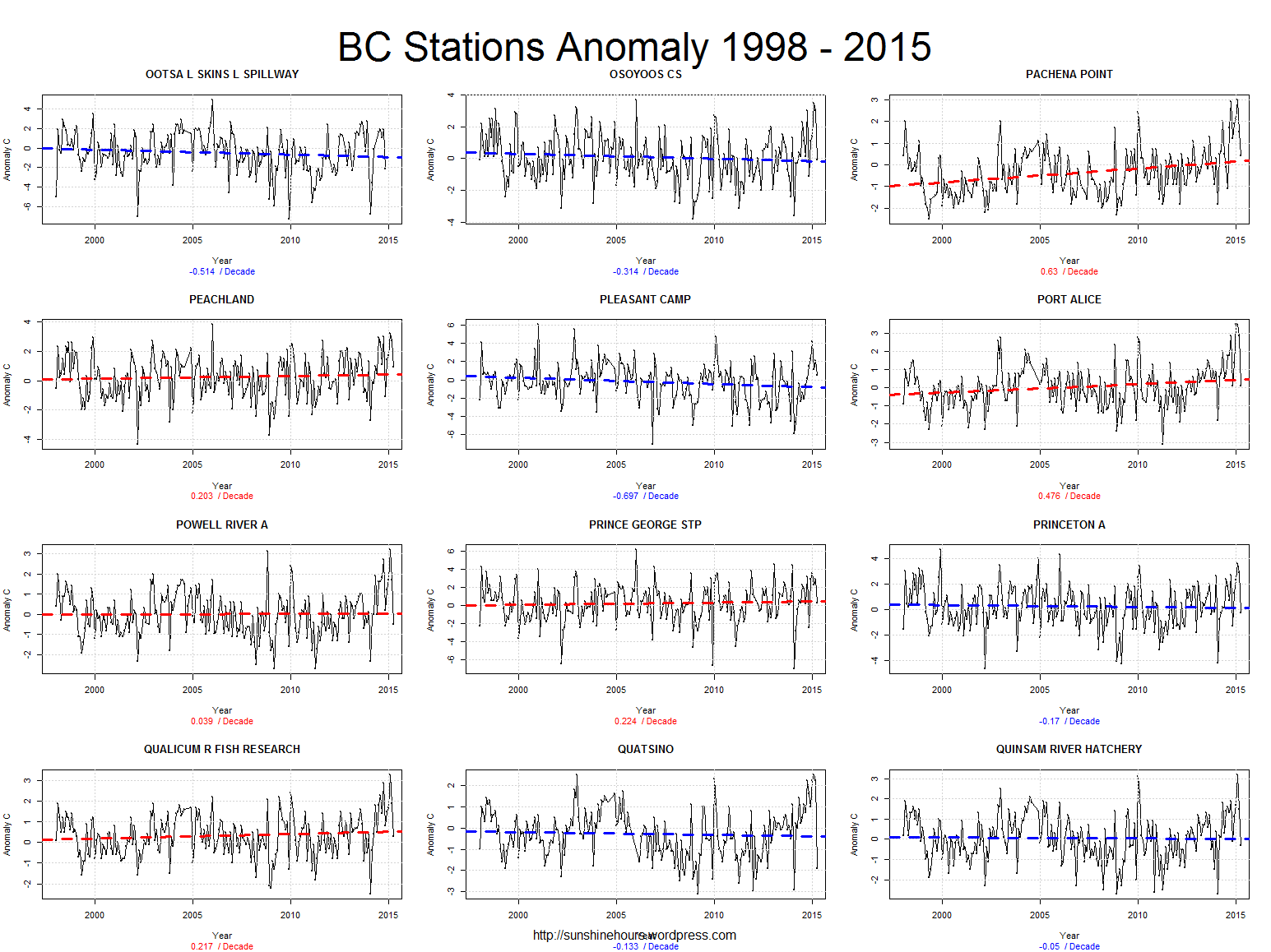
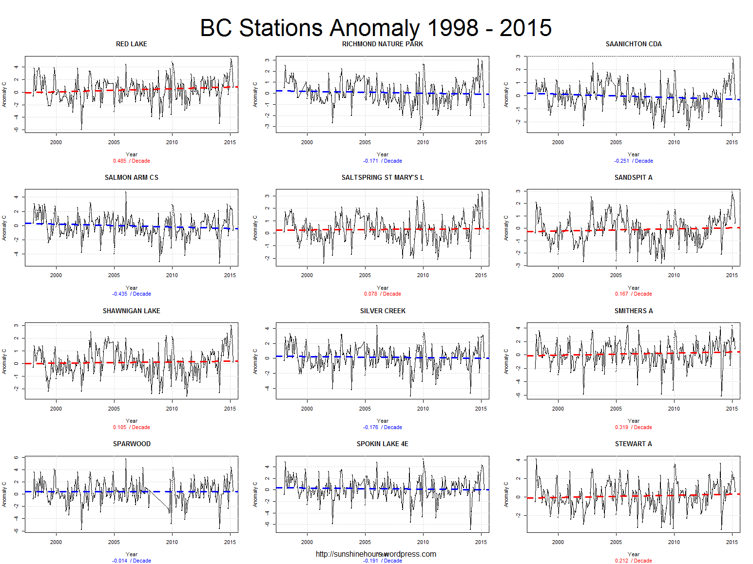
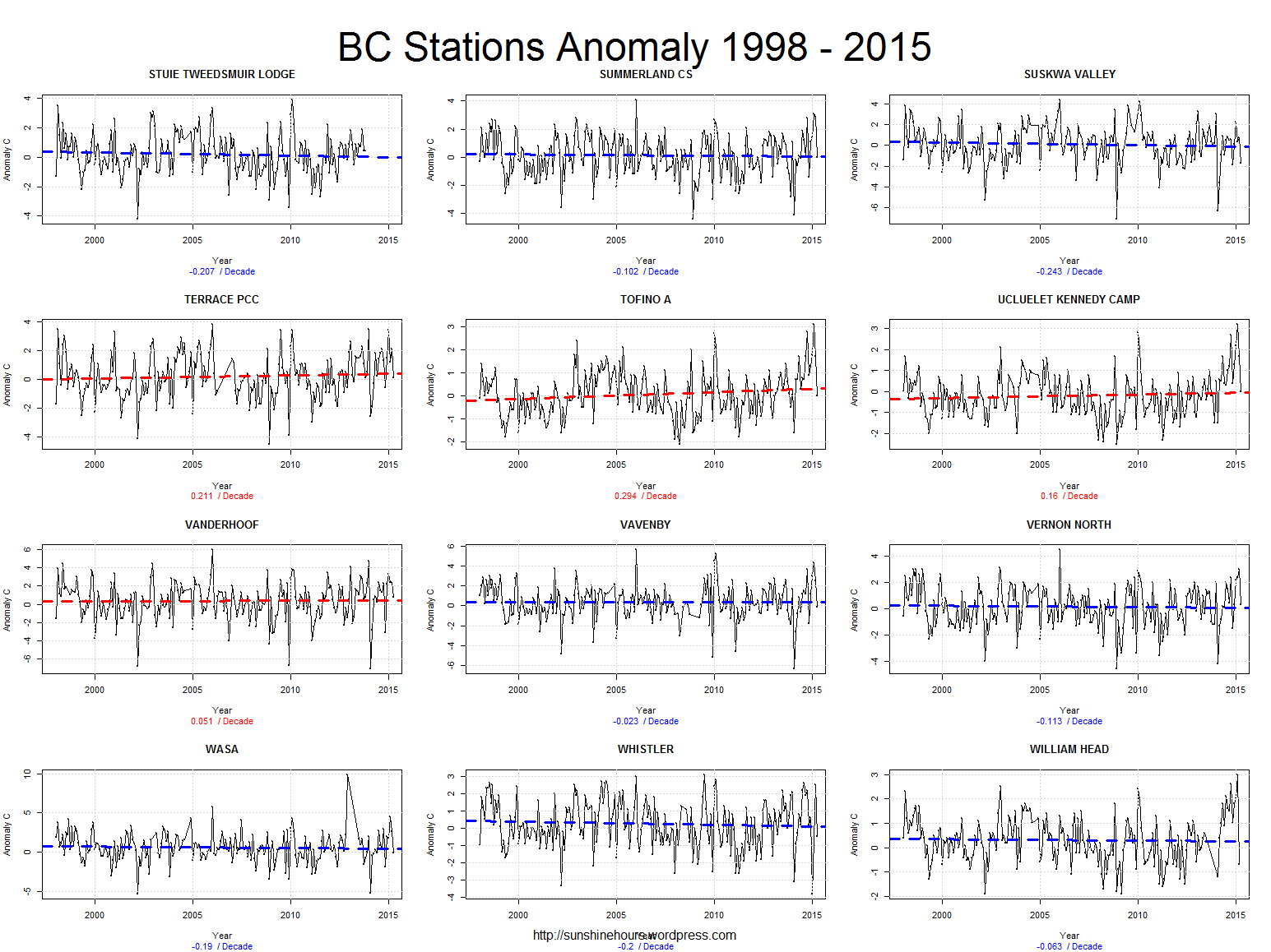
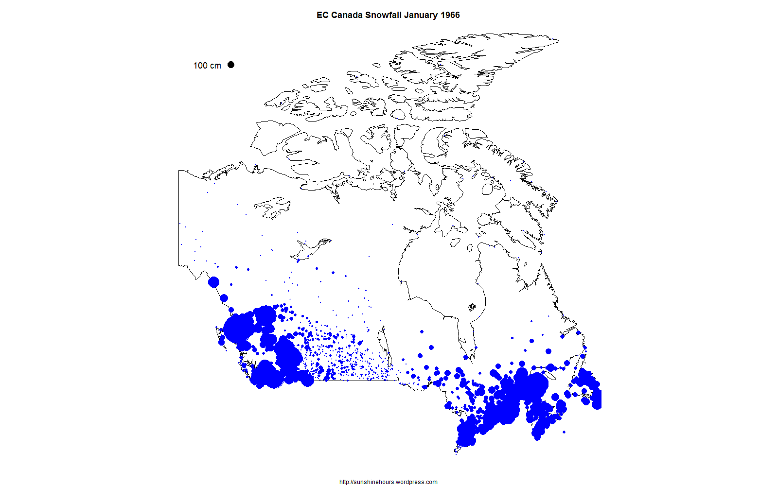
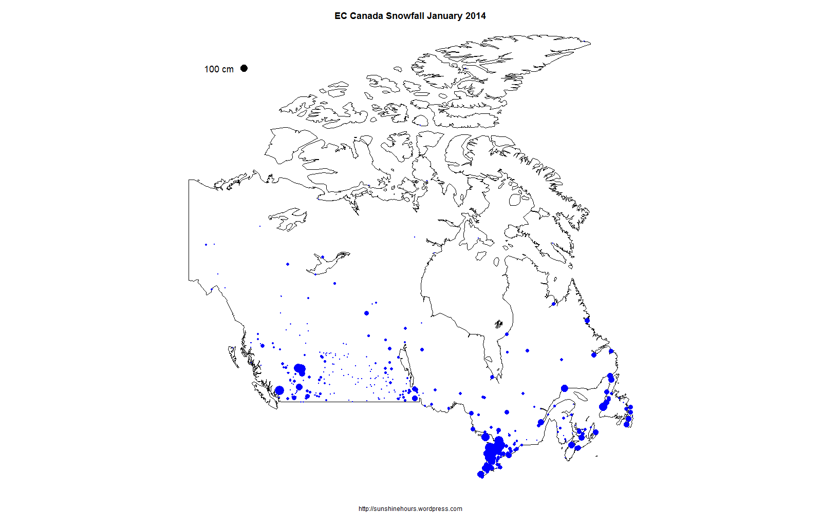
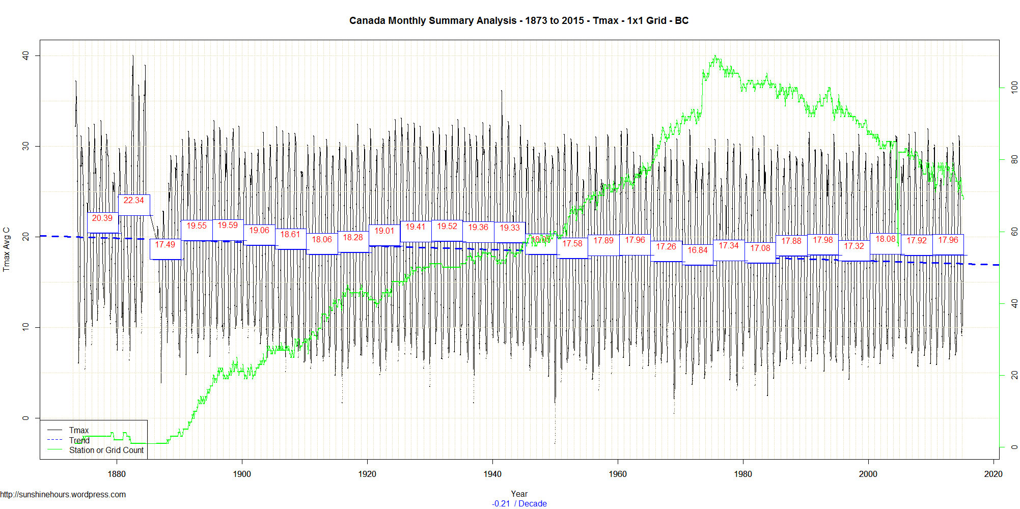
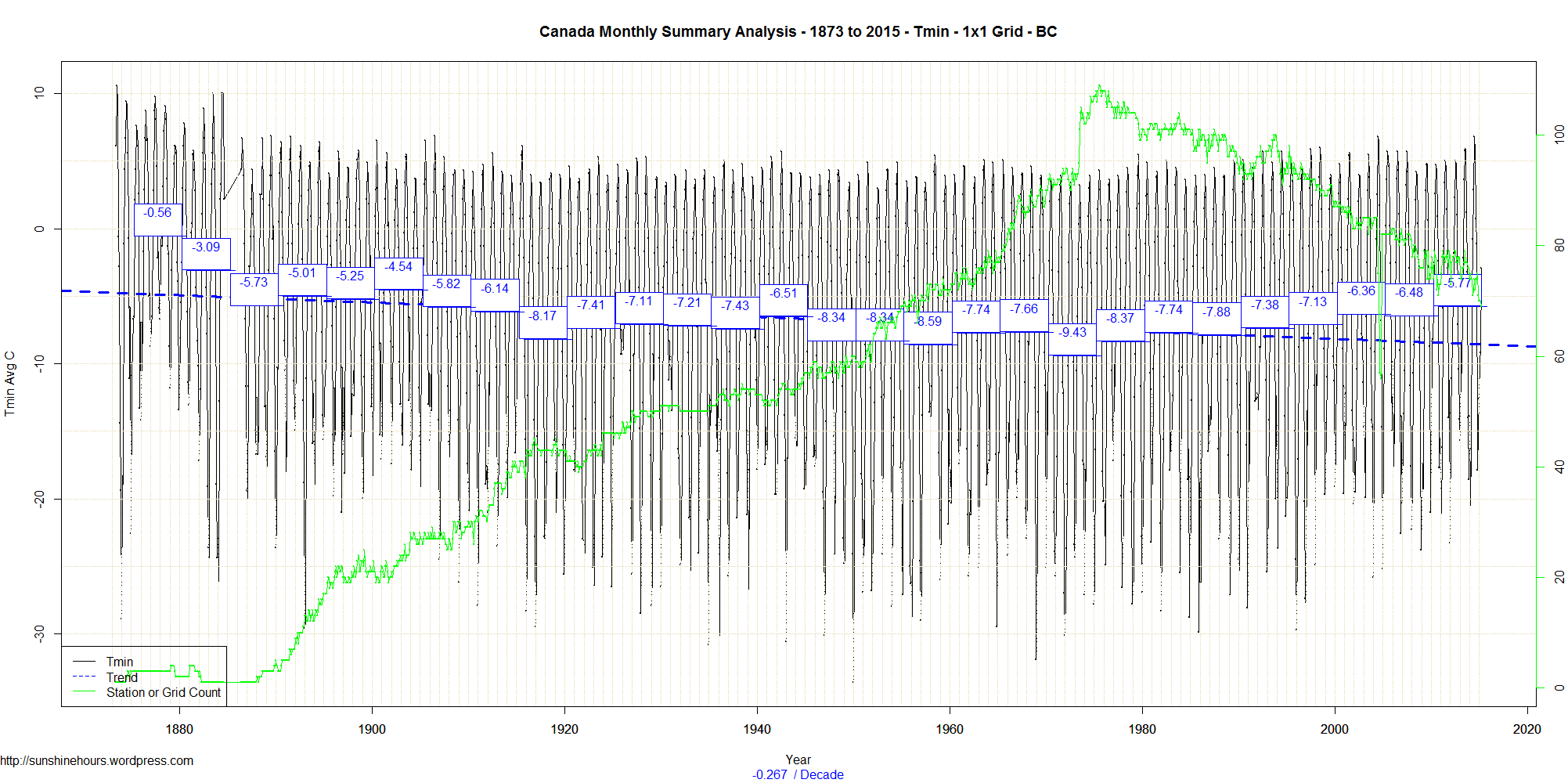
Step 1: Use Data from Environment Canada’s monthly summaries.
Step 2: Summarize the data by 1×1 grid square so no region dominates.
Step 3: Graph Tmax, Tmin and Tmean.
The black line is the monthly data. The blue boxes contain the 5 year mean (and I set the 5 year period by just going back from the most recent data in 5 year increments)
The green line is the number of 1×1 grid squares. The blue dashed line is the trend from 1873 (which is the earliest data).
(I won’t count the pre-1900 data as too important since there were so few stations)
Tmax was 1.5C warmer in the the 1920s/30s/40s than now.
Tmin now is the hottest its been since 1900.
Tmean in the early 40s was slightly warmer than now.
Tmean/Tmin has been warming since 1970 thanks to Tmin … not Tmax.
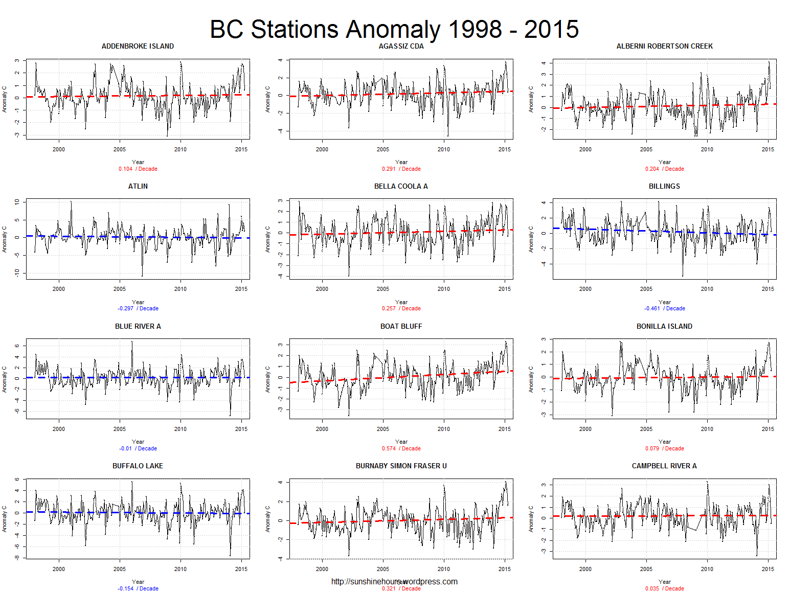
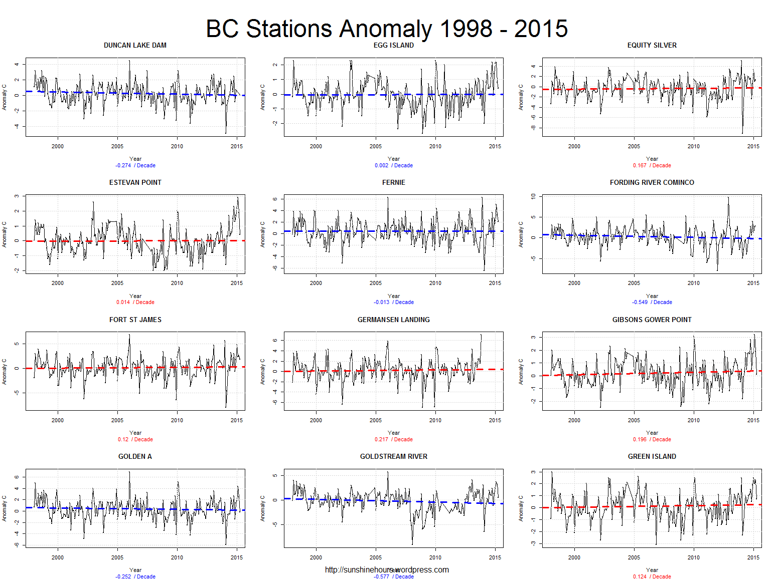
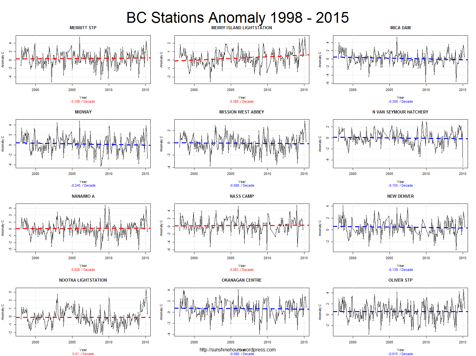
Click for larger:
Tmax
Tmin
Tmean