Update: See bottom map for fun.
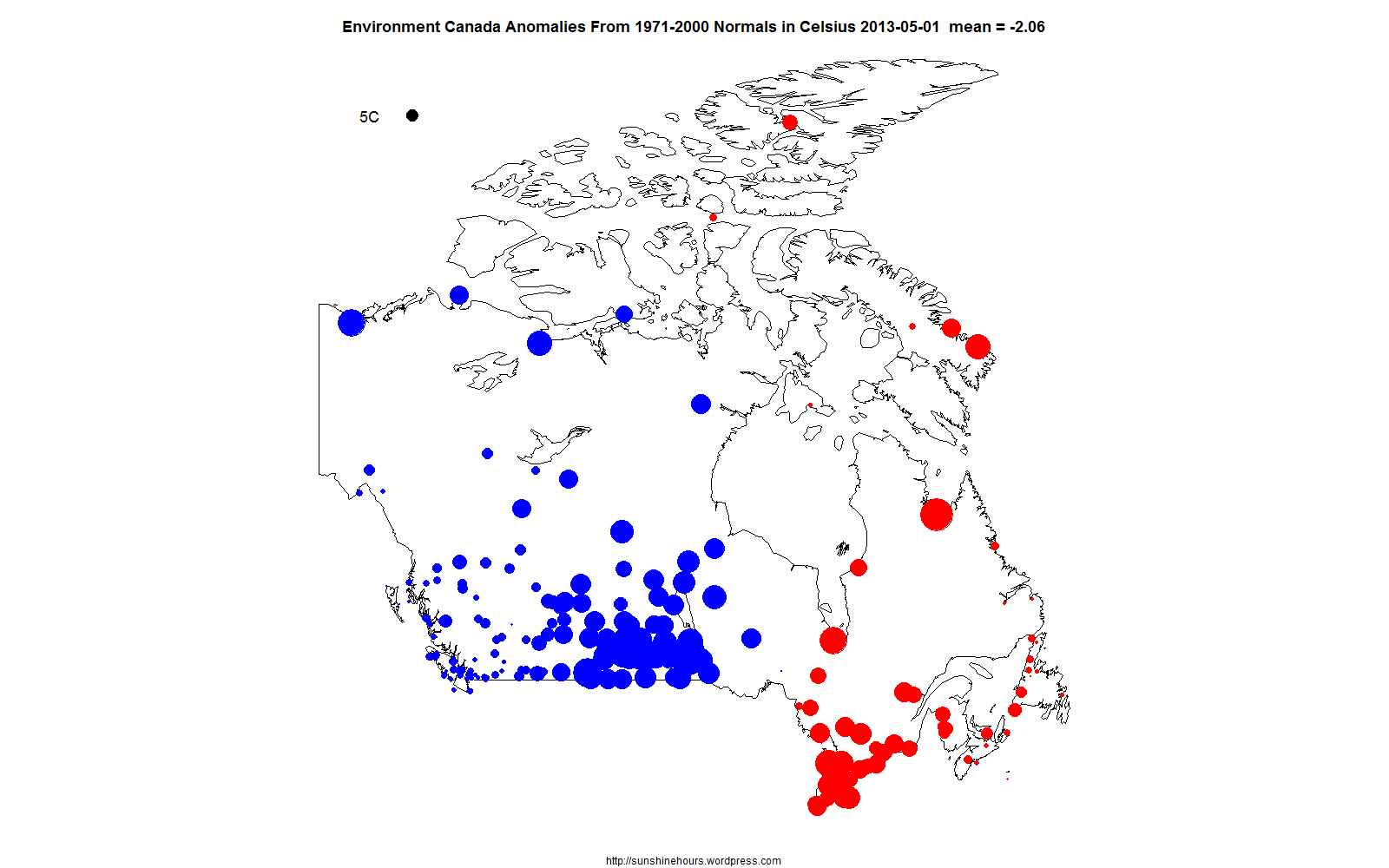
Using the stations in Canada with Environment Canada calculated anomalies, here is the month of May visualized using the mean temperature for each station for each day.
You might have to click on the image or refresh the page to restart it.
The black circle in the top left corner represents a 5 Celsius anomaly from the 1971-2000 average.
Blue are below normal. Red above.
I thought I would map just the stations that were exactly average just for fun:

Interesting analysis. How many anomalies does it take before denialists are forced to admit that the climate is changing?
Climate always changes.
Yawn
At least the results will solve the population problem
Around 2050 world population growth will be near zero.
http://en.wikipedia.org/wiki/File:World_population_growth_rate_1950–2050.svg
Japan , Germany etc are already shrinking.
http://www.telegraph.co.uk/news/worldnews/asia/japan/9999591/Japans-population-suffers-biggest-fall-in-history.html