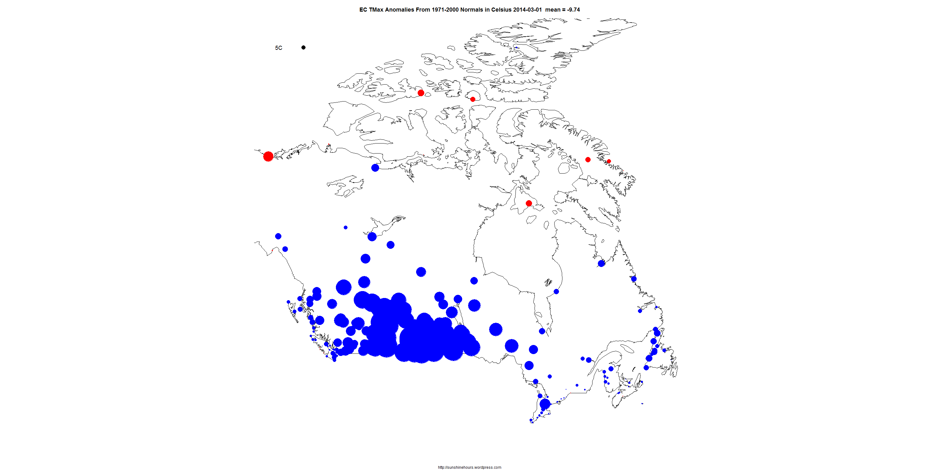
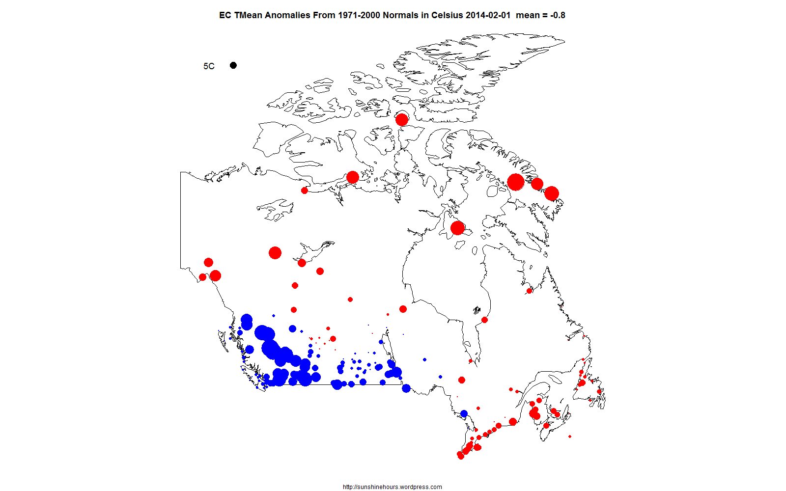
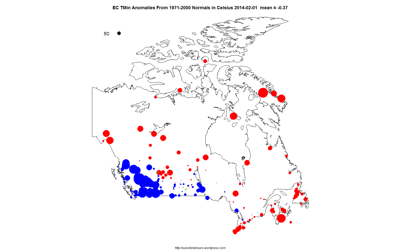
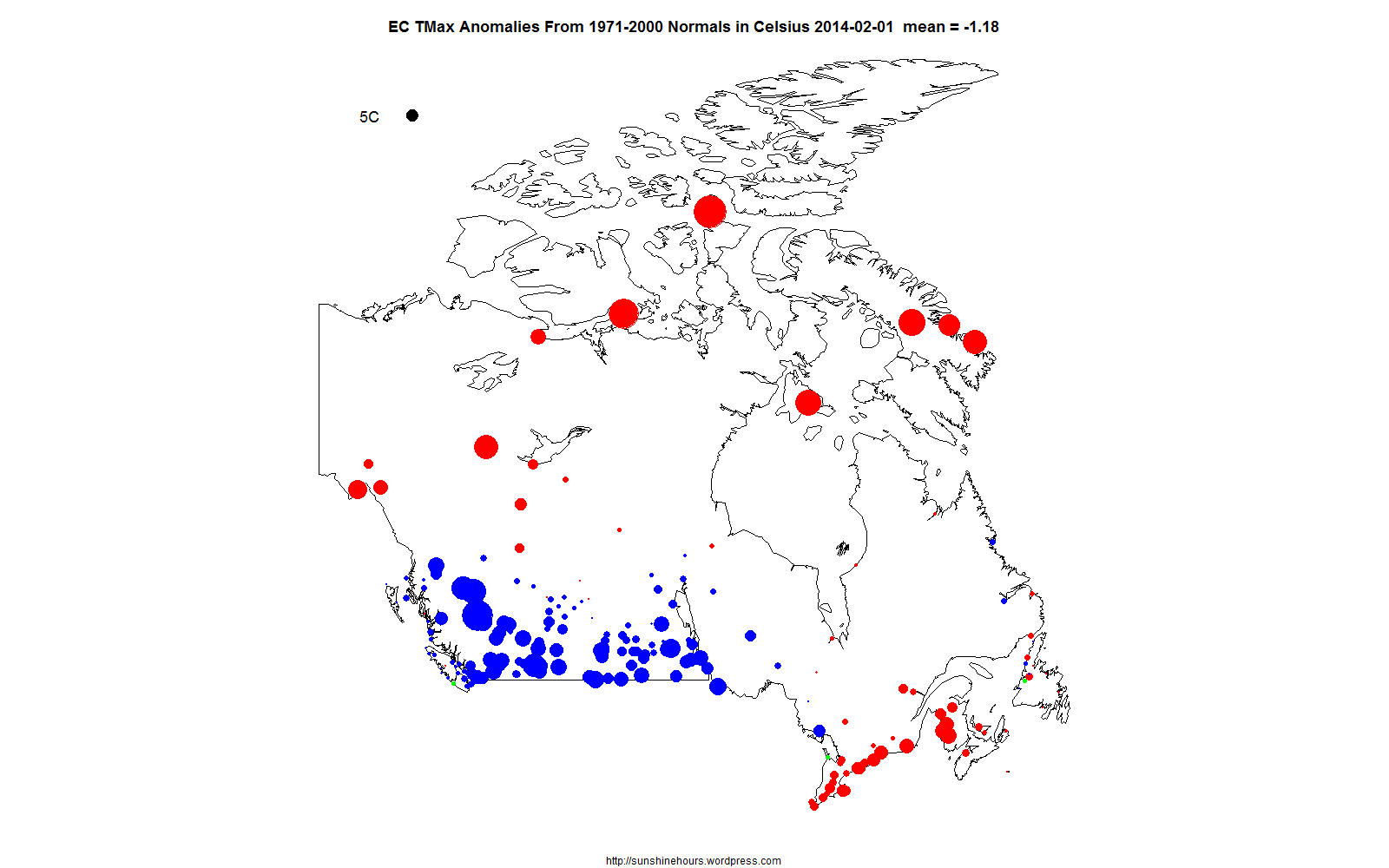
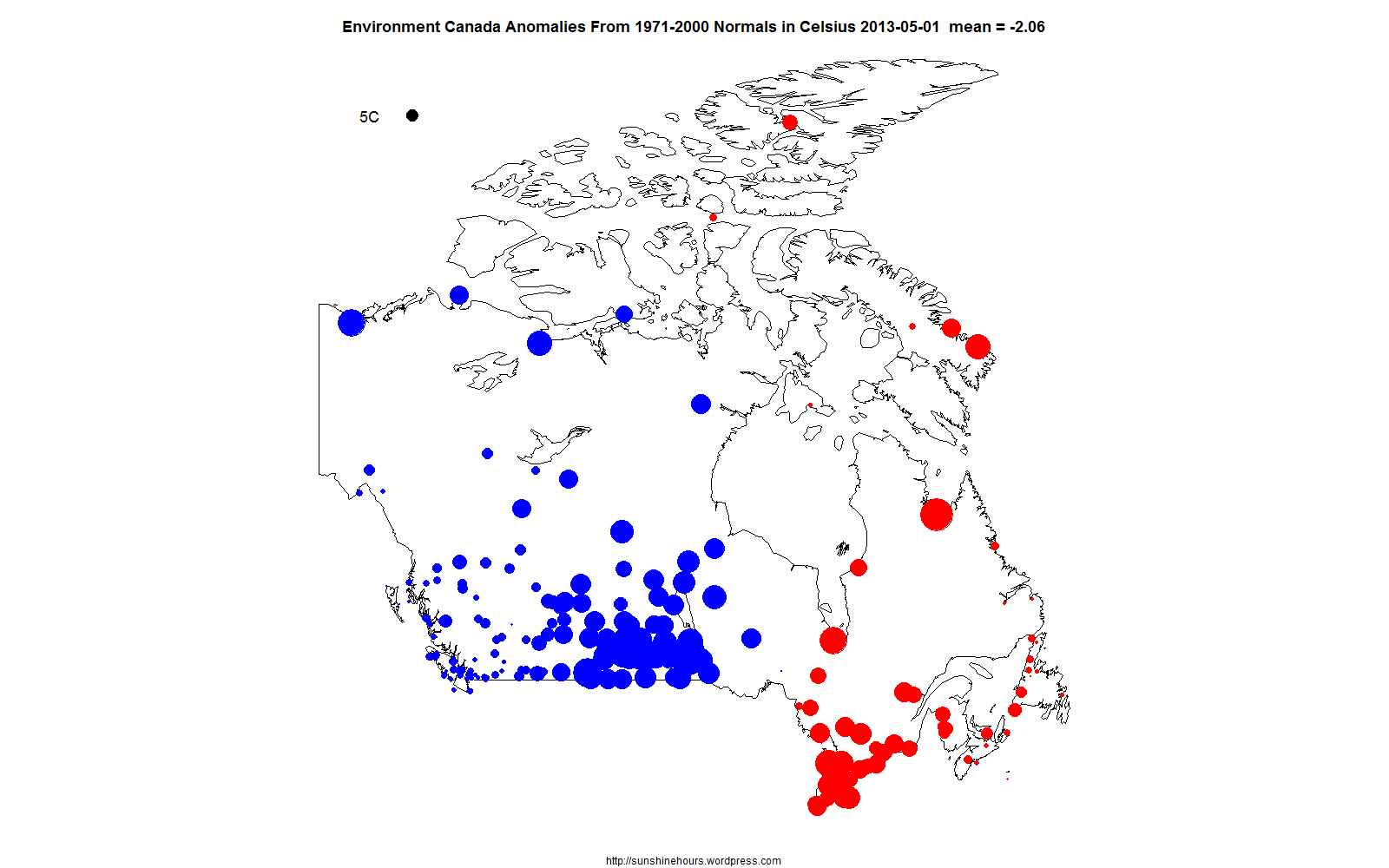
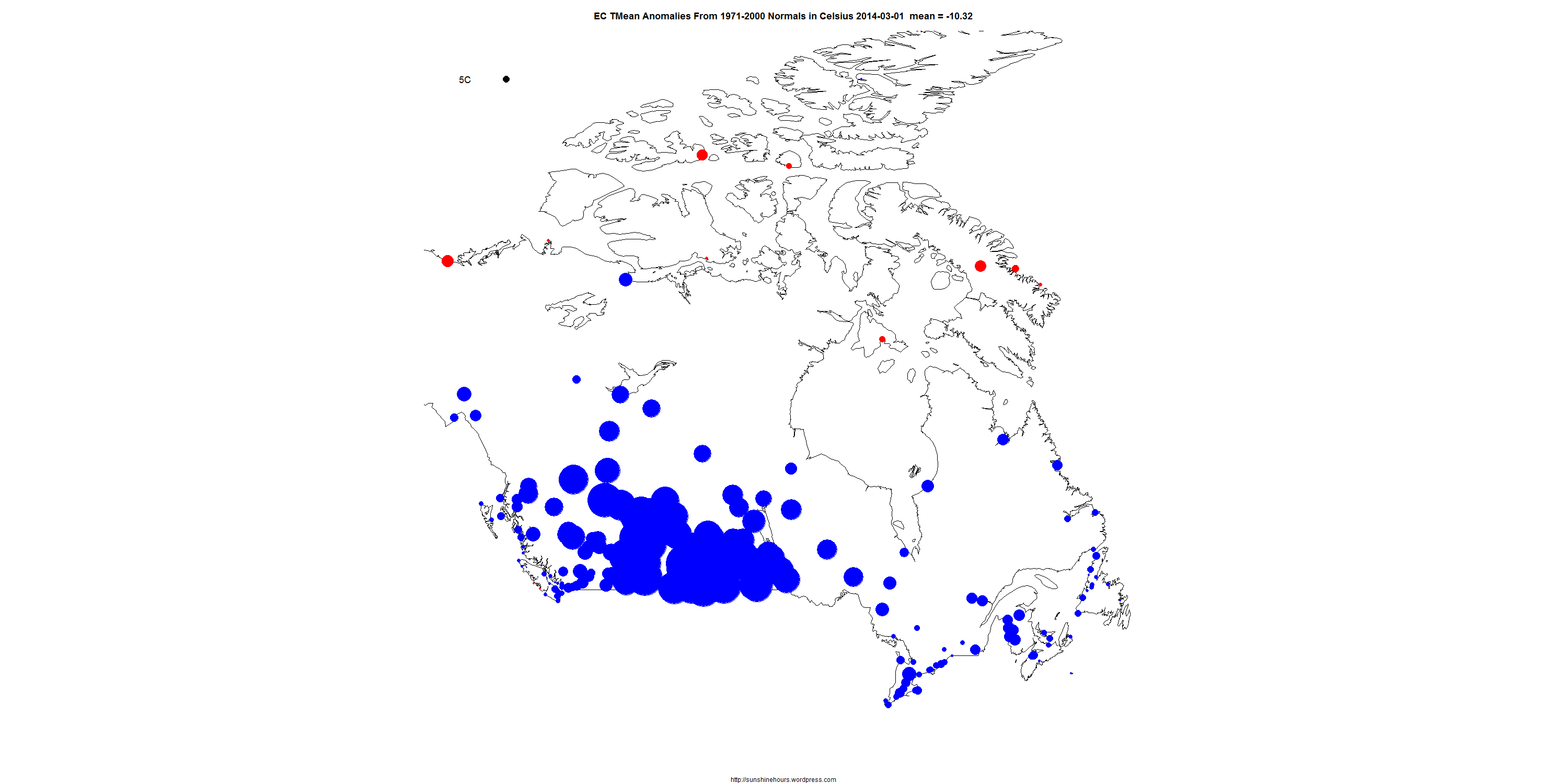
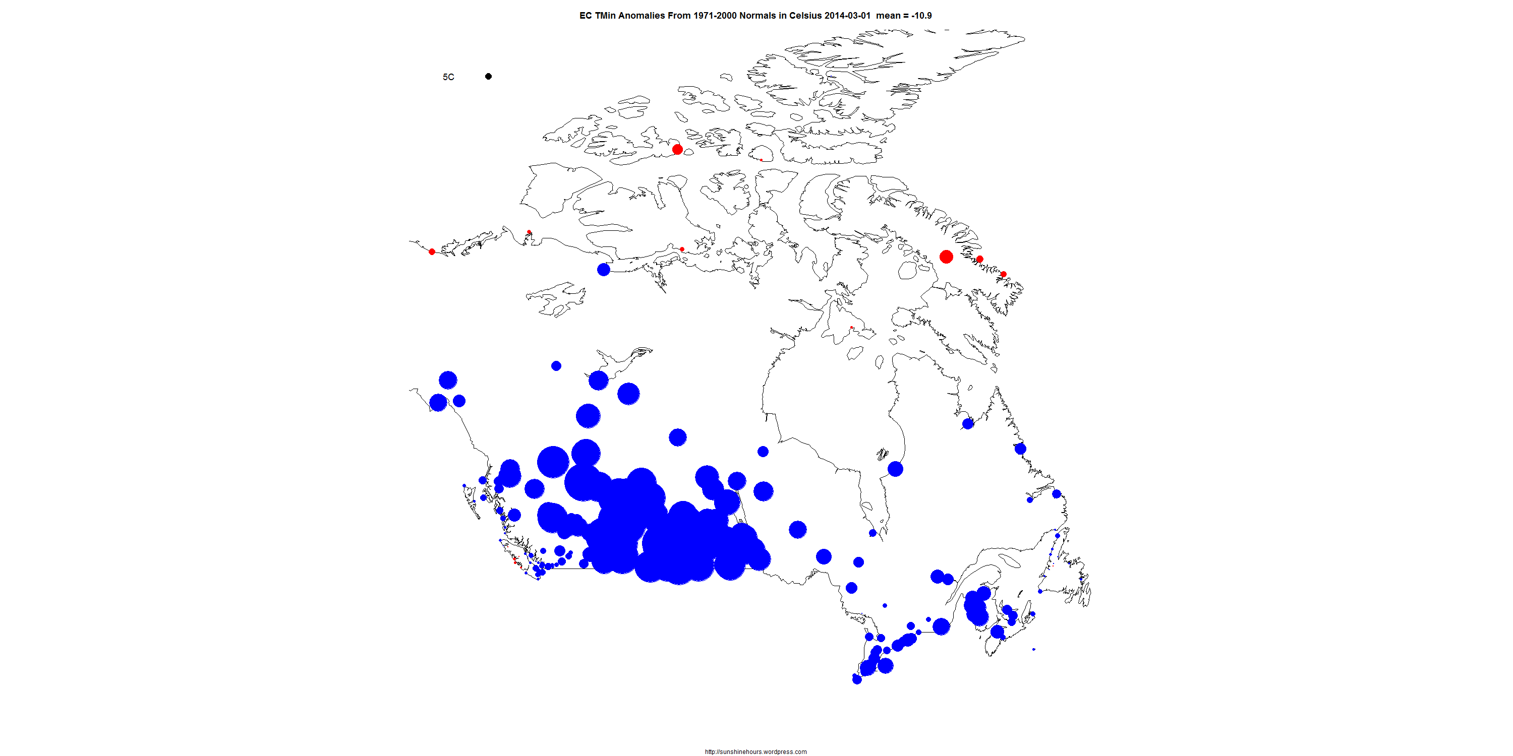
The data is from the daily data put out by Environment Canada. (It is wrong sometimes)
These are ONLY the “Normals” stations (the stations EC calculates anomalies for from the 1971-2000 mean)
The black circle in the top left corner represents 5C divergence from the “Normals”. Blue is cold. Red is warm. Click for bigger. Refresh to make it start over.
There are 3 maps: TMean,TMin and TMax. Click on each for bigger.
TMean
TMin
TMax