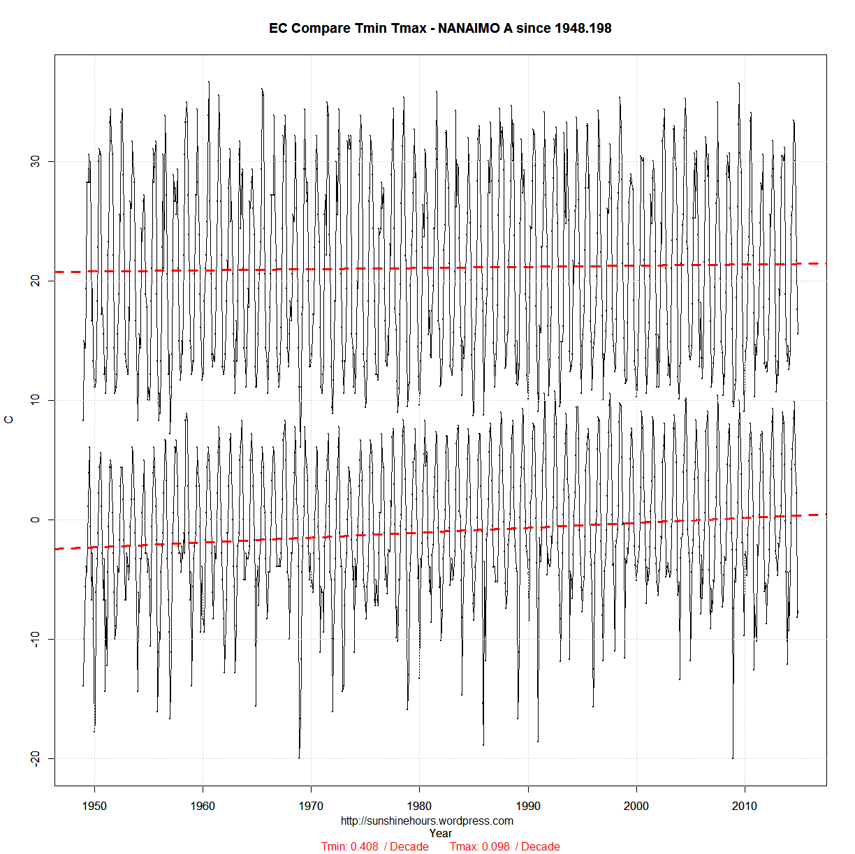
Update: From 1948 added at bottom
Every once in a while I visit the data for the weather station closest to my hometown on the west coast of Canada. The data only starts in the late 1940s so there is no extreme’s from the 1930s and 1940s.
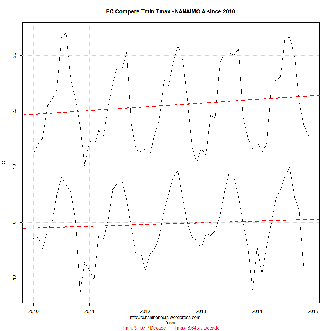
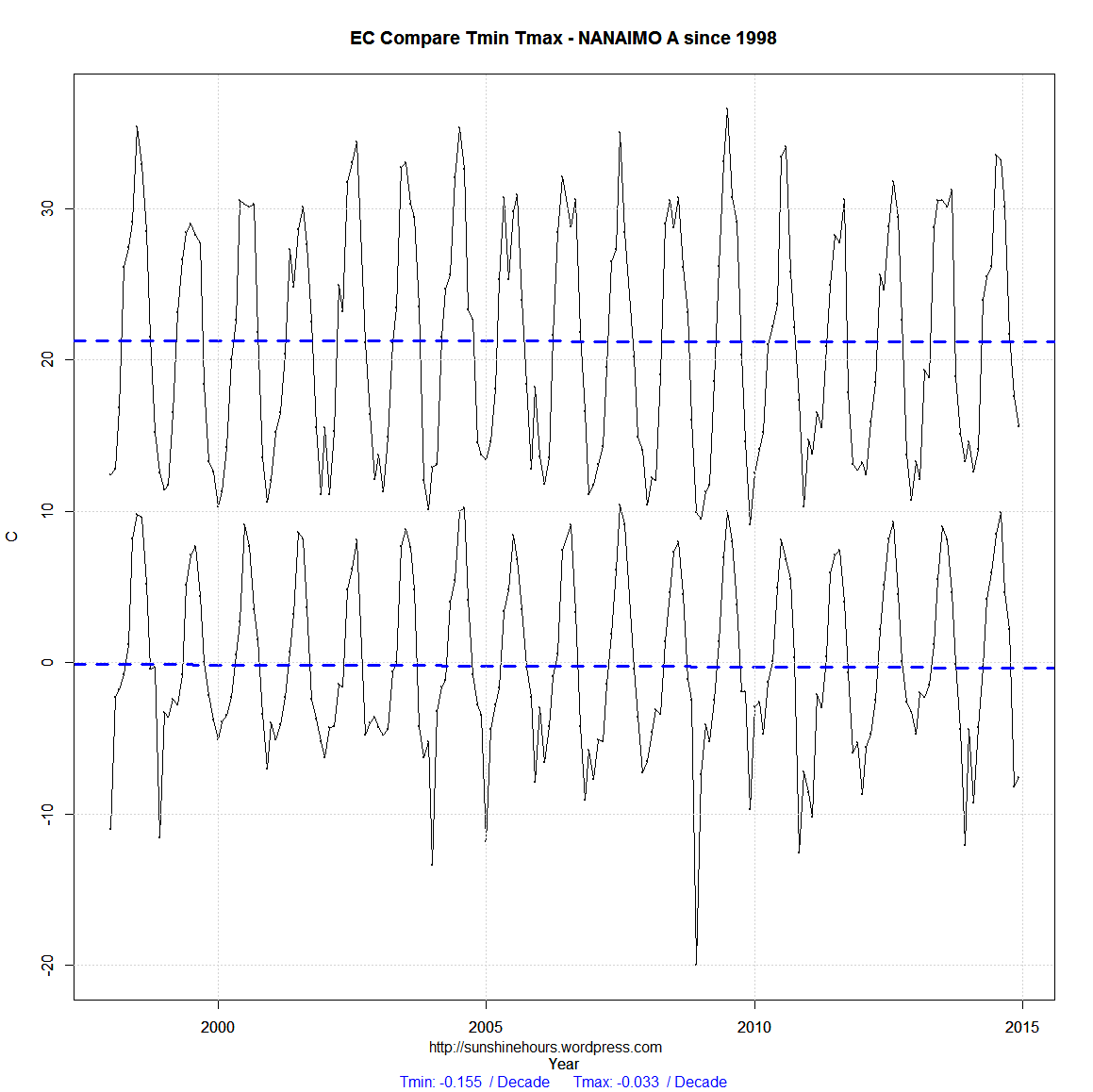
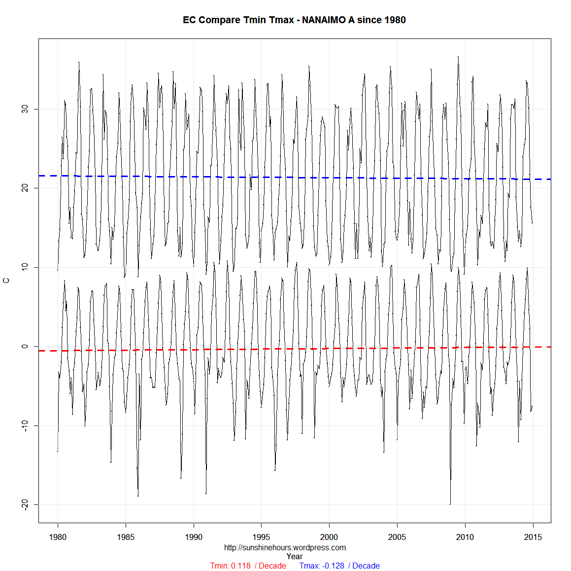
The three graphs below have the Tmin and Tmax data from the Environment Canada monthly reports up to the end of 2014.
The three start in 2010, 1998 and 1980. What does the data tell you?
If you start in 2010 … we are going to bake to death.
If you start in 1998 … we are slowly cooling.
If you start in 1980 the Tmin is climbing and the Tmax is dropping. UHI probably.

Interesting, I like this! In a sense it gives people an idea of what ‘cherry-picking’ means.
I don’t suppose you could graph the entire period you have records for? It would cover the last half of the cooling period which began in the 40s. Actually, most of it.
Done.
Thanks!
I graphed Calgary (closest to me), and same sort of thing! Tmin is rising much faster than Tmax. Same with the ‘cherry’ picked starting point…you get cooling or warming… Unfortunately, the later years at Calg. Airport are missing a lot of data. I believe they also changed locations and instruments….so my later years are ‘messed’ up. if you graph with 3 or 5th polynomial, you can see the up and down swings with regards to the PDO too.
I have done quite a lot of research on max and mins over the years, and for most stations more than 100% of the warming since records began has come from nighttime temperatures. I’m talking about stations that started way back in 1900 or later.
Just in case you don’t follow, this means that in 100+ years daytime temperatures have fallen slightly while nighttime temperatures have risen. The only parts of BC that have seen a decrease in mean temperature are the transition zones between coastal and interior climates (eg. Lytton and Tatlayoko Lake).