Nanaimo Tmin and Tmax from 1980/1998/2010

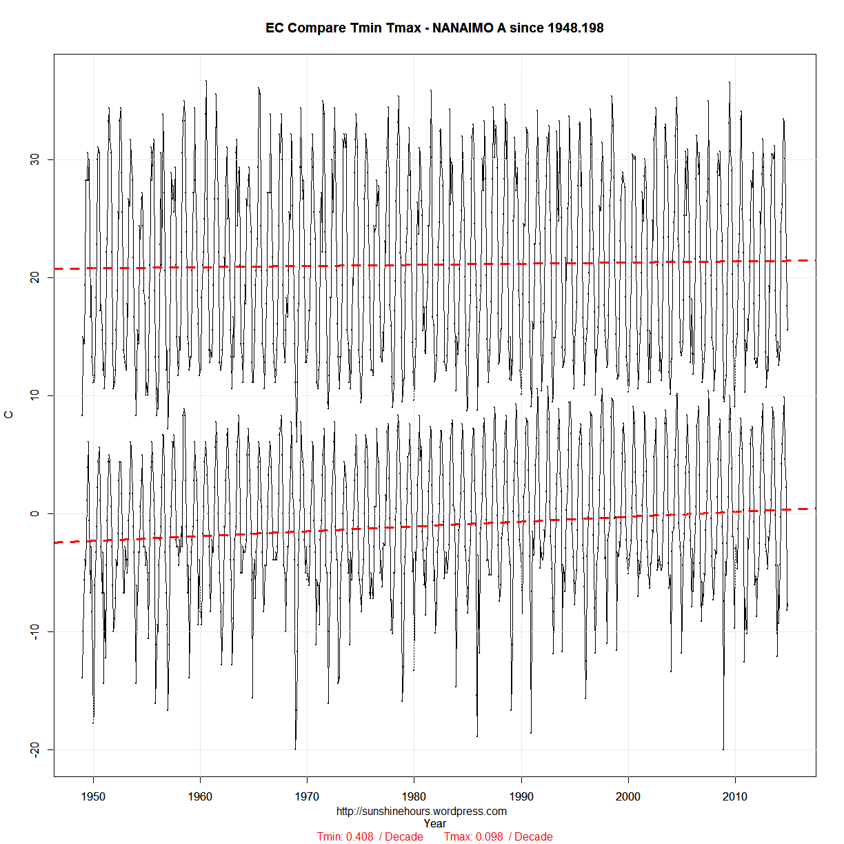
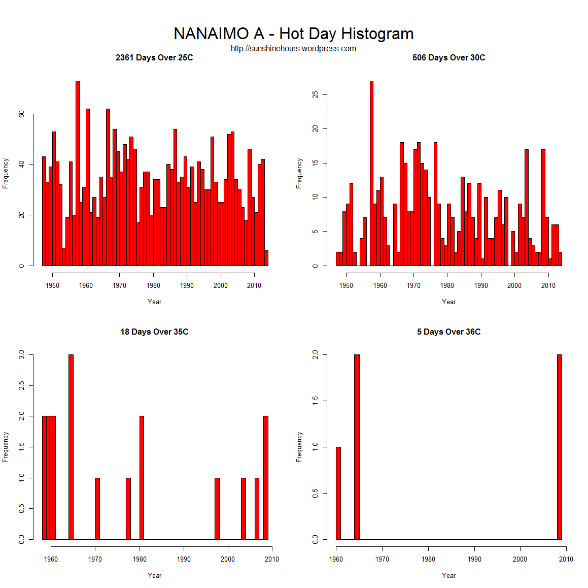
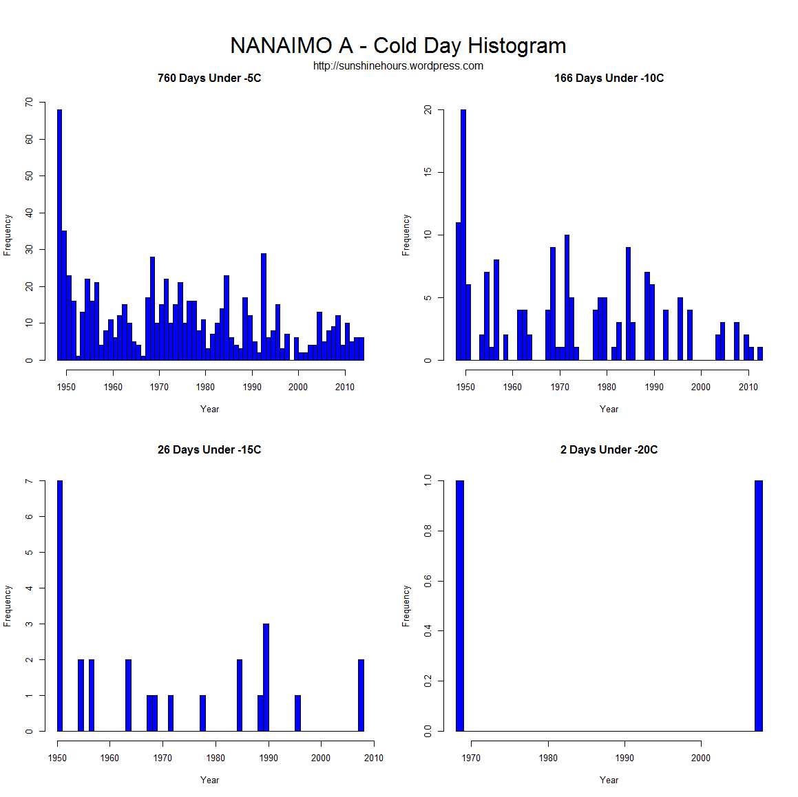
Update: From 1948 added at bottom

Every once in a while I visit the data for the weather station closest to my hometown on the west coast of Canada. The data only starts in the late 1940s so there is no extreme’s from the 1930s and 1940s.

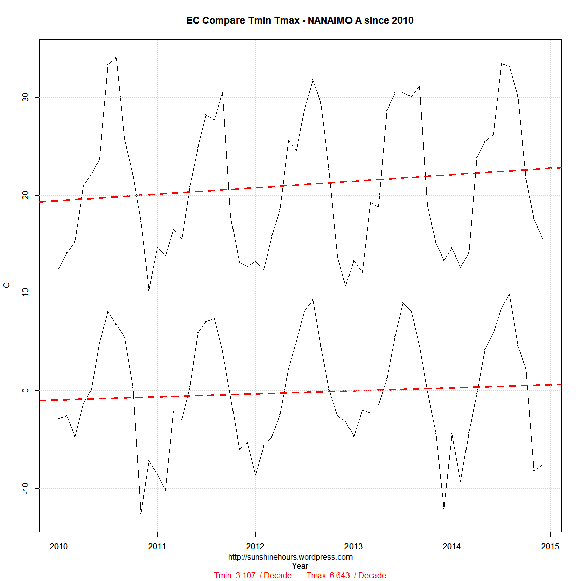
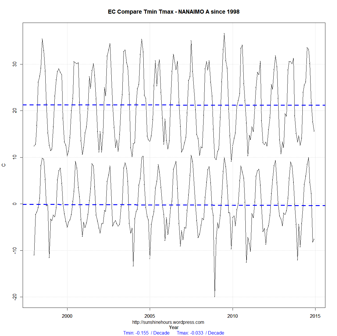
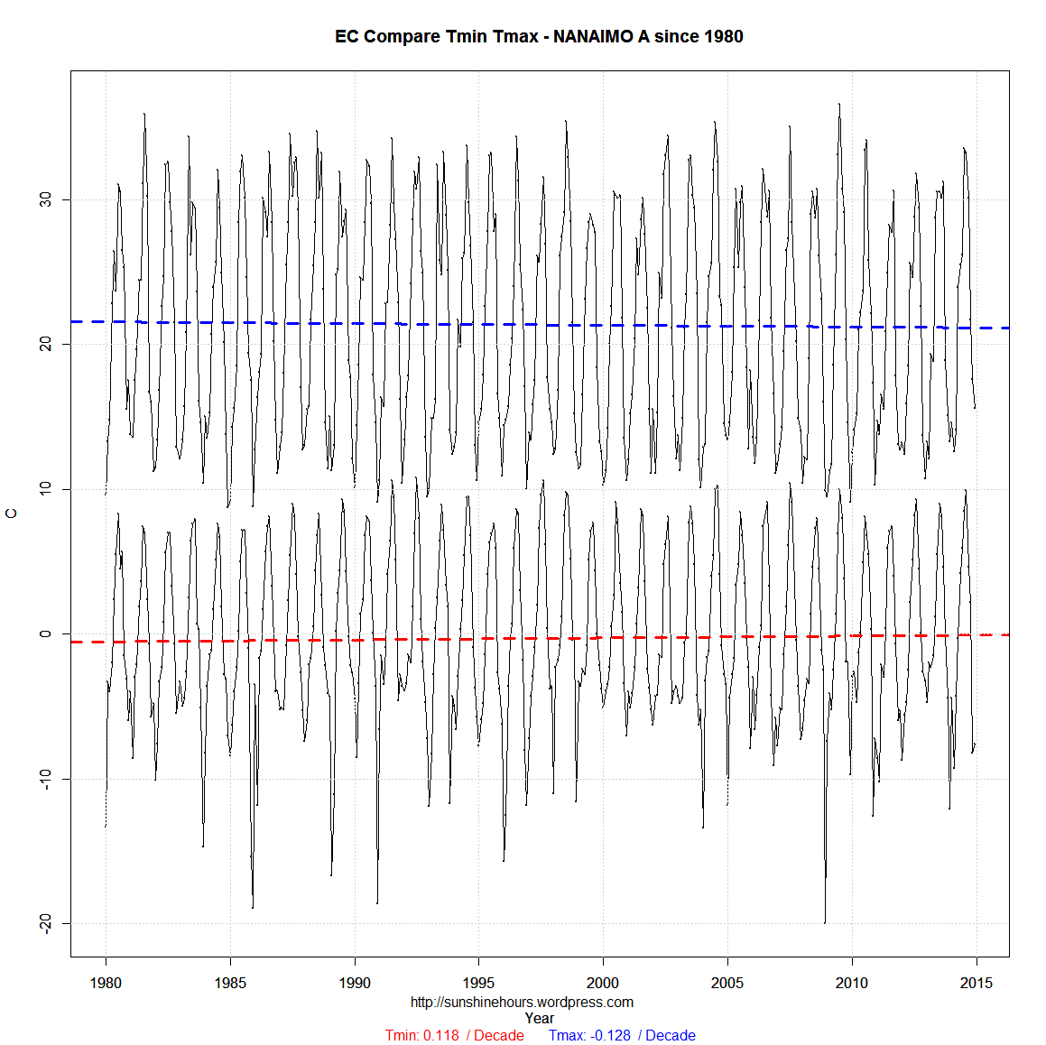
The three graphs below have the Tmin and Tmax data from the Environment Canada monthly reports up to the end of 2014.

The three start in 2010, 1998 and 1980. What does the data tell you?

If you start in 2010 … we are going to bake to death.

If you start in 1998 … we are slowly cooling.

If you start in 1980 the Tmin is climbing and the Tmax is dropping. UHI probably.

EC Compare_min_max-NANAIMO A-2010

EC Compare_min_max-NANAIMO A-1998

EC Compare_min_max-NANAIMO A-1980


EC Compare_min_max-NANAIMO A-1948.198

Nanaimo Hot and Cold Day Histograms – So Much For Extreme Weather

You all know that the AGW cult likes to go on and on about “Extreme Weather” because the warming stopped in 1998 and they like to think the world is coming to an end and only they can save us. Just another end of the world cult.

So I thought I would look at the same data for the weather station closest to my hometown on the west coast of Canada. The data only starts in the late 1940s so there is no extreme’s from the 1930s and 1940s.

One thing to remember. The 2361 Days Over 25C number (for example) includes the 506 Days Over 30C etc.

I don’t see any increase in extreme hot days. I don’t see any increase in extreme cold days.

Aside from 2 hot days in July 2009 (matched by the 3 days in the 1960s) and 1 cold day in 2008 matched by a day in 1968 it seems to have been getting less extreme.

HotDay_Histogram_NANAIMO A - Hot Day Histogram

ColdDay_Histogram_NANAIMO A - Cold Day Histogram