UK Sunshine Hours versus Tmax

You can download climate data from the UK Met here.

If you graph the difference between the median sunshine hours against the difference  between the median maximum temperature (Tmax) you see sunshine on the rise and tmax on the rise.

Don’t forget to ask the AGW side whether climate variables other than CO2 have changed recently.

More Sunshine in the Netherlands

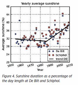
The Hockey Schtick blog has a new post about a paper noting that in the Netherlands “global summer average sunshine …  dimmed during period 1958-1983 [prompting an ice age scare], but markedly increased from 1985-2010.” The paper is here.

Just a reminder that UK sunshine went up starting at almost exactly the same time:

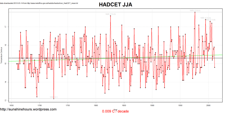
HADCET June July and August trend for 350 years is a measly .009C per decade

HADCET is the Central England Temperature record maintained by the UK Met. The seasonal mean data is available here.

If you graph JJA (June, July and August) the trend is a measly .009C per decade.

The two warmest years are 1976 and 1826. 2011 JJA was 14.8C, below the mean, and 3C colder than 1976.

We were told we were going to fry as “Global Warming” gets going.

HADCRUT3 Northern Hemisphere – December and January

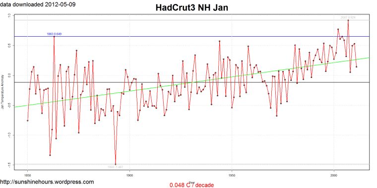
Update:  January data is just as unscary as December. I’ve added it at the bottom.

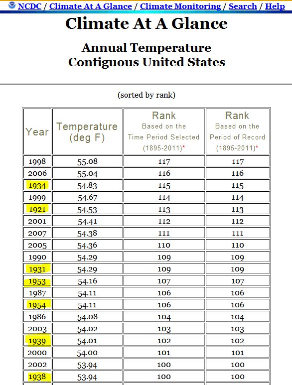
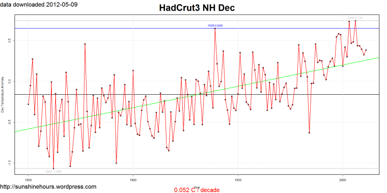
Has anyone ever noticed that the 3rd warmest December in the Northern Hemisphere (according to HADCRUT3) was 1939?

Anyone who wants to remake our fossil fuel economy based on this graph is insane. On top of 2006 being only .095C warmer than 1939, it was only .3C warmer than 3 years in the 1940s/50s. And its just as cold as those 40s/50s years now.


Only two years warmer than January 1863. Doesn’t look too scary. And January’s subsequent to 2007 were much colder than 1863.

NOAA 17 of 48 states warmest decade was far in the past

Using the NOAA data I thought I would look and see when the warmest 10 years were for each state.

17 states warmest 10 years were well in the past. Only 2 were 2002 to 2011. All of the rest but one overlapped 1998. And California was an outlier with 1988 to 1997 as the warmest 10 years. At the bottom of this post is the list with some highlighting.

Here is an animated gif of the 48 states with the warmest 10 years highlighted in gray. Click on it for the full effect.

Is the USA warming? The NOAA data says”It depends” – Part 2

Part 2 of 3. Part 1 explains the series.  Part 1a and Part 1b have some nice graphs

In part 1 I took a look at the NOAA data when it starts in 1895. I then thought why not write an R script to find the trends for each state using every possible year as a start date.

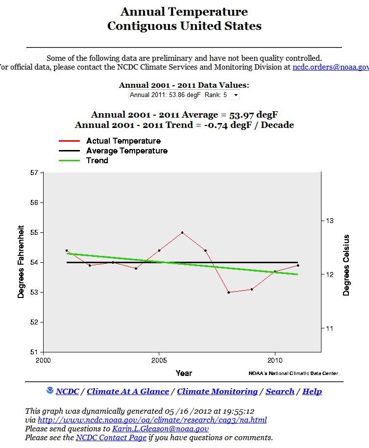
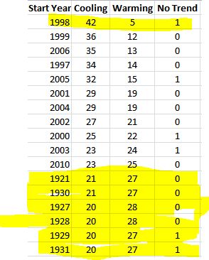
42 of 48 states were cooling and 1 had no trend from 1998. No surprise. The world started to cool in 1998. I’ll return to 1998 in the future.

But look at 1921. And 1930. 21 states have been cooling since 1921 and 1930. 1921 is an important pivot point in US climate.

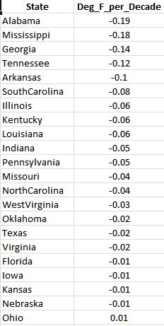
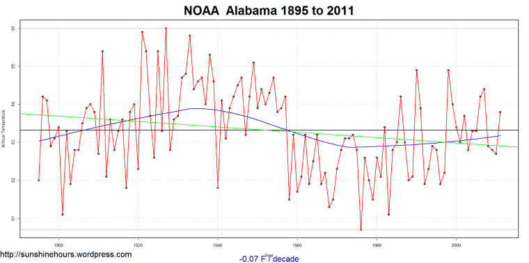
The trend for Alabama is cooling at -0.19F / decade since 1921.

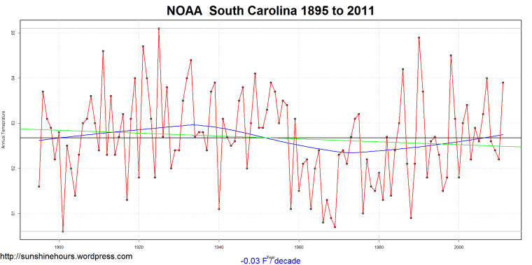
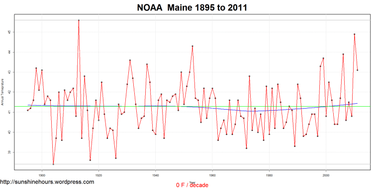
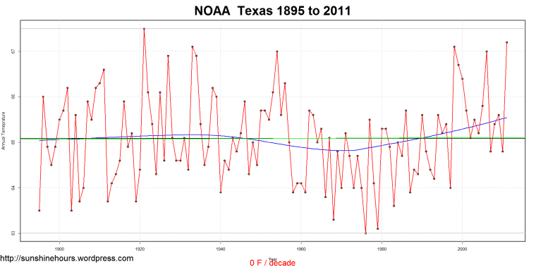
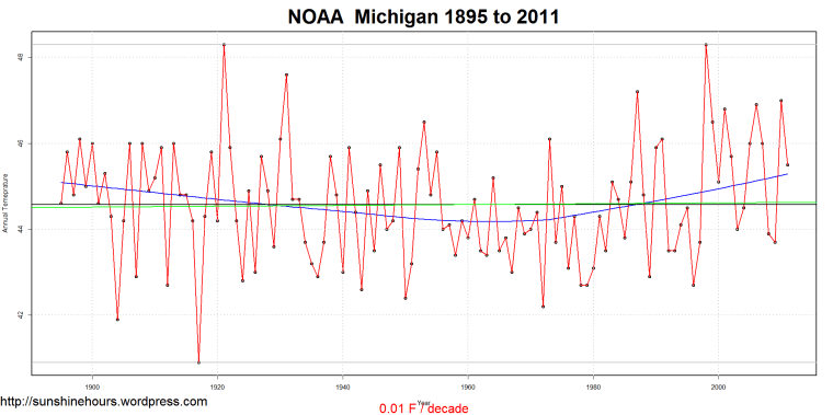
The green line is the trend, the blue line is the default loess fit, the red line is the data, the black line is the average for the whole period, and the faint top and bottom grey lines are max and min.

Does anyone see the mark of CO2 warming in that graph?

Here is the list of states cooling from 1921. (Plus Ohio since .01F is so small)

I’ll include the graph for Tennessee with a new addition — the grey rectangle highlights the 10 warmest consecutive years.

Is the USA warming? The NOAA data says”It depends” – Part 1a

Part 1a of 3. See part 1 for the start of this series. This quick post is just to contain graphs from the other cooling states. Part 1b will be an animated gif of the 48 states where the data starts from 1895.

The green line is the trend, the blue line is the default loess fit, the red line is the data, the black line is the average for the whole period, and the faint top and bottom grey lines are max and min.


Is the USA warming? The NOAA data says”It depends” – Part 1

Part 1 of 3. Update: Part 1a has all the graphs.

There is an article on WUWT called “Drats! Down the warmhole the warming went” about a new paper from Harvard. I’ve blogged about the NOAA data that shows some states have been cooling here, here and here.

There is also an article on WUWT called “Climate scientists who have been claiming Texas is warming are totally wrong.” I commented with some of the links of my articles to show that Texas is not the only state that isn’t warming.

So rather than continuing to investigate the states one state at a time on the NOAA Climate At a Glance page I thought it would be best to download the raw data here, and analyze it with R myself.

So I read the state.README file, created a state to statecode mapping file from the info in the stae.README and started analyzing.

First step was to graph Arkansas, one of the states I looked a previously. as you can see both the NOAA and I think Arkansas is cooling at -.03F/decade since 1895.

The green line is the trend, the blue line is the default loess fit, the red line is the data, the black line is the average for the whole period, and the faint top and bottom grey lines are max and min.

I think we can agree that Arkansas warmed until about 1921, stayed warm until round 1955, cooled until around 1980 and them warmed up again but never matched the 20s/30s/40s.

So then I graphed all of the continental states (Alaska and Hawaii aren’t in the file, but regional and national summaries are). And then I wrote some code to count which states were cooling from 1895 to 2011 and which were warming.

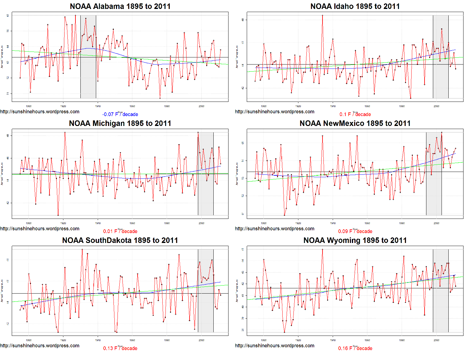
6 of the 48 were cooling. 3 had a trend of 0.  And 5 had a trend of .01F/decade.

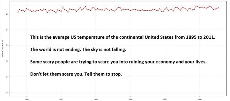
Considering that NOAA/NCDC tend to adjust the heck out of the data to make the present warmer, to find that 30% of the 48 states were cooling to flat from all the way back in 1895 makes me think that the USA is not warming. Parts of it are. Parts of it are not. It is only by putting all of this data in the meat grinder of averaging it all that you can torture out the claim that the USA is warming.

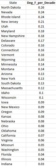
Here are the warming states. 
Oregon – NOAA -1986

Another slight diversion from the Warming Hole Series. Oregon is not in the Warming Hole. And the NOAA says there is a warming trend from 1895 to 2012. That trend is a very small 0.09 degF / Decade. Because I know from other blog posts that the West Coast started cooling in the mid-1980s, I thought I would see which year the climate shifted even with the hopelessly biased NOAA data.

And it was around 1986. -0.25 degF / Decade.