Washington – NOAA -1986

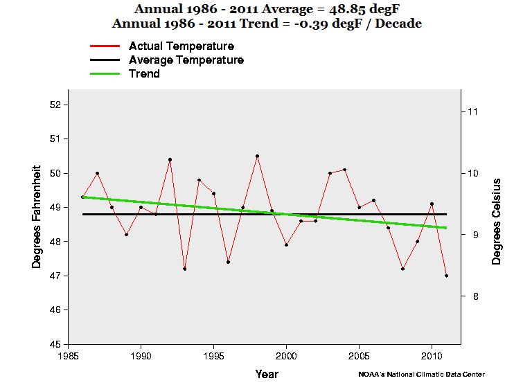
A slight diversion from the Warming Hole Series. Washington State is not in the Warming Hole. And the NOAA says there is a warming trend from 1895 to 2012. That trend is a microscopic 0.05 degF / Decade. Because I know from other blog posts that the West Coast started cooling in the mid-1980s, I thought I would see which year the climate shifted even with the hopelessly biased NOAA data.

And it was around 1986. -0.39 degF / Decade.


The Warming Hole – Illinois – NOAA

This is the 3rd or 4th in a series. There is an article on WUWT called “Drats! Down the warmhole the warming went” about a new paper from Harvard:

“Climate scientists at the Harvard School of Engineering and Applied Sciences (SEAS) have discovered that particulate pollution in the late 20th century created a “warming hole” over the eastern United States—that is, a cold patch where the effects of global warming were temporarily obscured.”

The argument is essentially that the air pollution over the northeast USA kept temperatures artificially cool until clean air legislation in the 1970s – 1990s time frame.

So I’ve been looking at the NOAA data. Today it is Illinois.

The NOAA says Illinois has been warming since 1895 by a microscopic 0.04F / decade.

Frankly, I don’t see it. See the area I circled above. Wouldn’t you agree that was the warmest period in the last 120 years?

If I change the start year to 1925, Illinois has been cooling at -0.04 degF / Decade.

Changing the criteria to Table and Rank, here are some things that jumped out at me.

1) 1921 was the warmest year.

2) The warmest year from this century was 2006, 106 out of 117th.  It didn’t make the top 10.

3) 2011 tied for 92 out of 117 … 2.6F colder than 1921.

4) CO2 is one wimpy GHG in Illinois

Changing criteria to Table and Year

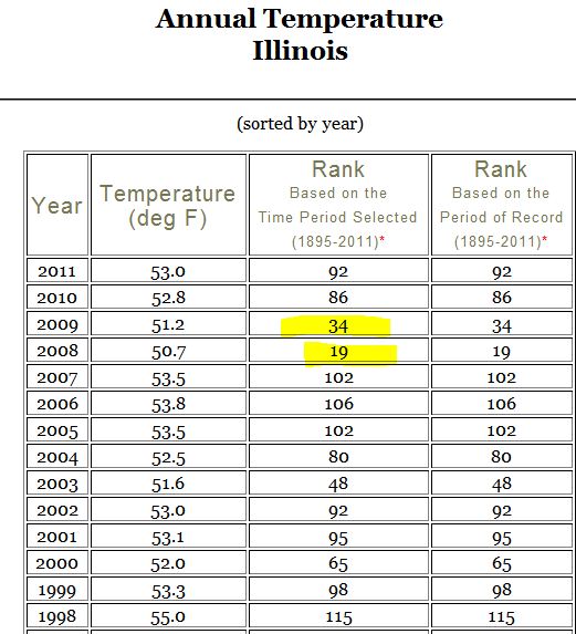
1) 2008 was ranked 19 out of 117. 98 years were warmer!

2) 2009 was ranked 34 out of 117. 83 were warmer.


The Warming Hole – Tennessee – NOAA

This is the 2nd of a series of … until I get bored with it. 🙂

There is an article on WUWT called “Drats! Down the warmhole the warming went” about a new paper from Harvard:

“Climate scientists at the Harvard School of Engineering and Applied Sciences (SEAS) have discovered that particulate pollution in the late 20th century created a “warming hole” over the eastern United States—that is, a cold patch where the effects of global warming were temporarily obscured.”

The argument is essentially that the air pollution over the northeast USA kept temperatures artificially cool until clean air legislation in the 1970s – 1990s time frame.

So I’ve been looking at the NOAA data. Today it is Tennessee.

And the results are quite interesting.

The NOAA says Tennessee has been cooling since 1895 by -.03F / decade. Which is the same as Arkansas.

Changing the criteria to Table and Rank, here are some things that jumped out at me.

1) Only 1 year from this century made the top 10 – 2007

2) 2011 is at position 88 out of 117

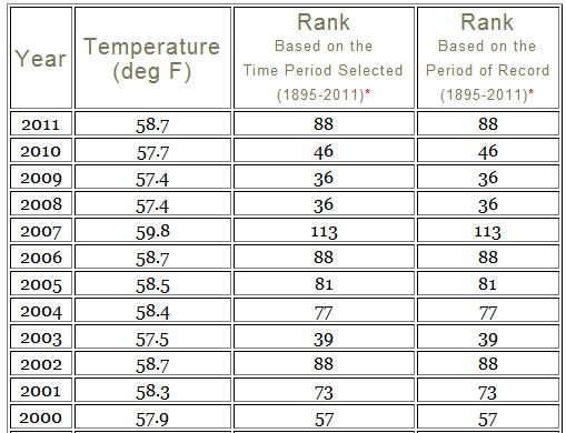
If you sort by year, 2010 was 46 out of 117 and 2009 and 2008 were 36 out of 117. Those are really low scores!  It has been a cold century in Tennessee.

Take a look at the bar chart. CO2 is the wimpiest GHG ever! The 20s and 30s and 40s were hot compared to this whole century.

You have to wonder why all that sulphate in the air totally neglected to effect Tennessee until 1960!

The Warming Hole – Arkansas – NOAA

There is an article on WUWT called “Drats! Down the warmhole the warming went” about a new paper from Harvard:

“Climate scientists at the Harvard School of Engineering and Applied Sciences (SEAS) have discovered that particulate pollution in the late 20th century created a “warming hole” over the eastern United States—that is, a cold patch where the effects of global warming were temporarily obscured.”

The argument is essentially that the air pollution over the northeast USA kept temperatures artificially cool until clean air legislation in the 1970s – 1990s time frame.

So I’ve been looking at the NOAA data. Today it is Arkansas.  The settings I use are:

And the results are quite interesting.

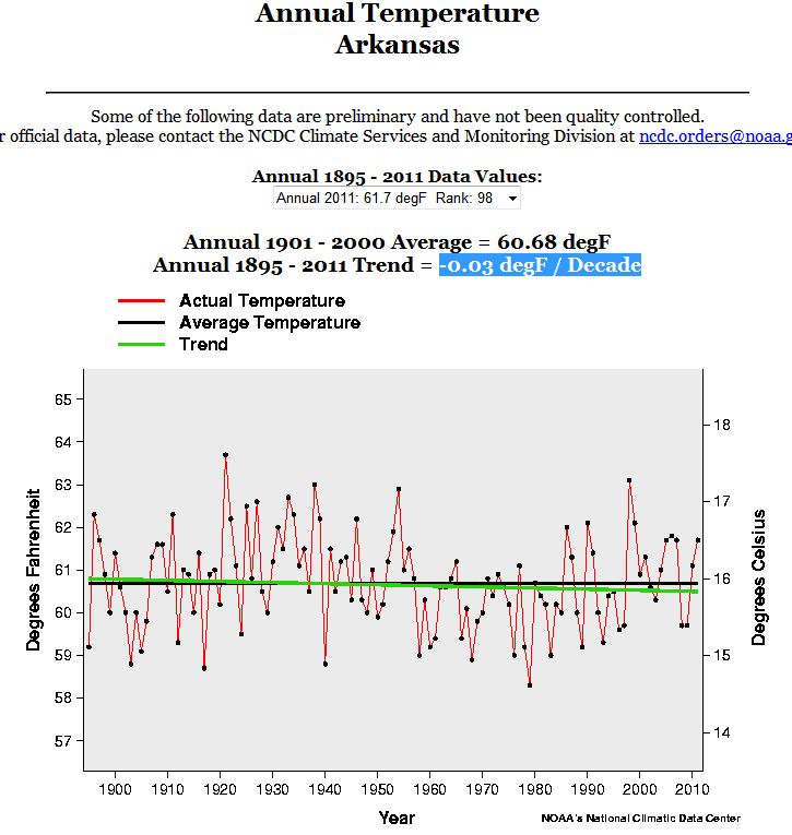
The NOAA says Arkansas has been cooling since 1895 by -.03F / decade.

Changing the criteria to Table and Rank, here are some things that jumped out at me.

1) The warmest year from this century was 2006, 99 out of 117th. 18 years were warmer.

2) 1896 was tied with 1934 for 110th out of 117.

3) 1897 was tied with 2011.

4) CO2 is one wimpy GHG in Arkansas

What does NOAA mean by “Near Normal”?

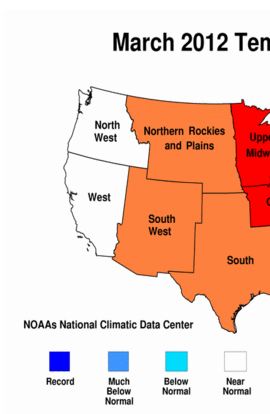
Yes I know that most of the USA was warm in March of 2012. But what does the NOAA mean by “Near Normal” in the North West and West regions?

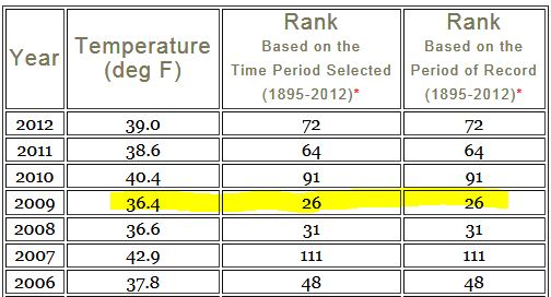
In the North West, March 2012 was the 72nd warmest March out of 118. 118 is the warmest. It was 7F colder than 1934 which was the warmest March.  7F colder. Wow.

The North West has been cold recently. March 2011 was the 64th warmest, 2010 was the 91st warmest, 2009 was the 26th warmest and 2008 was the 31st warmest.

92 Marches were warmer than 2009. 2009 was 9.6F colder than March of 1934.

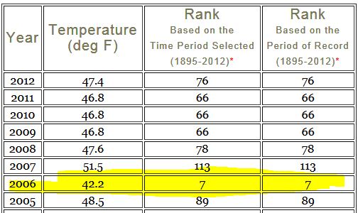
In the West region, March 2012 was 76th warmest.  It was 7.6F colder than 1934, again the warmest March.

But take a look at 2006. 7th warmest. 111 were warmer. The last 5 years have been quite cold.

1934 sure turns up a lot as the year with the warmest month.

Wait until we took a look at April. I’ll give you a hint. 5th and 6th warmest out of  118 in the last 4 years. 112 and 113 warmer Aprils.

West Coast has been cooling since 1983!

Update:  See the cooling as an animated gif.

Did you know it is cooling on the west coast of North America from 1983 to 2011? Before I show you how I found that out and what I found, I will tell you a story.

About a month ago I was reading the Victoria Times Colonist and read an article titled Warmer weather in B.C. threatens waterfront, forests. The key sentence to me wasAn analysis of 62 years of Environment Canada weather data by the University of Victoria’s Pacific Climate Impacts Consortium has found that B.C.’s temperature has been warming by about 0.25 degrees Celsius per decade”  which came from this report .

My first thought was “No Way”. I live in BC. It hasn’t been warming recently. But how was I to prove otherwise?  I sent an email to Francis Zwiers who is the Director and I sent him a couple of screen shots from GISS from a few nearby climate stations showing that it has been warmer , and recently it hasn’t been warming. I sent a screenshot of Clearbrook (and a few others) which is right on the border with BC in Washington State. Fig 1 Clearbrook from GISS.
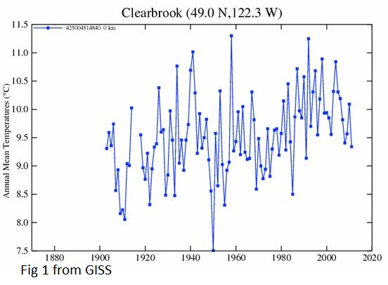
The key number in the quote was 62 years, which means they were using 1950 as a starting year. Clearbrook exhibits one of the common signatures of west coast climate stations – 1950 was amazingly cold. You can see that temperatures dropped 3.5C from 1940 to 1950.1950 on the west coast is kind of like a micro Little Ice Age. Sure it warmed after 1950 because every year was warmer than 1950.

After a few emails back and forth I asked for his data. Guess what he said? “It’s publically available from Environment Canada.” Sound familiar? That kind of ticked me off. To be fair, after a couple more emails he offered to send me the data and also pointed me at an Environment Canada website where I could scrape it myself or I could wait for the public access portal they were planning.

By then I had decided it was time to learn R. I wrote an R script to scrape the EC site for data and then I came across a tip that would allow me to segment a plot into 12 subplots and thought why not show each month.  I picked Victoria Int A from 1998 to 2011. I chose to take the lm  (linear model) value from [R] and multiply it by 10 to show the trend in C per decade.

Fig 2 – Victoria Int A 1998 to 2011
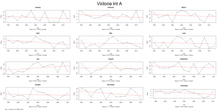
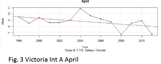
Even though it was an airport some months were cooling. Fig. 3 Victoria April 1998 to 2011
Then the BEST data came out with a new release. I decided to compare BEST with Environment Canada and found some interesting things out. But that’s a different story. I decided to rewrite my [R] script and analyze the Quality Controlled release, and I came up with another idea of “mapping” the stations by color (red for warming and blue for cooling) against latitude and longitude.

The code to do Victoria (or any other station) is not complex. Assuming you have the BEST data loaded as BESTdata and the column names are Year, Tm, Month and Station_ID here is a snippet of code to graph Victoria.

months <- c(“January”,”February”,”March”,”April”,”May”,”June”,”July”,”August”,”September”,”October”,”November”,”December”)
dev.new(width=1200,height=800)
split.screen( figs = c( 4, 3 ) )
par( oma = c( 0, 0, 3, 1 ) )
sid<- 7998
dfOneStation <- subset(BESTdata,Station_ID == sid & Year >= 1990,select=c(Year,Tm,Month))
decslope.all <- 0
decslope.count <- 0
for (i in 1:12) {
screen(i)
dfOneStation.m <- subset(dfOneStation,Month == i )
r = lm(dfOneStation.m$Tm~dfOneStation.m$Year)
Decadal_slope <- round(coef(r)[2],digits=4) * 10
decslope.all <- decslope.all + Decadal_slope
decslope.count <- decslope.count + 1
mTitle = paste(months[i],Decadal_slope,”Celsius/Decade”)
if (Decadal_slope > 0) {
colmain = “red”
} else { colmain = “blue”}

plot(dfOneStation.m$Year,dfOneStation.m$Tm,main=mTitle,type=”o”,xlab=”Year”, ylab=”Temperature”,col.main=colmain)
abline(r,col=colmain)
}
ds <- decslope.all/decslope.count
if (decslope.all > 0) {
colmain = “red”
} else { colmain = “blue”}
mtext(paste(sid,” “,round(ds,digits=4),” Celsius/Decade”,sep = “”,collapse = NULL), outer = TRUE, cex=2,line=1 ,col=colmain)

Fig. 4 is Victoria done using code snippet
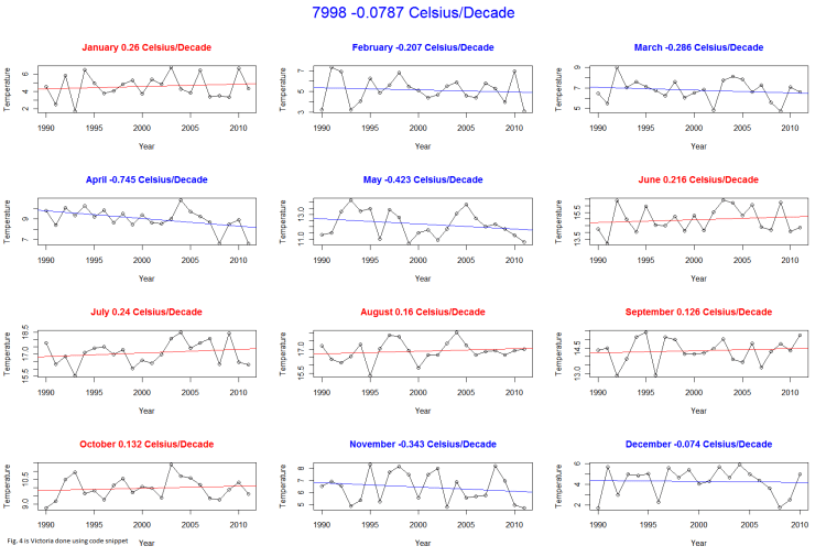
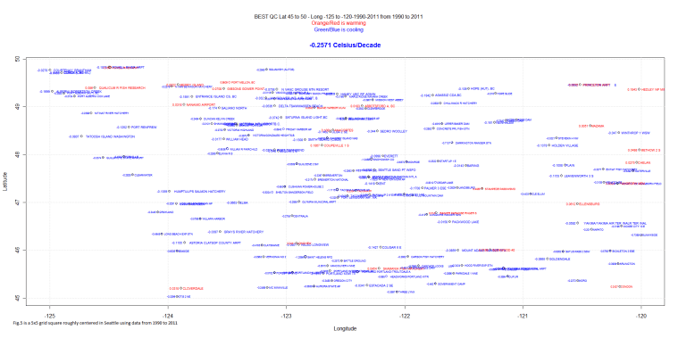
Fig. 5 is a “map” Fig. 5 is a 5×5 grid square centered around Seattle using data from 1990 to 2011 (only stations with data in 1990 and data in 2011) It is really cooling by -.2571 Celsius per decade.
And, just to be fair, Fig. 6 is the same grid square 1945 to 2011. Notice that a few stations are still cooling and the warming trend is only .1C per decade.
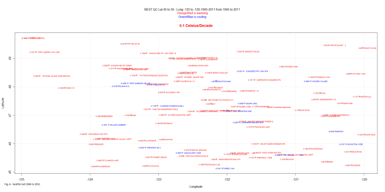
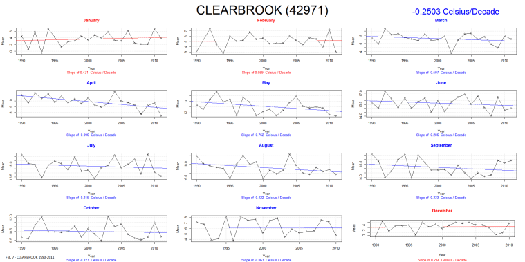
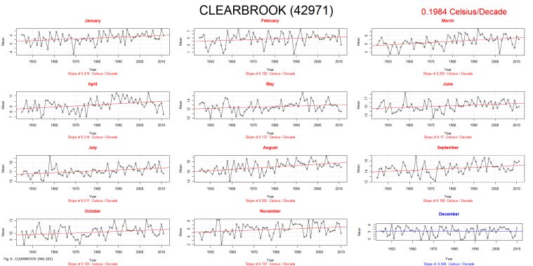
Fig. 7 is Clearbrook for 1990 to 2011 and Fig. 8 is Clearbrook for 1945 to 2011.

Notice that on both graphs there is still one or more months that are contrary to the overall trend. That is quite common.  Of course sometimes the trends are quite miniscule one way or the other. And other times they are huge.

After running my script for a few regions I am just amazed at the difference between stations. Fig. 9 is Crete Nebraska, warming at a miniscule .031C/Decade since 1910! And yet July, August, September and October (not shown) are cooling and have never been as warm as the 1930s:

I could bounce all over the world with fascinating examples.

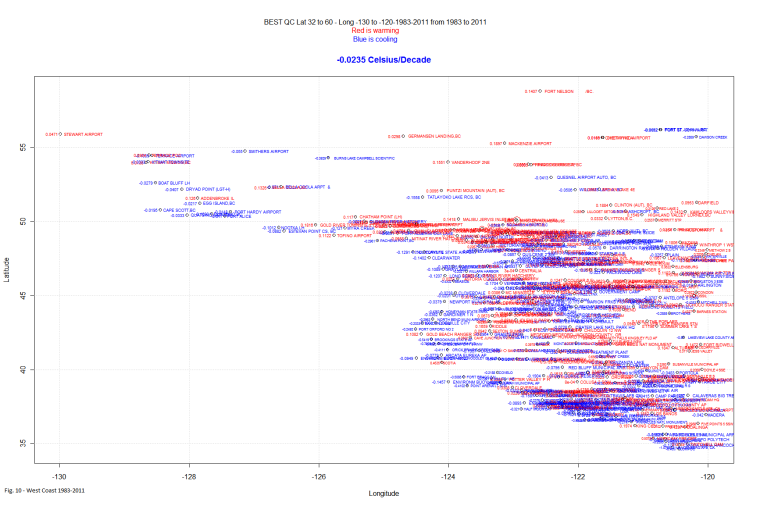
But, is the west coast warming? In this case, by West Coast, I mean a box Latitude 32 to Latitude 60 and Longitude -130 to -120. It is slightly cooling from 1983 to 2011. There appears to have been a climate shift well before the 1998 one seen in the global indexes like CRU.  Fig. 10 – West Coast 1983-2011
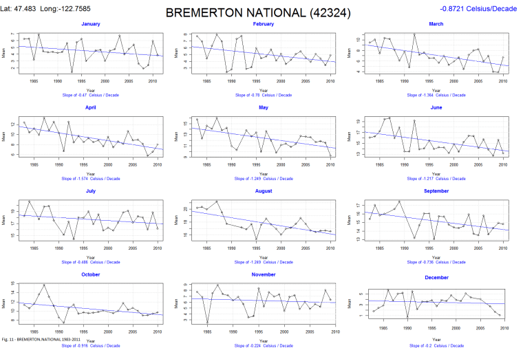
One of the stations with the biggest cooling trend is Bremerton National. It is cooling at a rate of -.87 Celsius/decade.  And it is an airport! Fig. 11 – BREMERTON.NATIONAL 1983-2011
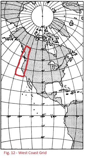
The grid I call the West Coast is shown here in Fig. 12
Climate Data and Elevation

Yesterday, The Cheefio mentioned “During the times I was looking at GIStemp, I’d noticed that GHCN had reduced the high altitude coverage. Thermometers had fled the mountains for lower elevations.”

I’ve been using the Berkley Earth dataset, quality controlled. (not that I trust it for reasons demonstrated here) .

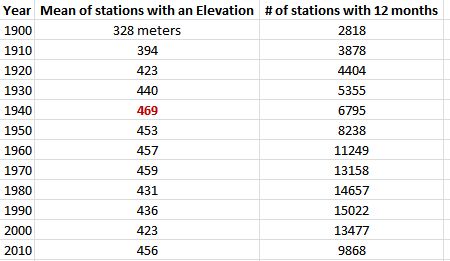
So I thought I would take a quick and dirty snapshot of the BEST data elevation. I looked all stations that had an elevation and had 12 months of data at the decadal rollover (1900, 1910 … 2010).

It looks like the Cheefio was right, with the peak year being near 1940 and then dropping for the next 60 years . (Of course the Elevation may have peaked slightly higher before or after 1940 … I didn’t do every year).

According to a lapse rate calculator I found online, a 46m drop would raise temperature by .45C from 1940 to 2000. I’m not quite sure what to make of the big drop in stations in 2010 and subsequent rise in elevation. The number drops back to 423m in 2010 if you change the criteria to any data in 2010. I must assume many of the stations were incomplete for 2010.

How Well Do We Know What The Temperature Was in 1900?

As part of my investigation into the BEST data (which I do not trust, but I’d like to understand) I thought I would see how many weather stations there were at various times and places.

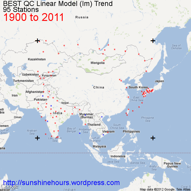
We really don’t know what the temperature was in 1900. There are only 95 stations (the four big + are the boundary of the data) in the following image.

China is essentially a blank .


Cooling Weather Stations by decade from 1880 to 2000

As part of my investigation into the BEST data (which I do not trust, but I’d like to understand) I thought I would make a little gif movie of the stations that are cooling at 10 year intervals from 1880.

These are just the cooling stations that actually have data in 1880 (for example) and 2011.

And this is just for Latitude  25N to 70N and Longitude 160W to 60W. But most are in this region.

The count of stations cooling is the count for the region displayed.

You can see the number of stations rise as more stations have data, but also because it got warmer in the 1930s meaning the chance of a cooling trend to 2011 increased. And then the number of stations dropped into the 1960s/70s as it cooled off. And the numbers skyrocket as global warming (at least in the USA) somewhat ends in the 1990s.

The image is a large animated gif. If it isn’t moving clicking on it or refreshing the page should get it to restart.

County Population Statistics and Cooling/Warming Stations Since 1900

I took the list of BEST sites and using those sites in BEST with a Country code of United States I used State/County name to merge with the list of Counties I have with population changes.

I am attempting to correlate County population changes changes from 1900 to 2010 with cooling or warming from 1900 to 2011.

1956 Stations with data in 2011 and 1900.

1320 were warming and 636 were cooling.

1213 of those I could match to the table of US Counties.

1089 distinct counties.

562 of those counties had more warming stations than cooling.

496 had more cooling stations than warming.

31 had an equal number of cooling and warming stations.

Warming Counties had a mean temperature change of .0692C/decade.

Warming counties had a mean population increase of 174,361.

Warming counties on average grew by 648% from 1900 to 2011.

Cooling counties had a mean temperature change of -.0573C/decade.

Cooling counties had a mean population increase of 39,060.

Cooling counties on average grew by 194% for 1900 to 2011.

“Equal” counties had a mean temperature change of .0119C/decade.

“Equal” counties had a mean population increase of 86,469.

“Equal”   counties on average grew by 512% from 1900 to 2011.

It appears warming counties grew much, much faster than the country as a whole, while cooling counties grew  slower than the country as a whole.