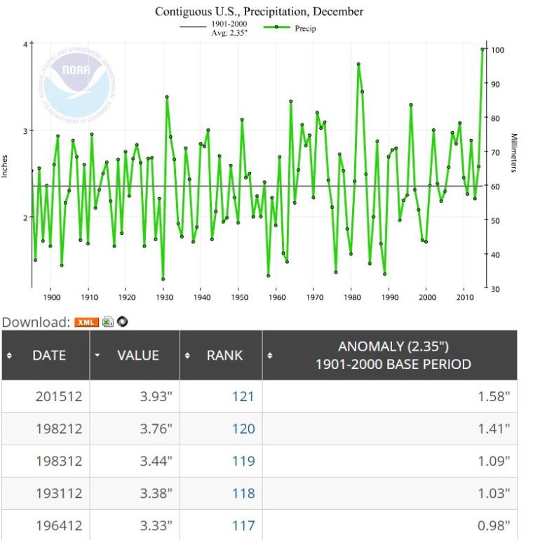
According to the NOAA, December 2015 ranked wettest out of 121 (121 is wettest).
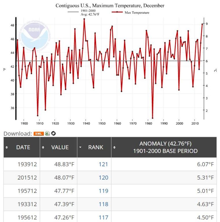
Wow. According to the NOAA December 2015 was 2nd Hottest Max Temperature behind 1939.
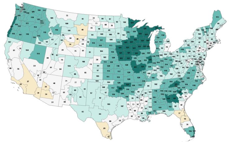
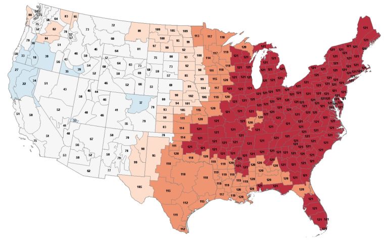
The divisional map shows the whole of the eastern US at record level or near record level.
I came across a calendar tool for [R] (the language I do the programming in) in the package openAir.
With a lot of kludging (the package was designed to visualize air pollution data) I can visualize the Anomaly % for the year 2015. By anomaly % I mean if the mean is 10,000,000 sq km for 1981-2010 and the anomaly is -500,000 then the anomaly % is -5%.
Darkest red days are closest to the mean. Light colors are far below the mean.

UPDATE: The original version of this post had the y axis going from -1 to 1. I’ll leave those graphs at the bottom.
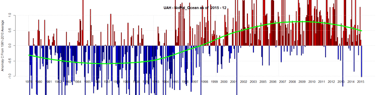
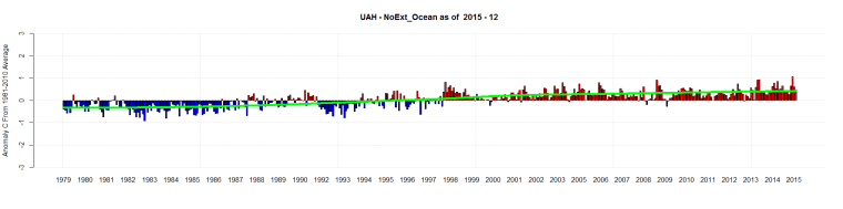
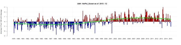
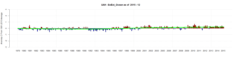
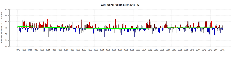
The new graphs have -3 to 3. Notice how much the NoPol Ocean temperatures fluctuate compared to the other 3 regions.
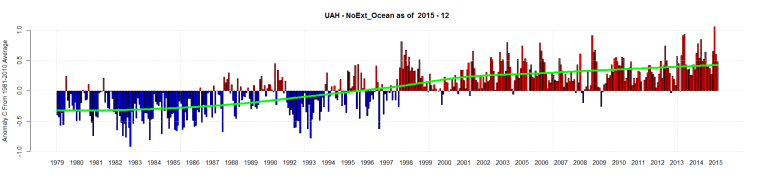
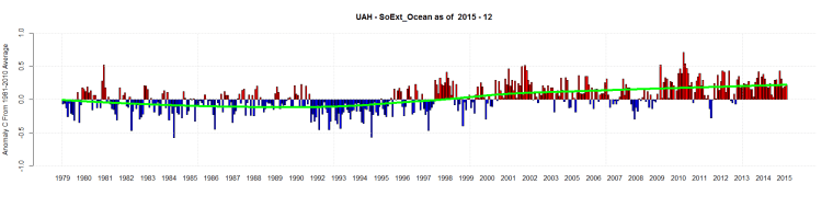
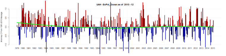
UAH for December 2015 is out.
Here is the South and North Pole Ocean Data plus the Southern and Northern Extent Ocean Data
Original graphs: