UHI and Tmin Nanaimo

Yesterday I posted a WUWT article about Tmin in the UK rising 1.7C thanks to UHI.

I ive near Nanaimo BC and here is the graphs for Tmin and Tmax since 1947.

Tmax has barely changed. Tmin is up 2C or more. UHI.

Data from Weatherstats and Environment Canada

National Post Tries to Scare Canadians – And Fails If you Look Carefully

National Post has published some maps claiming Canada is going to suffer from “scorching summers”.

I’ve hit my online paper article limit so I’ll post the tweet.

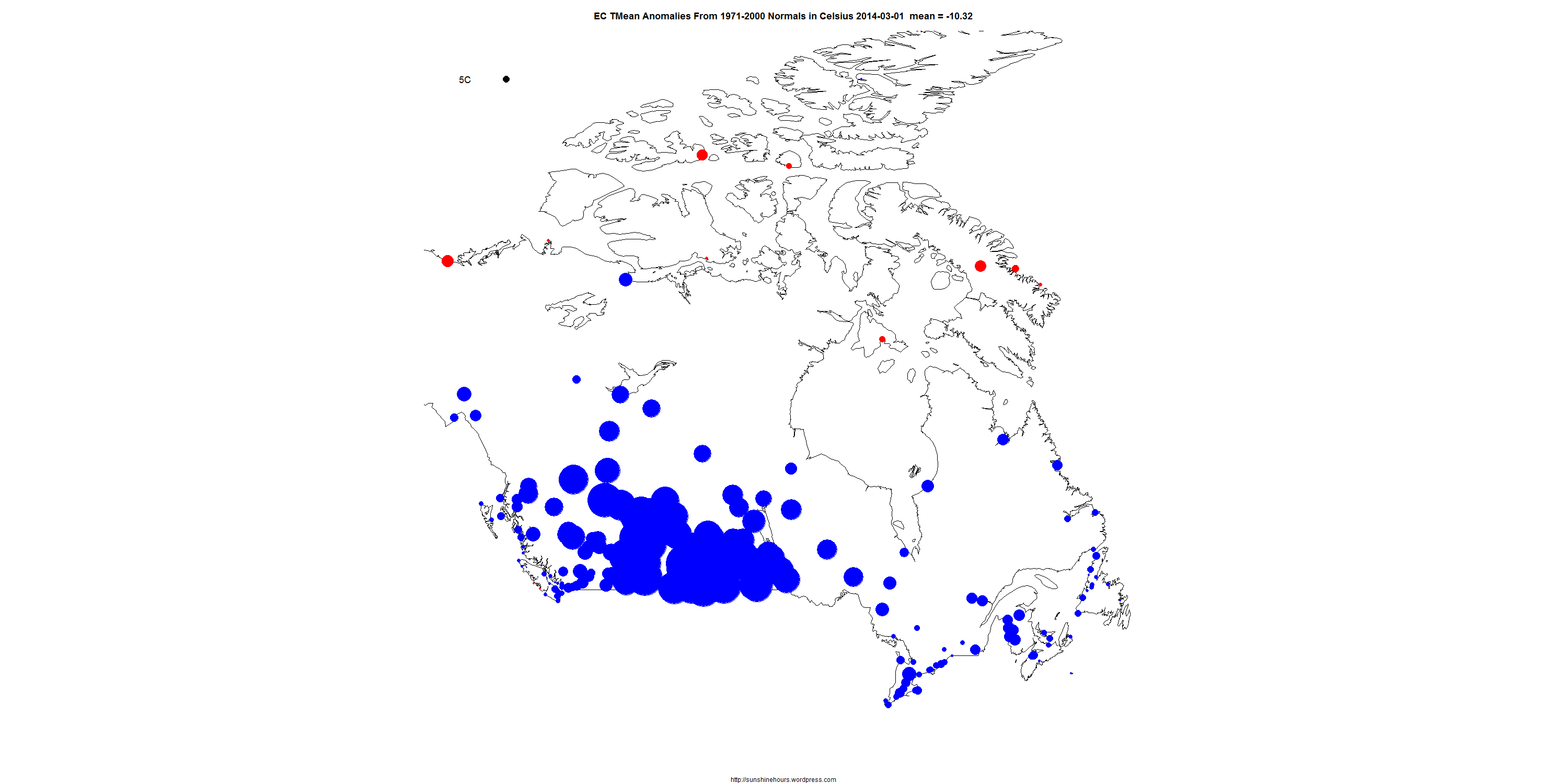
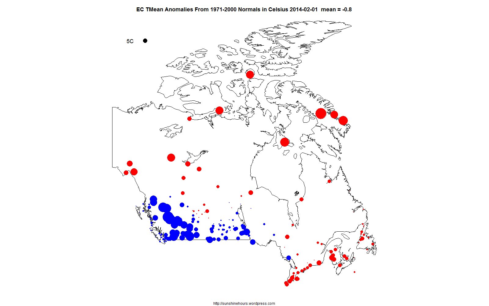
The animated gif starts with a scary January, lots of red. And article/tweet predicts “warm winters, scorching summers”.

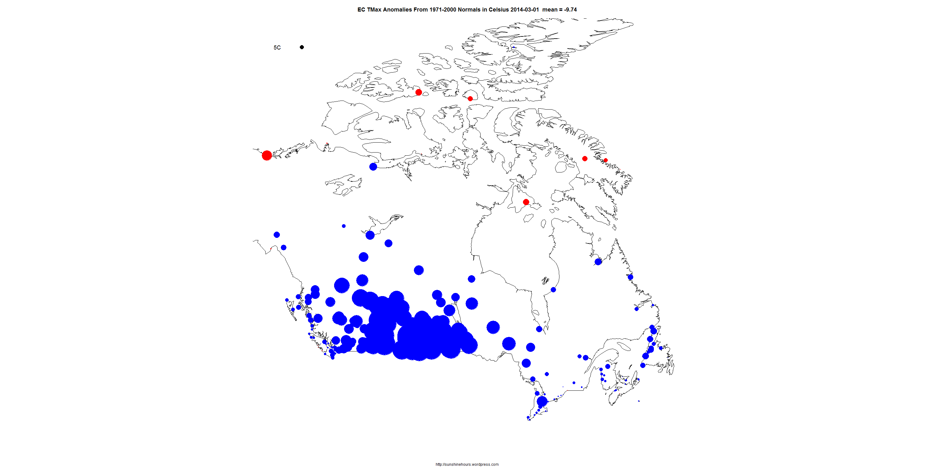
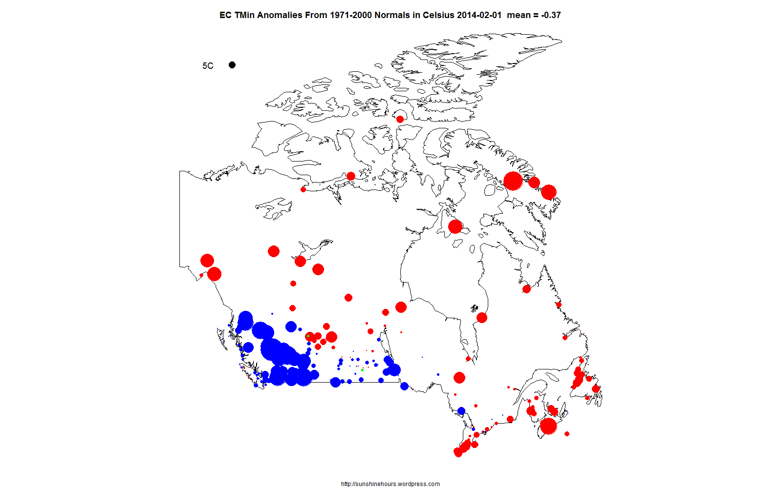
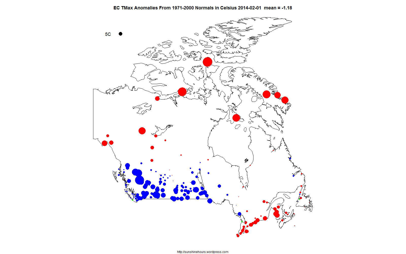
Note that they are using “mean temperatures”, not maximums.

But if you capture the monthly images , when do you notice about the summer months?

June/July/Aug are not scary and all red. They are pretty high up on the scale (which means the lowest change)


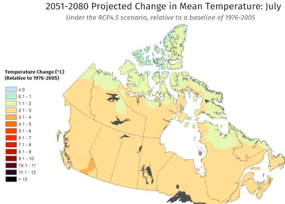
And I repeat. This is mean temperatures. Not max. And having looked at the data I know many of the BC cities have a very low rate of maximum change versus minimum.

It is the minimums that are climbing in a lot of cities and the max isn’t.

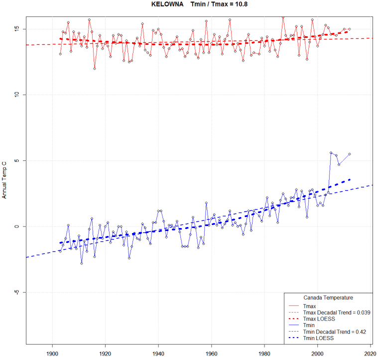
Here is my original hometown of Kelowna. Tmax has barely changed since 1900 (and in fact dropped from 1900 to 1950 and then climbed a bit since then.

The ratio of Tmin change to Tmax change is 10.8 to 1. Look at the Tmin climb. Huge. 7C warmer.


Canada March 2014 Visualized

The data is from the daily data put out by Environment Canada. (It is wrong sometimes)

These are ONLY the “Normals” stations (the stations EC calculates anomalies for from the 1971-2000 mean)

The black circle in the top left corner represents 5C divergence from the “Normals”. Blue is cold. Red is warm. Click for bigger. Refresh to make it start over.

There are 3 maps: TMean,TMin and TMax. Click on each for bigger.

TMean
TMean_DailyNormals_2014-03

TMin
TMin_DailyNormals_2014-03

TMax
TMax_DailyNormals_2014-03

Canada February 2014 Visualized

The data is from the daily data put out by Environment Canada. (It is wrong sometimes)

These are ONLY the “Normals” stations (the stations EC calculates anomalies for from the 1971-2000 mean)

The black circle in the top left corner represents 5C divergence from the “Normals”. Blue is cold. Red is warm. Click for bigger. Refresh to make it start over.

There are 3 graphs: TMean,TMin and TMax. Feb 28 had average anomalies in the -8C range. Many were more than -10C. Polar Vortex!

TMean

TMean_DailyNormals_2014-02

TMin
TMin_DailyNormals_2014-02

TMax
TMax_DailyNormals_2014-02

HADCET – November 2013 Monthly Report – .82C Colder

This report is using TMax data for HADCET (Central England Temperature)  which is available from 1878.

November 2013 was .82C colder than the 1981-2010 average and .12C colder than the 1878-2013 average.

17 of the days were colder than the 1878-2013 average and 21 were colder than the 1981-2010 average.

Note that 5 of the daily records were from 1938 and 2 of the daily records are from 1895.

Date TMax 1878-2013 Mean 1878-2013 Anomaly 1981-2010 Mean 1981-2010 Anomaly Warmest Year Warmest TMax Difference (Warmest – TMax)
2013-11-1 12.2 11.4 0.8 12.6 -0.4 1984 16.3 4.1
2013-11-2 13.1 11.3 1.8 11.9 1.2 1927 17.7 4.6
2013-11-3 11 11.1 -0.1 11.9 -0.9 2011 16.8 5.8
2013-11-4 9.7 10.9 -1.2 11.6 -1.9 1946 18.7 9
2013-11-5 10.5 10.8 -0.3 11.6 -1.1 1938 17.6 7.1
2013-11-6 12.6 10.4 2.2 11.3 1.3 1972 16.1 3.5
2013-11-7 10.6 10.3 0.3 11.2 -0.6 1978 15.1 4.5
2013-11-8 9 10.2 -1.2 11.4 -2.4 1998 15.5 6.5
2013-11-9 7.3 10 -2.7 10.9 -3.6 1977 15.9 8.6
2013-11-10 9.4 10.2 -0.8 11.1 -1.7 1977 16.2 6.8
2013-11-11 12.9 10.3 2.6 11.2 1.7 1938 15.3 2.4
2013-11-12 11.4 10 1.4 10.9 0.5 1938 16.3 4.9
2013-11-13 9.7 9.5 0.2 10.2 -0.5 1938 16.1 6.4
2013-11-14 8.7 9.1 -0.4 9.9 -1.2 1994 14.8 6.1
2013-11-15 8.5 9 -0.5 10.1 -1.6 1895 15.2 6.7
2013-11-16 9 8.7 0.3 9.6 -0.6 1895 15.7 6.7
2013-11-17 9.5 8.5 1 9.2 0.3 1997 14.8 5.3
2013-11-18 8.5 8.6 -0.1 9.5 -1 1978 15.2 6.7
2013-11-19 6.5 8.7 -2.2 9 -2.5 1994 15.6 9.1
2013-11-20 6.7 8.6 -1.9 8.7 -2 1947 15.3 8.6
2013-11-21 8.2 8.4 -0.2 8.8 -0.6 1947 15.7 7.5
2013-11-22 7.5 8.5 -1 8.6 -1.1 1906 15.4 7.9
2013-11-23 5.6 8.6 -3 8.7 -3.1 1947 14.3 8.7
2013-11-24 7.3 8.7 -1.4 9.2 -1.9 1980 14 6.7
2013-11-25 6 8.5 -2.5 9.1 -3.1 1983 13.8 7.8
2013-11-26 8.8 8.2 0.6 8.8 0 1979 14.5 5.7
2013-11-27 10.6 8.2 2.4 8.8 1.8 2000 13.6 3
2013-11-28 9 8.1 0.9 8.5 0.5 2000 14.7 5.7
2013-11-29 9.5 8 1.5 8.4 1.1 1939 14 4.5
2013-11-30 7.7 7.8 -0.1 8.9 -1.2 2001 14.3 6.6

HADCET – Tmax – March 2013

I know March was months ago. But I’m playing around with a new report and I thought I would look  at TMax data for HADCET (Central England Temperature). TMax data is only available since 1878.

23 out of the 31 days were colder than the warmest day (since 1878) by double digits. March 23rd was 18.6C colder than the warmest March 23rd.

Date TMax 2013 Warmest Year Warmest TMax Difference (Warmest – 2013)
2013-3-1 6.8 1959 14.9 8.1
2013-3-2 6.4 1977 16.5 10.1
2013-3-3 7.5 1957 14.3 6.8
2013-3-4 8.9 1928 16 7.1
2013-3-5 13.8 1961 16 2.2
2013-3-6 9.1 1961 15.3 6.2
2013-3-7 8.8 1906 14.9 6.1
2013-3-8 8 1961 15.1 7.1
2013-3-9 5.3 1948 19.9 14.6
2013-3-10 2.7 1929 17.4 14.7
2013-3-11 1.2 1957 18.4 17.2
2013-3-12 4.1 1957 18.4 14.3
2013-3-13 6 1991 17.2 11.2
2013-3-14 6.7 1948 17.9 11.2
2013-3-15 8.1 1961 17.9 9.8
2013-3-16 8.5 1961 20 11.5
2013-3-17 6.8 1990 19.3 12.5
2013-3-18 6.5 1990 19.6 13.1
2013-3-19 7.1 1972 17.6 10.5
2013-3-20 3.9 1929 17.5 13.6
2013-3-21 4.9 1927 17.8 12.9
2013-3-22 3.6 1918 16.3 12.7
2013-3-23 0.8 1945 19.4 18.6
2013-3-24 1.2 2012 18.9 17.7
2013-3-25 2.7 1953 19.1 16.4
2013-3-26 2.3 2012 18.8 16.5
2013-3-27 3 2012 19.5 16.5
2013-3-28 4.3 1929 20.3 16
2013-3-29 4.8 1965 22.1 17.3
2013-3-30 5.9 1929 19 13.1
2013-3-31 5.7 1907 18.7 13