Antarctic Sea Ice Extent set a 2nd daily record in a row on May 22 (day 141 of 2013).
That is the 10th daily record for the year.
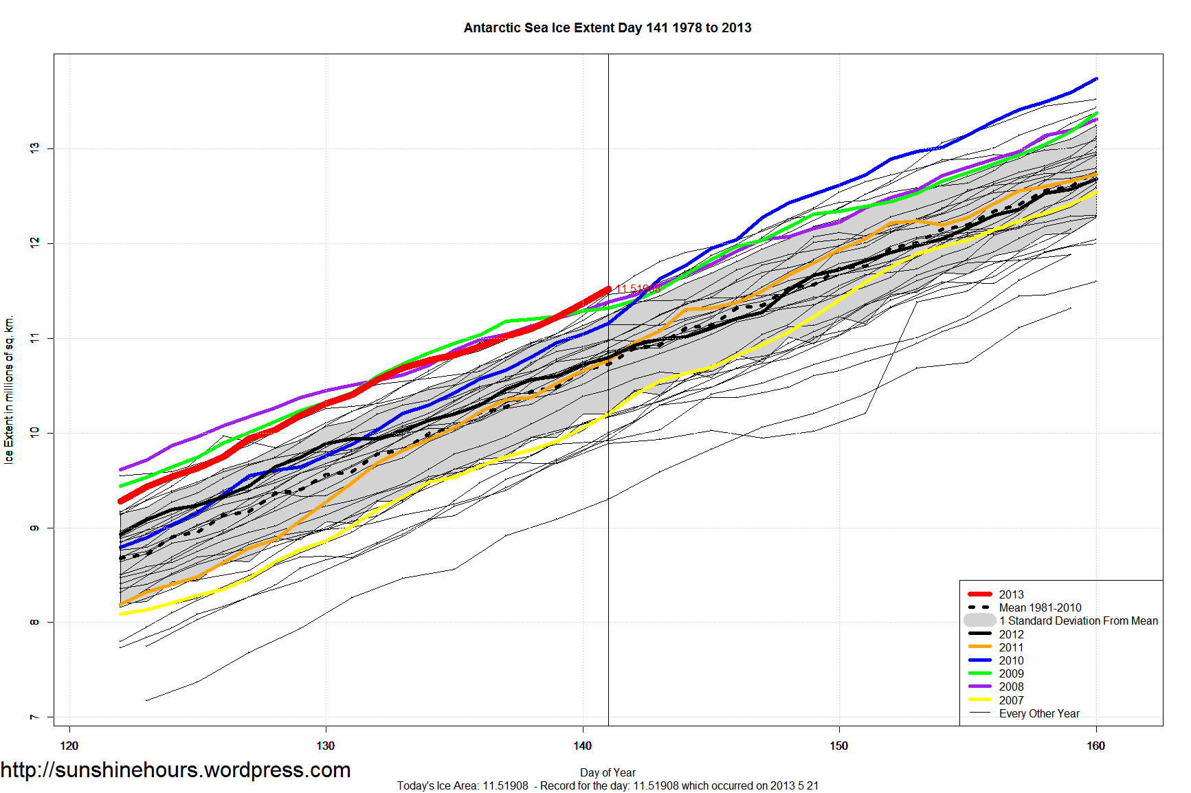
| Year | No of Records |
| 2010 | 129 |
| 2008 | 126 |
| 2006 | 29 |
| 2012 | 24 |
| 2007 | 21 |
| 2013 | 10 |
| 2009 | 8 |
| 2000 | 5 |
| 2004 | 5 |
| 1998 | 4 |
| 2005 | 3 |
| 1979 | 2 |
| 1980 | 1 |
Antarctic Sea Ice Extent set a 2nd daily record in a row on May 22 (day 141 of 2013).
That is the 10th daily record for the year.
| Year | No of Records |
| 2010 | 129 |
| 2008 | 126 |
| 2006 | 29 |
| 2012 | 24 |
| 2007 | 21 |
| 2013 | 10 |
| 2009 | 8 |
| 2000 | 5 |
| 2004 | 5 |
| 1998 | 4 |
| 2005 | 3 |
| 1979 | 2 |
| 1980 | 1 |
After setting 8 daily Antarctic Sea Ice Extent records earlier in the year, 2013 stayed near the top in 2nd, 3rd and 4th place until day 140 (May 20).
Another daily record was set yesterday breaking the old record set in 2000 by 66,000 sq km. 2013 is now in 6th place for daily records set.
| Year | No of Records |
| 2010 | 129 |
| 2008 | 126 |
| 2006 | 29 |
| 2012 | 24 |
| 2007 | 21 |
| 2013 | 9 |
| 2009 | 8 |
| 2000 | 5 |
| 2004 | 5 |
| 1998 | 4 |
| 2005 | 3 |
| 1979 | 2 |
| 1980 | 1 |

Arctic Sea Ice Extent 2013 is only 4th lowest so far using the mean up to this day in each year.
And the anomaly is half the 2006 anomaly.
We are saved!
| Year | Anomaly (sq km) |
| 2006 | -916,781 |
| 2005 | -744,955 |
| 2007 | -743,831 |
| 2013 | -484,217 |
| 2010 | -446,517 |
| 2012 | -445,151 |
| 2009 | -401,894 |
| 2004 | -347,932 |
| 2008 | -307,371 |
| 1996 | -212,097 |
| 2000 | -121,103 |
| 2002 | -54,227 |
| 2001 | -16,150 |
| 2003 | 14,480 |
| 1995 | 17,785 |
| 1991 | 52,640 |
| 1999 | 66,556 |
| 1997 | 96,180 |
| 1984 | 139,216 |
| 1992 | 184,595 |
| 1989 | 256,508 |
| 1994 | 271,011 |
| 1998 | 344,667 |
| 1981 | 375,843 |
| 1985 | 380,320 |
| 1990 | 399,046 |
| 1993 | 467,706 |
| 1988 | 479,840 |
| 1986 | 513,926 |
| 1987 | 598,476 |
| 1980 | 644,064 |
| 1983 | 693,561 |
| 1982 | 744,653 |
| 1979 | 950,301 |
(daily data from here)
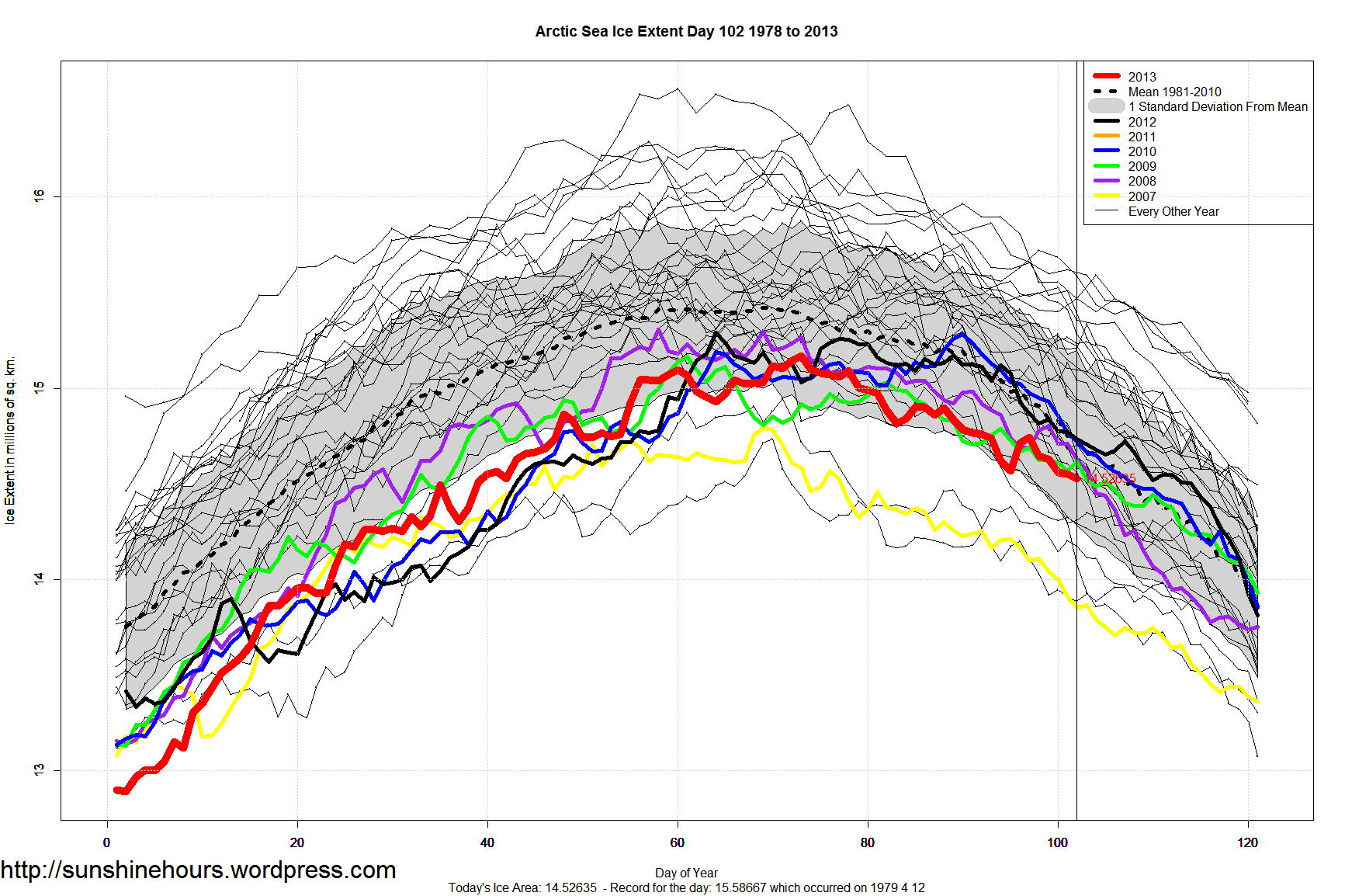
Did you know that the Arctic Sea Ice Extent is only 1.4% lower than the 1981 – 2010 mean?
NSIDC data says that on March 19 (day 78) Arctic Sea Ice Extent was 15.09 million sq km. The mean for 1981-2010 for day 78 is 15.30 million sq km.
Wow. Only 1.4% below normal. Has that made the news?

Arctic Data from here.
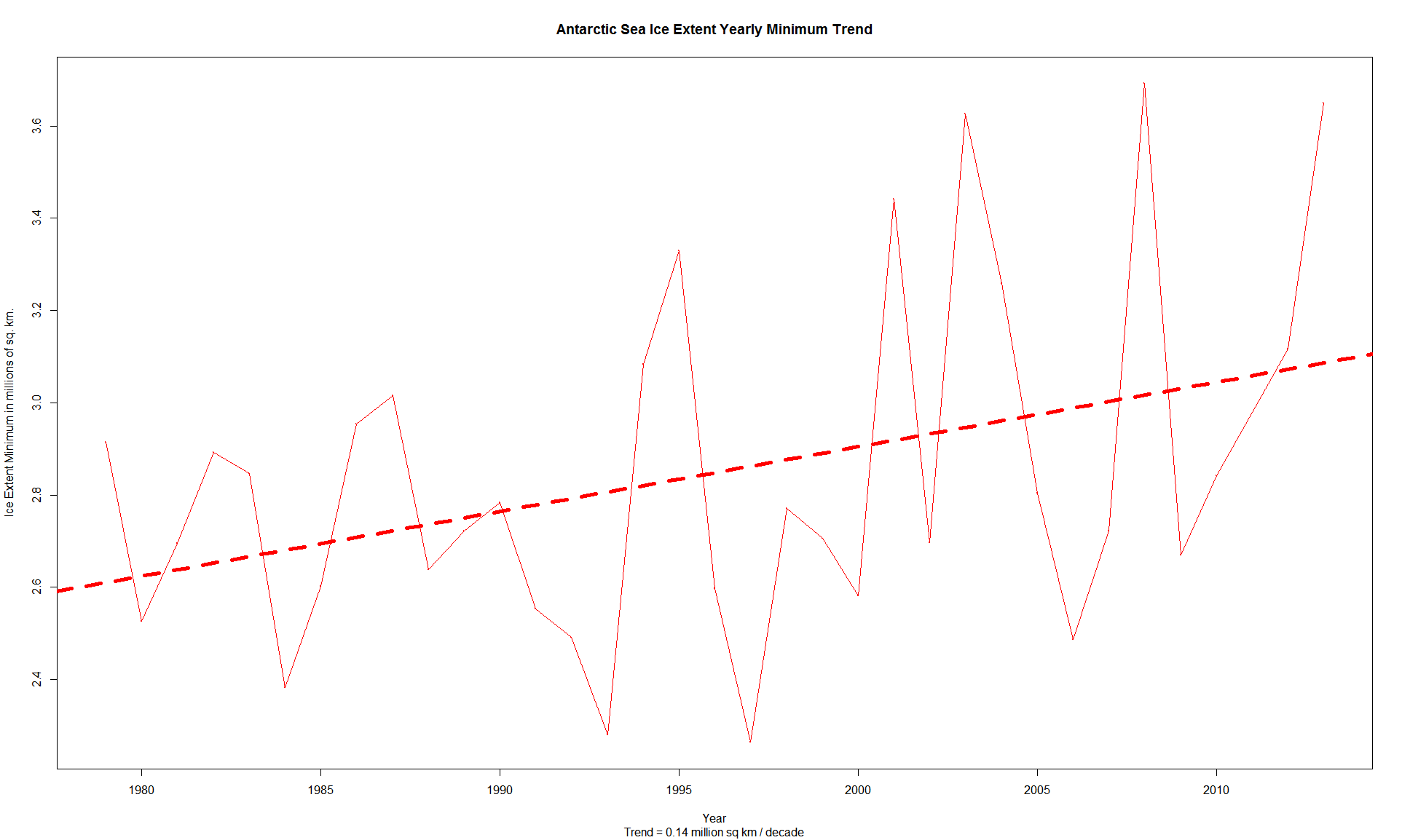
Antarctic Sea Ice Minimum Trend is climbing at 140,000 sq km per decade!
After declaring Antarctic had the 2nd highest minimum of all time I thought I should graph the trend.
Wow. At this rate Antarctic Sea Ice minimum will just keep growing and growing until you can’t get near Antarctica by ship at all! (probably not but it is fun to claim).
Study: Global Warming Can Be Slowed By Working Less
“Want to reduce the effects of global warming? Stop working so hard. Working fewer hours might help slow global warming, according to a new study released Monday by the Center for Economic Policy and Research.
A worldwide switch to a “more European” work schedule, which includes working fewer hours and more vacation time, could prevent as much as half of the expected global temperature rise by 2100, according to the analysis, which used a 2012 study that found shorter work hours could be associated with lower carbon emissions.
The Center for Economic Policy and Research is a liberal think tank based in Washington.”
A “more European” work schedule???
Like Spain?
Spain unemployment rate hit a record: youth rate at 55%
Spain’s unemployment rate has hit a modern day record, and joblessness among young people has topped 55%.
Official data showed that the jobless rate in the last three months of 2012 rose 1% to 26%, or 5.97 million people.
The figure, the highest since the mid-1970s, follows Spain’s prolonged recession and deep spending cuts.Spain unemployment rate hit a record: youth rate at 55%
(h/t Tom Nelson)
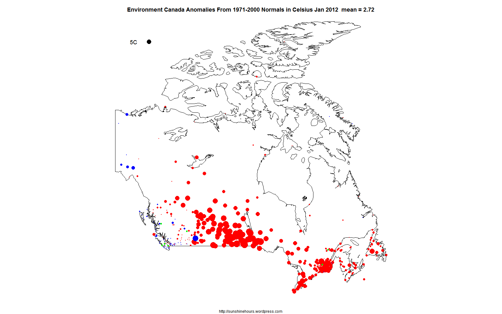
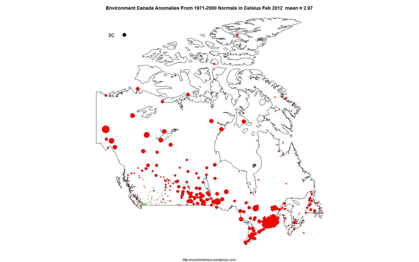
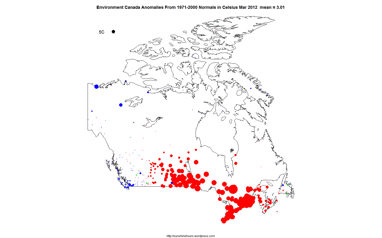
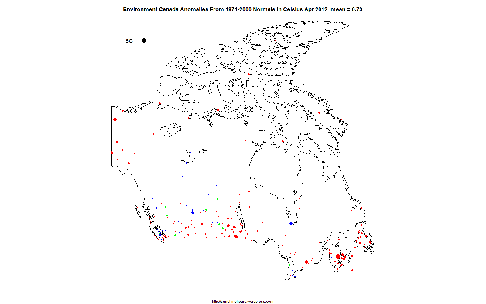
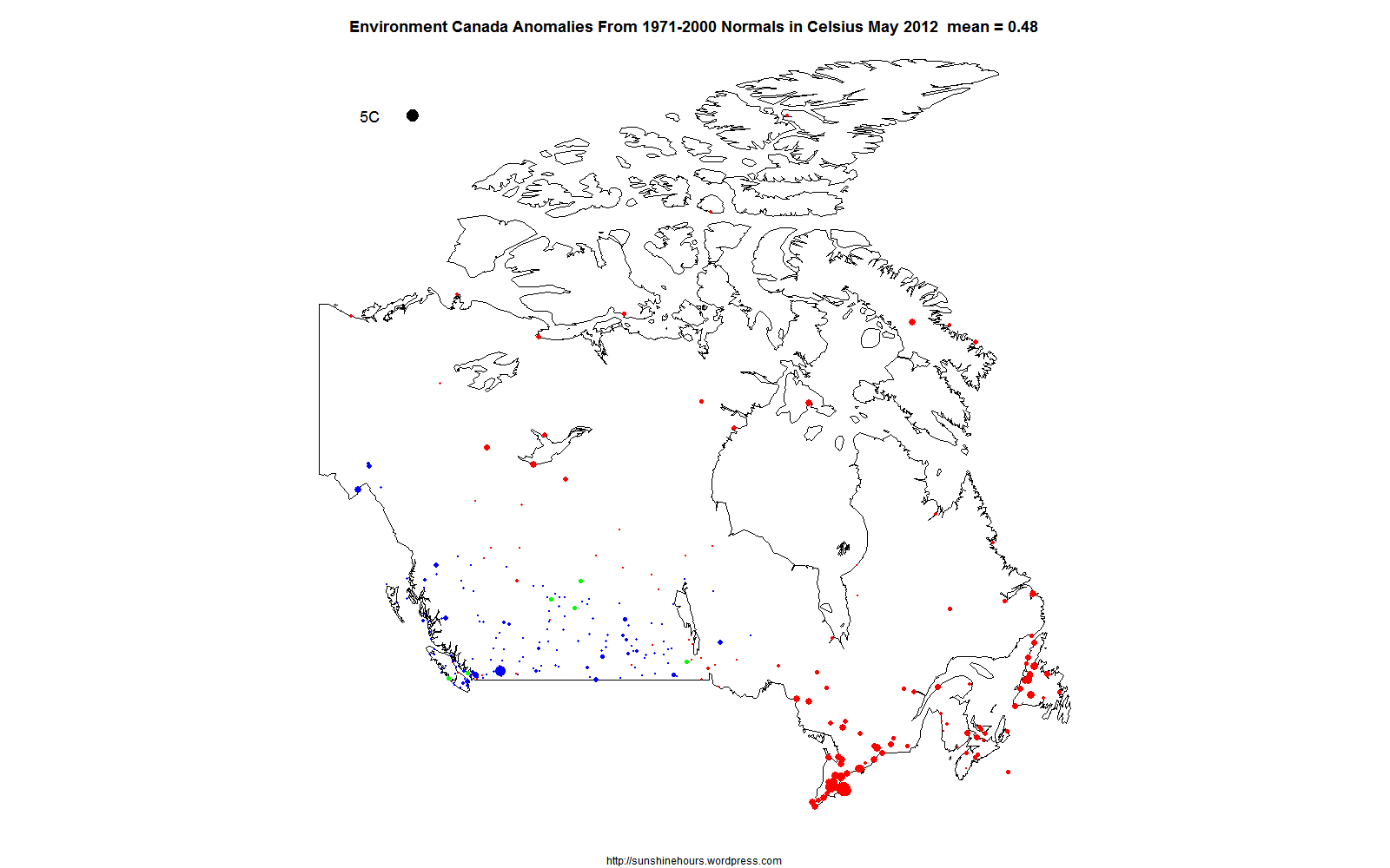
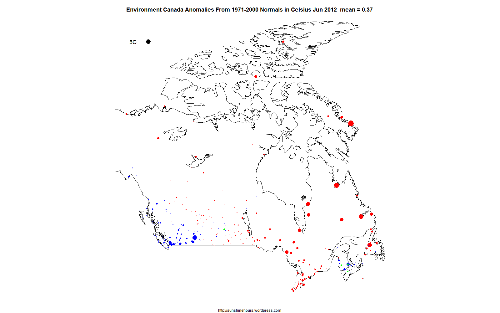
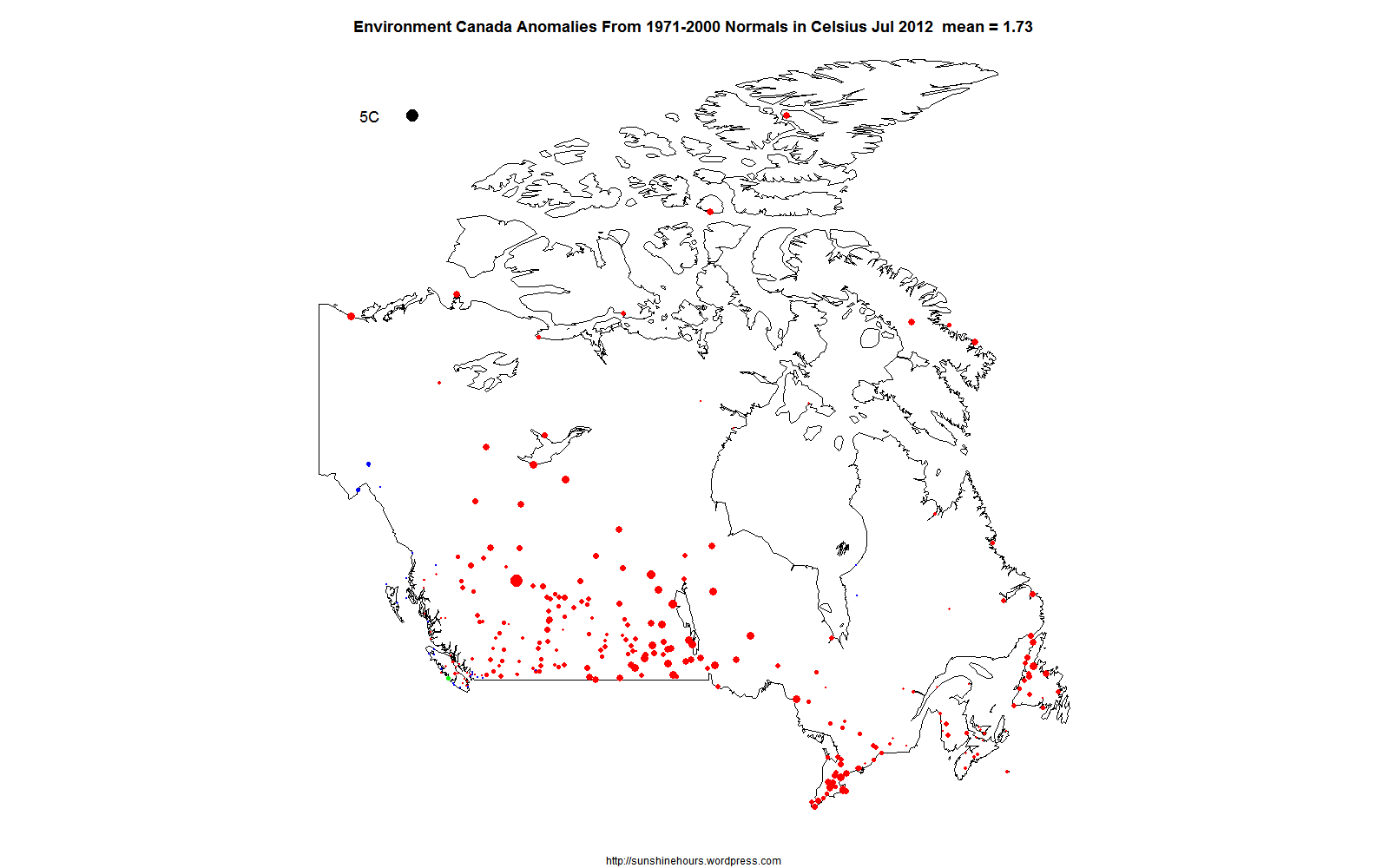
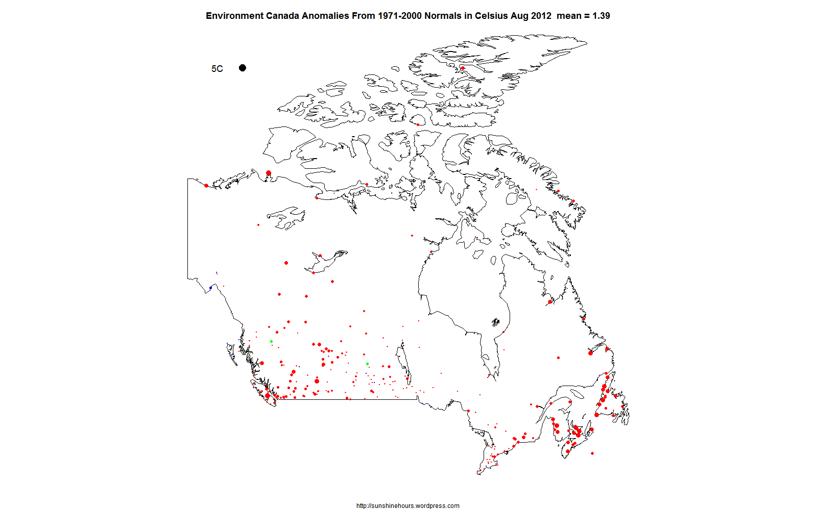
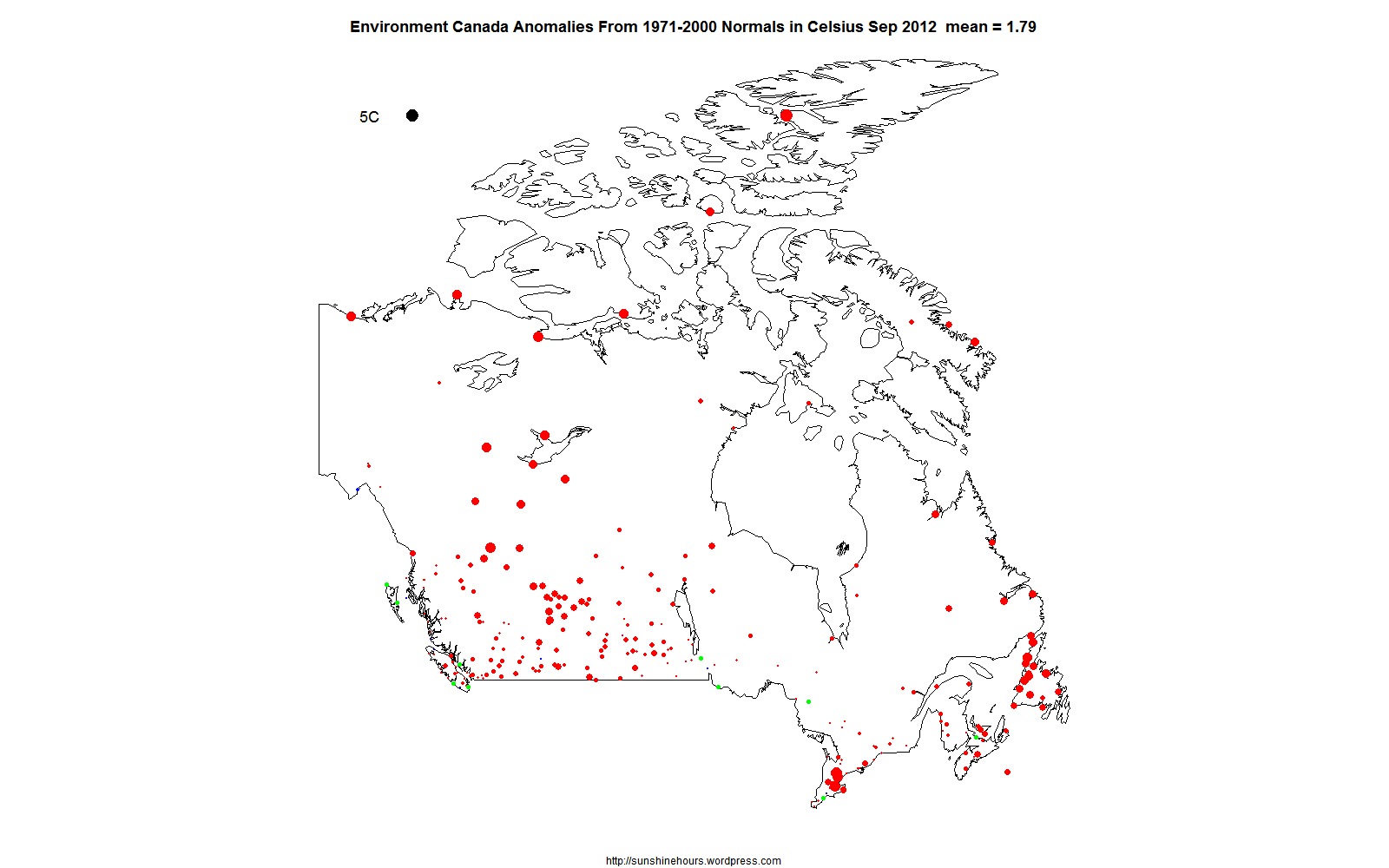
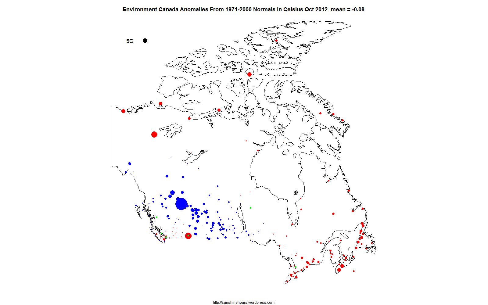
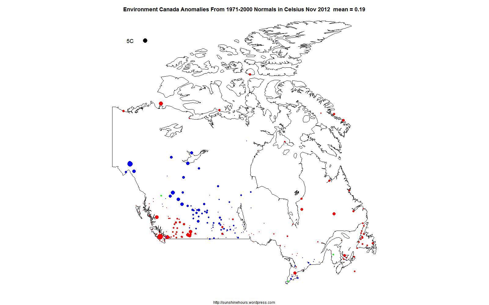
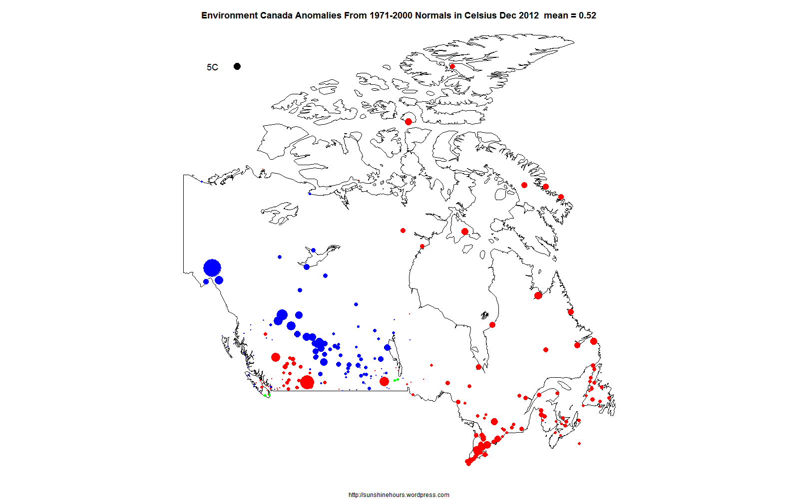
I have mapped the anomalies in the Environment Canada monthly summaries that have “normals”. The anomalies are calculated from selected stations based on the 1971-2000 average.
The 5C black dot in the top left hand corner represents 5C difference from “normal”. Red dots are warmer than normal. Blue are cooler. And Green are 0.
March April and May are really close to normal (all the dots are small). Other months have extremes. October is colder than normal. March is really interesting for having no red dots in the Arctic which means below normal temperatures which has not been true for years.
There is an animated gif at the bottom showing all months of 2012.

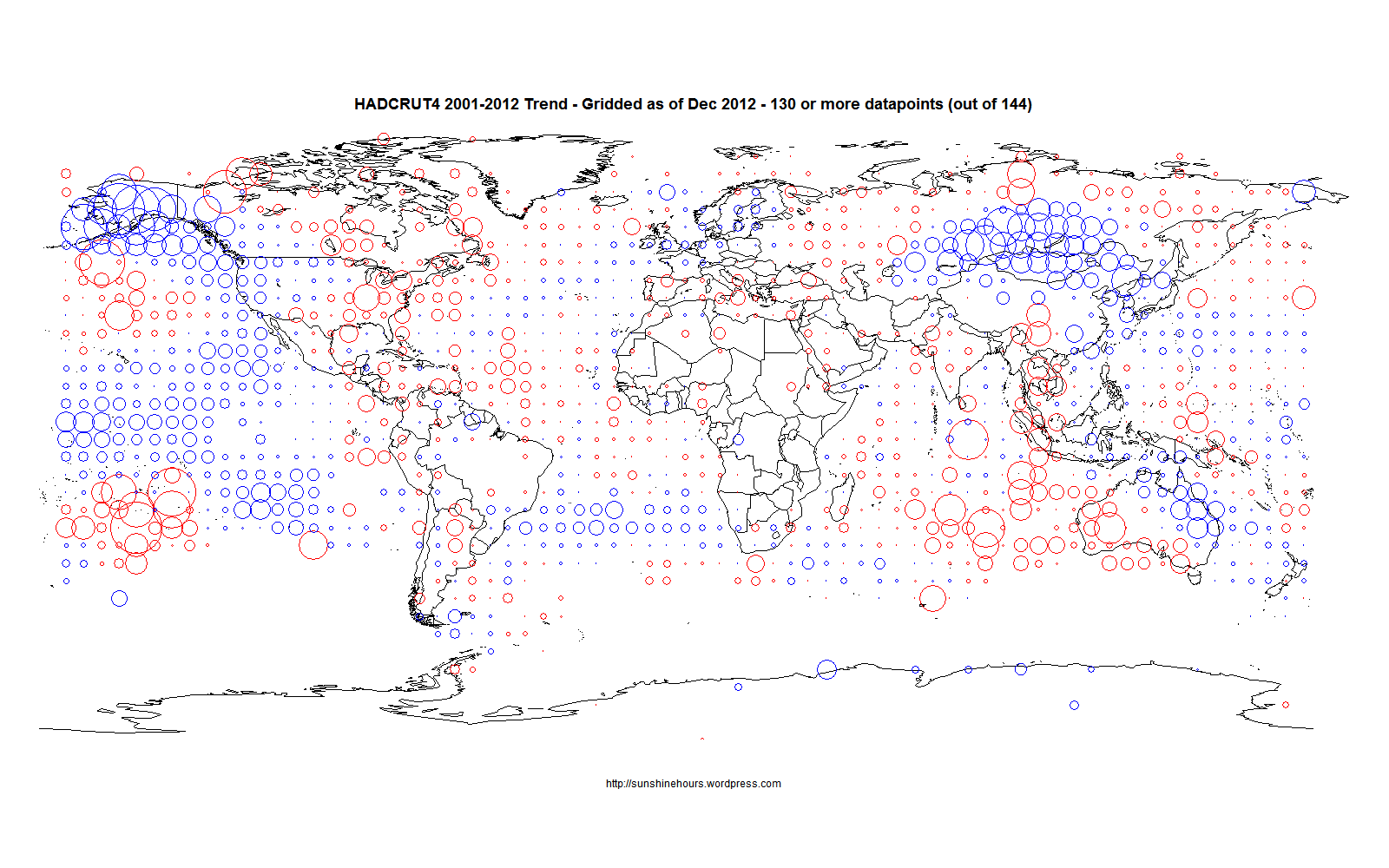
HADCRUT4 for the last 12 years shows a small amount of cooling. The following map shows which 5×5 grid squares are warming or cooling. I am using grid squares with 130 out of 144 possible datapoints for the period. The circles are proportional to the trends. Keep in mind that this is 5×5 grids squares. As I’ve shown for Canada different size of grid squares change warming to cooling.
Kyoto was not a failure. The CBC are being pessimists.
The controversial and ineffective Kyoto Protocol’s first stage comes to an end today, leaving the world with 58 per cent more greenhouse gases than in 1990, as opposed to the five per cent reduction its signatories sought.
From the beginning, the treaty that was adopted in 1997 in Kyoto, Japan …
Lets connect the dots. Warming stopped in 1997. Kyoto was adopted in 1997. CO2 is up 58%. Signing the Kyoto has stopped global warming. More CO2 is irrelevant. The very act of creating a treaty stopped the warming.
🙂
This graph is Tmax % of normal versus Sunshine% of normal. The curved lines are the Loess curves from [R]. Data retrieved from here.
Why would sunshine be higher? Cleaner air in the UK (until China and India started to burn a lot more coal) thanks to the Clean Air Acts of 1956 and 1968.
The loess curves bottom out around 1968/1972.

