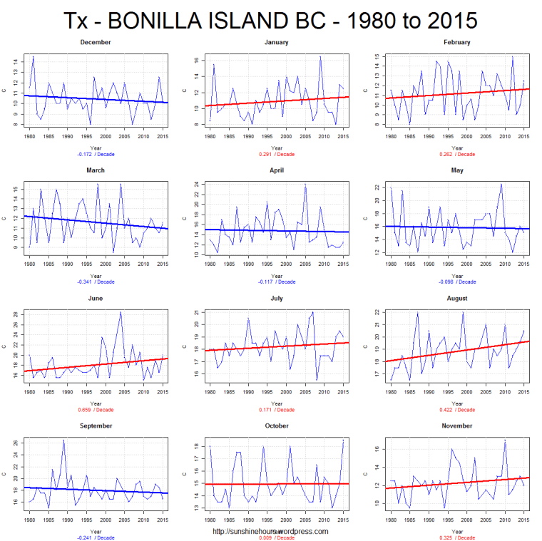
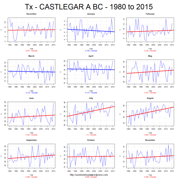
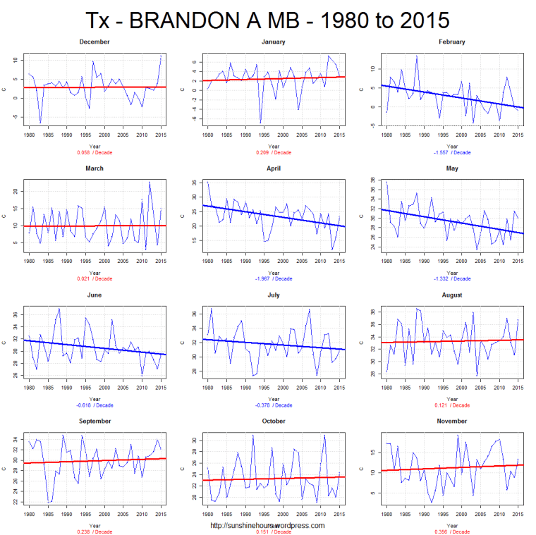
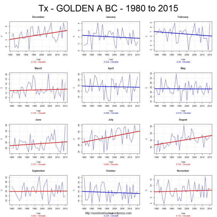
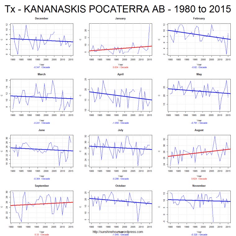
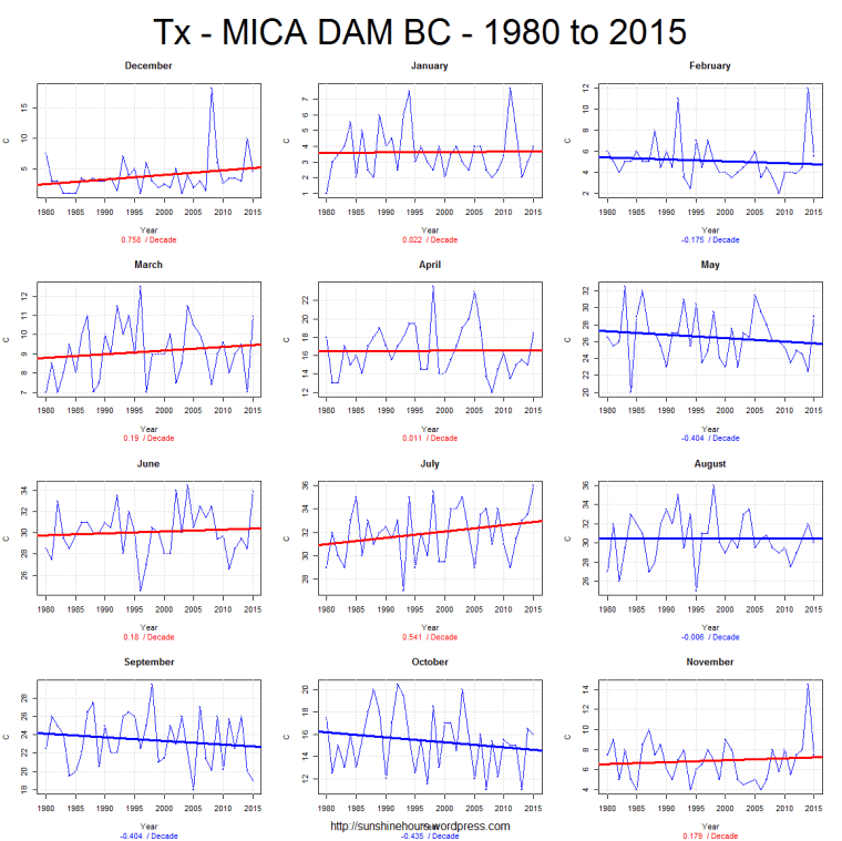
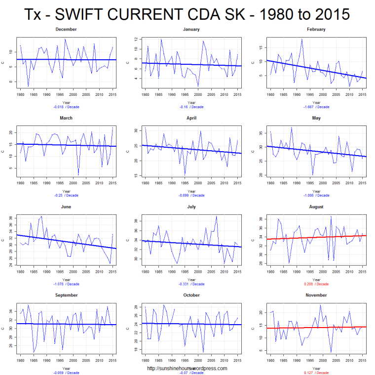
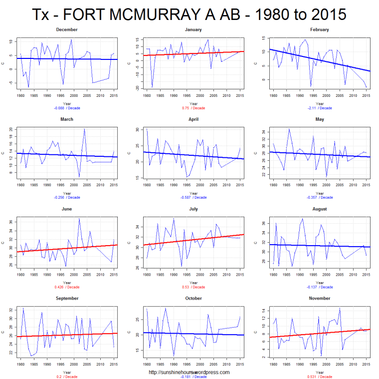
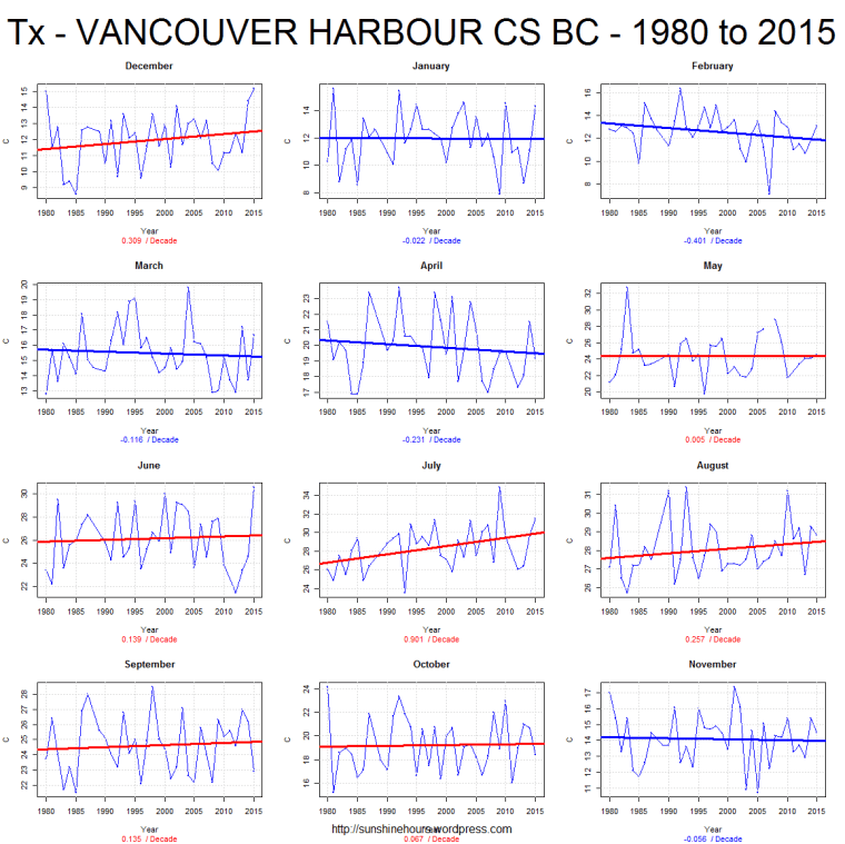
A few days I published 10 randomly chosen graphs of TMAX using Environment Canada’s monthly summaries.
I picked 1980 to 2015 partly to create a round number and partly because that is sort of when AGW became noticeable.
I picked TMAX because I think TMIN’s are rising because of UHI.
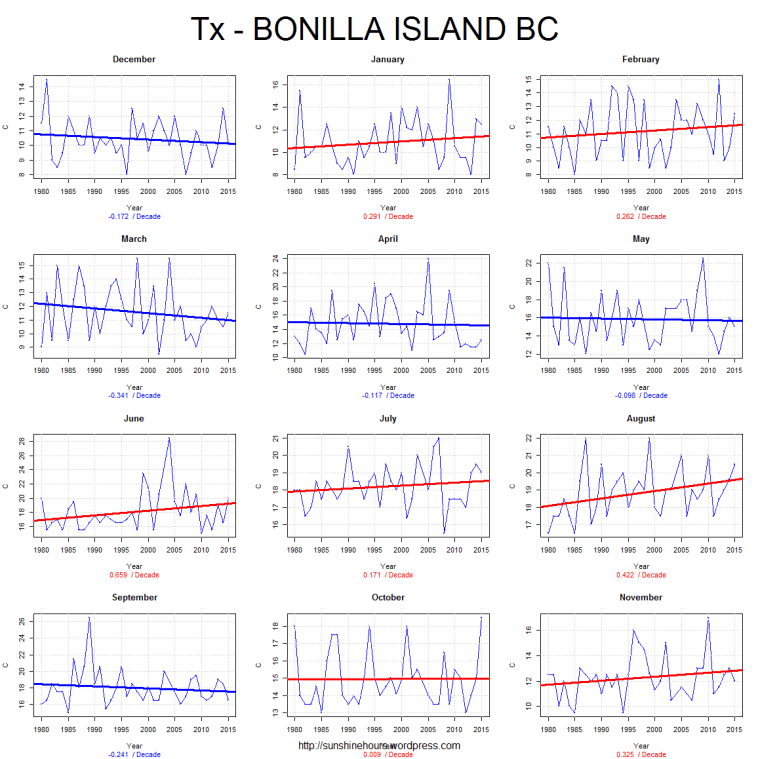
The red lines indicate a warming trend. The blue a cooling trend.
Anyone see evidence of CO2 making it warm?
Here are 10 more.

I’d like to see what evidence you have come across for the assumption that Tmin is not rising because of UHI. I have gone through the temperature records of a number of Canadian cities and have found that on the whole, TMax has not increased but TMin has increased and this change goes in step with increase in the size of the urban area. Furthermore, that finding is not taken from 980 but from the start of temperature records which in the case of Toronto is 1840, Calgary 1881, Moncton 1898, etc.
I believe Tmin is rising because of UHI. So I focus (when I can) on Tmax. The claim by the AGW cult that we will fry is disproven when Tmax is looked at.
Okay, we seem to be in basic agreement. My suggestion is that you take the Tmax further back than 1980. The point then becomes even stronger. The real potential here is in comparing the smaller, preferably rural locations to the large urban locations. If any hint of warming in Tmax or Tmin is less or even negative in the smaller locations, then the UHI hypothesis gains strength. As it stands, the data seems to be showing that Tmax is going nowhere while Tmin is increasing in urban locations. Given that, any warmist position, as far as Canada is concerned, has to base itself on Tmin. If it can be shown that this increase is highly associated with the population of the location, then the warming position has nothing to base its case on.
Wait, you guys do know that UHI effect is taken into account when assessing long term regional/global temperature trends, right? Scientists take out the extra heat from UHI effects. If they left it in temperatures would be way higher.
Also, using 1980 and Tmax because it “feels good” doesn’t make any sense. Use when we started using fossil fuels as the start date. Look at Tmin, Tmax, and averages. Don’t be doing your pseudoanalyses. They don’t make any sense how they are.
The sneaky b***ards cool the past to make the present warmer.
https://notalotofpeopleknowthat.wordpress.com/2015/01/15/uhi-what-uhi-say-giss/