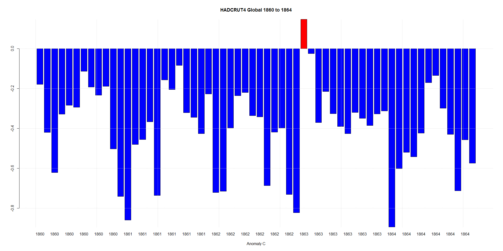
Using HADCRUT4 monthly anomalies, I noticed the largest one month rise in temperature anomaly was in December 1862 to January 1863.
The anomaly rose from -0.822C to +0.147.
A change of .969C. Before CO2.
Using HADCRUT4 monthly anomalies, I noticed the largest one month rise in temperature anomaly was in December 1862 to January 1863.
The anomaly rose from -0.822C to +0.147.
A change of .969C. Before CO2.
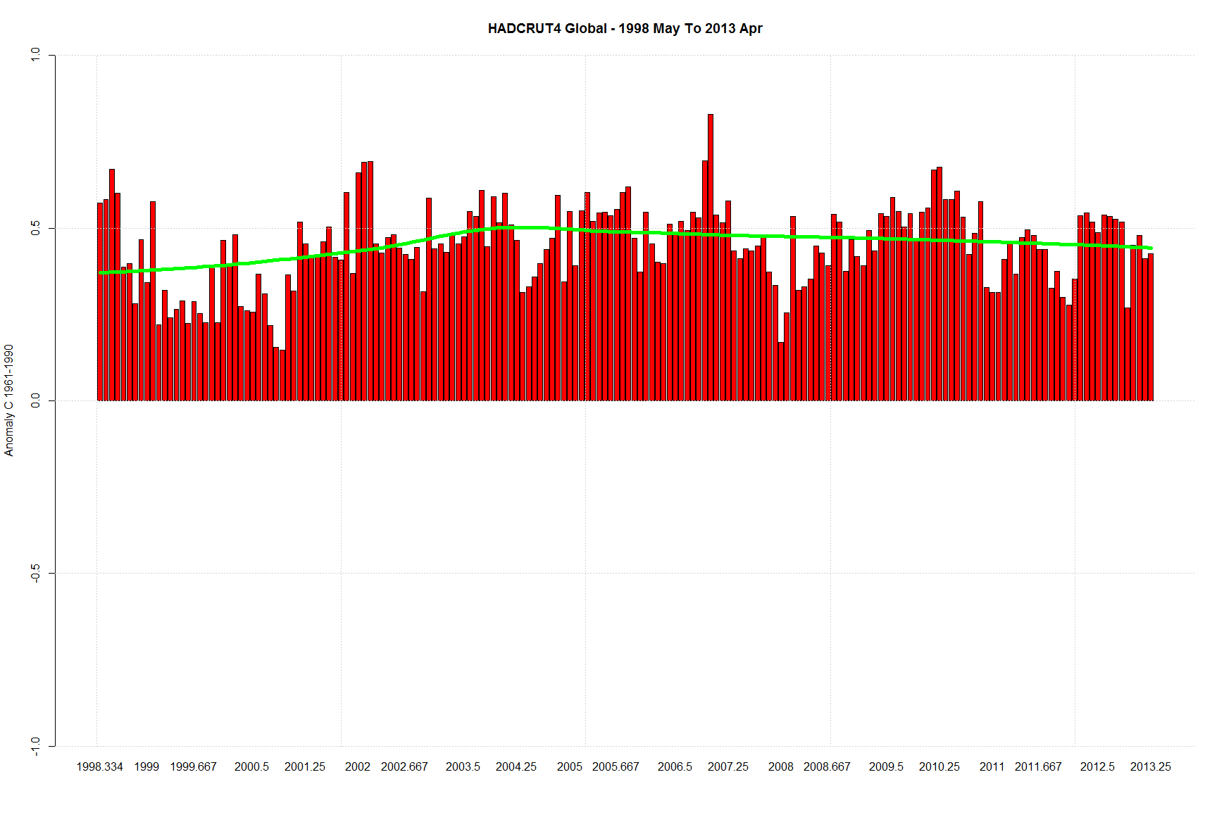
HADCRUT4 Global (15 Years as of April 2013) – Anomaly From 1961 – 1990. Data from here.
With a loess trend line added.
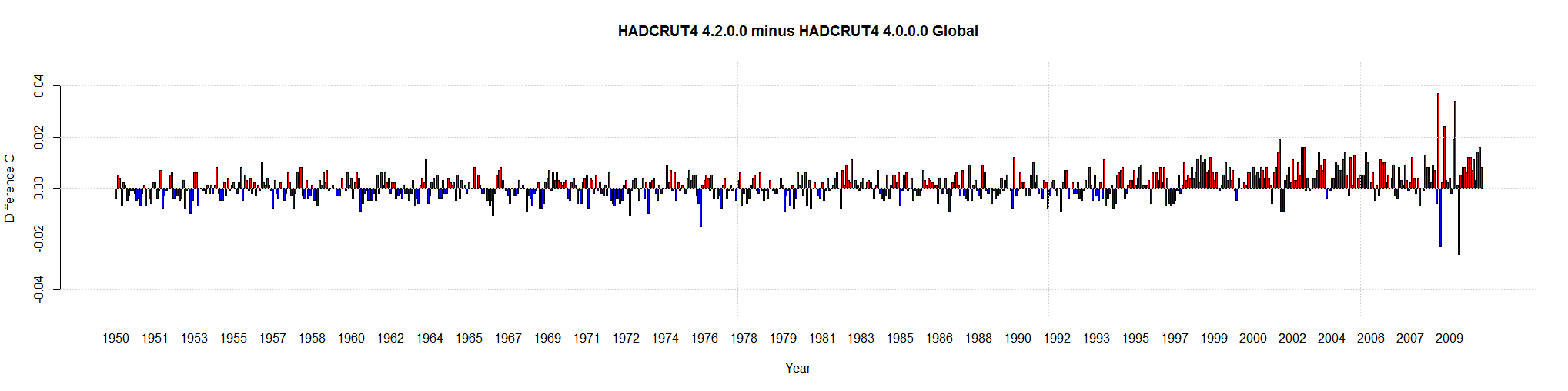
HADCRUT4 is now at its 3rd iteration. It started with version 4.0.0.0 and then version 4.1.1.0 come out. As of the latest data it is at 4.2.0.0.
I thought I would compare them. Here is the difference between them ( 4.2.0.0 monthly anomaly minus 4.0.0.0 monthly anomaly).
If the bar is red, the newest HADCRUT4 is warmer. If blue, then the newest data is cooler.
This is the data from 1950 on. Note that the values are pretty low and relatively evenly divided between blue and red.
Until 1997. Then the values are a little larger (still relatively small). And almost all red.
They are warming the most recent temperatures again! Give them a few years and the pause will disappear.
Click to make bigger.
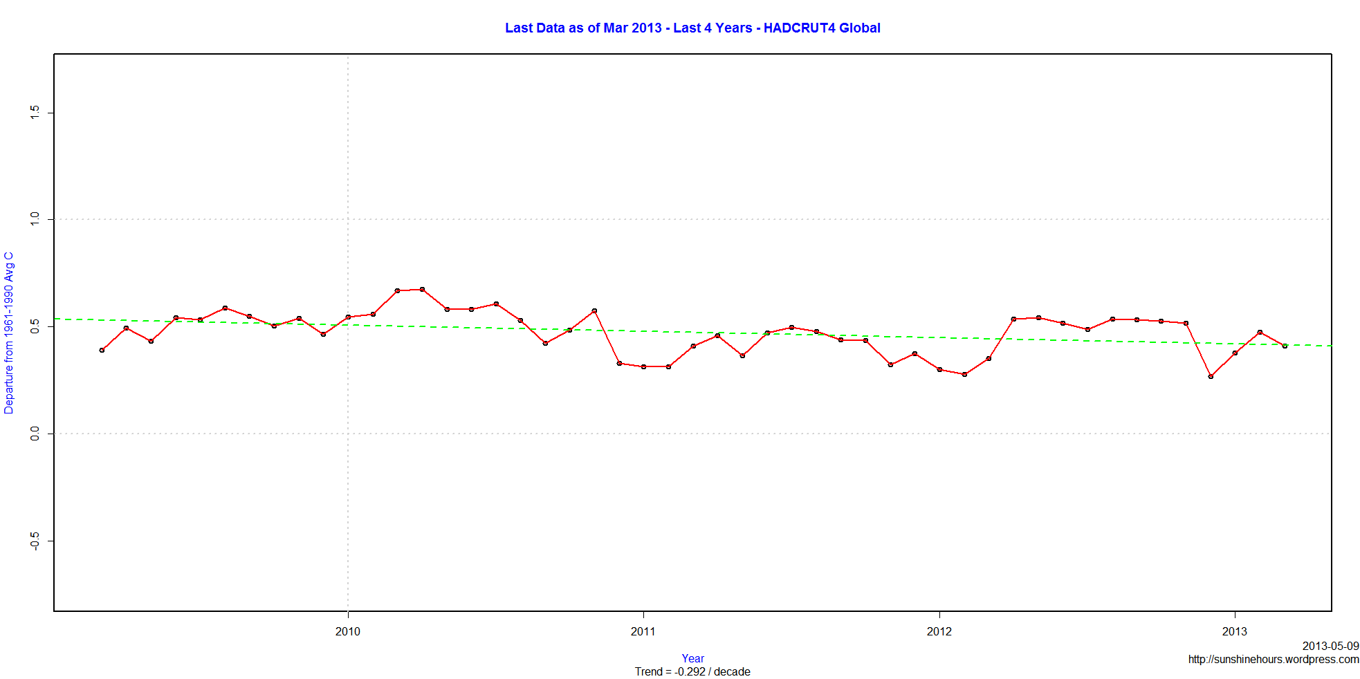
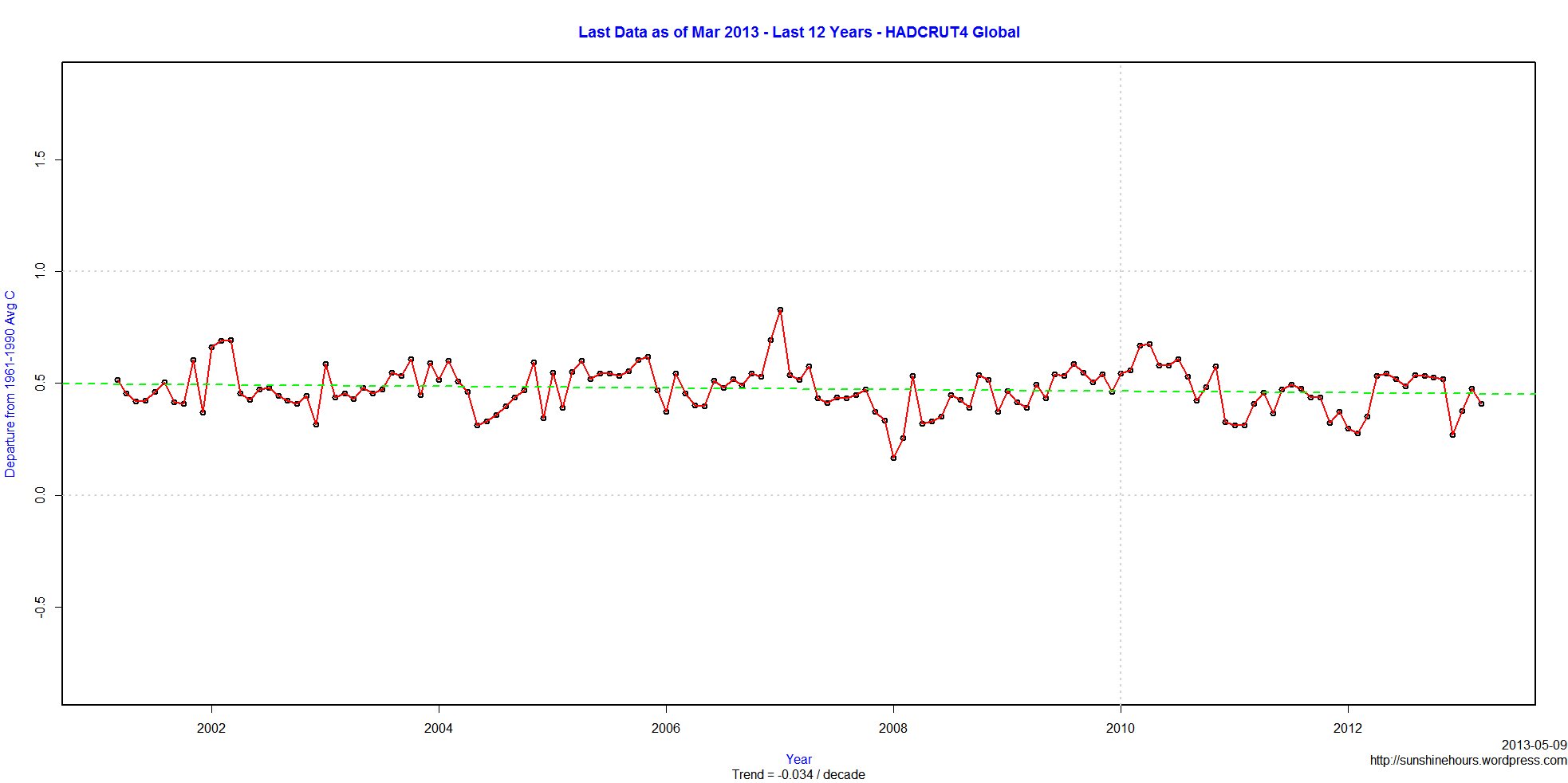
HADCRUT4 March 2013 data is finally available. Remember that the anomaly is the difference from the 1961-1990 average.
The global data shows cooling at -0.292C / Decade for last 4 years. (Click to make bigger)
For those who think 4 years is too short, the global data shows cooling at -0.034C / Decade for last 12 years.
2nd UPDATE: UAH is out. My post here.I knew if I complained it would all show up. 🙂
UPDATE: HADCRUT4 for March 2013 is out. My post is here.
Anyone know where the UAH and HADCRUT data is?
While some of the UAH data arrived a few days ago, the downloadable file is still missing April’s data. March’s data arrived April 2.
HADCRUT is usually available by the 28th of the following month. February’s data came out March 28. It is now 10 days late.
Are they having a conference? March and April too cold to explain?
RSS is out. HADCET is out. NCDC is due soon, but not overdue.
HADCRUT4 1930 to 1949 by Month.
Normally you see this part of the graph with 2 or 3 red ticks because it is done annually.
Keep in mind the highest red tick is an anomaly of 0.355C for August 1945. The anomaly for August 2012 was 0.532C. Which is only 0.177C warmer. (Corrected)
Click to see bigger.

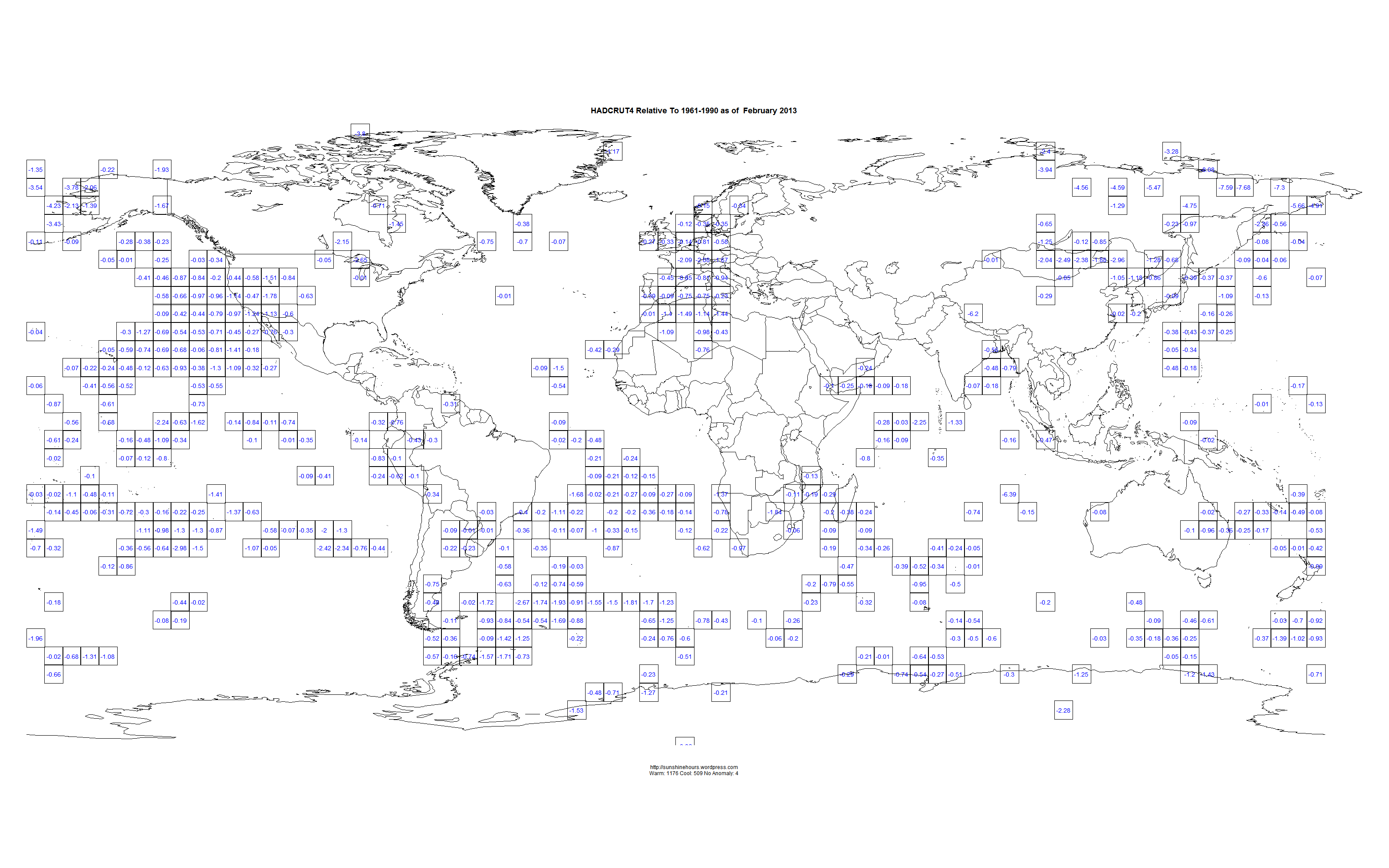
Using HADCRUT4 Gridded data for Feb 2013 , I thought it would be useful to map the 5×5 grid squares colder than 1961-1990.
For some strange reason HADCRUT4 uses the archaic 1961-1990 period as the baseline, rather than the accepted 1981-2010.
Please click on the maps to make them bigger. And make sure you get them to go full size. I made them pretty big (3200 x 2000 pixels).
The number in the boxes is the temperature difference between the 1961-90 average and Feb 2013.
Notice that most of Western Europe was colder than 1961-1990!!!!!!!
Why only the cold squares? Because the HADCRUT4 page colr choices tends to minimize the cold areas. And because I can.
HADCRUT4 for the last 12 years shows a small amount of cooling. The following map shows which 5×5 grid squares are warming or cooling. I am using grid squares with 130 out of 144 possible datapoints for the period. The circles are proportional to the trends. Keep in mind that this is 5×5 grids squares. As I’ve shown for Canada different size of grid squares change warming to cooling.
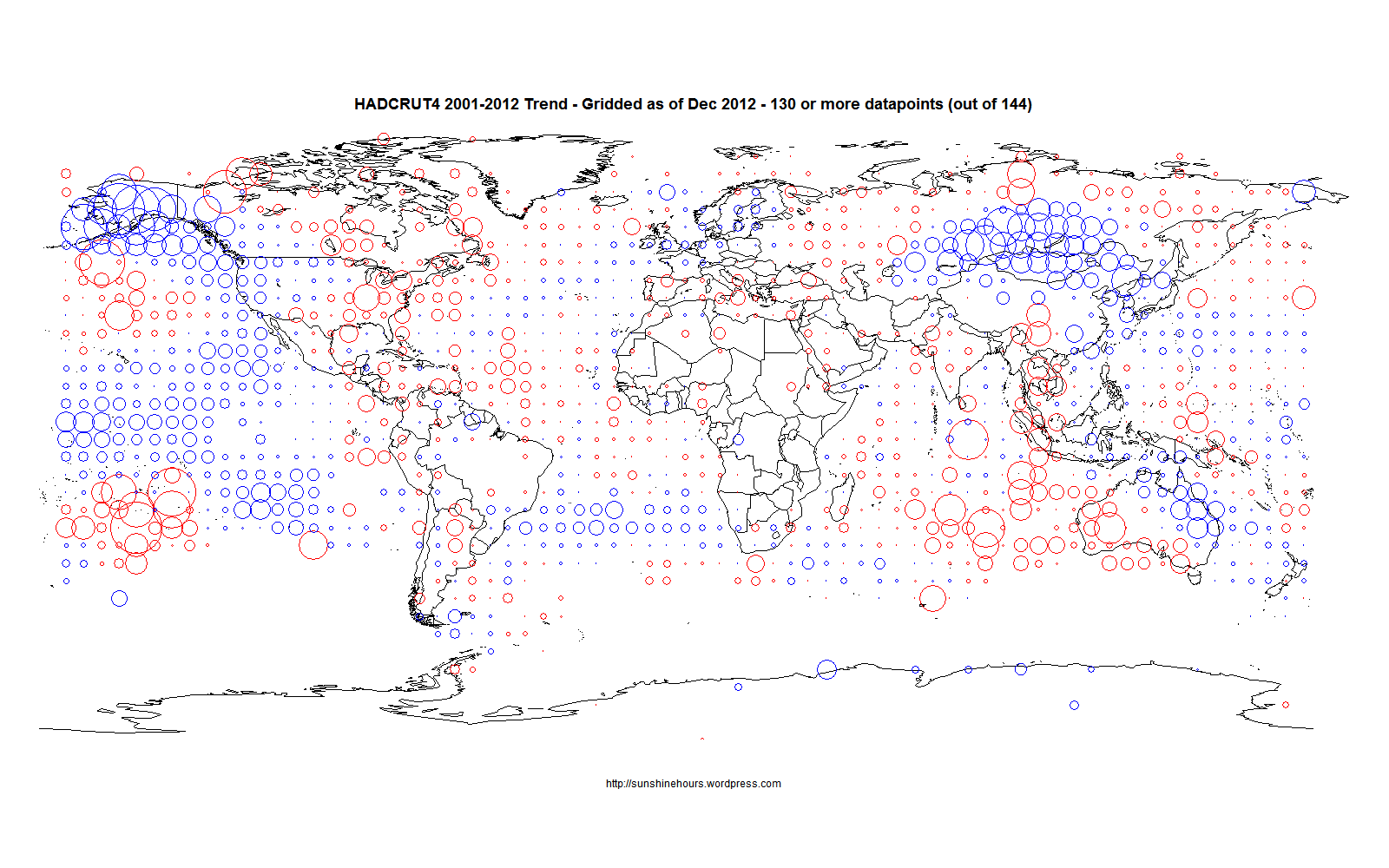
Thanks to the big drop in Dec 2012, HADCRUT4 has a negative trend for 12 years.
-.012C / Decade
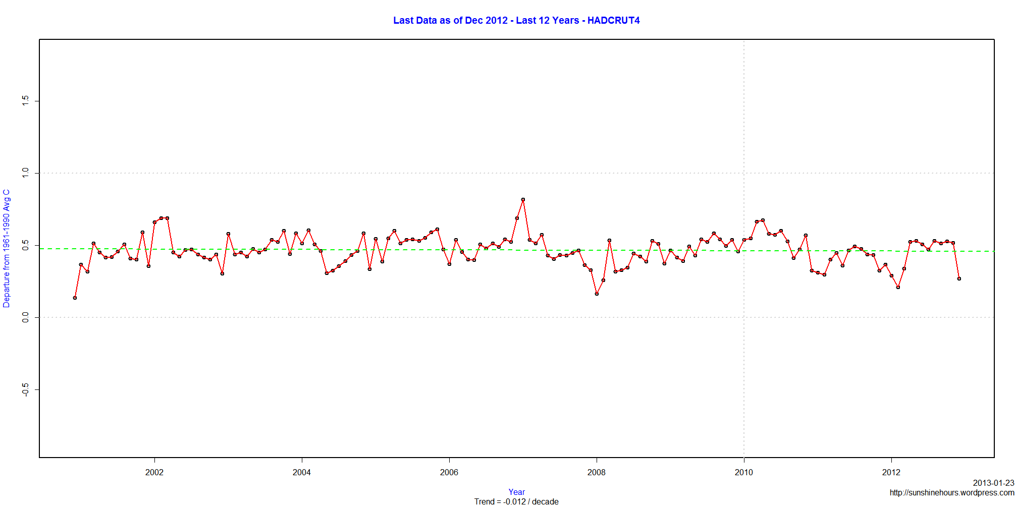
HADCRUT4 for Dec 2012 is out. The anomaly was .269C.
I looked at HADCRUT3 in a previous post.
Here is a list of months with a warmer anomaly than Dec 2012 that came before 1990.
| year | month | Anomaly |
| 1878 | 2 | 0.395 |
| 1878 | 3 | 0.348 |
| 1878 | 4 | 0.334 |
| 1944 | 1 | 0.29 |
| 1944 | 9 | 0.295 |
| 1945 | 8 | 0.355 |
| 1958 | 1 | 0.277 |
| 1973 | 2 | 0.269 |
| 1979 | 12 | 0.357 |
| 1981 | 1 | 0.333 |
| 1981 | 12 | 0.269 |
| 1983 | 1 | 0.431 |
| 1983 | 2 | 0.313 |
| 1987 | 2 | 0.284 |
| 1987 | 12 | 0.316 |
| 1988 | 1 | 0.385 |
| 1988 | 3 | 0.275 |
