A rank of 121 in Oregon indicates the warmest (since NOAA records started in 1895). This data is Maximum temperature average for the month..
On the other hand, a rank of 30 indicates 91 January’s were warmer.
es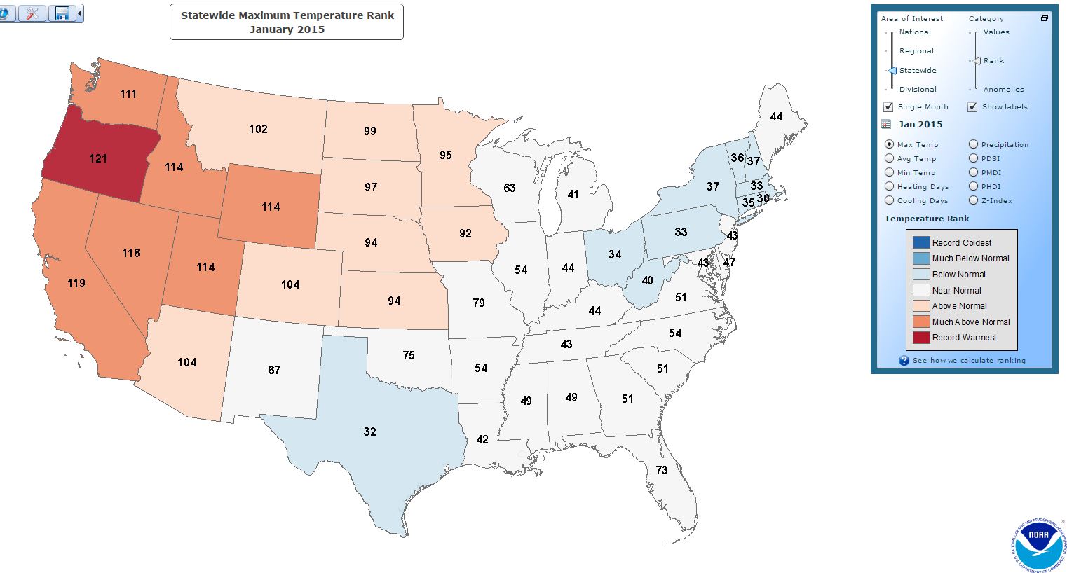
A rank of 121 in Oregon indicates the warmest (since NOAA records started in 1895). This data is Maximum temperature average for the month..
On the other hand, a rank of 30 indicates 91 January’s were warmer.
es
“When future generations look back on the global-warming scare of the past 30 years, nothing will shock them more than the extent to which the official temperature records – on which the entire panic ultimately rested – were systematically “adjusted” to show the Earth as having warmed much more than the actual data justified.”
“Two weeks ago, under the headline “How we are being tricked by flawed data on global warming”, I wrote about Paul Homewood, who, on his Notalotofpeopleknowthat blog, had checked the published temperature graphs for three weather stations in Paraguay against the temperatures that had originally been recorded. In each instance, the actual trend of 60 years of data had been dramatically reversed, so that a cooling trend was changed to one that showed a marked warming.”
Read it all here:
Big Fat Lie: “Sceptics who still doubt anthropogenic climate change have now been stripped of one of their last-ditch arguments: It is true that there has been a warming hiatus and that the surface of the earth has warmed up much less rapidly since the turn of the millennium than all the relevant climate models had predicted. However, the gap between the calculated and measured warming is not due to systematic errors of the models, as the sceptics had suspected, but because there are always random fluctuations in the Earth’s climate.“
Briggs: “No. No. No. It is as simple and no more difficult than this. A climate model consistently says the temperatures will be way up here, and reality just as consistently fails to cooperate and puts temperatures way down there. That model is therefore a failure. It is busted. It is broken. It is not right. It should not be trusted. It should not be used as a basis for any decision. It is wrong.”
Read It All
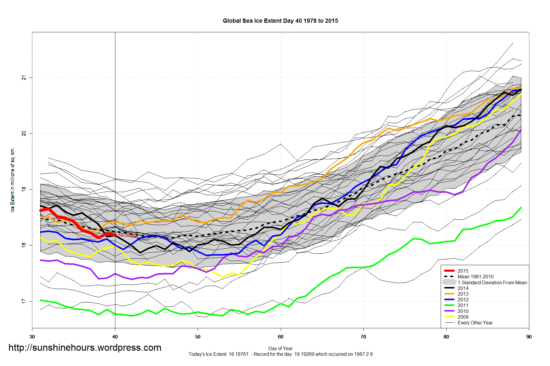
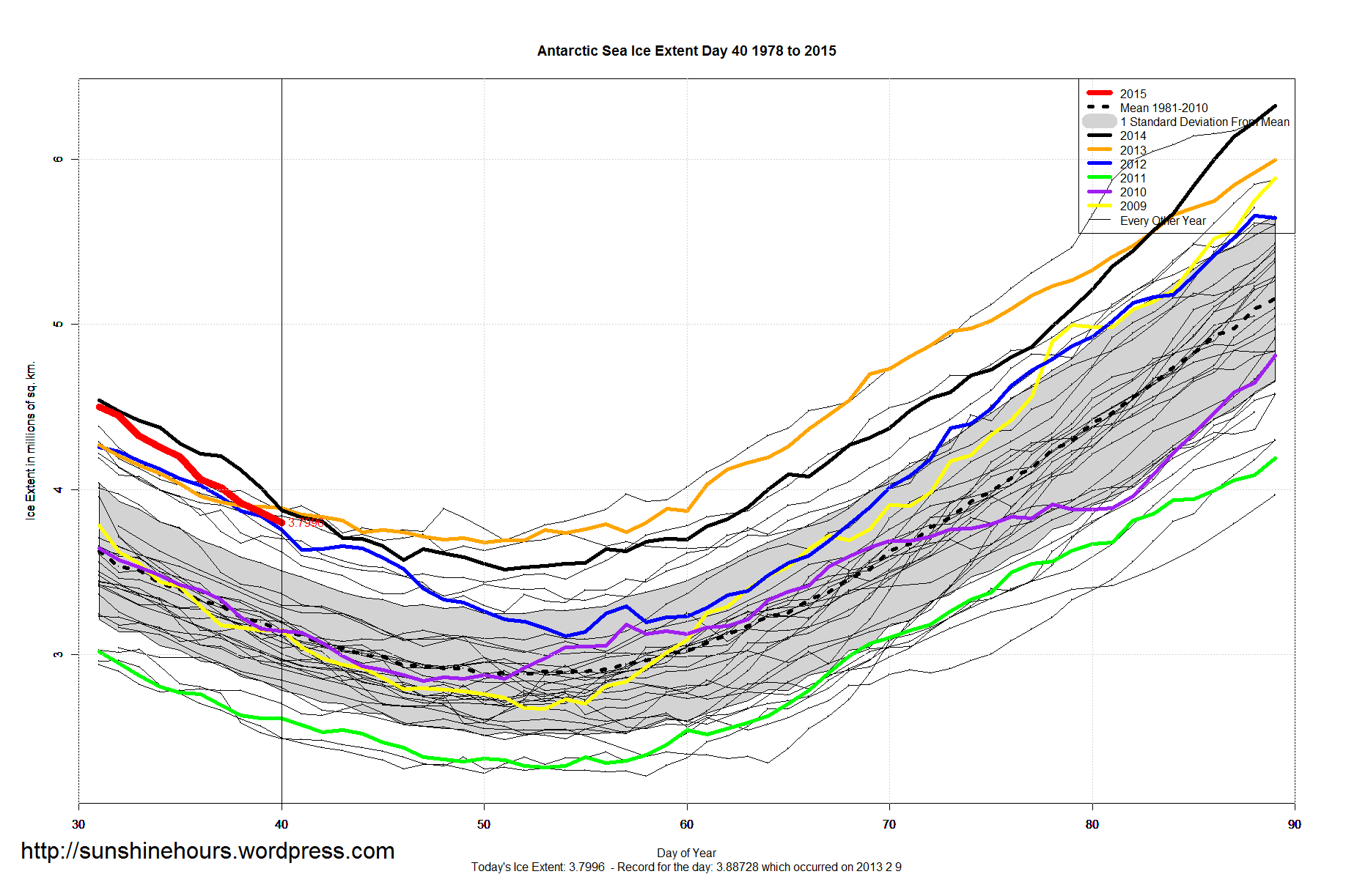
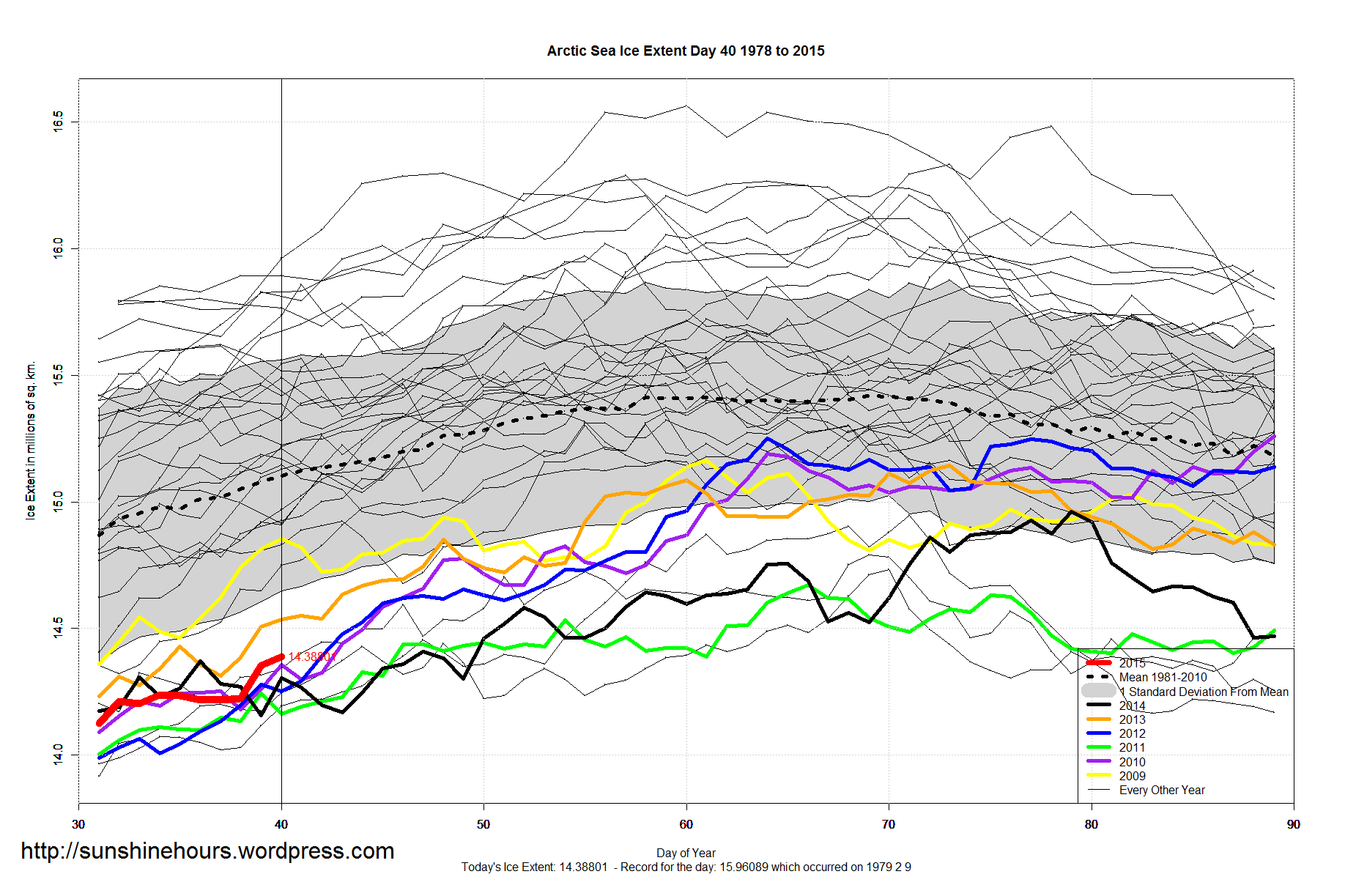
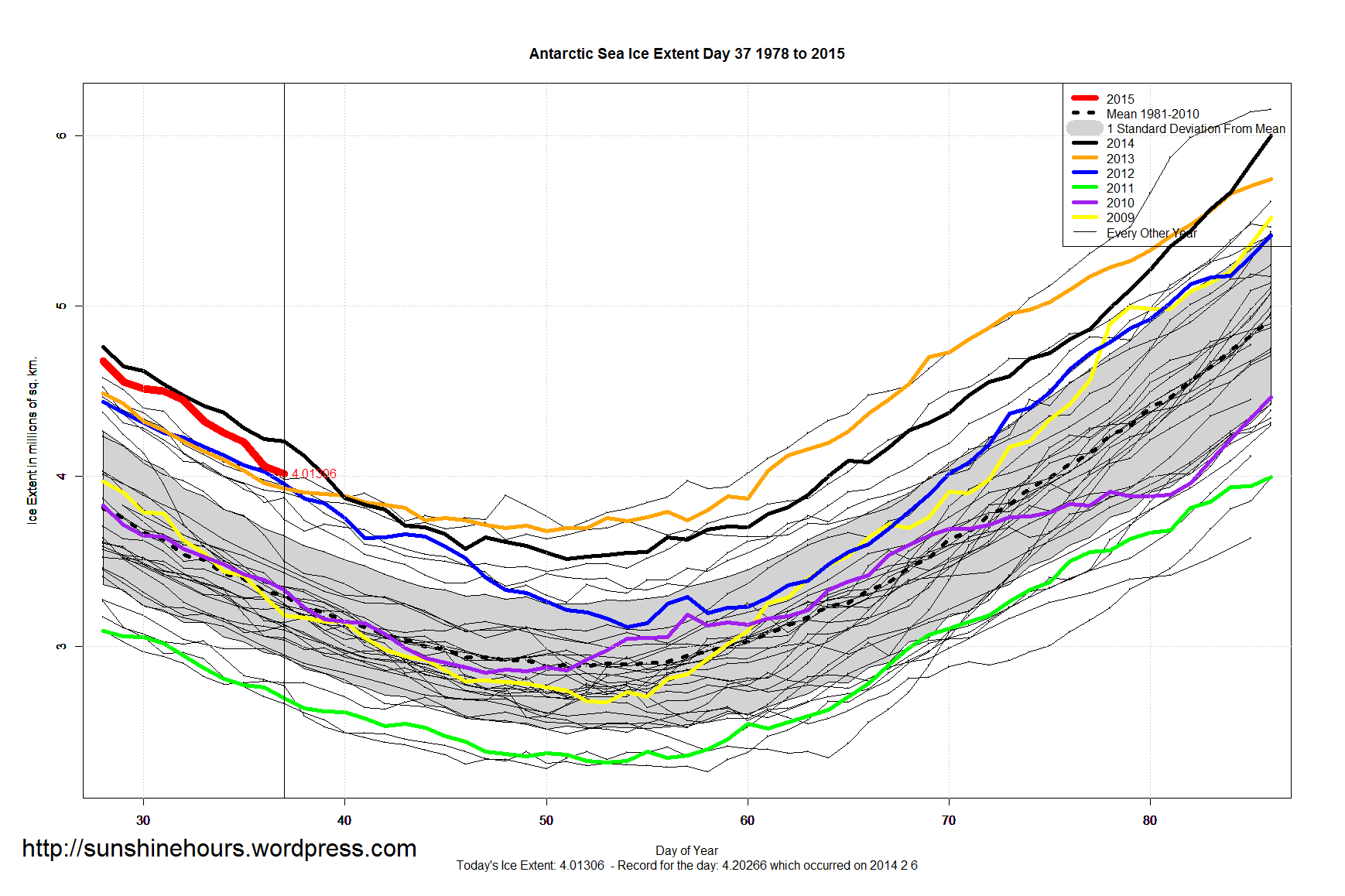
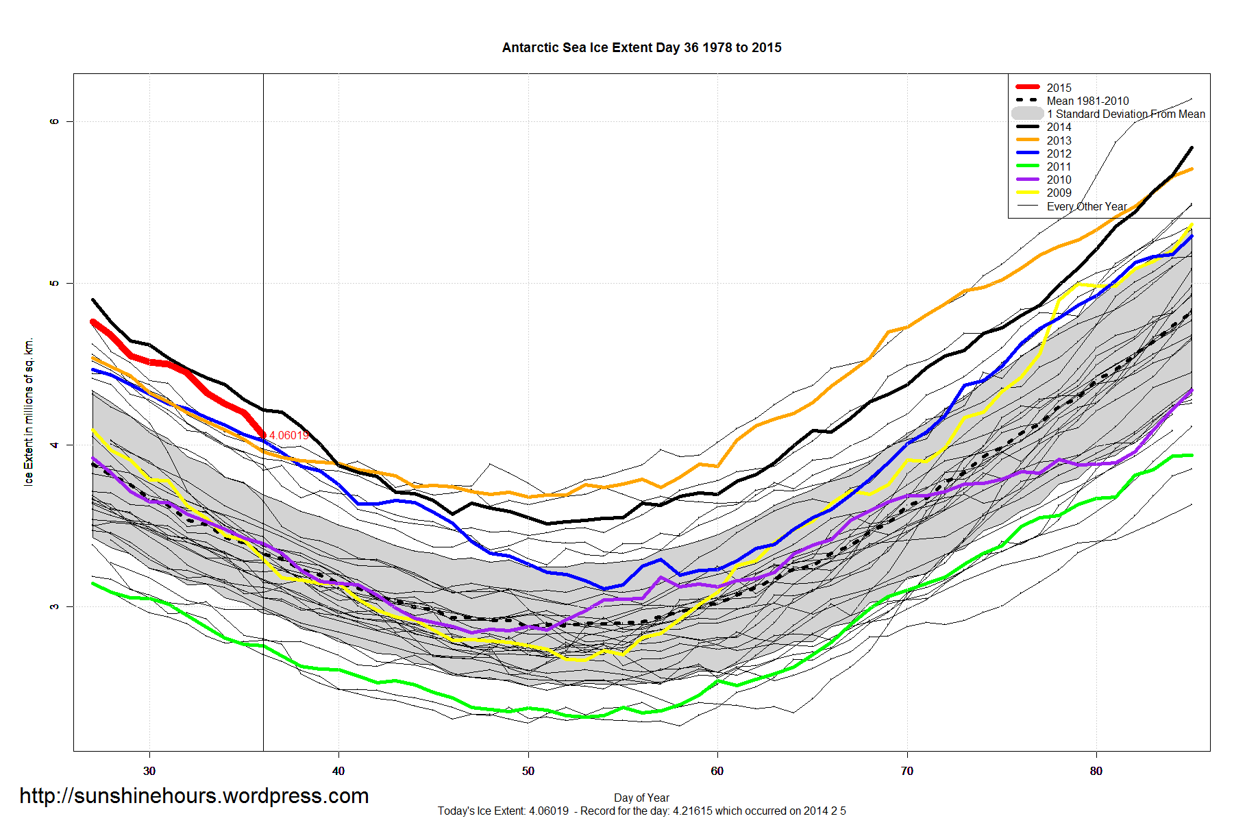
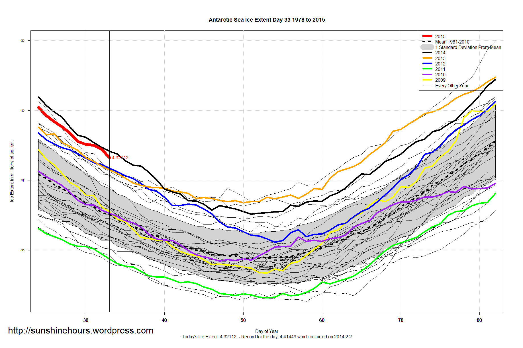
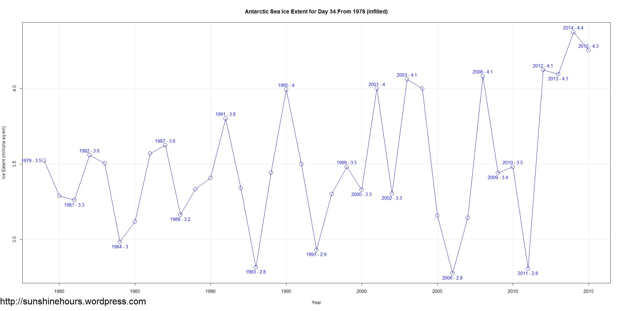
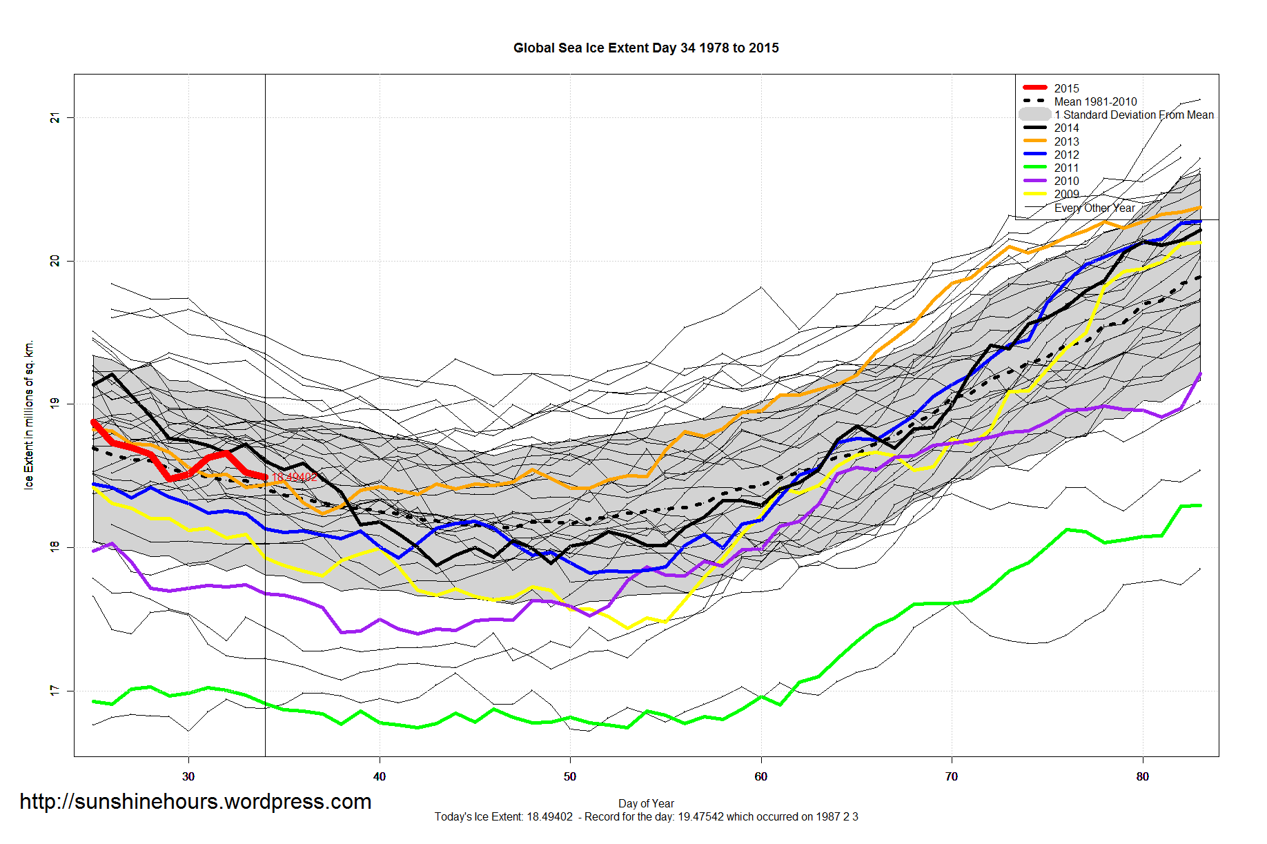
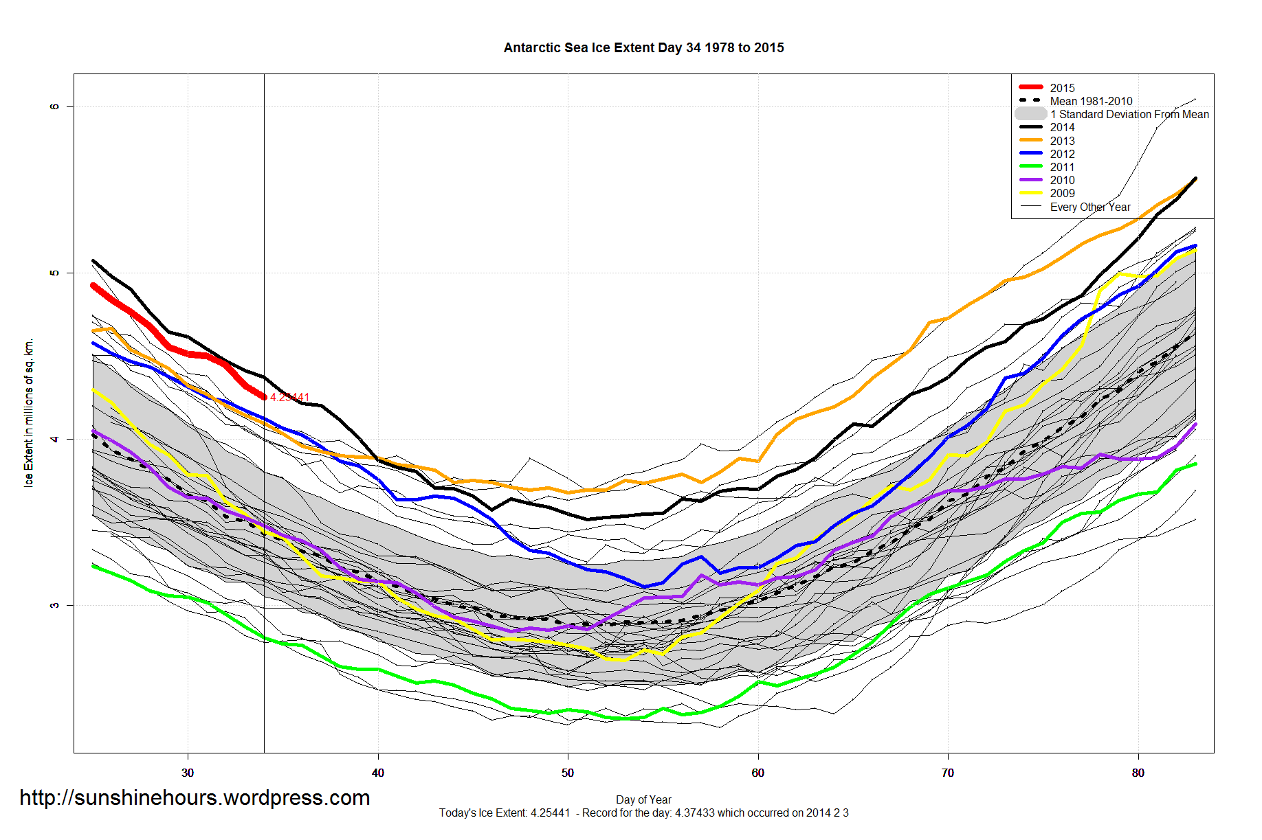
Normally (as you can see from the graph below) at this time of year Antarctic Sea Ice is high one or two years and then drops as much as 1.3 million sq km to a low (even a new) low and then repeats.
From 2012 the big drop in the sawtooth pattern stopped. From 2012 every value is above every value before 2012 (with a little license for the tiny dip from 2012 to 2013).
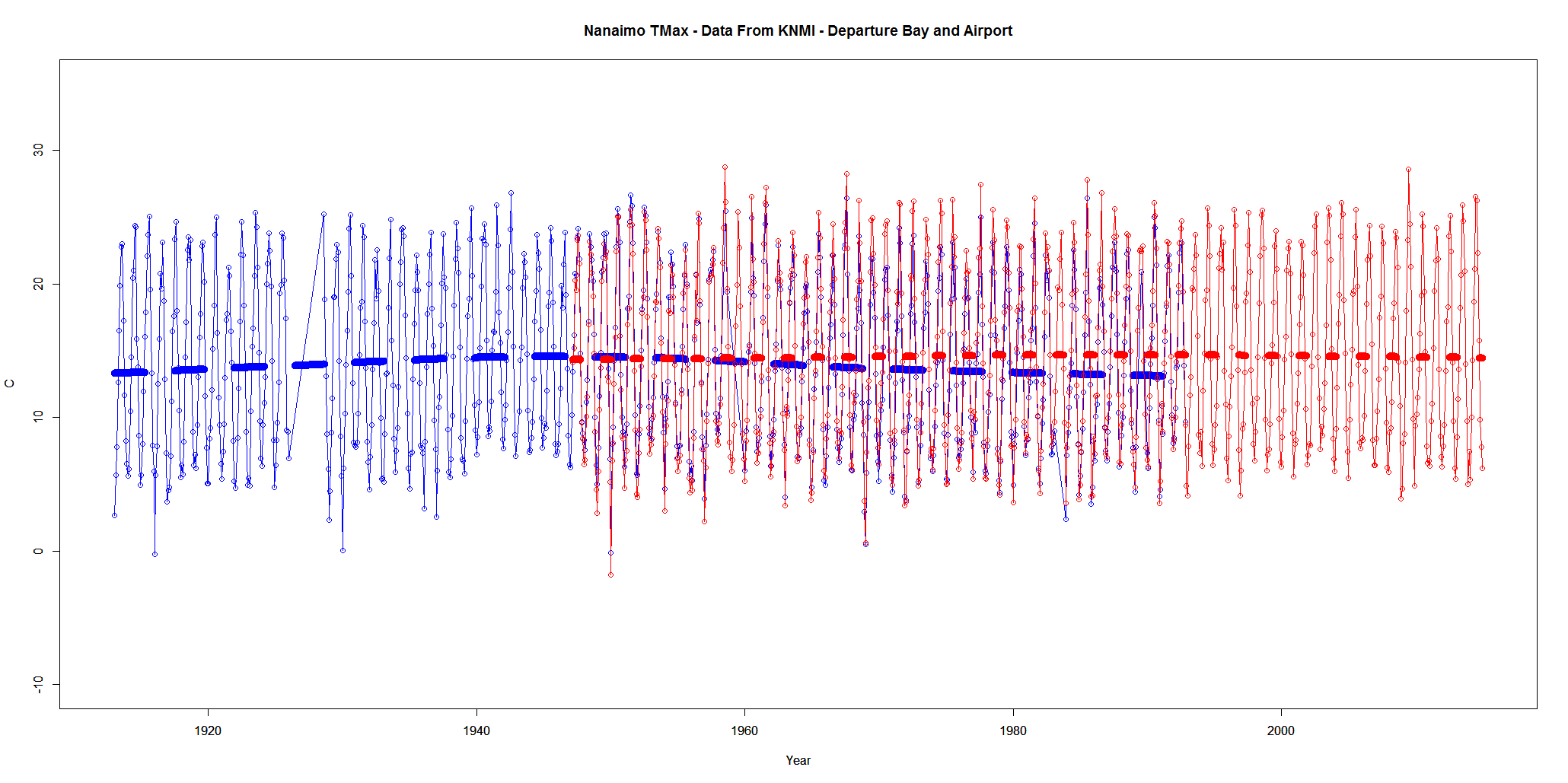
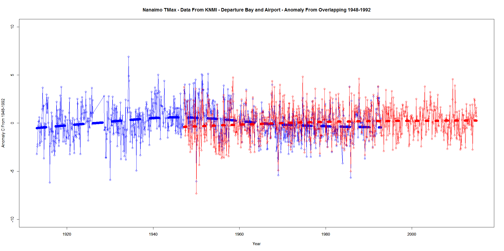
Every once in a while I visit the data for the weather station closest to my hometown on the west coast of Canada.
Today I am looking at daily data (using KNMI) from Departure Bay (1913 – 1992) and Nanaimo Airport (1947 – 2014).
I’ve summarized the data by monthly mean.
The data does overlap. The first graph is just Tmax. The second graph is Tmax anomaly from the overlap period of 1948 to 1992