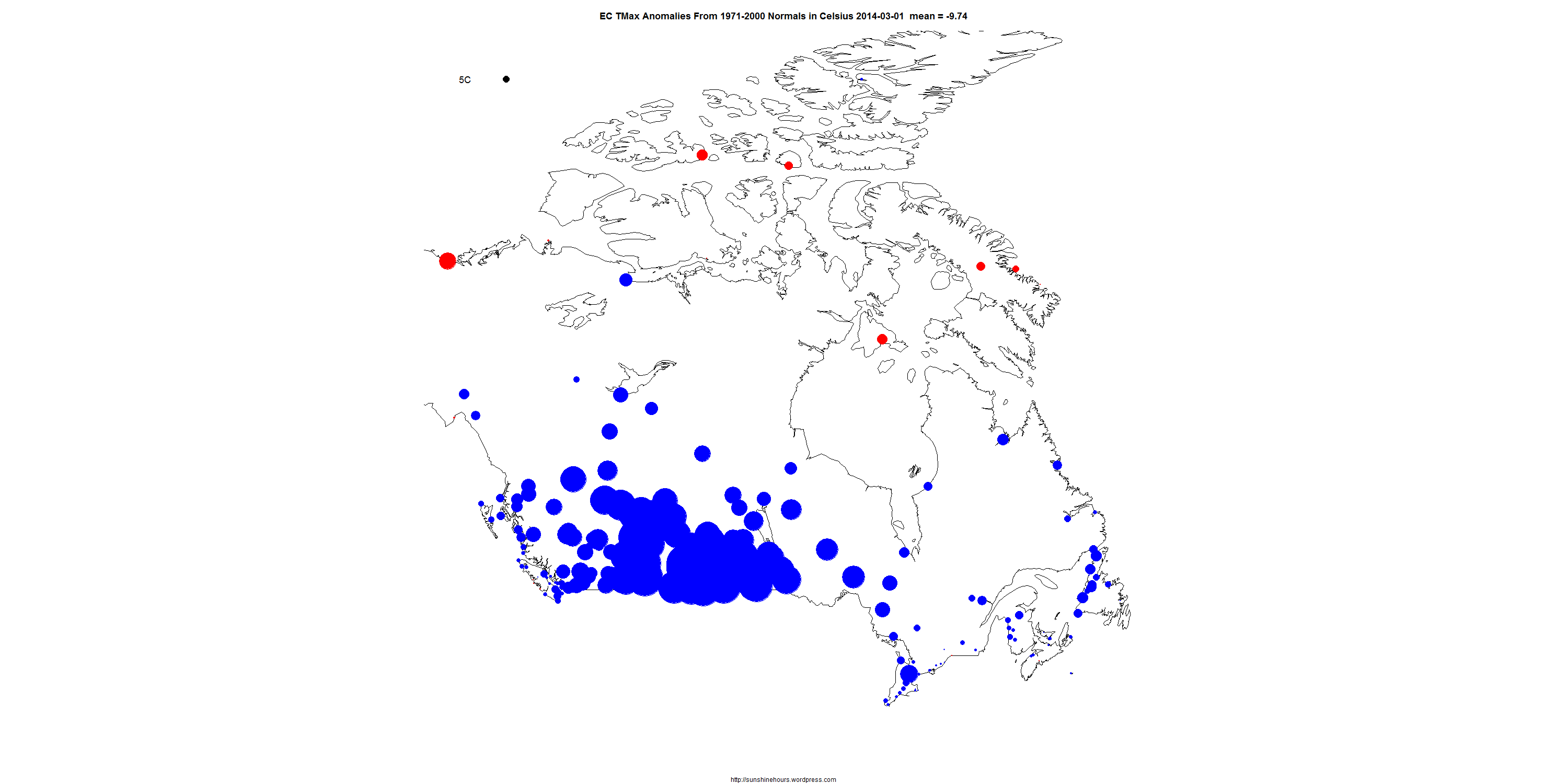
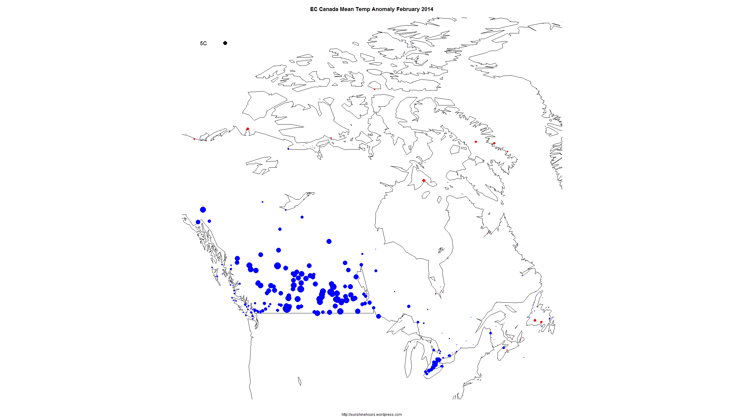
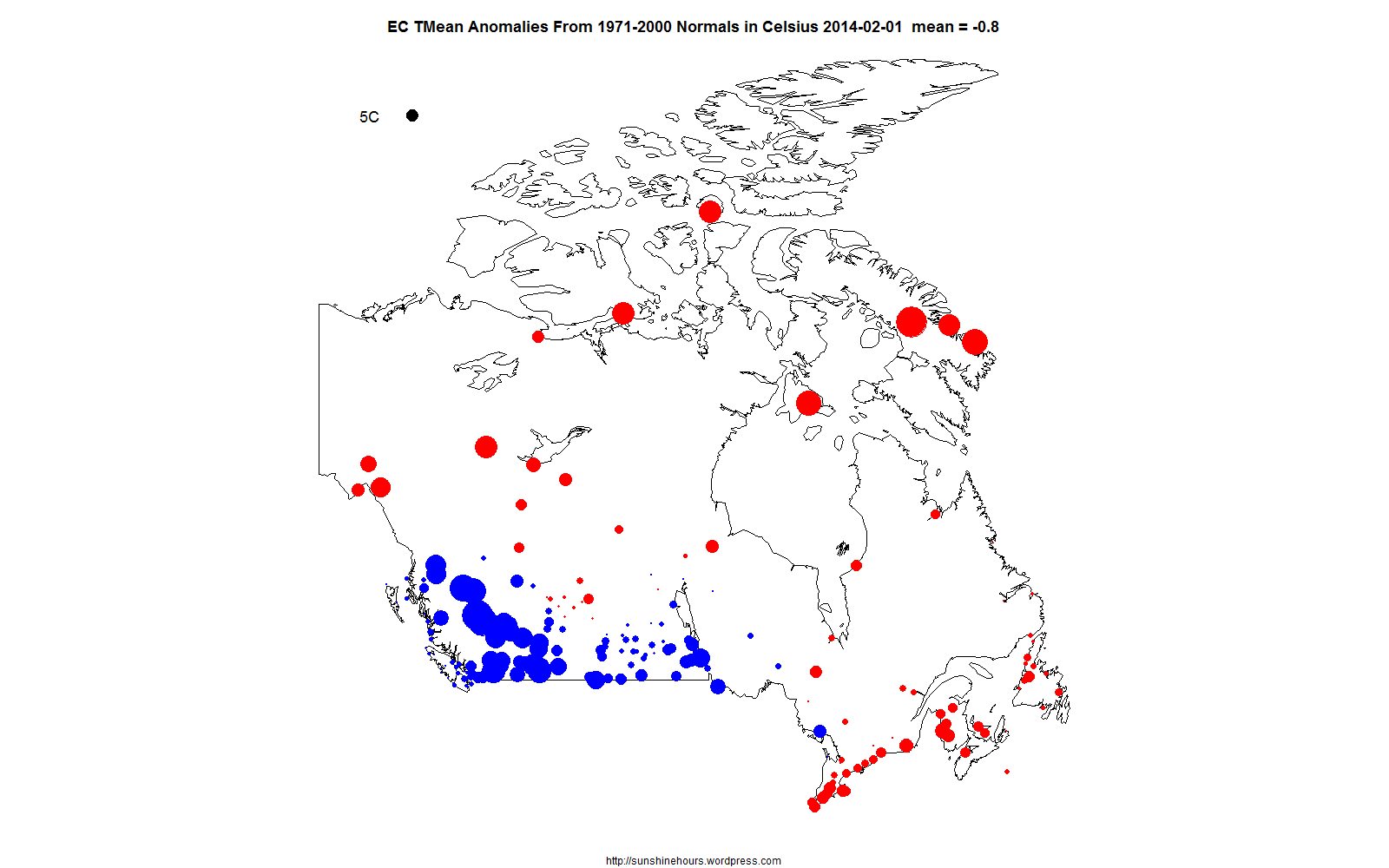
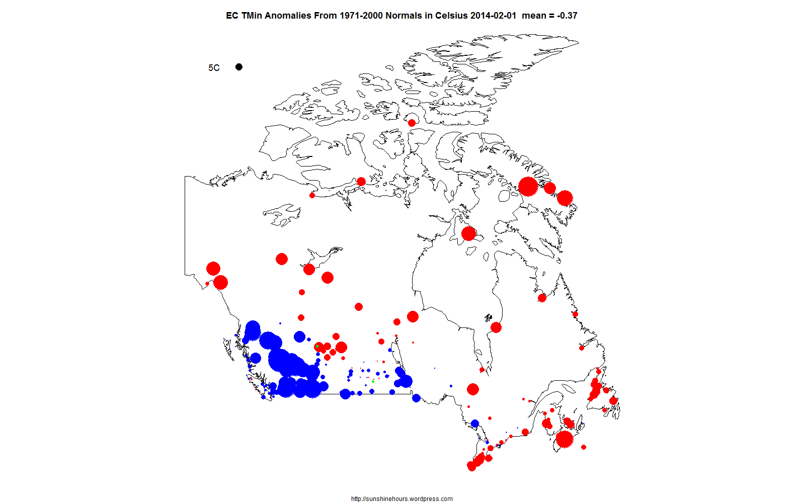
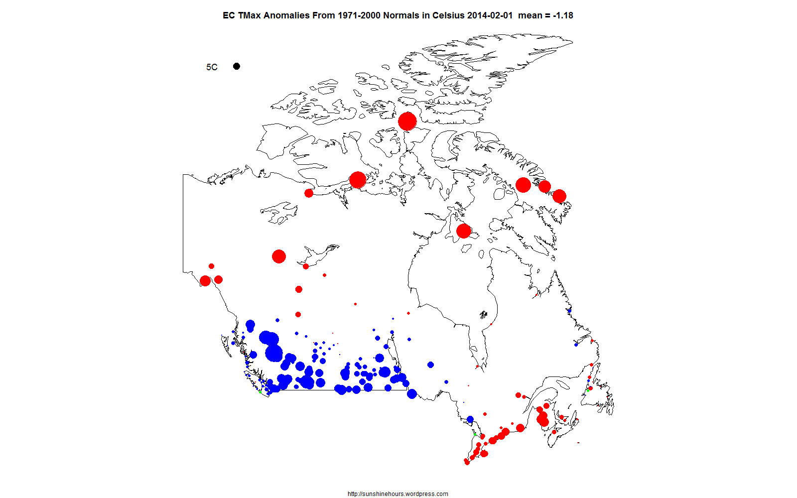
Environment Canada publishes monthly summaries here. The data included Tmax, Tmean, Tmin and Normals (the D column). The Normals column is “Mean Temperature difference from Normal (1971-2000) (°C)”. These are supposedly the higher quality stations. Only some of the stations get a Normals value.
I could just look at the stations with Normals and summarize the data. But some of the stations are close together. So I thought why not summarize the data by 1×1 grid square and then summarize the grid squares.
Correction: I left the green line out of these graphs – The green line is the count of grid squares with data in them. That is dropping like a stone. (I will discuss this in another post).
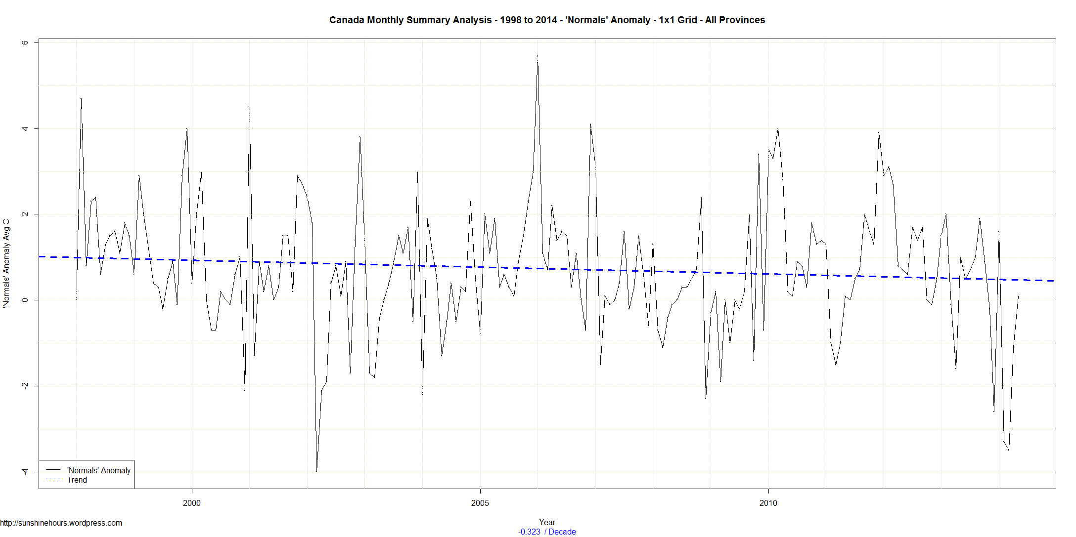
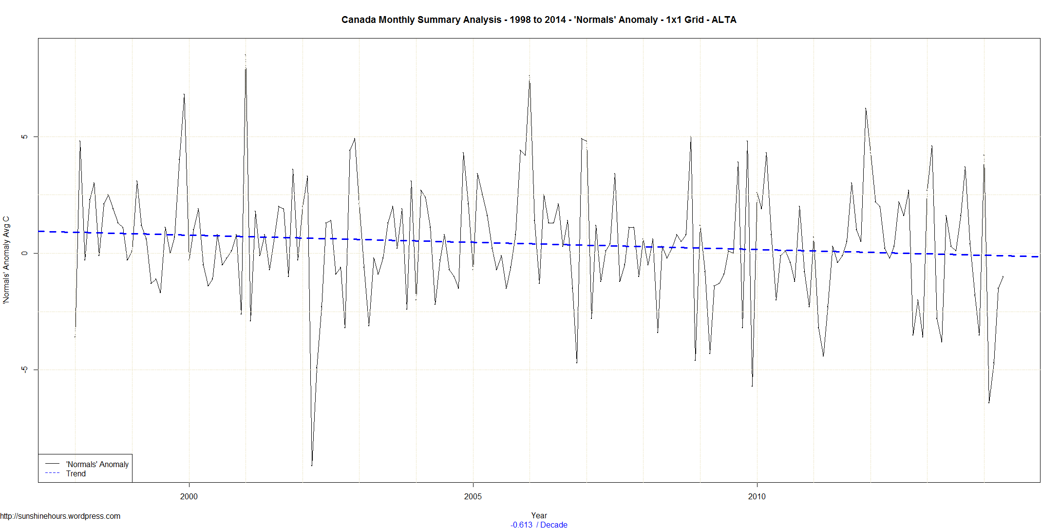
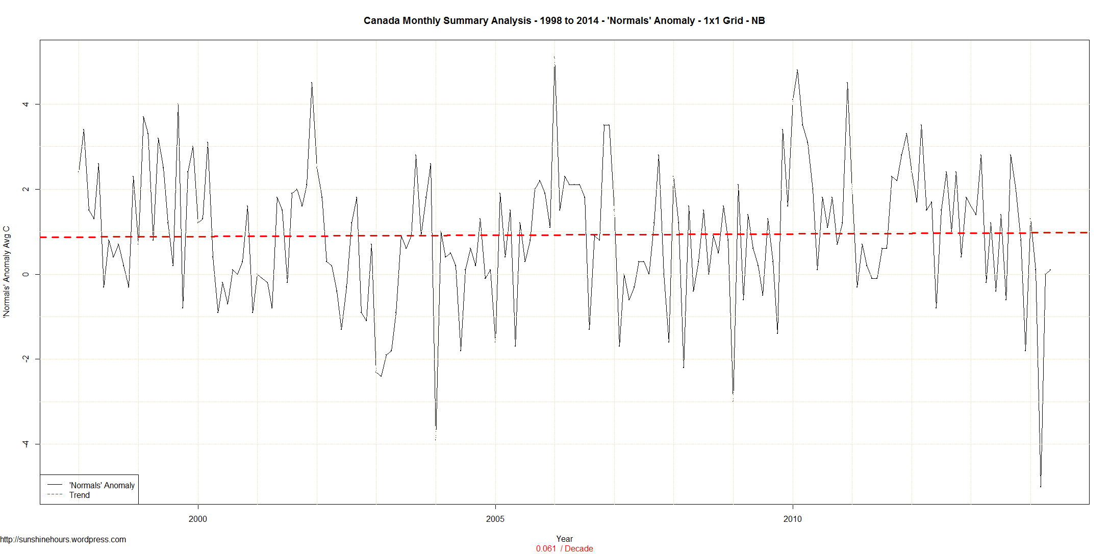
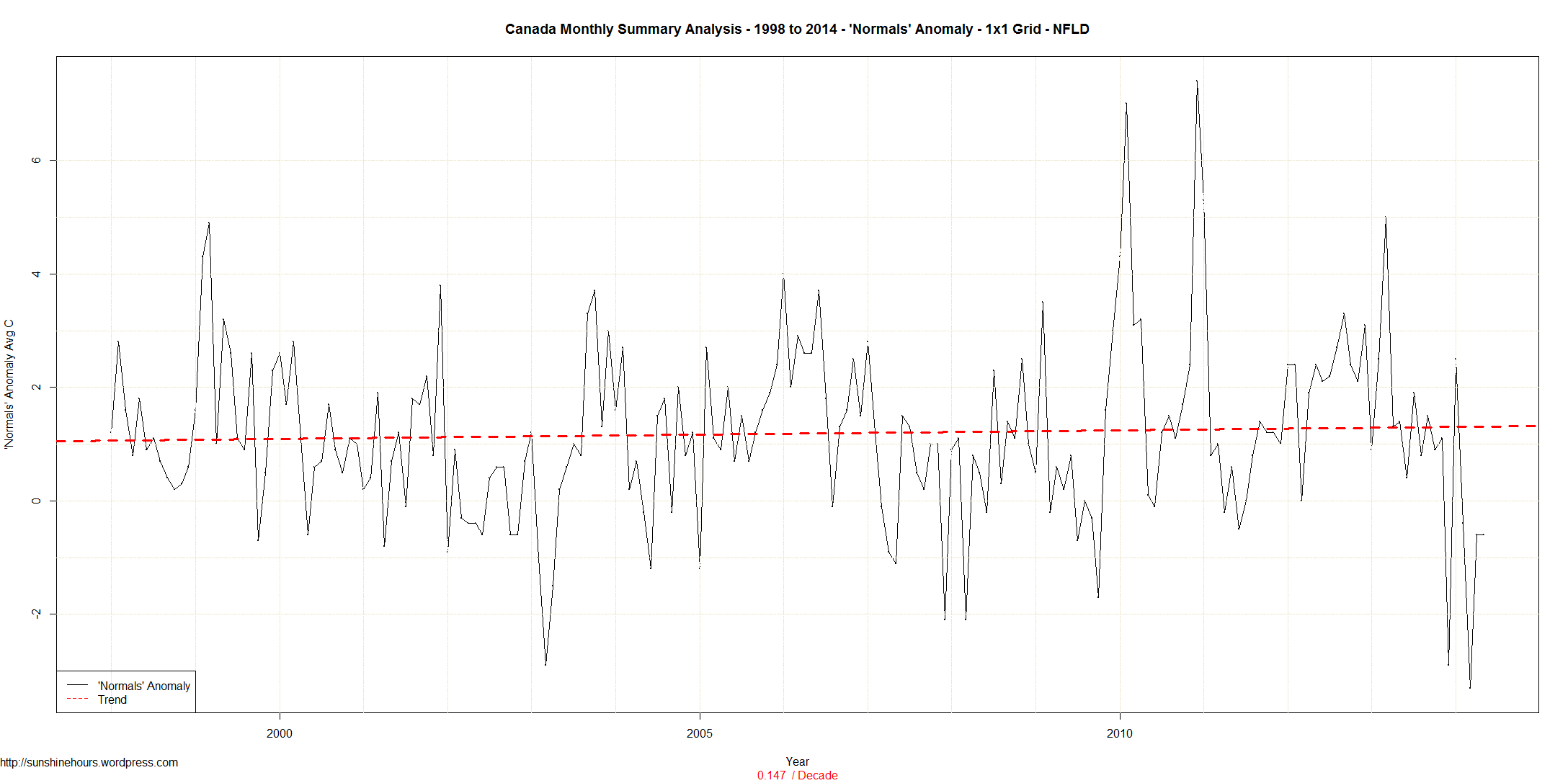
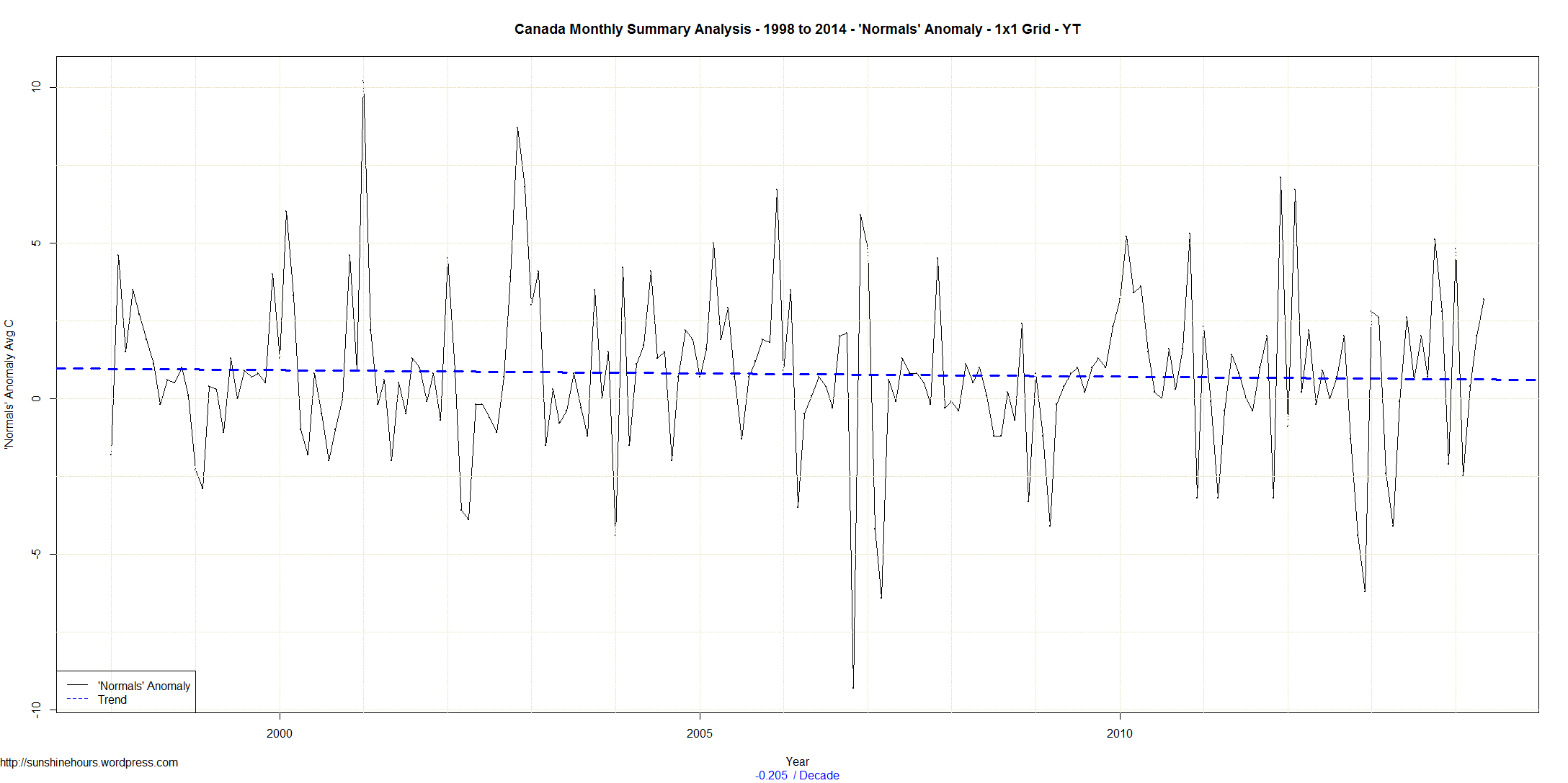
And why not see what happens from 1998. We know 1998 is a pivot point in climate.
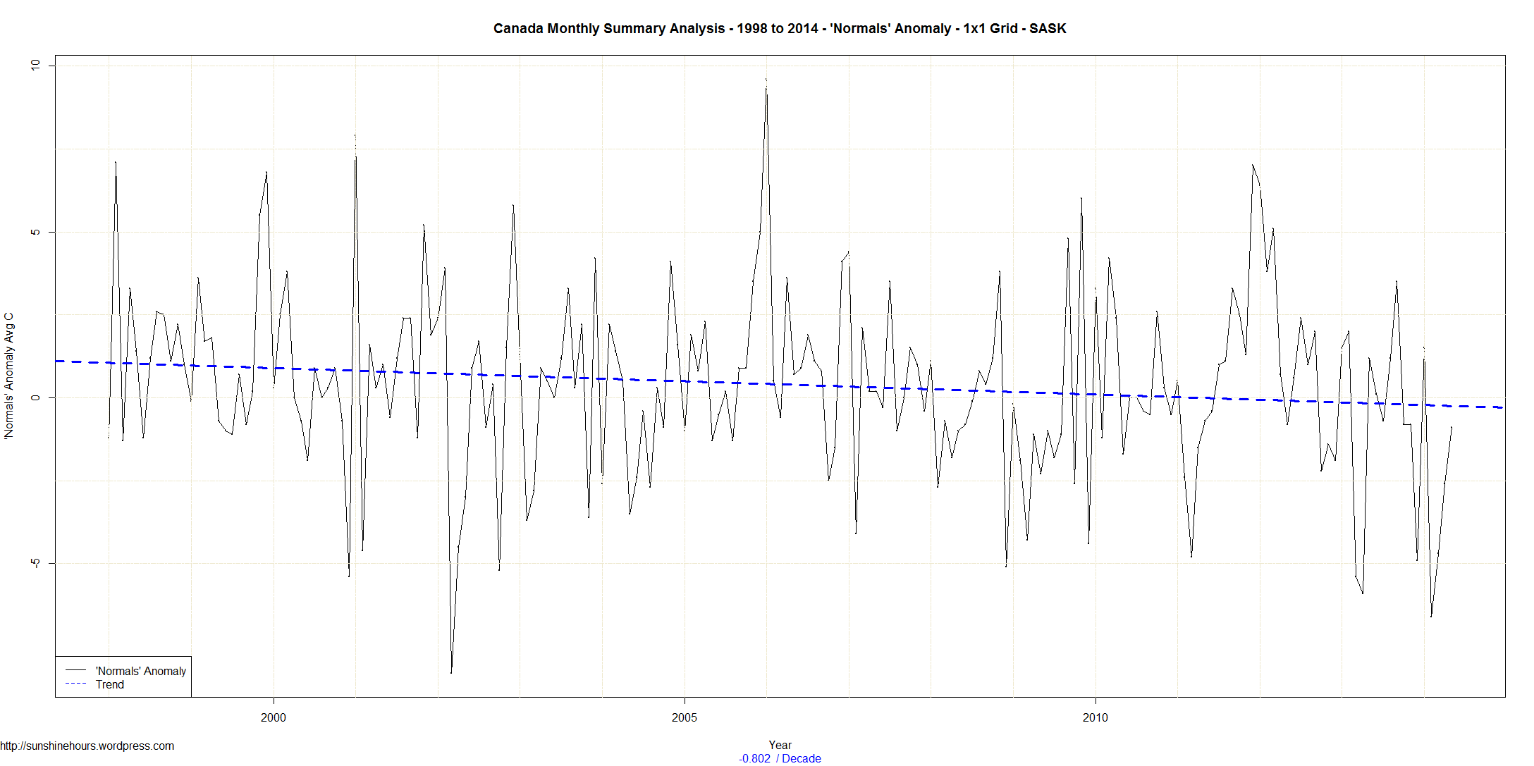
The trend for the whole country from 1998 is cooling at -0.32C/decade. Saskatchewan and Manitoba are cooling at over -.8 C /decade. Wow.
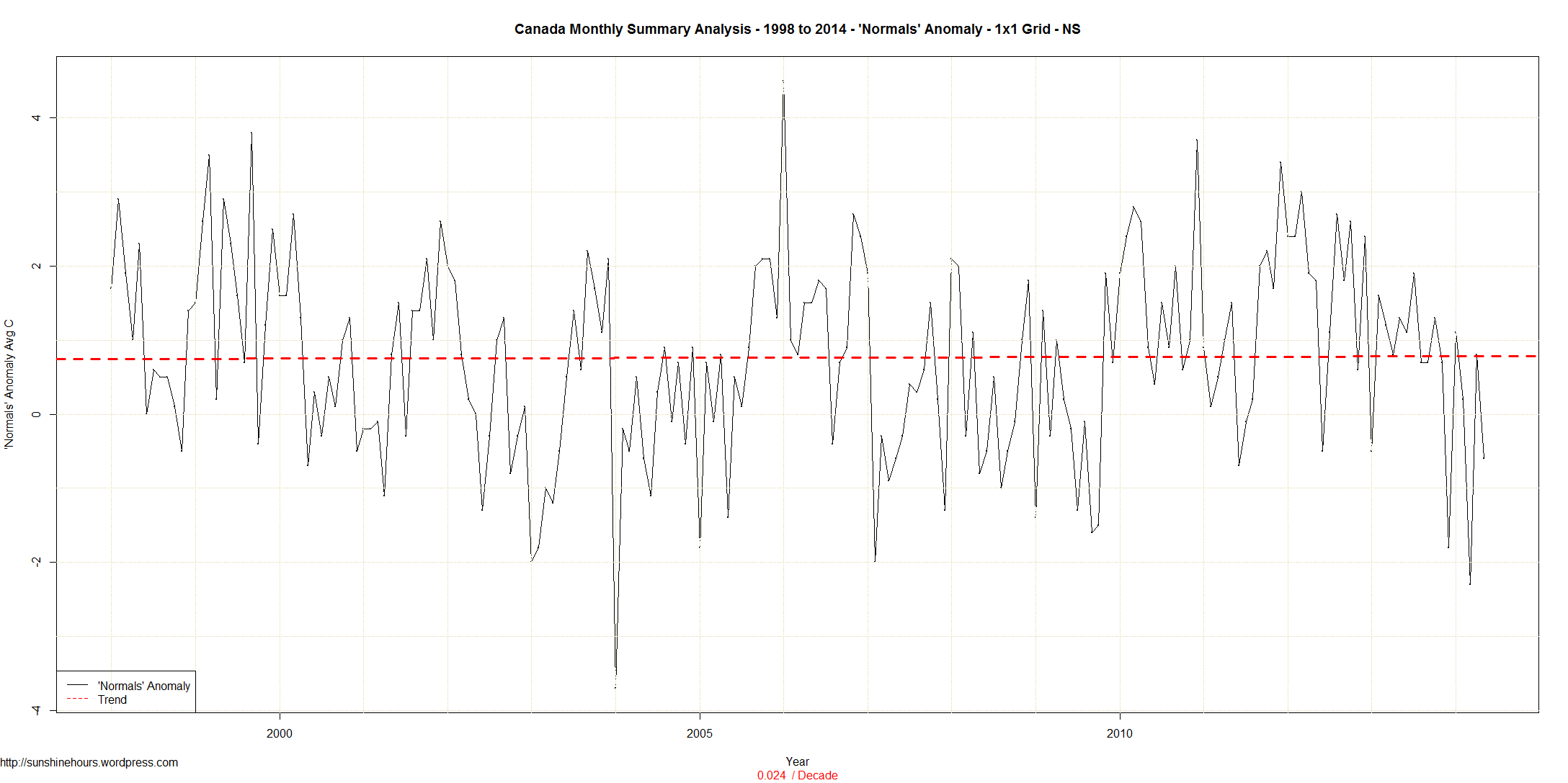
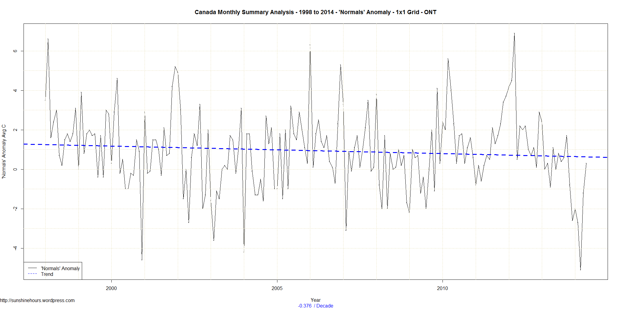
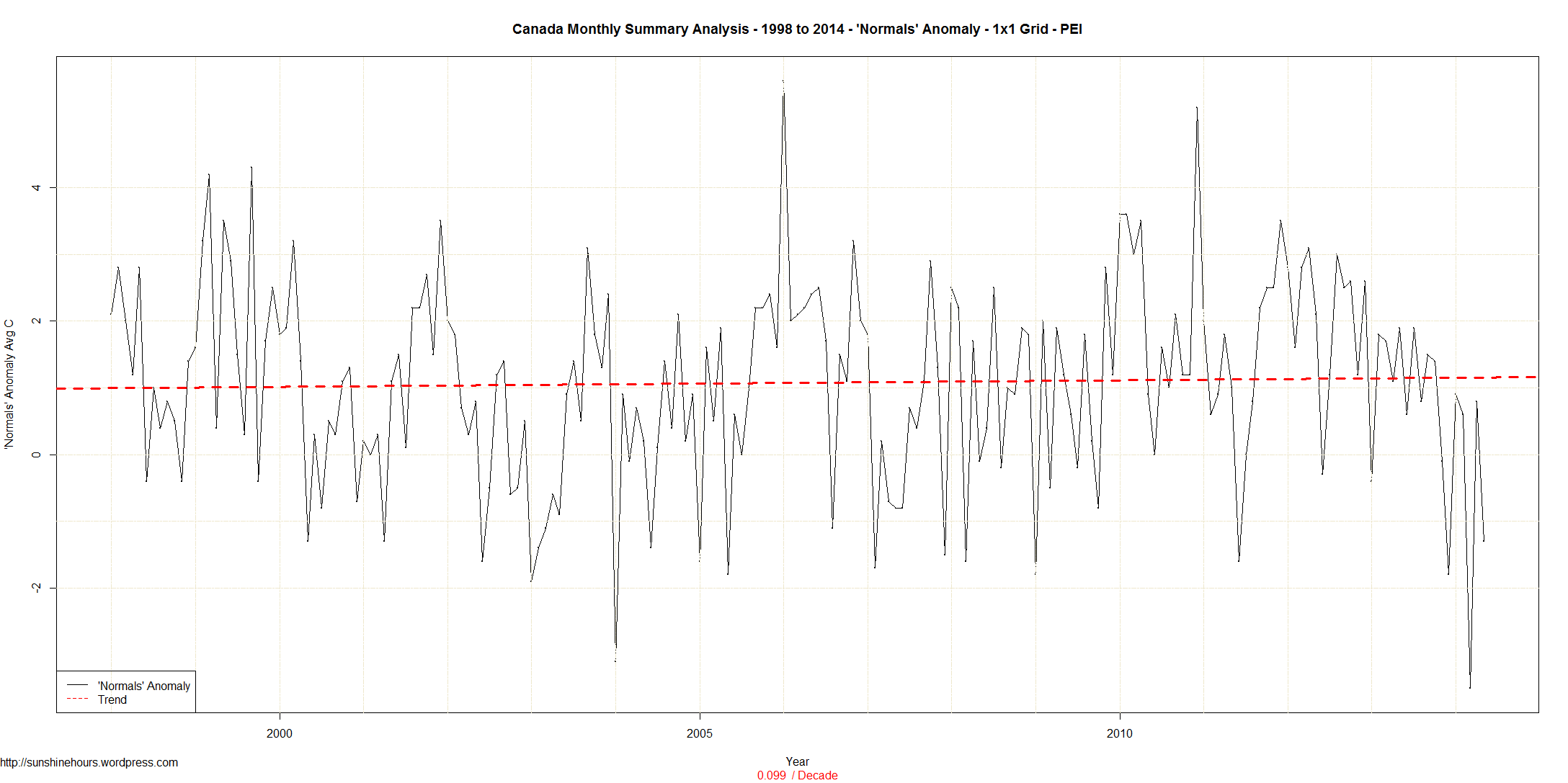
Here are the trends for each province.
All Provinces -0.32 C/decade
ALTA -0.61
BC -0.3
MAN -0.86
NB 0.06
NFLD 0.15
NS 0.02
NU 0.47
NWT -0.36
ONT -0.38
PEI 0.1
QUE 0.01
SASK -0.8
YT -0.21
And here are the graphs for each province and then one more for the whole country. Click For bigger.


