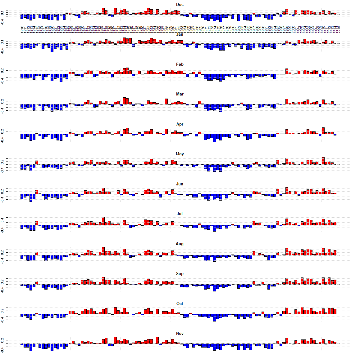
The AMO for each month as of Dec 2015. Some months the AMO is still high. Some it is low.
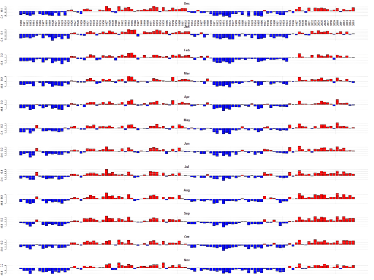
The AMO for each month as of Dec 2015. Some months the AMO is still high. Some it is low.
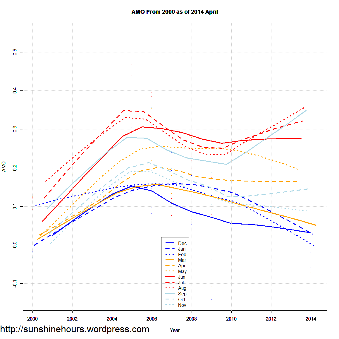
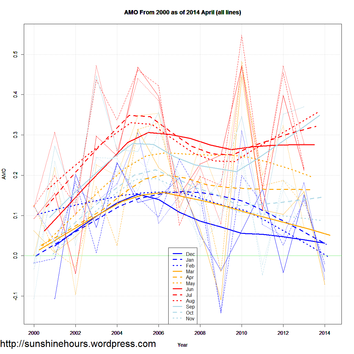
Sep/Oct/Nov/Dec only go up to 2014 of course. 2005 was the peak AMO (approximately).
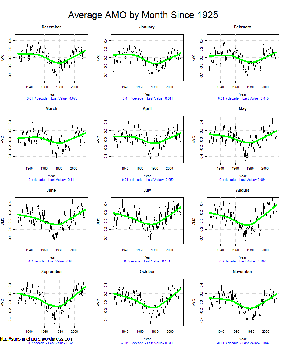
And its downhill to same kind of late 70s cold that made people think a new ice age was coming.
The good news. It should be another 25 years to reach bottom. The bad news. 2005 style warmth is 60 years away.
 only
only
The AMO syncs up with climate change very nicely. This is just a view I like. The deepest blue sections are the 1970s.
1978/79 was the coldest winter in US history.
UPDATE: Sorry about the title. Not sure what happened. Fixed now.
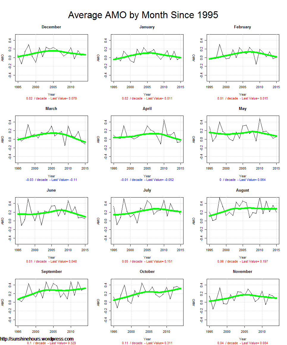
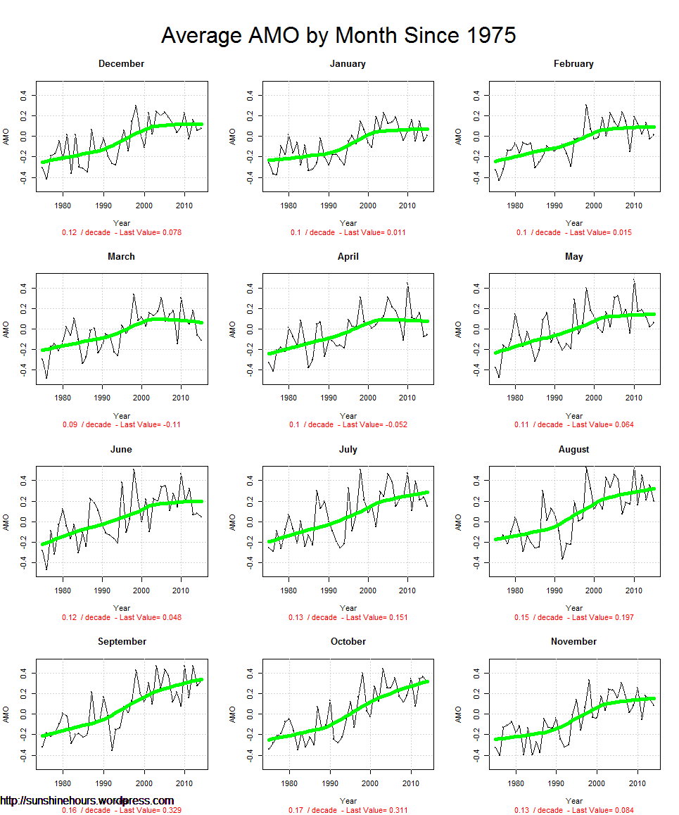
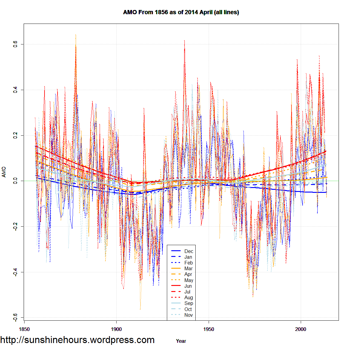
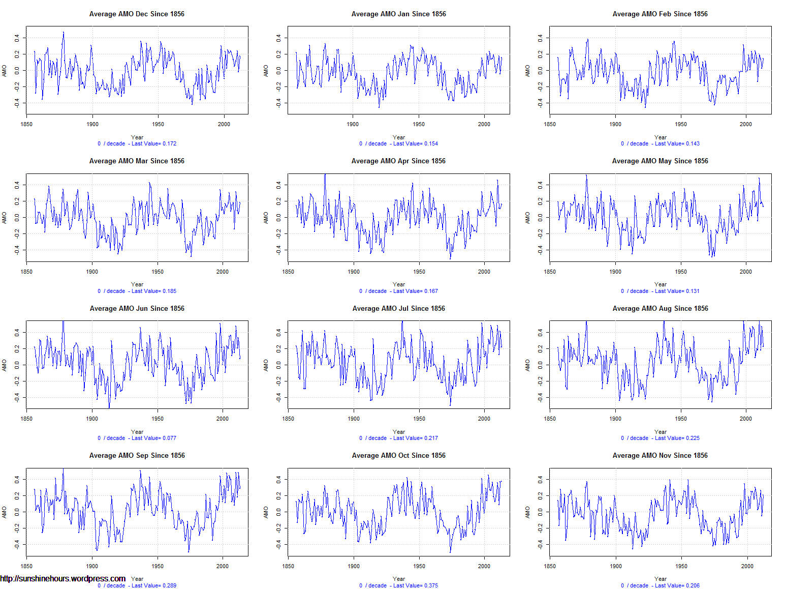
The AMO is definitely linked with climate cycles. And probably has more to do with Arctic Sea Ice than any other factor. This is loess trend of each month of the AMO on the same graph.
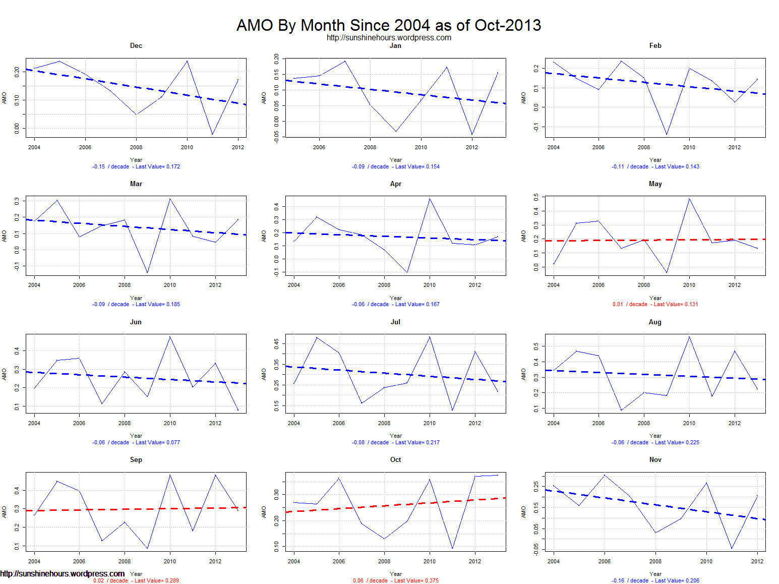
The winter months started trending down around 2005/2008. Spring months have been flattish since the same time. Only July-Sept have stayed high. June has been flat.
The first four months of 2014 were all negative.
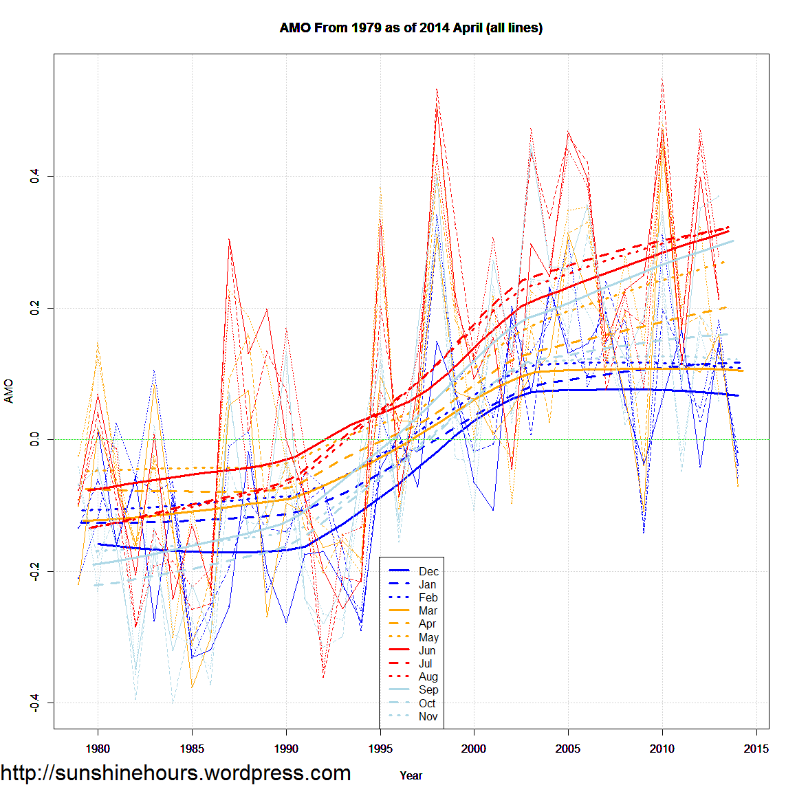
Same graph, but from 1856 and 1979. The spread in months now seems to be repeating the pattern way back in 1856. But that could be an endpoint artifact.
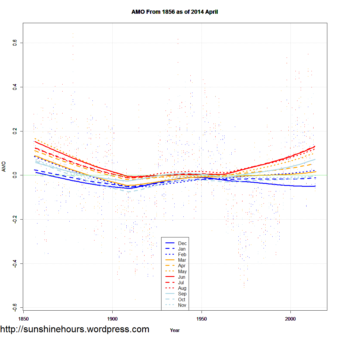
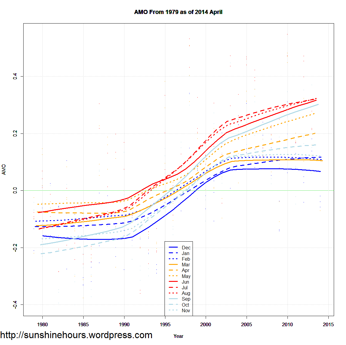
Same graphs, but the data and the trends.
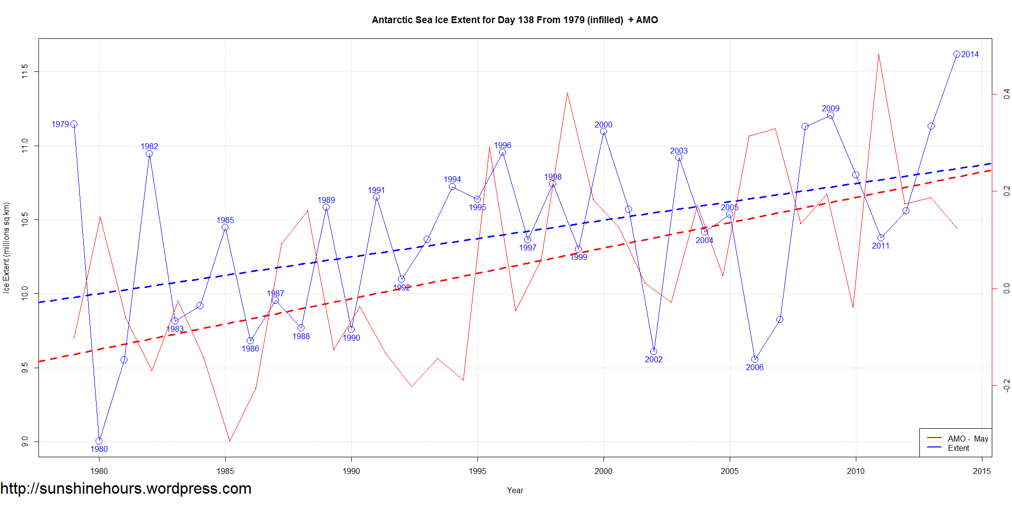
The graph is in thise post compares sea ice extent for just one day of each year – 138 to the AMO for the month day 138 is in – in this case May. There isn’t any AMO data for May 2014 yet.
AMO data comes from NOAA, Sea Ice data comes from NSIDC.
The red is the May AMO – Atlantic Multidecadal Oscillation. The blue is Antarctic Sea Ice Extent just for day 138.
The dashed lines are the liner trends for each.
Click on the graph for a larger size.
The AMO is definitely linked with climate cycles. Below are two graphs of each month of the AMO. One is from 2004. The other from 1856.
I think the AMO has peaked, but it is still wobbling around at the top of the peak and may continue to do so for several years.
Thw winter months definitely show an alternating saw-tooth pattern going down. If the pattern holds Nov/Dec/Jan/Feb should show a big drop.
But Oct stayed flat when it should have dropped. Who knows.
Do you live in the Northern Hemisphere.? Did anyone tell you that in the midst of record CO2 levels HADCRUT4 shows massively dropping winter temperatures?
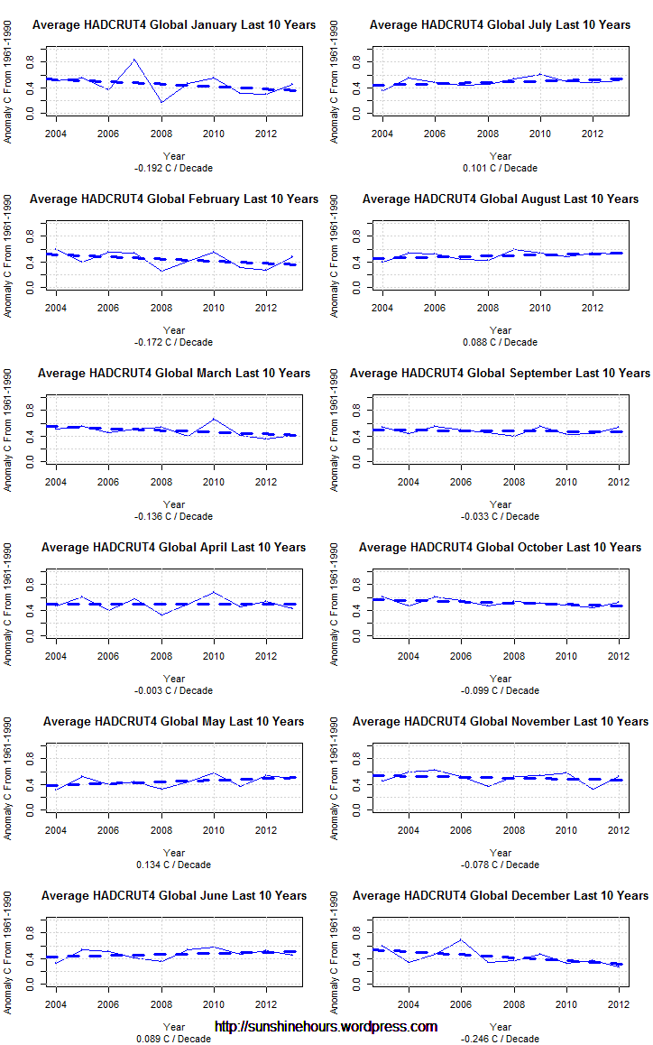
At the bottom of this post is a graph of HADCRUT4 Northern Hemisphere only temperatures for each month for the last 7 years.
Did you know December was cooling at -.9C per decade? By 2100 December could be 8C colder?
Did you know January was cooling at -.73C per decade?
Did you know March was cooling at -.56C per decade?
Did you know February was cooling at -.19C per decade?
Did you know November was cooling at -.2C per decade?
Did you know October was cooling at -.17C per decade?
Did you know April was cooling at -.17C per decade?
I’m glad I have a wood stove.

Over the last 10 years HADCRUT4 has had a slightly negative trend. But the months each have their own trend.
September to April have been cooling, while May – August have been warning, All 12 months with trends are below.
I wonder why CO2 has forsaken the winter months?
The interesting thing is this matches the AMO as you can see in the post I did in January. (I would do a new post but the US shutdown has shutdown the page I got the AMO data from).
When the AMO finishes going negative this will be very bad news for the CO2/Warmist Cult.. And even worse news for the world’s agriculture.
Right now, Dec/Jan/Feb are cooling at -0.17C/decade to -0.25C/decade. Brr. Germany is already off to the coldest start of winter in 200 years.
Update: In an earlier version the legend on the graph had blue labeled as Antarctic even though it was Arctic. The body of the post had it right (thanks Tom,Hugh,Tom,Anthony,Mike and Sundance for noticing ).
I decided to graph the AMO vs Arctic Sea Ice Extent vs Antarctic Sea Ice Extent. AMO data comes from NOAA, Sea Ice data comes from NSIDC.
The green is the AMO – Atlantic Multidecadal Oscillation. The red is Antarctic Sea Ice Extent. The blue is the Arctic Sea Ice Extent.
The dashed lines are the liner trends for each.
There are three amazing things:
1) The AMO trend is identical to the Antarctic trend even though the AMO is the sea surface trend of the North Atlantic Ocean! The trend are so close it is hard to see the AMO and Antarctic trends as separate items.
2) The Arctic trend is almost a mirror image of the Antarctic trend.
3) The cross over point is around 1997 which is when the AMO went officially positive (it sometimes goes opposite to the main trend for a few months)
The AMO is cyclic and will return to negative soon enough and this graph implies that sea ice trends will just reverse in a few years.
Click on the graph for a larger size.

I am not a graphics wizard, but I took the Arctic Ice image from NSIDC, and graphed the AMO.
And then I flipped the AMO. Looks like AMO has an effect on Arctic Sea Ice.

