Dirty Truth About Wood-Burning Biomass

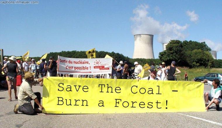
“Far from being “carbon neutral,” wood-burning biomass actually emits more carbon dioxide (the primary global warming greenhouse gas) per unit of energy produced than either gas or coal. Yes, trees can grow back and reabsorb that carbon, but that growth takes many years. The most recent studies show that

The renewability of wood is also questionable, as forests would be threatened by any meaningful increase in electricity generation using biomass as fuel. Replacing just 10 percent of the coal used in Pennsylvania would require more than 12.8 million green tons of wood per year — far more than the state’s annual commercial wood harvest (about 5 million tons).

Read more here.

SaveTheCoal

Coral is fine and thriving

Coral has nothing to fear from CO2 (the Australian):

“A WIDESPREAD belief that the world’s coral reefs face a calamitous future due to climate change is proving less resilient than the natural wonders themselves.

Rising sea temperatures, storm damage and ocean acidification have grabbed the headlines as looming threats to reef survival.

But as each concern is more thoroughly investigated, scientists are finding nature better equipped to cope than they had imagined.

The latest research, published in Nature: Climate Change today, blows away the theory that reefs were doomed due to rising ocean acidification caused by the higher take-up of carbon dioxide in the seas.

Researchers have found a common coralline algae that grows at the leading edge of coral reefs is not nearly as susceptible to changing ph levels as coral because it contains high levels of dolomite.

In fact, the dolomite-laden algae has a rate of dissolution six to 10 times lower than coral’s.

The good news is that dolomite-rich coralline algae is common in shallow coral reefs across the world.

“Our research suggests it is likely they will continue to provide protection for coral reef frameworks as carbon dioxide rises,” the paper says.”


Canada – Grid Square Choices – 5×5 = Warming and 1×1 = Cooling

Update: There are 54 5×5 grid squares in Canada with EC normals with 170 datapoints in the last 15 years. 29 are warming and 25 are cooling.

There are 199 1×1 grid squares using the same data. 116 are cooling and 83 are warming.

——————-

Previously I have looked at the 15 year trend for Environment Canada data up to Nov 2012 using 1×1 grids here, and 5×5 grids here.

Using 1×1 grid squares,  Canada is cooling at -0.089C / decade.

Using 5×5 grid squares, Canada is warming at 0.053C / decade.

Don’t the big guys like to use 5×5 grids? What a shock.

Maps for 5×5 and 1×1 below.

map_L5_Grid_Square_Non_Proportional_2012_11 map_L0_Grid_Square_Non_Proportional_2012_11

UK Tmax versus Sunshine are well correlated. Cleaner Air. More Sunshine.

This graph is Tmax % of normal versus Sunshine% of normal. The curved lines are the Loess curves from [R]. Data retrieved from here.

Why would sunshine be higher? Cleaner air in the UK (until China and India started to burn a lot more coal) thanks to the Clean Air Acts of 1956 and 1968.

The loess curves bottom out around 1968/1972.

UK Tmax vs Sunshine (Annual)_Tmax_Sunshine


Huge Increase in Sunshine Reaching Earth – 12.5 times the CO2 warming

The Hockey Schtick points to a new paper that finds a large increase in sunshine over the last 26 years.

“According to the authors, “the average increase of [surface solar radiation] from 1982 to 2008 is estimated to be 0.87 W m−2 per decade,” which equates to 2.26 W m-2 over the 26 year period. By way of comparison, this forcing was 12.5 times greater than the surface forcing alleged by the IPCC from increased CO2 over the same period.

The abstract is here. The paper is here.

“since the late 1980’s Rs has brightened over Europe due to decreases in aerosols but dimmed over China due to their increases. We found that variation of cloud cover determines Rs at a monthly scale but that aerosols determine the variability of Rs at a decadal time scale, in particular, over Europe and China.”

The warming since 1980 was caused by clean air legislation in the the US, UK and Europe.

Not by CO2.

I have posted several articles on this theme here , here and here.

AGW Arctic Sea Ice Propaganda Ignores Area

AGW Arctic Sea Ice Propaganda in 4 Easy Steps with an added bonus.

The Yellow is the amount of ice where 2012 was higher than 2007.

The Pink is the amount of ice where 2007 was higher than 2012.

One of those areas is an indicator of the end of the world according to AGW. The other area is to be ignored.